Components / forms
Labeled control
Lets people tap the whole label of a switch, checkbox or radio: label, helper text and error message around the control.
Import
In a Flutter app where fliin init has run:
Examples
Example
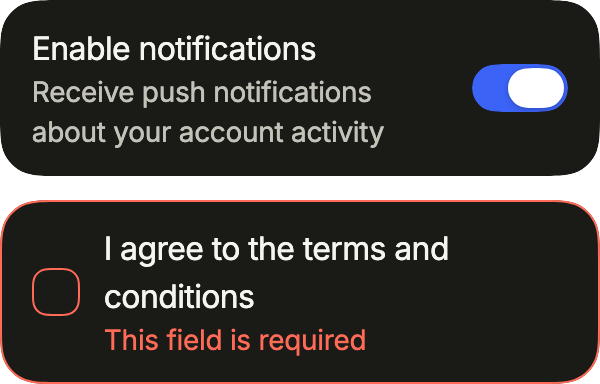
A switch or a checkbox with its label, a description and, when invalid, an error. The whole row toggles the control.
import 'package:your_app/ui/fliin/components/control_field/fl_control_field.dart';
import 'package:your_app/ui/fliin/core/fliin.dart';
import 'package:flutter/widgets.dart';

class ControlFieldExample extends StatefulWidget {
  const ControlFieldExample({super.key});

  @override
  State<ControlFieldExample> createState() => _ControlFieldExampleState();
}

class _ControlFieldExampleState extends State<ControlFieldExample> {
  var _notifications = true;
  var _terms = false;

  @override
  Widget build(BuildContext context) {
    return Column(
      mainAxisSize: MainAxisSize.min,
      crossAxisAlignment: CrossAxisAlignment.stretch,
      spacing: FlScope.of(context).space.md,
      children: [
        FlControlField(
          value: _notifications,
          onChanged: (value) => setState(() => _notifications = value),
          label: 'Enable notifications',
          description: 'Receive push notifications about your account activity',
        ),
        FlControlField(
          value: _terms,
          onChanged: (value) => setState(() => _terms = value),
          indicator: FlControlFieldIndicator.checkbox,
          invalid: !_terms,
          label: 'I agree to the terms and conditions',
          error: 'This field is required',
        ),
      ],
    );
  }
}Enabled
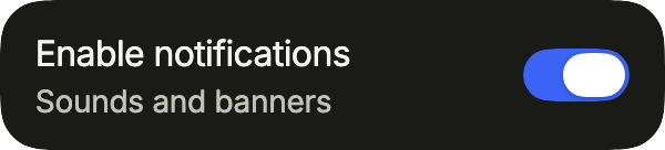
A labelled switch: the label says what it controls, the description adds detail.
import 'package:your_app/ui/fliin/components/control_field/fl_control_field.dart';
import 'package:flutter/widgets.dart';

class ControlFieldEnabledExample extends StatefulWidget {
  const ControlFieldEnabledExample({super.key});

  @override
  State<ControlFieldEnabledExample> createState() => _ControlFieldEnabledExampleState();
}

class _ControlFieldEnabledExampleState extends State<ControlFieldEnabledExample> {
  var _on = true;

  @override
  Widget build(BuildContext context) {
    return FlControlField(
      value: _on,
      onChanged: (value) => setState(() => _on = value),
      label: 'Enable notifications',
      description: 'Sounds and banners',
    );
  }
}Selected
FlControlFieldIndicator.checkbox puts a checkbox in place of the switch, here checked.

import 'package:your_app/ui/fliin/components/control_field/fl_control_field.dart';
import 'package:flutter/widgets.dart';

class ControlFieldSelectedExample extends StatefulWidget {
  const ControlFieldSelectedExample({super.key});

  @override
  State<ControlFieldSelectedExample> createState() => _ControlFieldSelectedExampleState();
}

class _ControlFieldSelectedExampleState extends State<ControlFieldSelectedExample> {
  var _on = true;

  @override
  Widget build(BuildContext context) {
    return FlControlField(
      value: _on,
      onChanged: (value) => setState(() => _on = value),
      indicator: FlControlFieldIndicator.checkbox,
      label: 'Remember me',
      description: 'On this device only',
    );
  }
}Unselected
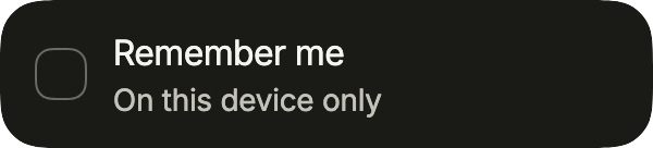
The same checkbox row, not checked yet.
import 'package:your_app/ui/fliin/components/control_field/fl_control_field.dart';
import 'package:flutter/widgets.dart';

class ControlFieldUnselectedExample extends StatefulWidget {
  const ControlFieldUnselectedExample({super.key});

  @override
  State<ControlFieldUnselectedExample> createState() => _ControlFieldUnselectedExampleState();
}

class _ControlFieldUnselectedExampleState extends State<ControlFieldUnselectedExample> {
  var _on = false;

  @override
  Widget build(BuildContext context) {
    return FlControlField(
      value: _on,
      onChanged: (value) => setState(() => _on = value),
      indicator: FlControlFieldIndicator.checkbox,
      label: 'Remember me',
      description: 'On this device only',
    );
  }
}Disabled
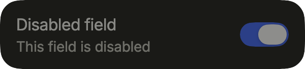
onChanged: null disables the row: the control keeps its value and ignores touches.
import 'package:your_app/ui/fliin/components/control_field/fl_control_field.dart';
import 'package:flutter/widgets.dart';

class ControlFieldDisabledExample extends StatelessWidget {
  const ControlFieldDisabledExample({super.key});

  @override
  Widget build(BuildContext context) {
    return const FlControlField(
      value: true,
      onChanged: null,
      label: 'Disabled field',
      description: 'This field is disabled',
    );
  }
}Invalid
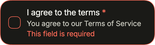
A required checkbox not yet checked: invalid shows the error in place of the description until the user agrees.
import 'package:your_app/ui/fliin/components/control_field/fl_control_field.dart';
import 'package:flutter/widgets.dart';

class ControlFieldInvalidExample extends StatefulWidget {
  const ControlFieldInvalidExample({super.key});

  @override
  State<ControlFieldInvalidExample> createState() => _ControlFieldInvalidExampleState();
}

class _ControlFieldInvalidExampleState extends State<ControlFieldInvalidExample> {
  var _agreed = false;

  @override
  Widget build(BuildContext context) {
    return FlControlField(
      value: _agreed,
      onChanged: (value) => setState(() => _agreed = value),
      indicator: FlControlFieldIndicator.checkbox,
      invalid: !_agreed,
      required: true,
      label: 'I agree to the terms',
      description: 'You agree to our Terms of Service',
      error: 'This field is required',
    );
  }
}Indicator side
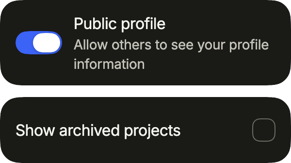
indicatorSide moves the control: a switch before its label, as in a web form, or a checkbox at the end of the row, as in a list to sort.
import 'package:your_app/ui/fliin/components/control_field/fl_control_field.dart';
import 'package:your_app/ui/fliin/core/fliin.dart';
import 'package:flutter/widgets.dart';

class ControlFieldIndicatorSideExample extends StatefulWidget {
  const ControlFieldIndicatorSideExample({super.key});

  @override
  State<ControlFieldIndicatorSideExample> createState() =>
      _ControlFieldIndicatorSideExampleState();
}

class _ControlFieldIndicatorSideExampleState
    extends State<ControlFieldIndicatorSideExample> {
  var _public = true;
  var _archived = false;

  @override
  Widget build(BuildContext context) {
    return Column(
      mainAxisSize: MainAxisSize.min,
      crossAxisAlignment: CrossAxisAlignment.stretch,
      spacing: FlScope.of(context).space.md,
      children: [
        FlControlField(
          value: _public,
          onChanged: (value) => setState(() => _public = value),
          indicatorSide: FlControlFieldSide.start,
          label: 'Public profile',
          description: 'Allow others to see your profile information',
        ),
        FlControlField(
          value: _archived,
          onChanged: (value) => setState(() => _archived = value),
          indicator: FlControlFieldIndicator.checkbox,
          indicatorSide: FlControlFieldSide.end,
          label: 'Show archived projects',
        ),
      ],
    );
  }
}Unframed
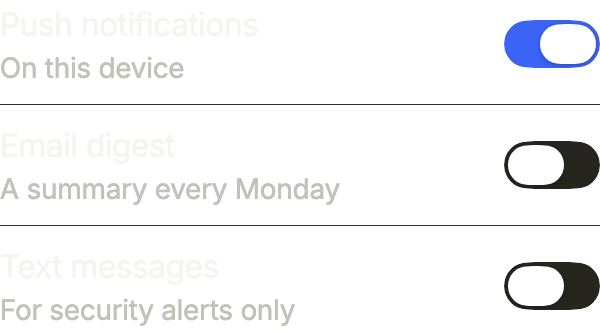
framed: false drops the card: settings rows in a list of your own, between separators.
import 'package:your_app/ui/fliin/components/control_field/fl_control_field.dart';
import 'package:your_app/ui/fliin/components/separator/fl_separator.dart';
import 'package:your_app/ui/fliin/core/fliin.dart';
import 'package:flutter/widgets.dart';

class ControlFieldUnframedExample extends StatefulWidget {
  const ControlFieldUnframedExample({super.key});

  @override
  State<ControlFieldUnframedExample> createState() =>
      _ControlFieldUnframedExampleState();
}

class _ControlFieldUnframedExampleState
    extends State<ControlFieldUnframedExample> {
  final _on = {'push': true, 'email': false, 'sms': false};

  @override
  Widget build(BuildContext context) {
    return Column(
      mainAxisSize: MainAxisSize.min,
      crossAxisAlignment: CrossAxisAlignment.stretch,
      spacing: FlScope.of(context).space.sm,
      children: [
        for (final (i, (id, label, description)) in [
          ('push', 'Push notifications', 'On this device'),
          ('email', 'Email digest', 'A summary every Monday'),
          ('sms', 'Text messages', 'For security alerts only'),
        ].indexed) ...[
          if (i > 0) const FlSeparator(),
          FlControlField(
            key: ValueKey(id),
            value: _on[id]!,
            onChanged: (value) => setState(() => _on[id] = value),
            framed: false,
            label: label,
            description: description,
          ),
        ],
      ],
    );
  }
}Radio cards
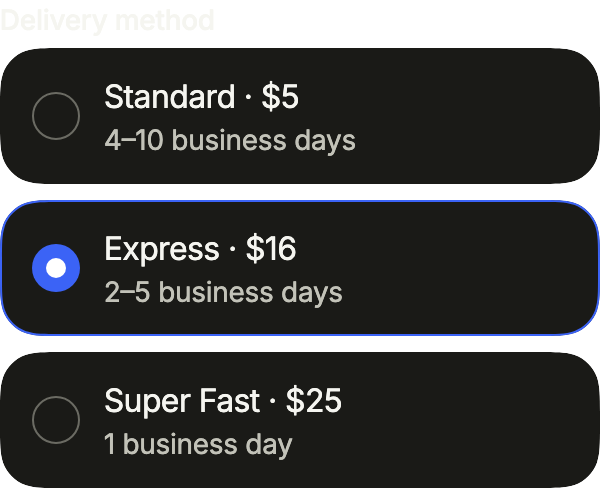
One card per delivery method: framed FlControlFields with the radio indicator, each selected when it holds the chosen value, the delay as description; outlineSelected rings the chosen card.
import 'package:your_app/ui/fliin/components/control_field/fl_control_field.dart';
import 'package:your_app/ui/fliin/components/field/fl_field.dart';
import 'package:your_app/ui/fliin/core/fliin.dart';
import 'package:flutter/widgets.dart';

class ControlFieldRadioCardsExample extends StatefulWidget {
  const ControlFieldRadioCardsExample({super.key});

  @override
  State<ControlFieldRadioCardsExample> createState() =>
      _ControlFieldRadioCardsExampleState();
}

class _ControlFieldRadioCardsExampleState
    extends State<ControlFieldRadioCardsExample> {
  var _delivery = 'express';

  @override
  Widget build(BuildContext context) {
    return FlField(
      label: 'Delivery method',
      child: Column(
        mainAxisSize: MainAxisSize.min,
        crossAxisAlignment: CrossAxisAlignment.stretch,
        spacing: FlScope.of(context).space.sm,
        children: [
          for (final (id, title, delay) in [
            ('standard', 'Standard · \$5', '4–10 business days'),
            ('express', 'Express · \$16', '2–5 business days'),
            ('fast', 'Super Fast · \$25', '1 business day'),
          ])
            FlControlField(
              key: ValueKey(id),
              value: _delivery == id,
              onChanged: (_) => setState(() => _delivery = id),
              indicator: FlControlFieldIndicator.radio,
              outlineSelected: true,
              label: title,
              description: delay,
            ),
        ],
      ),
    );
  }
}Usage
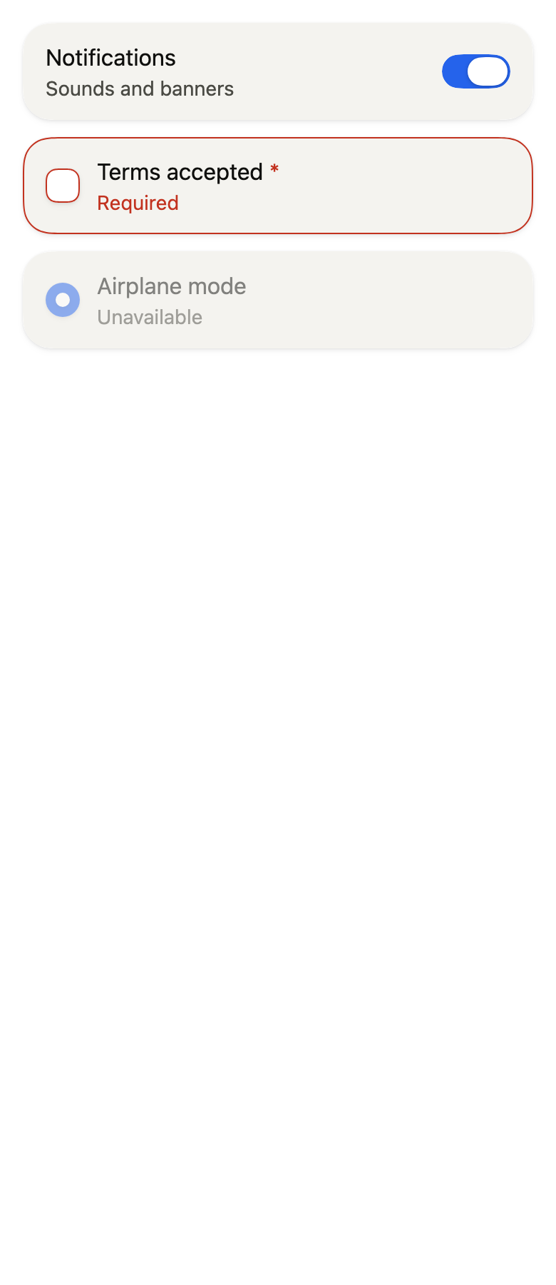
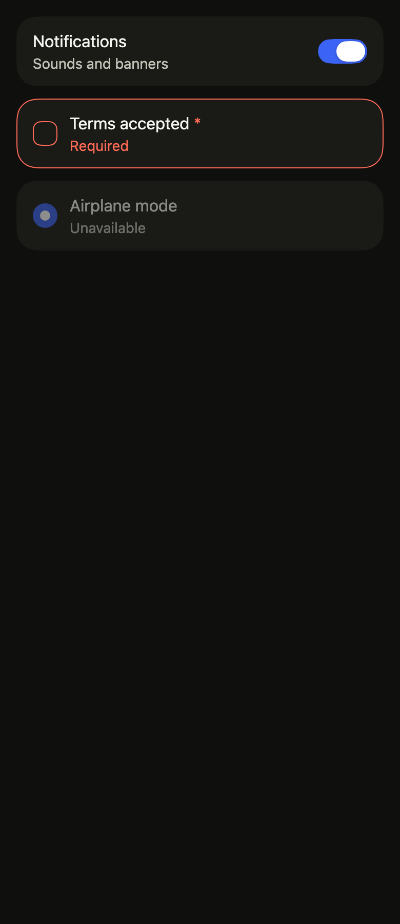
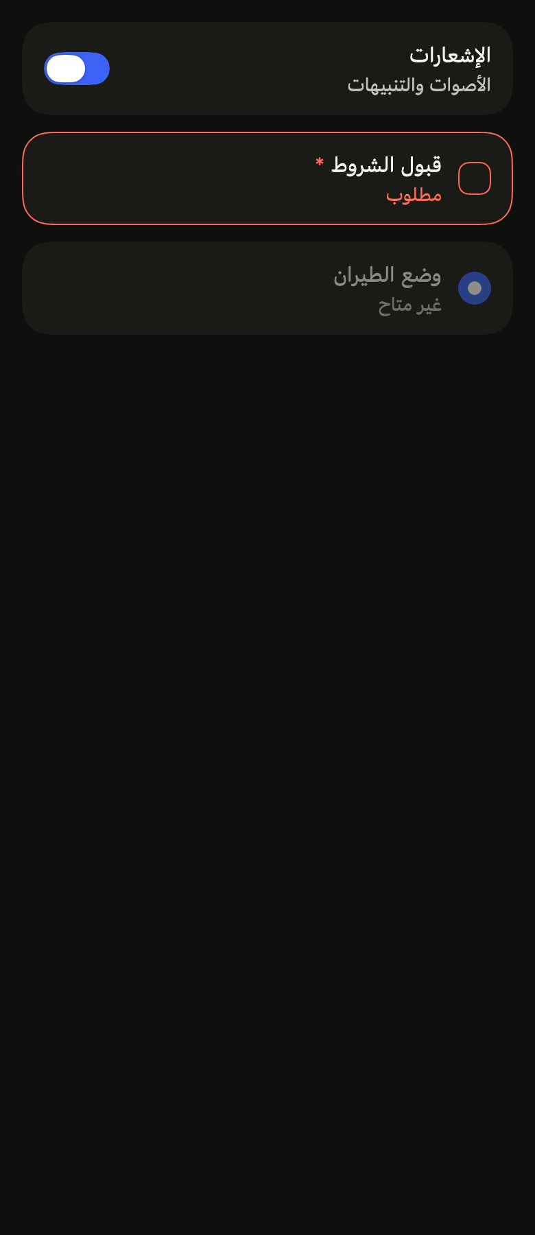
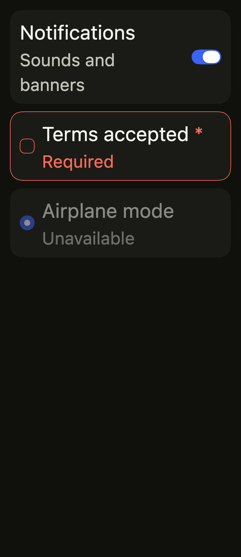
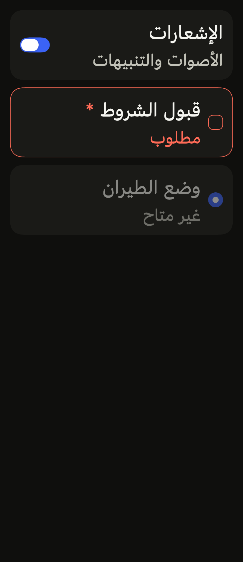
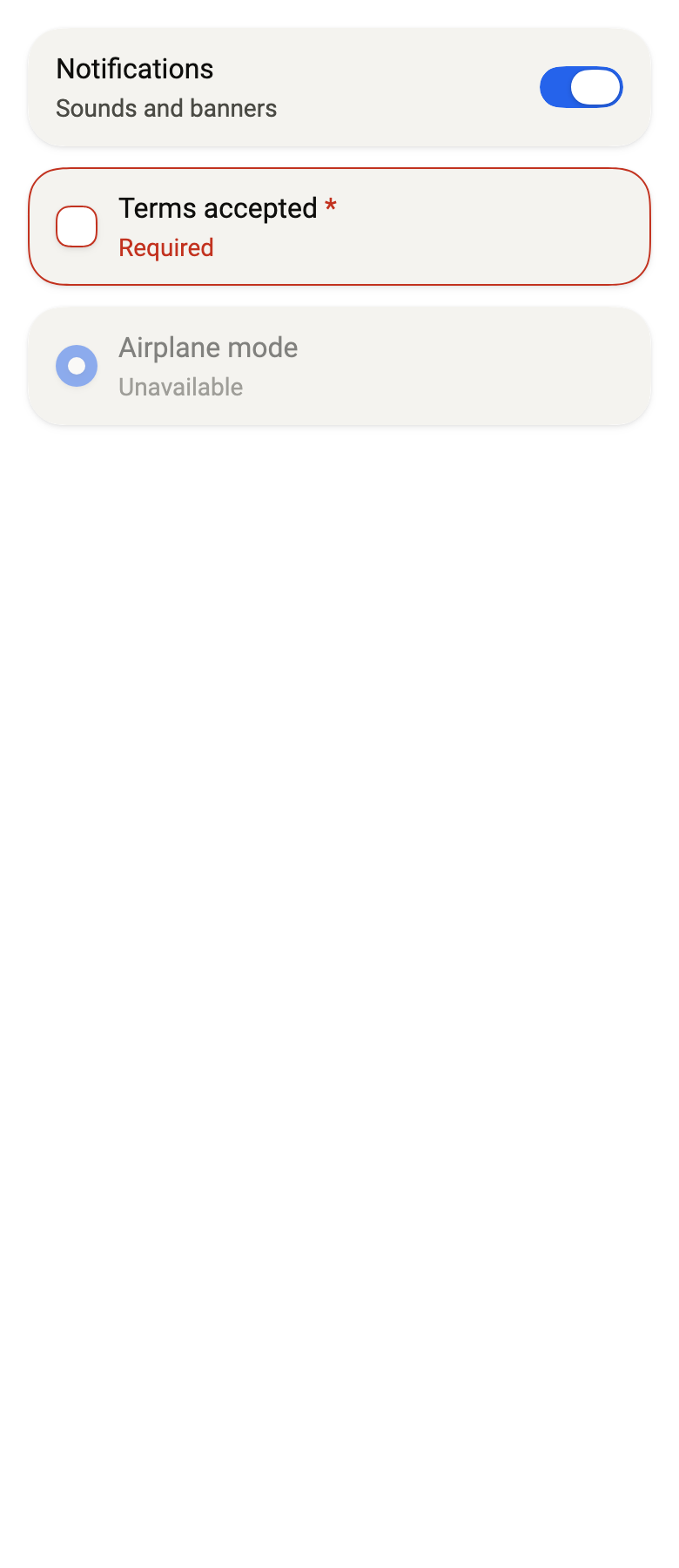
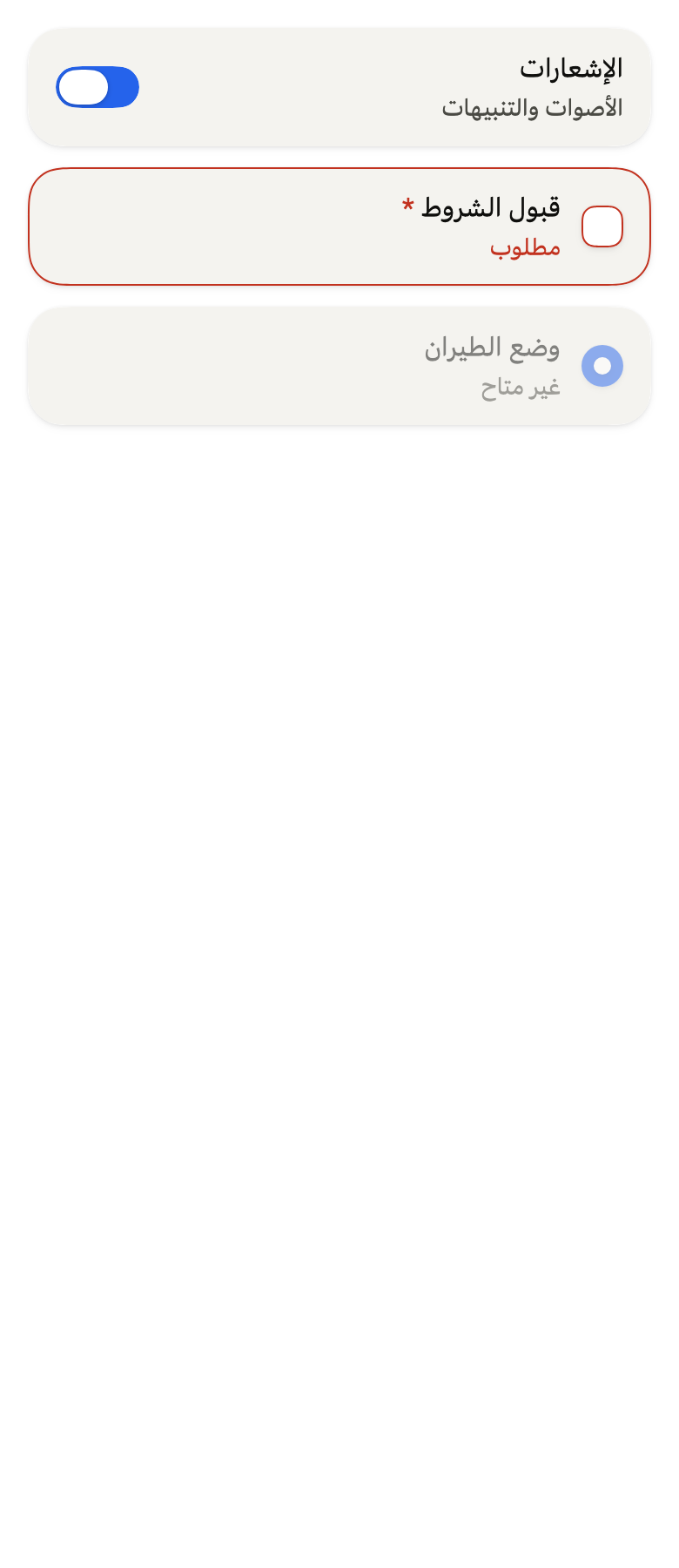
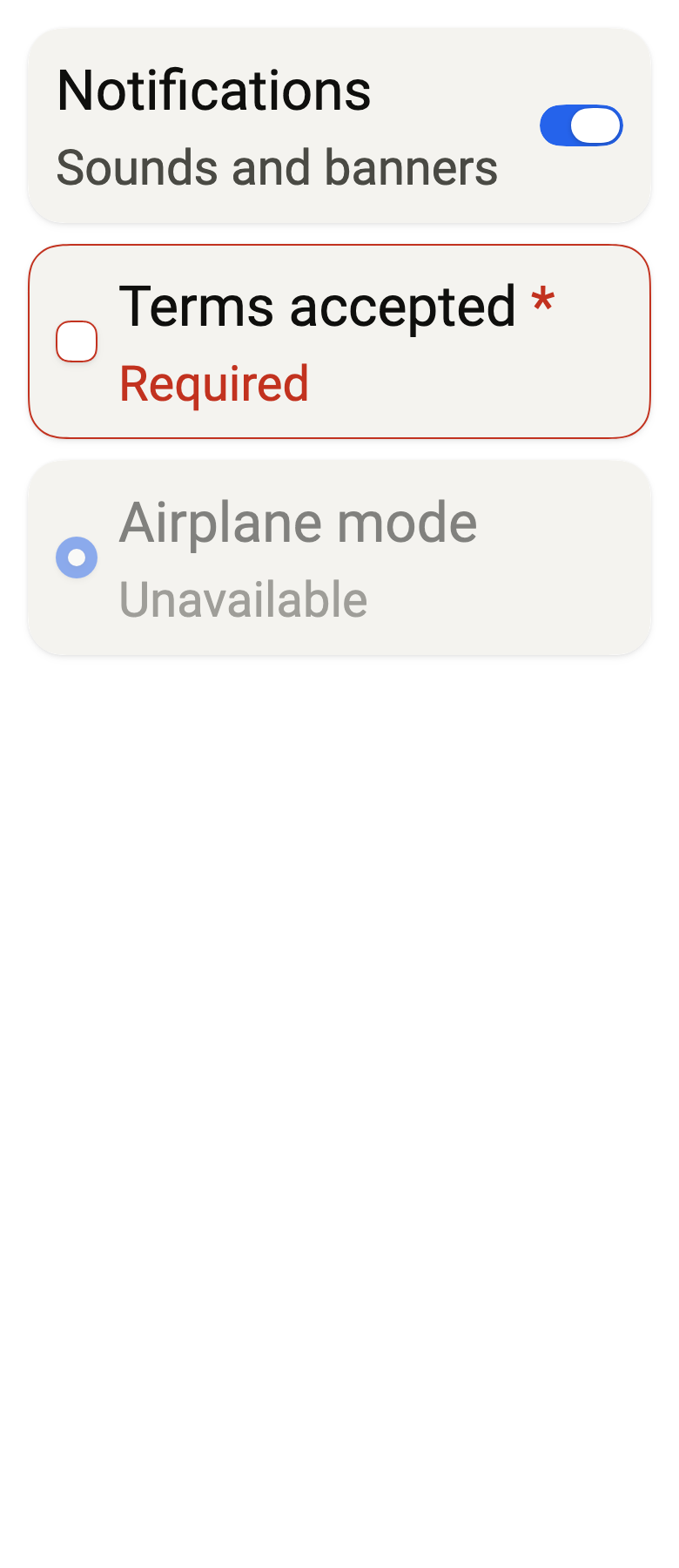
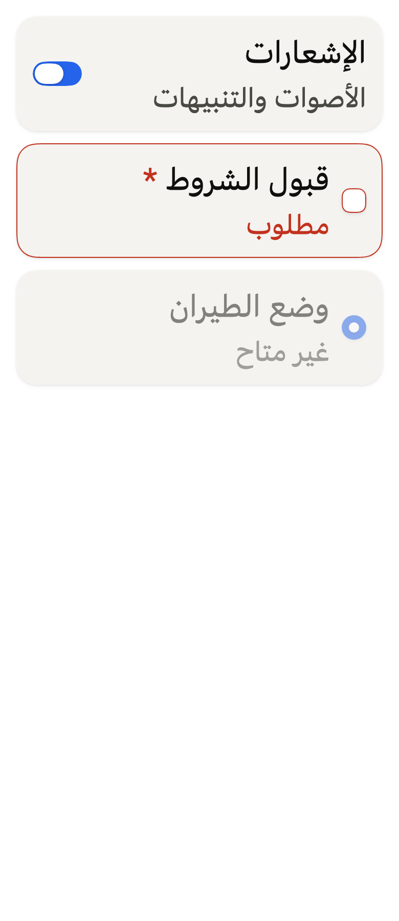
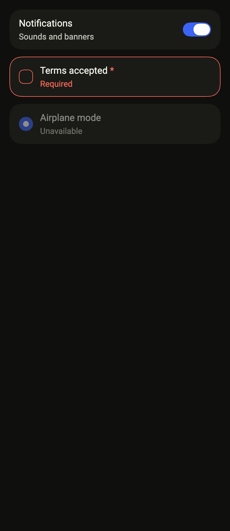
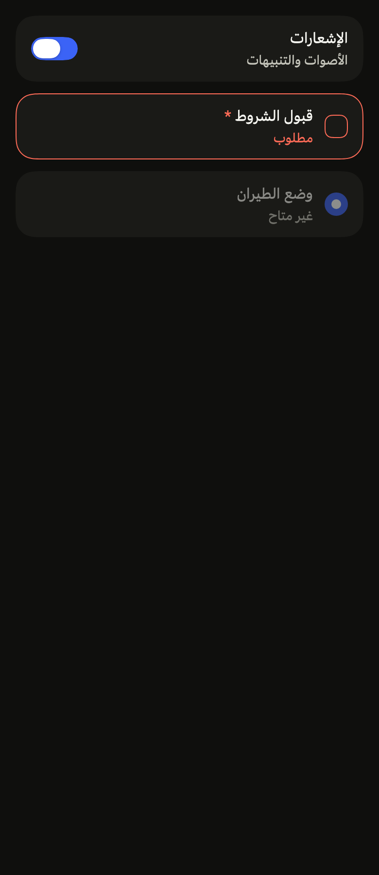
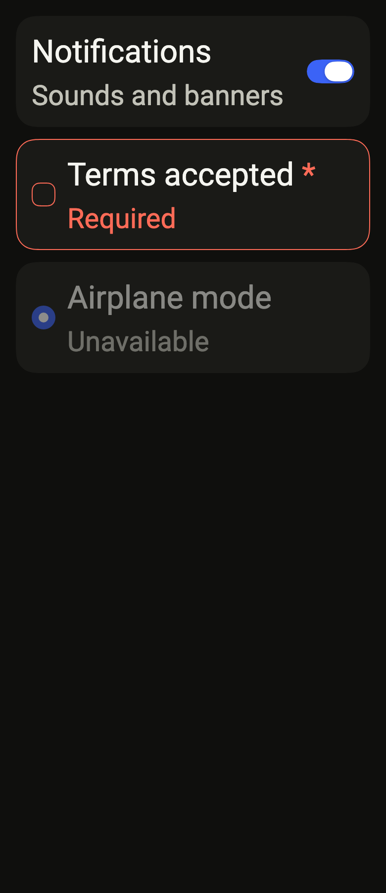
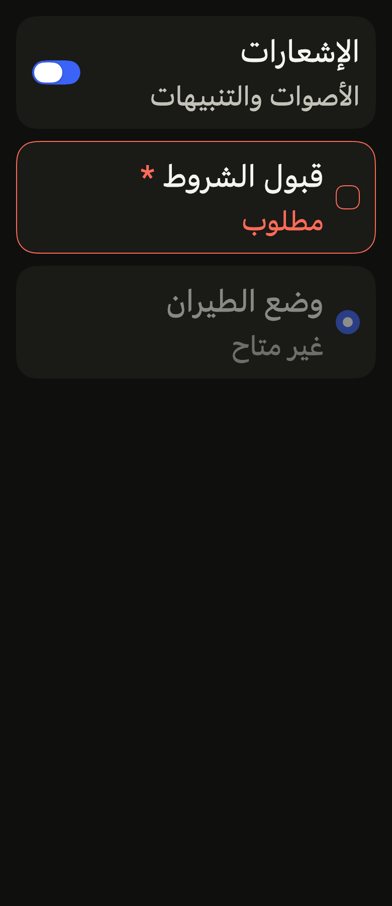
The code the reference images render:
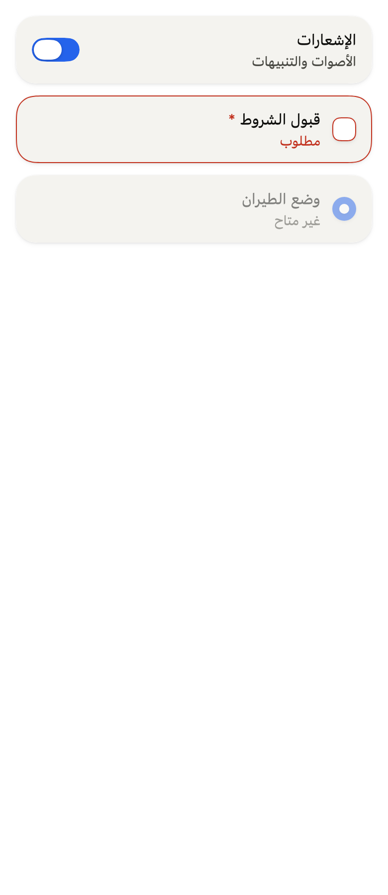
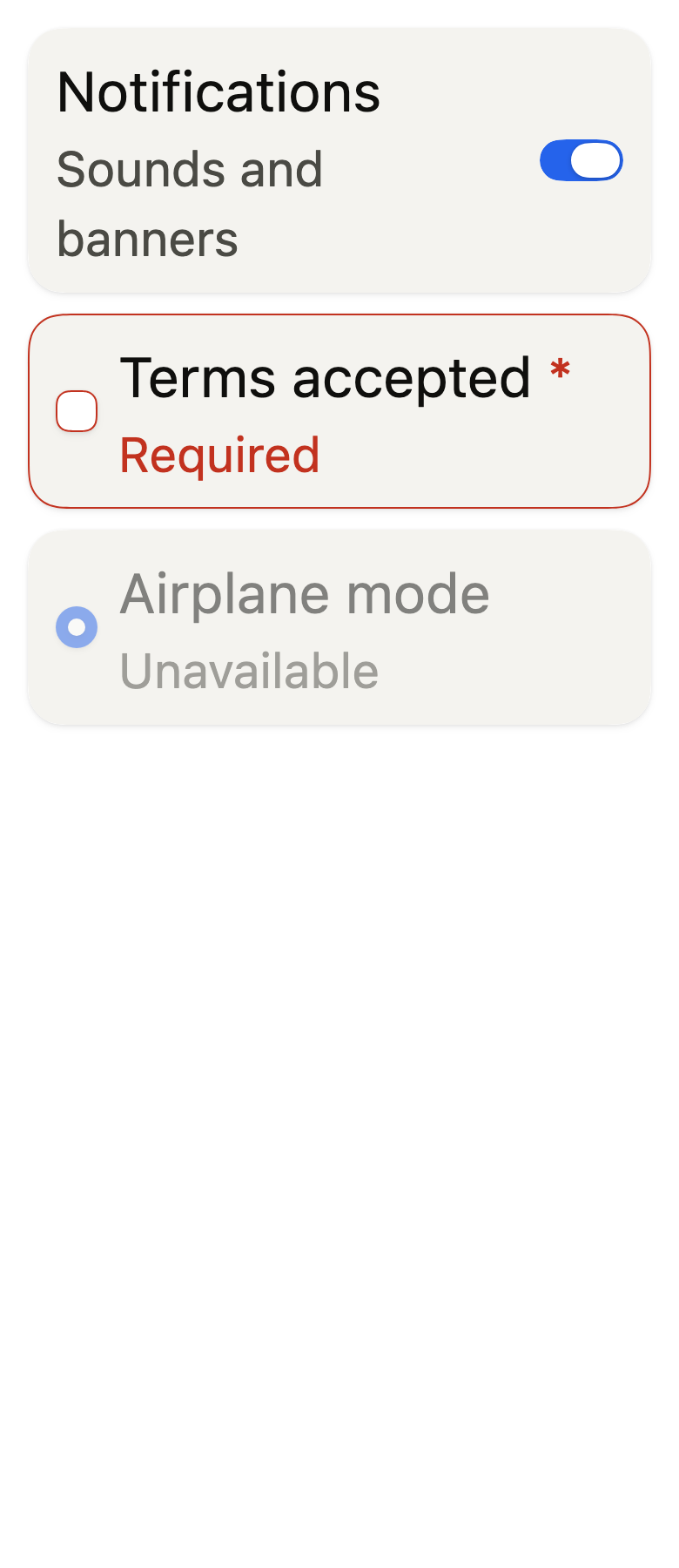
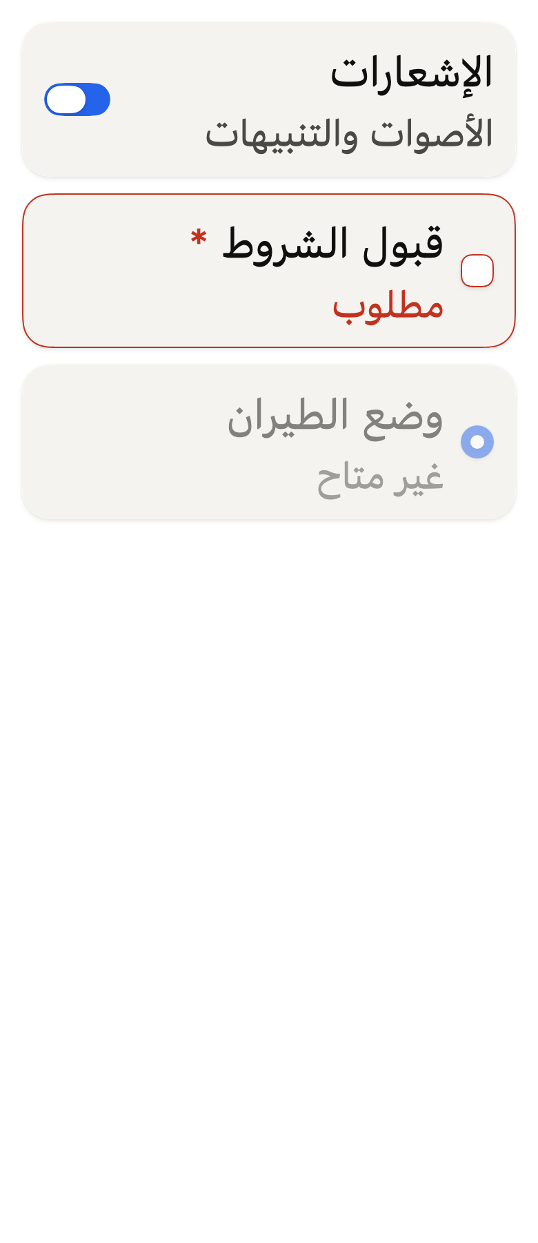
Localizations(locale: Locale'en', delegates: const [DefaultWidgetsLocalizations.delegate], child: Directionality(textDirection: variant.dir, child: ColoredBox(color: FlScope.of(context).colors.surface, child: Padding(padding: EdgeInsetsDirectional.all(FlScope.of(context).space.lg), child: Column(crossAxisAlignment: CrossAxisAlignment.stretch, spacing: FlScope.of(context).space.md, children: [FlControlField(value: true, onChanged: (_) {}, label: 'Notifications', description: 'Sounds and banners', FlControlField(value: false, onChanged: (_) {}, indicator: FlControlFieldIndicator.checkbox, invalid: true, required: true, label: 'Terms accepted', error: 'Required', FlControlField(value: true, onChanged: null, indicator: FlControlFieldIndicator.radio, label: 'Airplane mode', description: 'Unavailable'])))))API
FlControlFieldIndicator: enum {toggle, checkbox, radio}
FlControlFieldIndicator.toggle: static final FlControlFieldIndicator
FlControlFieldIndicator.checkbox: static final FlControlFieldIndicator
FlControlFieldIndicator.radio: static final FlControlFieldIndicator
FlControlFieldVariant: enum {primary, secondary}
FlControlFieldVariant.primary: static final FlControlFieldVariant
FlControlFieldVariant.secondary: static final FlControlFieldVariant
FlControlFieldSide: enum {start, end}
FlControlFieldSide.start: static final FlControlFieldSide
FlControlFieldSide.end: static final FlControlFieldSide
FlControlField: class extends StatefulWidget
FlControlField.new: const new({super.key, required bool value, required ValueChanged<bool>? onChanged, required String label, String? description, String? error, FlControlFieldIndicator indicator, FlControlFieldVariant variant, bool invalid, bool required, bool? framed, FlControlFieldSide? indicatorSide, bool outlineSelected})
FlControlField.value: get bool
FlControlField.onChanged: get ValueChanged<bool>?
FlControlField.label: get String
FlControlField.description: get String?
FlControlField.error: get String?
FlControlField.indicator: get FlControlFieldIndicator
FlControlField.variant: get FlControlFieldVariant
FlControlField.invalid: get bool
FlControlField.required: get bool
FlControlField.framed: get bool?
FlControlField.indicatorSide: get FlControlFieldSide?
FlControlField.outlineSelected: get bool
FlControlField.createState: State<FlControlField>()Reference renders
The 16 images published with version 0.2.3, rendered by the shared harness on macOS with Flutter 3.47.7. fliin verify control-field compares your copy to them.
Use it to
- make the caption beside a checkbox respond to a tap
- explain a control with helper text under its label
- show the error of a required checkbox
- describe a switch with a label and a hint
- add a pressable label to a radio
- Not for
- a control alone, without a visible label: use a switch (switch), a checkbox (checkbox) or a radio button (radio)
- several exclusive options of the same choice: use a radio group (radio)
- States
Source
The files fliin add control-field copies into your app, before your prefix and imports are applied.
control_field/fl_control_field.dart
// Modified from the ControlField of HeroUI Native 1.0.10, Copyright 2025 NextUI
// Inc., licensed under Apache 2.0: https://www.apache.org/licenses/LICENSE-2.0
import 'package:flutter/widgets.dart';
import 'package:fliin_ui/components/checkbox/fl_checkbox.dart';
import 'package:fliin_ui/components/field/fl_field.dart';
import 'package:fliin_ui/components/radio/fl_radio.dart';
import 'package:fliin_ui/components/surface/fl_surface.dart';
import 'package:fliin_ui/components/switch/fl_switch.dart';
import 'package:fliin_ui/core/fliin.dart';

/// The control of a [FlControlField]: a switch after the label, a checkbox or a
/// radio before it.
enum FlControlFieldIndicator {
  /// A `FlSwitch`.
  toggle,

  /// A `FlCheckbox`.
  checkbox,

  /// A `FlRadio`, which is selected and never unchecked: the row, the
  /// keyboard and the screen reader only select it. It gets no pressed
  /// state.
  radio,
}

/// The background of the box or the unchecked radio of a [FlControlField].
/// The switch has only one.
enum FlControlFieldVariant {
  /// `field` background and `field` shadow: a row placed on the page.
  primary,

  /// `control` background, no shadow: a row placed on a surface, a sheet or
  /// a dialog, whose background is that of `field`.
  secondary,
}

/// Where the control of a [FlControlField] sits.
enum FlControlFieldSide {
  /// Before the label and its description.
  start,

  /// After them, at the end of the row.
  end,
}

/// A one-row setting: a checkbox or a radio
/// before the label and its description, a switch after them. The whole
/// row is tappable and presses the switch or the checkbox (not the radio,
/// which has no pressed state); the screen reader reads it as a single
/// control, label and description included. [error] shows under the label
/// and the description, beside the control, when the field is [invalid].
/// Framed, the row sits on a `surfaceRaised` card that a `danger` outline
/// surrounds when invalid, or a `selected` one when [outlineSelected] and
/// on. [indicatorSide] moves the control to the other side.
class FlControlField extends StatefulWidget {
  /// A row [label] whose control is in state [value].
  const FlControlField({
    super.key,
    required this.value,
    required this.onChanged,
    required this.label,
    this.description,
    this.error,
    this.indicator = FlControlFieldIndicator.toggle,
    this.variant = FlControlFieldVariant.primary,
    this.invalid = false,
    this.required = false,
    this.framed,
    this.indicatorSide,
    this.outlineSelected = false,
  });

  /// On, checked or selected. The parent holds it.
  final bool value;

  /// Receives the opposite state when the row is tapped (always true for a
  /// radio), or the one the control requests. When null: the row is
  /// disabled, its texts go to `size.disabledOpacity`.
  final ValueChanged<bool>? onChanged;

  /// The label, in `textBase`.
  final String label;

  /// A help text under the label, in `textSm`.
  final String? description;

  /// The error message under the label and the description, as a
  /// `FlFieldError`, shown when [invalid] is true.
  final String? error;

  /// The control at the end of the row; a switch by default.
  final FlControlFieldIndicator indicator;

  /// The background of the box or the unchecked radio; `primary` by default.
  final FlControlFieldVariant variant;

  /// True: the value is rejected; the box, the radio or the switch, and the
  /// card when [framed], take a `danger` outline, and [error] appears.
  final bool invalid;

  /// True: the label carries an asterisk.
  final bool required;

  /// True: the row sits on its own `surfaceRaised` card, as a setting placed
  /// on the page. When null, a `primary` field is framed and a `secondary`
  /// one, already on a surface, is not; a group's rows are never framed.
  final bool? framed;

  /// The side of the control. When null, a switch at the end, as in iOS
  /// settings, and a checkbox or a radio at the start, as in a form.
  final FlControlFieldSide? indicatorSide;

  /// True: a framed field that is on, checked or selected is outlined in
  /// `selected`, like delivery options: the chosen card of a list of
  /// options stands out. An invalid field keeps its `danger` outline.
  final bool outlineSelected;

  @override
  State<FlControlField> createState() => _FlControlFieldState();
}

class _FlControlFieldState extends State<FlControlField> {
  final WidgetStatesController _states = WidgetStatesController();

  bool get _enabled => widget.onChanged != null;

  /// Toggles the switch or the checkbox; selects the radio, never
  /// unchecking it, like its keyboard (`toggleable: false`).
  void _activate() => widget.onChanged?.call(widget.indicator == FlControlFieldIndicator.radio || !widget.value);

  void _press(bool pressed) => _states.update(WidgetState.pressed, pressed && _enabled);

  @override
  void didUpdateWidget(FlControlField oldWidget) {
    super.didUpdateWidget(oldWidget);
    if (!_enabled) _states.update(WidgetState.pressed, false);
  }

  @override
  void dispose() {
    _states.dispose();
    super.dispose();
  }

  Widget _control() {
    final onChanged = widget.onChanged;
    final secondary = widget.variant == FlControlFieldVariant.secondary;
    return switch (widget.indicator) {
      FlControlFieldIndicator.toggle => FlSwitch(
        value: widget.value,
        onChanged: onChanged,
        label: widget.label,
        statesController: _states,
      ),
      FlControlFieldIndicator.checkbox => FlCheckbox(
        value: widget.value,
        onChanged: onChanged == null ? null : (value) => onChanged(value ?? false),
        label: widget.label,
        variant: secondary ? FlCheckboxVariant.secondary : FlCheckboxVariant.primary,
        statesController: _states,
      ),
      FlControlFieldIndicator.radio => RadioGroup<bool>(
        groupValue: widget.value ? true : null,
        onChanged: (_) => onChanged?.call(true),
        child: FlRadio<bool>(
          value: true,
          label: widget.label,
          enabled: _enabled,
          variant: secondary ? FlRadioVariant.secondary : FlRadioVariant.primary,
        ),
      ),
    };
  }

  /// The label in `textBase` regular, `onSurface` even when invalid (the
  /// outline and the error carry it), its asterisk in `danger`; the
  /// description in `textSm` `onSurfaceMuted`.
  Widget _texts(FlTheme theme) {
    final colors = theme.colors;
    final scale = theme.typography;
    final family = DefaultTextStyle.of(context).style.fontFamily;
    Widget text(String data, FlTextRole role, Color color, {List<InlineSpan> trailing = const []}) => Text.rich(
      TextSpan(text: data, children: trailing),
      style: scale.resolve(role).copyWith(color: color, fontWeight: theme.tokens.typography.weight.normal),
      strutStyle: scale.strut(role, inheritedFamily: family),
    );
    final description = widget.description;
    final texts = Column(
      mainAxisSize: MainAxisSize.min,
      crossAxisAlignment: CrossAxisAlignment.start,
      children: [
        text(
          widget.label,
          FlTextRole.textBase,
          colors.onSurface,
          trailing: [
            if (widget.required)
              TextSpan(
                text: ' *',
                semanticsLabel: '',
                style: TextStyle(color: _enabled ? colors.danger : colors.onSurfaceMuted),
              ),
          ],
        ),
        if (description != null) text(description, FlTextRole.textSm, colors.onSurfaceMuted),
      ],
    );
    // A disabled field fades its texts with its control, and falls outside
    // the contrast rule like it (WCAG 1.4.3).
    return _enabled ? texts : Opacity(opacity: theme.size.disabledOpacity, child: texts);
  }

  @override
  Widget build(BuildContext context) {
    final theme = FlScope.of(context);
    final colors = theme.colors;
    final description = widget.description;
    final error = widget.error;
    final onChanged = widget.onChanged;
    final framed = widget.framed ?? widget.variant == FlControlFieldVariant.primary;
    final leading = switch (widget.indicatorSide) {
      FlControlFieldSide.start => true,
      FlControlFieldSide.end => false,
      null => widget.indicator != FlControlFieldIndicator.toggle,
    };
    // The error is the texts' last line (`.choice-text .err`), outside the
    // row's merged reading: it is announced on its own when it appears.
    final texts = Expanded(
      child: Column(
        mainAxisSize: MainAxisSize.min,
        crossAxisAlignment: CrossAxisAlignment.stretch,
        children: [
          ExcludeSemantics(child: _texts(theme)),
          if (error != null) FlFieldError(error),
        ],
      ),
    );
    final control = ExcludeSemantics(child: _control());
    final row = FlHitTarget(
      child: Semantics(
        enabled: _enabled,
        label: widget.label,
        hint: description,
        toggled: widget.indicator == FlControlFieldIndicator.toggle ? widget.value : null,
        checked: widget.indicator == FlControlFieldIndicator.toggle ? null : widget.value,
        inMutuallyExclusiveGroup: widget.indicator == FlControlFieldIndicator.radio ? true : null,
        onTap: onChanged == null ? null : _activate,
        child: GestureDetector(
          excludeFromSemantics: true,
          behavior: HitTestBehavior.opaque,
          onTapDown: (_) => _press(true),
          onTapUp: (_) => _press(false),
          onTapCancel: () => _press(false),
          onTap: onChanged == null ? null : _activate,
          child: ConstrainedBox(
            constraints: BoxConstraints(minHeight: theme.size.controlCompact),
            child: Row(spacing: theme.space.md, children: leading ? [control, texts] : [texts, control]),
          ),
        ),
      ),
    );
    final Widget field;
    if (framed) {
      final shape = FlContinuousBorder(
        radius: theme.shape.radiusCard,
        side: switch ((widget.invalid, widget.outlineSelected && widget.value)) {
          (true, _) => BorderSide(color: colors.danger, width: theme.size.border),
          (false, true) => BorderSide(color: colors.selected, width: theme.size.border),
          (false, false) => BorderSide.none,
        },
      );
      field = DecoratedBox(
        position: DecorationPosition.foreground,
        decoration: ShapeDecoration(shape: shape),
        child: FlSurface(
          padding: EdgeInsetsDirectional.symmetric(horizontal: theme.space.lg, vertical: theme.space.md),
          child: row,
        ),
      );
    } else {
      field = row;
    }
    return FlFieldScope(invalid: widget.invalid, disabled: !_enabled, required: widget.required, child: field);
  }
}