Components / overlays
Action menu
Lets people pick an action from a list opened by a control, by touch or keyboard. Checked options, a submenu that unfolds in place, or a bottom sheet.
Import
In a Flutter app where fliin init has run:
Examples
Example
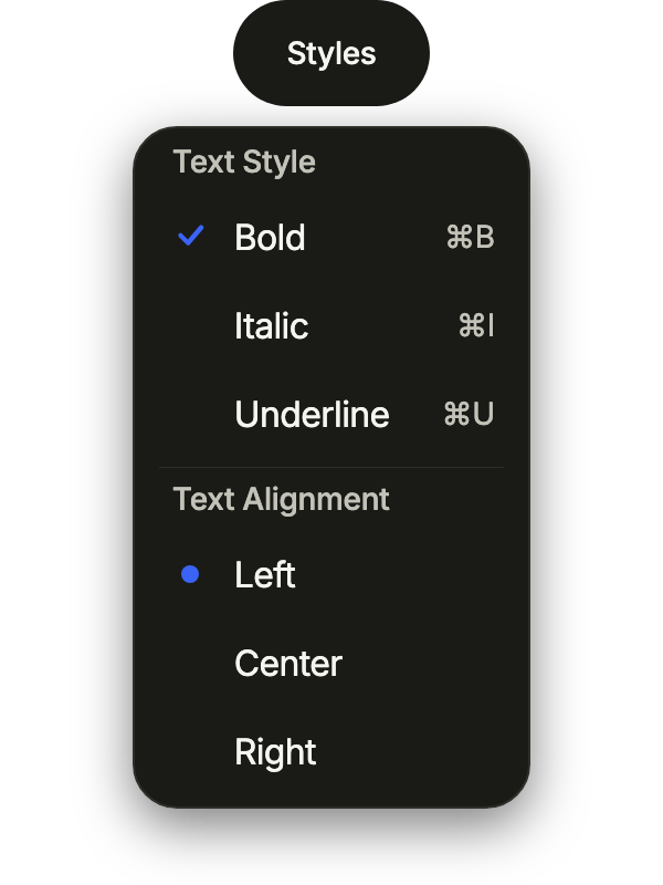
Groups of options in one menu: several text styles at once with FlMenuSelection.multiple, one alignment marked by a dot, each group under its label.
import 'package:your_app/ui/fliin/components/button/fl_button.dart';
import 'package:your_app/ui/fliin/components/menu/fl_menu.dart';
import 'package:flutter/widgets.dart';

class MenuExample extends StatefulWidget {
  const MenuExample({super.key});

  @override
  State<MenuExample> createState() => _MenuExampleState();
}

class _MenuExampleState extends State<MenuExample> {
  var _style = const {'bold'};
  var _align = const {'start'};

  @override
  Widget build(BuildContext context) {
    return FlMenu(
      items: [
        const FlMenuLabel('Text Style'),
        FlMenuGroup<String>(
          selection: FlMenuSelection.multiple,
          selected: _style,
          onChanged: (style) => setState(() => _style = style),
          options: const [
            FlMenuOption(value: 'bold', label: 'Bold', trailing: Text('⌘B')),
            FlMenuOption(value: 'italic', label: 'Italic', trailing: Text('⌘I')),
            FlMenuOption(value: 'underline', label: 'Underline', trailing: Text('⌘U')),
          ],
        ),
        const FlMenuDivider(),
        const FlMenuLabel('Text Alignment'),
        FlMenuGroup<String>(
          indicator: FlMenuIndicator.dot,
          selected: _align,
          onChanged: (align) => setState(() => _align = align),
          options: const [
            FlMenuOption(value: 'start', label: 'Left'),
            FlMenuOption(value: 'center', label: 'Center'),
            FlMenuOption(value: 'end', label: 'Right'),
          ],
        ),
      ],
      builder: (context, controller) =>
          FlButton(label: 'Styles', variant: FlButtonVariant.secondary, onPressed: controller.open),
    );
  }
}Open
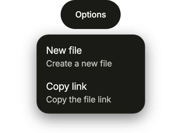
A menu of actions under its trigger, each with a description. FlMenu hands its controller to the trigger it builds.
import 'package:your_app/ui/fliin/components/button/fl_button.dart';
import 'package:your_app/ui/fliin/components/menu/fl_menu.dart';
import 'package:flutter/widgets.dart';

class MenuOpenExample extends StatelessWidget {
  const MenuOpenExample({super.key});

  @override
  Widget build(BuildContext context) {
    return FlMenu(
      items: [
        FlMenuItem(label: 'New file', description: 'Create a new file', onPressed: () {}),
        FlMenuItem(label: 'Copy link', description: 'Copy the file link', onPressed: () {}),
      ],
      builder: (context, controller) =>
          FlButton(label: 'Options', variant: FlButtonVariant.secondary, onPressed: controller.open),
    );
  }
}Disabled
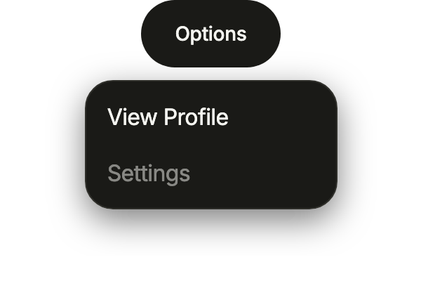
An item with onPressed: null stays in the menu, dimmed, for an action that is not available yet.
import 'package:your_app/ui/fliin/components/button/fl_button.dart';
import 'package:your_app/ui/fliin/components/menu/fl_menu.dart';
import 'package:flutter/widgets.dart';

class MenuDisabledExample extends StatelessWidget {
  const MenuDisabledExample({super.key});

  @override
  Widget build(BuildContext context) {
    return FlMenu(
      items: [
        FlMenuItem(label: 'View Profile', onPressed: () {}),
        const FlMenuItem(label: 'Settings', onPressed: null),
      ],
      builder: (context, controller) =>
          FlButton(label: 'Options', variant: FlButtonVariant.secondary, onPressed: controller.open),
    );
  }
}Destructive
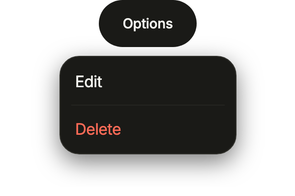
destructive: true sets an action that deletes apart, in the danger color, after a divider.
import 'package:your_app/ui/fliin/components/button/fl_button.dart';
import 'package:your_app/ui/fliin/components/menu/fl_menu.dart';
import 'package:flutter/widgets.dart';

class MenuDestructiveExample extends StatelessWidget {
  const MenuDestructiveExample({super.key});

  @override
  Widget build(BuildContext context) {
    return FlMenu(
      items: [
        FlMenuItem(label: 'Edit', onPressed: () {}),
        const FlMenuDivider(),
        FlMenuItem(label: 'Delete', destructive: true, onPressed: () {}),
      ],
      builder: (context, controller) =>
          FlButton(label: 'Options', variant: FlButtonVariant.secondary, onPressed: controller.open),
    );
  }
}Sections
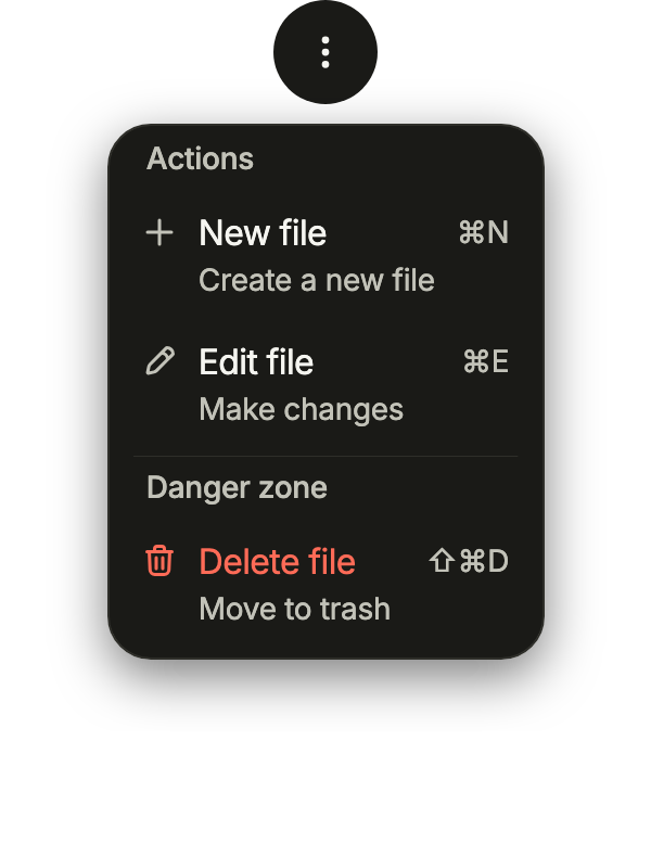
Sections under an FlMenuLabel, split by an FlMenuDivider; each action with a leading icon, a description and its shortcut as trailing, the deletion apart in a danger zone.
import 'package:your_app/ui/fliin/components/button/fl_button.dart';
import 'package:your_app/ui/fliin/components/menu/fl_menu.dart';
import 'package:your_app/ui/fliin/core/fliin.dart';
import 'package:your_app/ui/fliin/icons/fl_icons.dart';
import 'package:flutter/widgets.dart';

class MenuSectionsExample extends StatelessWidget {
  const MenuSectionsExample({super.key});

  @override
  Widget build(BuildContext context) {
    return FlMenu(
      items: [
        const FlMenuLabel('Actions'),
        FlMenuItem(
          label: 'New file',
          description: 'Create a new file',
          leading: FlIcon(FlIcons.plus),
          trailing: const Text('⌘N'),
          onPressed: () {},
        ),
        FlMenuItem(
          label: 'Edit file',
          description: 'Make changes',
          leading: FlIcon(FlIcons.pencil),
          trailing: const Text('⌘E'),
          onPressed: () {},
        ),
        const FlMenuDivider(),
        const FlMenuLabel('Danger zone'),
        FlMenuItem(
          label: 'Delete file',
          description: 'Move to trash',
          leading: FlIcon(FlIcons.trashBin),
          trailing: const Text('⇧⌘D'),
          destructive: true,
          onPressed: () {},
        ),
      ],
      builder: (context, controller) => FlButton.icon(
        label: 'File actions',
        icon: FlIcon(FlIcons.ellipsisVertical),
        variant: FlButtonVariant.secondary,
        onPressed: controller.open,
      ),
    );
  }
}Selection
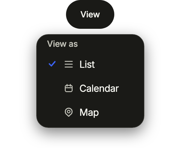
One choice in an FlMenuGroup, checked at the start of its row; each option can carry a leading icon. Choosing closes the menu.
import 'package:your_app/ui/fliin/components/button/fl_button.dart';
import 'package:your_app/ui/fliin/components/menu/fl_menu.dart';
import 'package:your_app/ui/fliin/core/fliin.dart';
import 'package:your_app/ui/fliin/icons/fl_icons.dart';
import 'package:flutter/widgets.dart';

class MenuSelectionExample extends StatefulWidget {
  const MenuSelectionExample({super.key});

  @override
  State<MenuSelectionExample> createState() => _MenuSelectionExampleState();
}

class _MenuSelectionExampleState extends State<MenuSelectionExample> {
  var _view = const {'list'};

  @override
  Widget build(BuildContext context) {
    return FlMenu(
      items: [
        const FlMenuLabel('View as'),
        FlMenuGroup<String>(
          selected: _view,
          onChanged: (view) => setState(() => _view = view),
          options: [
            FlMenuOption(value: 'list', label: 'List', leading: FlIcon(FlIcons.bars)),
            FlMenuOption(value: 'calendar', label: 'Calendar', leading: FlIcon(FlIcons.calendar)),
            FlMenuOption(value: 'map', label: 'Map', leading: FlIcon(FlIcons.mapPin)),
          ],
        ),
      ],
      builder: (context, controller) =>
          FlButton(label: 'View', variant: FlButtonVariant.secondary, onPressed: controller.open),
    );
  }
}Submenu
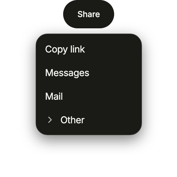
An FlSubmenu unfolds a second level in place, over the menu: the rarer share targets wait behind "Other".
import 'package:your_app/ui/fliin/components/button/fl_button.dart';
import 'package:your_app/ui/fliin/components/menu/fl_menu.dart';
import 'package:flutter/widgets.dart';

class MenuSubmenuExample extends StatelessWidget {
  const MenuSubmenuExample({super.key});

  @override
  Widget build(BuildContext context) {
    return FlMenu(
      items: [
        FlMenuItem(label: 'Copy link', onPressed: () {}),
        FlMenuItem(label: 'Messages', onPressed: () {}),
        FlMenuItem(label: 'Mail', onPressed: () {}),
        FlSubmenu(
          label: 'Other',
          items: [
            FlMenuItem(label: 'WhatsApp', onPressed: () {}),
            FlMenuItem(label: 'Telegram', onPressed: () {}),
            FlMenuItem(label: 'Discord', onPressed: () {}),
          ],
        ),
      ],
      builder: (context, controller) =>
          FlButton(label: 'Share', variant: FlButtonVariant.secondary, onPressed: controller.open),
    );
  }
}Usage
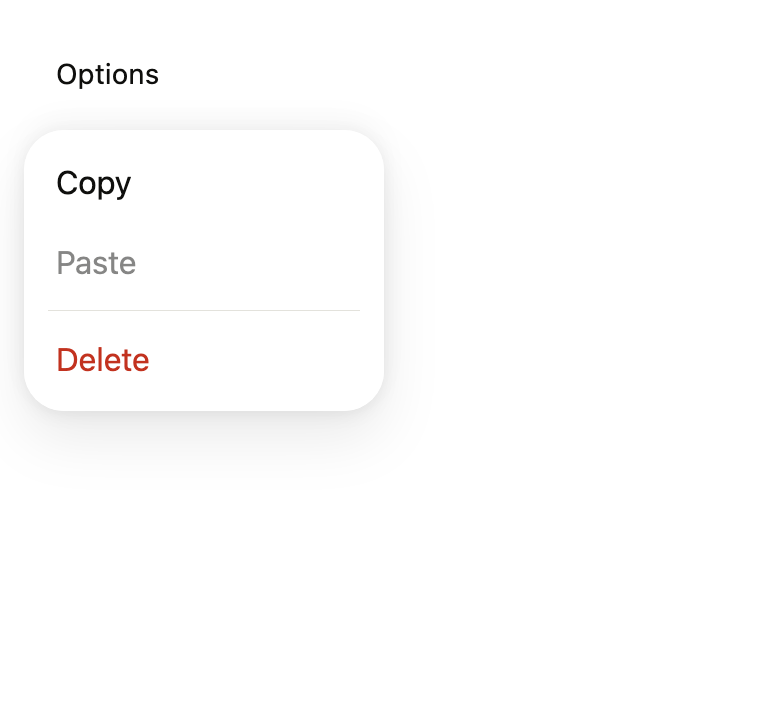
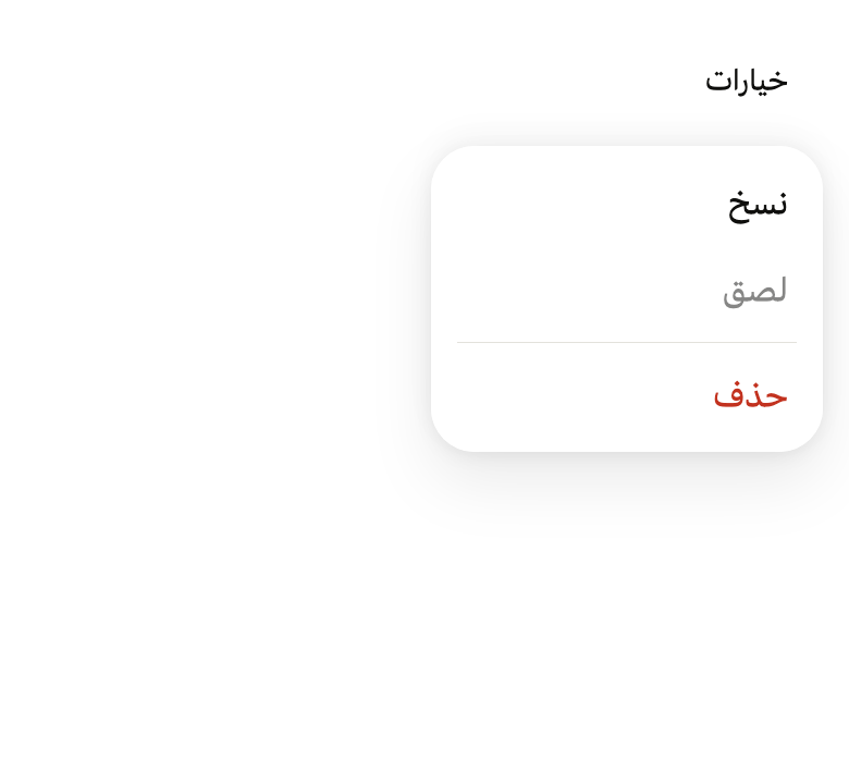
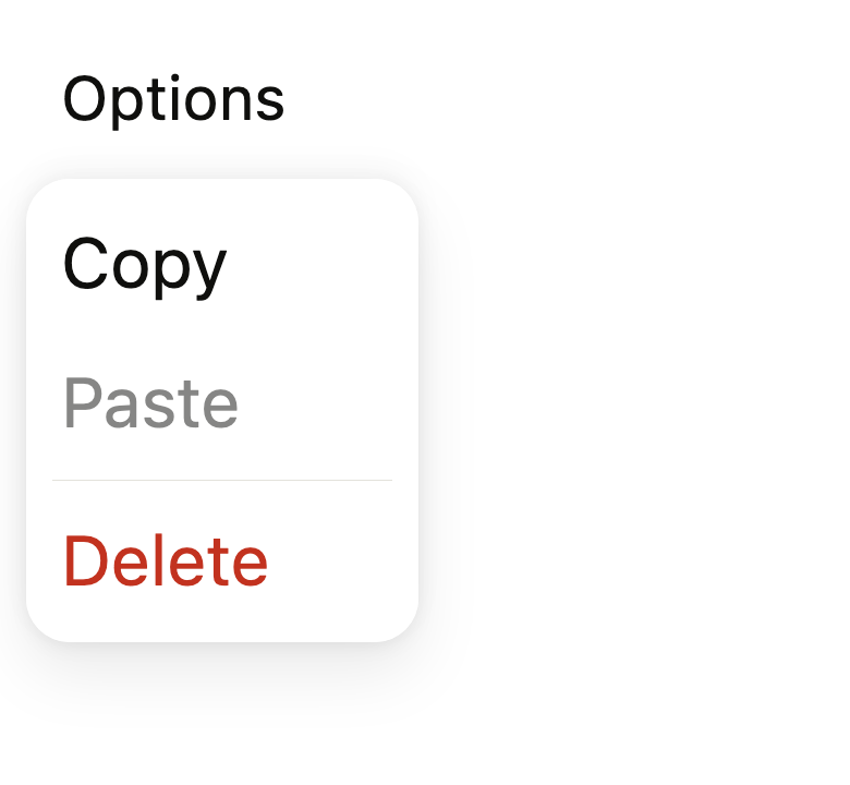
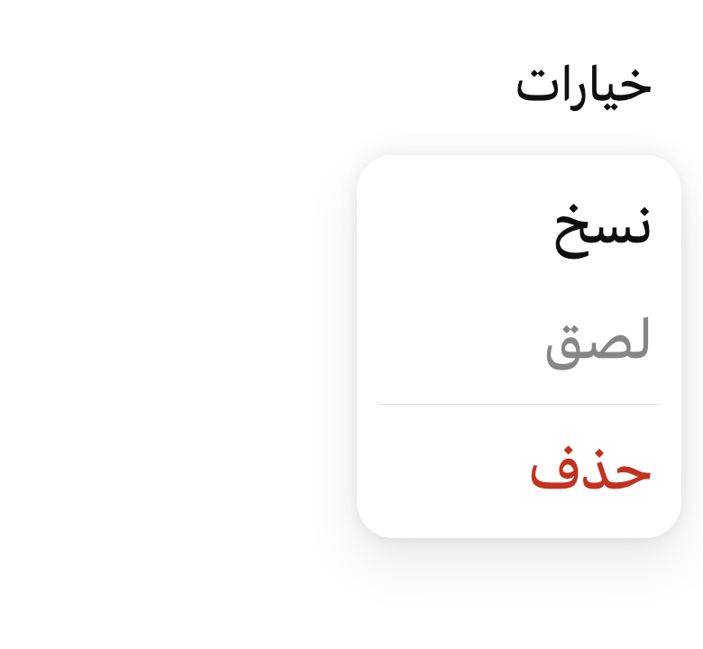
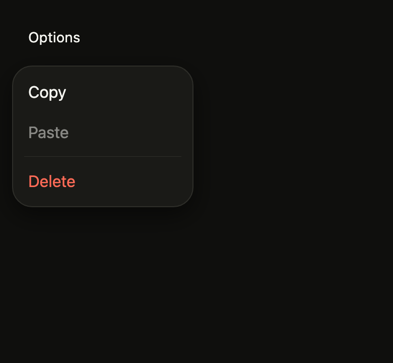
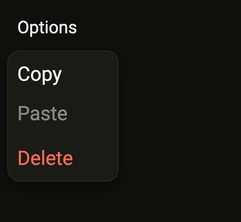
The code the reference images render:
final example = Overlay(
  initialEntries: [
    OverlayEntry(
      builder: (context) => ColoredBox(
        color: FlScope.of(context).colors.surface,
        child: Padding(
          padding: EdgeInsetsDirectional.all(FlScope.of(context).space.lg),
          child: Align(
            alignment: AlignmentDirectional.topStart,
            child: FlMenu(
              items: [
                FlMenuItem(label: 'Copy', onPressed: () {}),
                FlMenuItem(label: 'Paste', onPressed: null),
                const FlMenuDivider(),
                FlMenuItem(
                  label: 'Delete',
                  destructive: true,
                  onPressed: () {},
                ),
              ],
              builder: (context, controller) {
                if (!controller.isOpen)
                  WidgetsBinding.instance.addPostFrameCallback((_) {
                    if (!controller.isOpen) controller.open();
                  });
                return FlPressable(
                  onPressed: controller.open,
                  label: 'Options',
                  borderRadius: FlScope.of(context).shape.buttonRadius,
                  builder: (context, states) => Padding(
                    padding: EdgeInsetsDirectional.all(
                      FlScope.of(context).space.md,
                    ),
                    child: Text(
                      'Options',
                      style: TextStyle(
                        color: FlScope.of(context).colors.onSurface,
                      ),
                    ),
                  ),
                );
              },
            ),
          ),
        ),
      ),
    ),
  ],
);API
FlMenuEntry: sealed class permits {FlMenuDivider, FlMenuGroup, FlMenuItem, FlMenuLabel, FlSubmenu}
FlMenuEntry.new: const new()
FlMenuItem: final class extends FlMenuEntry
FlMenuItem.new: const new({required String label, required VoidCallback? onPressed, bool destructive, String? description, Widget? leading, Widget? trailing})
FlMenuItem.label: get String
FlMenuItem.onPressed: get VoidCallback?
FlMenuItem.destructive: get bool
FlMenuItem.description: get String?
FlMenuItem.leading: get Widget?
FlMenuItem.trailing: get Widget?
FlMenuDivider: final class extends FlMenuEntry
FlMenuDivider.new: const new()
FlMenuLabel: final class extends FlMenuEntry
FlMenuLabel.new: const new(String text)
FlMenuLabel.text: get String
FlMenuSelection: enum {single, multiple}
FlMenuSelection.single: static final FlMenuSelection
FlMenuSelection.multiple: static final FlMenuSelection
FlMenuIndicator: enum {checkmark, dot}
FlMenuIndicator.checkmark: static final FlMenuIndicator
FlMenuIndicator.dot: static final FlMenuIndicator
FlMenuOption: final class<T>
FlMenuOption.new: const new({required T value, required String label, String? description, Widget? leading, Widget? trailing, bool enabled})
FlMenuOption.value: get T
FlMenuOption.label: get String
FlMenuOption.description: get String?
FlMenuOption.leading: get Widget?
FlMenuOption.trailing: get Widget?
FlMenuOption.enabled: get bool
FlMenuGroup: final class<T> extends FlMenuEntry
FlMenuGroup.new: const new({required List<FlMenuOption<T>> options, required Set<T> selected, required ValueChanged<Set<T>> onChanged, FlMenuSelection selection, FlMenuIndicator indicator})
FlMenuGroup.options: get List<FlMenuOption<T>>
FlMenuGroup.selected: get Set<T>
FlMenuGroup.onChanged: get ValueChanged<Set<T>>
FlMenuGroup.selection: get FlMenuSelection
FlMenuGroup.indicator: get FlMenuIndicator
FlSubmenu: final class extends FlMenuEntry
FlSubmenu.new: const new({required String label, required List<FlMenuEntry> items, Widget? leading})
FlSubmenu.label: get String
FlSubmenu.items: get List<FlMenuEntry>
FlSubmenu.leading: get Widget?
FlMenuPresentation: enum {popover, sheet}
FlMenuPresentation.popover: static final FlMenuPresentation
FlMenuPresentation.sheet: static final FlMenuPresentation
FlMenu: class extends StatefulWidget
FlMenu.new: const new({super.key, required List<FlMenuEntry> items, required Widget Function(BuildContext context, MenuController controller) builder, FlSide side, FlAlign align, double? width, FlMenuPresentation presentation, String? label, String? barrierLabel, String? cancelLabel})
FlMenu.items: get List<FlMenuEntry>
FlMenu.builder: get Widget Function(BuildContext context, MenuController controller)
FlMenu.side: get FlSide
FlMenu.align: get FlAlign
FlMenu.width: get double?
FlMenu.presentation: get FlMenuPresentation
FlMenu.label: get String?
FlMenu.barrierLabel: get String?
FlMenu.cancelLabel: get String?
FlMenu.createState: State<FlMenu>()Reference renders
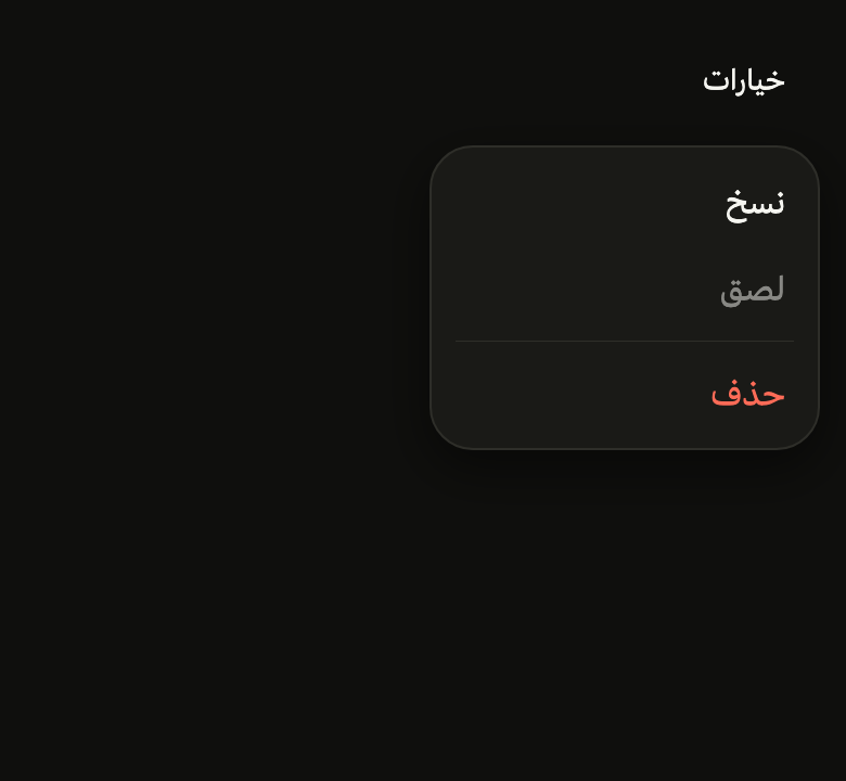
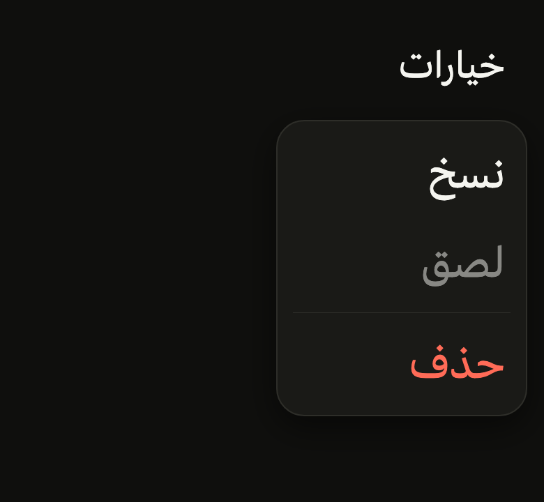
The 16 images published with version 0.2.5, rendered by the shared harness on macOS with Flutter 3.47.7. fliin verify menu compares your copy to them.
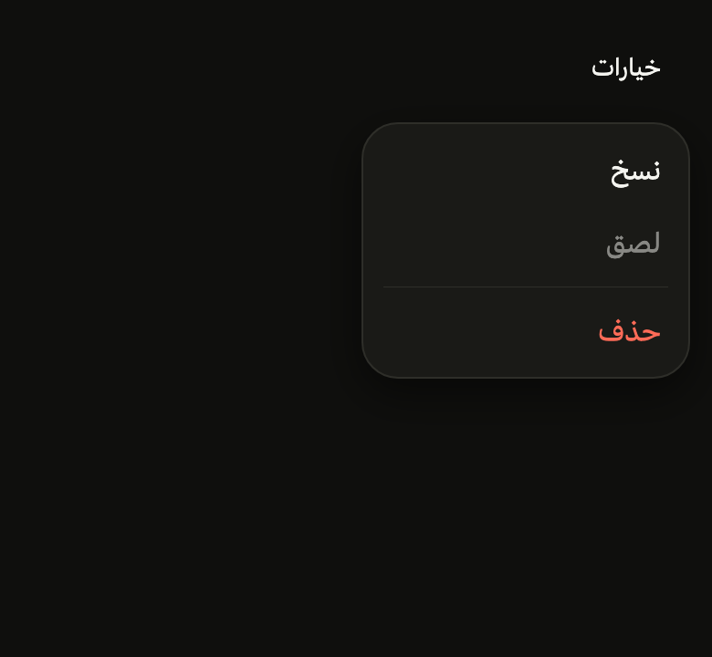
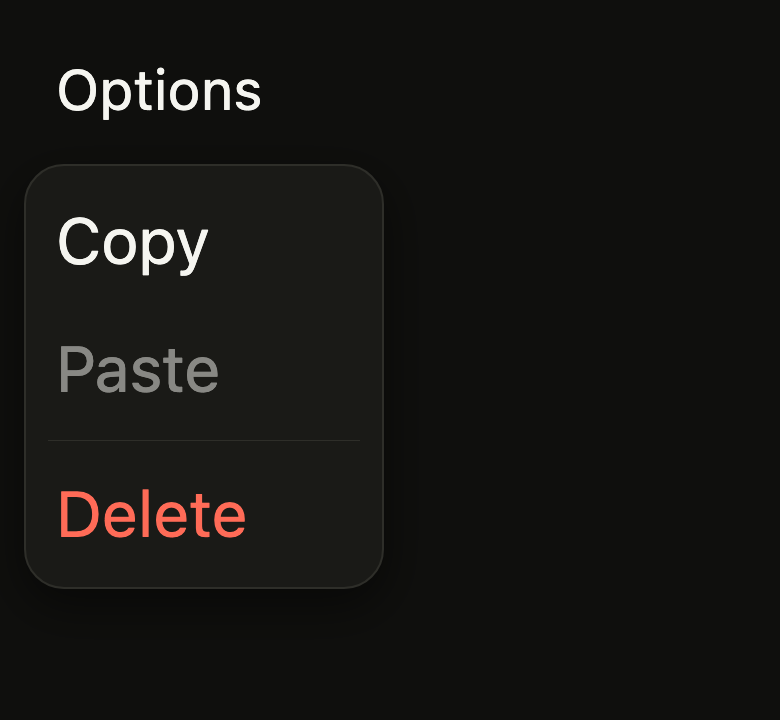
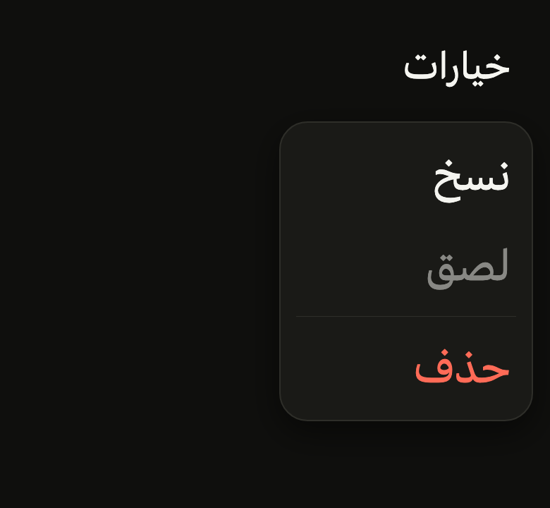
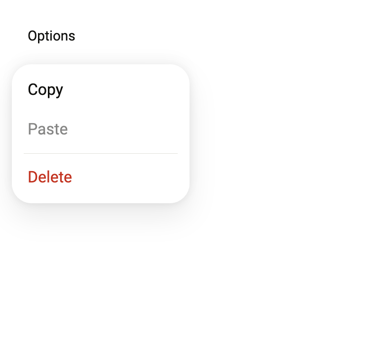
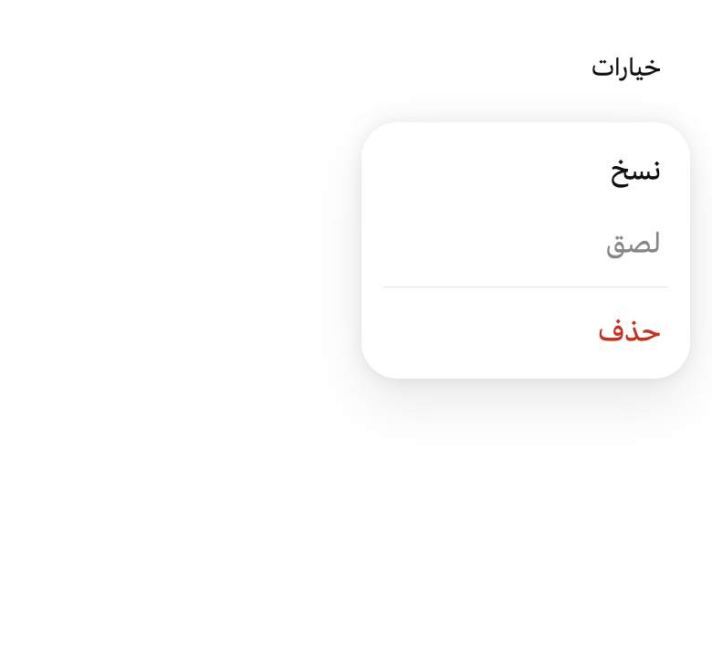
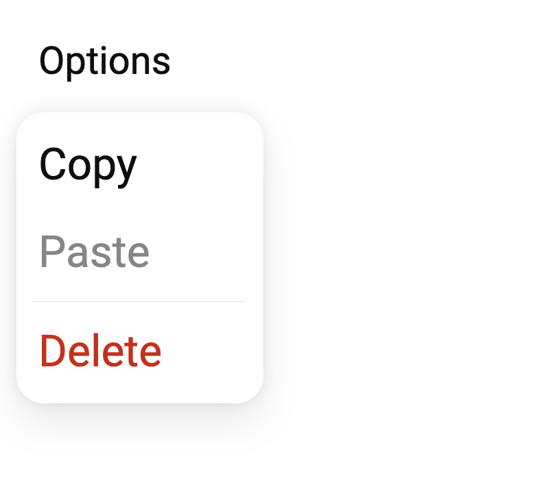
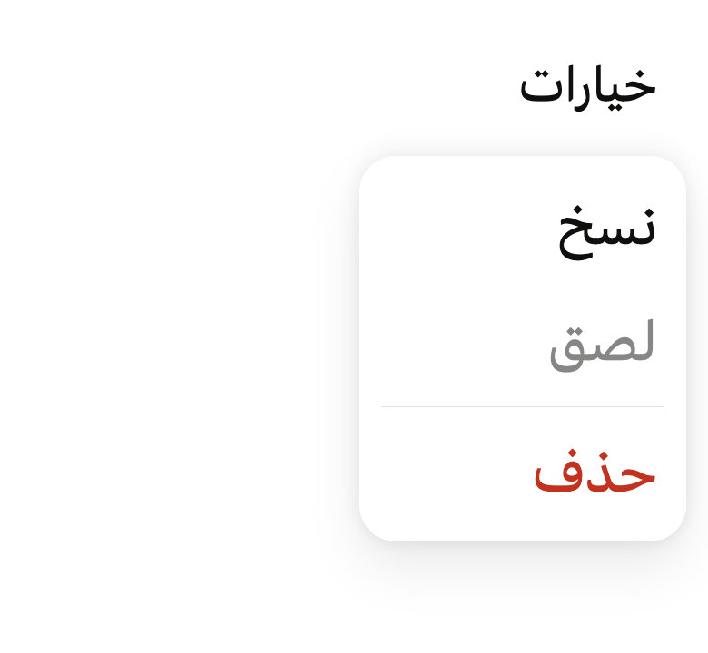
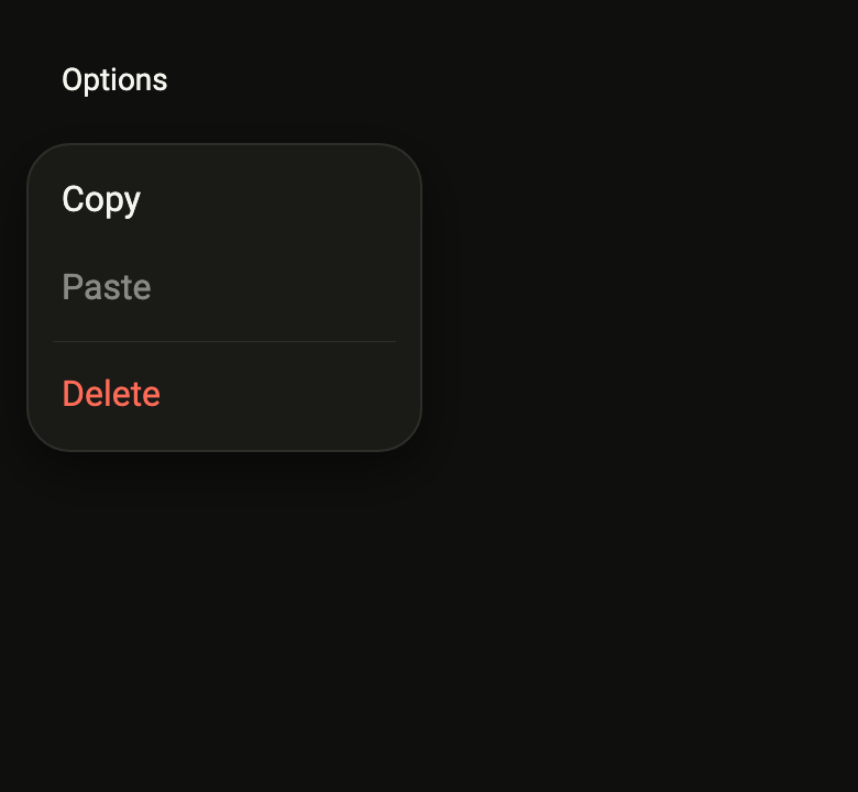
Use it to
- pick an action from a menu
- open a more options menu from a button
- offer copy, share or delete actions
- add a dropdown action menu
- navigate a menu with the keyboard
- Not for
- free content or a form, anchored: use a popover (popover)
- a confirmation that blocks the screen: use a dialog (dialog)
- picking a value among exclusive options: use radio buttons (radio)
- a navigation panel that slides from the left edge, opened by the three-bar icon: use a drawer (drawer)
- States
Source
The files fliin add menu copies into your app, before your prefix and imports are applied.
menu/fl_menu.dart
// Modified from Menu and SubMenu of HeroUI Native 1.0.10, Copyright 2025 NextUI
// Inc., licensed under Apache 2.0: https://www.apache.org/licenses/LICENSE-2.0
import 'dart:math' as math;
import 'dart:ui' show ViewFocusEvent, ViewFocusState;
import 'package:flutter/rendering.dart';
import 'package:flutter/services.dart';
import 'package:flutter/widgets.dart';
import 'package:fliin_ui/components/button/fl_button.dart';
import 'package:fliin_ui/components/separator/fl_separator.dart';
import 'package:fliin_ui/components/sheet/fl_sheet.dart';
import 'package:fliin_ui/core/fliin.dart';
import 'package:fliin_ui/icons/fl_icons.dart';
/// The scale of a pressed row (`useMenuItemAnimation`).
const double _pressedScale = 0.98;
/// `opacity: 0.4` of the rows outside the open submenu.
const double _outsideOpacity = 0.4;
/// The panel's scale when a submenu is open
/// (`useMenuContentPopoverAnimation`).
const double _openSubmenuScale = 0.98;
/// The 8 dot of `menu__item-indicator`, in its `size.indicatorBox`
/// box.
const double _dotSize = 8;
/// The submenu's `DEFAULT_ROOT_CONTENT_MARGIN`: the open card overflows its
/// row by 16 on each side.
const double _submenuOverflow = 16;
/// `DEFAULT_ROOT_CONTENT_PADDING_TOP`: the row moves down 12 inside the card,
/// and the list starts 12 below it.
const double _submenuPaddingTop = 12;
/// `color-mix(in oklab, var(--color-border) 20%, transparent)`: the open
/// card's outline.
const double _outlineOpacity = 0.2;
/// A row of [FlMenu].
sealed class FlMenuEntry {
const FlMenuEntry();
}
/// An action (`Menu.Item`). Without [onPressed], it is faded and does not
/// take focus. [destructive] renders it in `danger` (delete, quit).
final class FlMenuItem extends FlMenuEntry {
/// Creates an action; [onPressed] is required but may be null, to show it
/// disabled.
const FlMenuItem({
required this.label,
required this.onPressed,
this.destructive = false,
this.description,
this.leading,
this.trailing,
});
/// The row's title (`Menu.ItemTitle`), which also names it for the screen
/// reader.
final String label;
/// Called right after the request to close the whole menu, during its exit:
/// the menu is still in the tree when the action runs. Null: the action is
/// faded and focus skips it.
final VoidCallback? onPressed;
/// True: the title turns `danger`, and the pressed background `dangerFaint`.
final bool destructive;
/// The text under the title (`Menu.ItemDescription`); null, no text.
final String? description;
/// An icon before the title, usually 16 points.
final Widget? leading;
/// What follows the title, usually a shortcut ("⌘ B"), in muted `textSm` by
/// default.
final Widget? trailing;
}
/// A rule between two groups of rows (`Separator` 8 points from the edges,
/// at 75%).
final class FlMenuDivider extends FlMenuEntry {
/// Creates a separating rule.
const FlMenuDivider();
}
/// The title of a group of rows (`Menu.Label`), in muted `textSm`.
final class FlMenuLabel extends FlMenuEntry {
/// Creates a group title.
const FlMenuLabel(this.text);
/// The title text.
final String text;
}
/// How many options of an [FlMenuGroup] can be chosen.
enum FlMenuSelection {
/// A single one: choosing it closes the menu.
single,
/// Several: each one checks and unchecks, the menu stays open.
multiple,
}
/// The mark of a chosen option (`Menu.ItemIndicator`).
enum FlMenuIndicator {
/// A checkmark.
checkmark,
/// A dot.
dot,
}
/// An option of an [FlMenuGroup].
final class FlMenuOption<T> {
/// An option with value [value].
const FlMenuOption({
required this.value,
required this.label,
this.description,
this.leading,
this.trailing,
this.enabled = true,
});
/// The value given to `onChanged`.
final T value;
/// The row's title.
final String label;
/// The text under the title; null, no text.
final String? description;
/// An icon between the indicator and the title, muted, usually 16
/// points: a theme's sun and moon, a sort's arrows.
final Widget? leading;
/// What follows the title, usually a shortcut.
final Widget? trailing;
/// False: the option is faded and cannot be chosen.
final bool enabled;
}
/// Options to choose (`Menu.Group` with `selectionMode`), marked by
/// [indicator] when they are in [selected].
final class FlMenuGroup<T> extends FlMenuEntry {
/// A group of options.
const FlMenuGroup({
required this.options,
required this.selected,
required this.onChanged,
this.selection = FlMenuSelection.single,
this.indicator = FlMenuIndicator.checkmark,
});
/// The options, in display order.
final List<FlMenuOption<T>> options;
/// The chosen values.
final Set<T> selected;
/// Called with the chosen values after a choice.
final ValueChanged<Set<T>> onChanged;
/// One or several options at a time.
final FlMenuSelection selection;
/// Checkmark or dot.
final FlMenuIndicator indicator;
bool _isSelected(FlMenuOption<Object?> option) => selected.contains(option.value);
void _toggle(FlMenuOption<Object?> option) {
final value = option.value as T;
onChanged(switch (selection) {
FlMenuSelection.single => {value},
FlMenuSelection.multiple => selected.contains(value) ? ({...selected}..remove(value)) : {...selected, value},
});
}
}
/// A row that unfolds a second level in place (`SubMenu`): it becomes a card
/// that grows over the menu, the rest of the menu recedes and fades.
final class FlSubmenu extends FlMenuEntry {
/// Creates a row that unfolds [items].
const FlSubmenu({required this.label, required this.items, this.leading});
/// The row's text, and its name for the screen reader.
final String label;
/// The submenu's rows: actions, rules, titles and groups.
final List<FlMenuEntry> items;
/// An icon between the chevron and the title.
final Widget? leading;
}
/// How the menu presents its rows.
enum FlMenuPresentation {
/// A panel floating against the anchor.
popover,
/// A modal bottom sheet ([showFlSheet]). Without submenus.
sheet,
}
/// An action menu anchored to what [builder] builds,
/// usually a button that calls `controller.open`, on `RawMenuAnchor`: a touch
/// outside or Escape closes it.
///
/// The panel is on `surfaceOverlay`, with continuous corners of
/// `shape.radiusCard`, the `overlay` shadow, centered under the anchor, 9
/// points from it and 12 from the safe edges; it enters from the anchor,
/// growing from 0.92 to 1 (`FlPopup`). A pressed row shrinks to 0.98 on a
/// `control` background (`dangerFaint` for a destructive action), in 150 ms.
///
/// On opening, focus goes to the first enabled action; the up and down
/// arrows move from one action to the next, Home and End go to the first and
/// the last, the end arrow unfolds a submenu, the start arrow and Escape fold
/// it. A chosen action closes the whole menu, then runs; an option of a
/// multiple group checks without closing it. Disabled actions do not take
/// focus, as in native menus. Opened from a popover, it stays "inside" it.
class FlMenu extends StatefulWidget {
/// Creates a closed menu, centered under the anchor by default.
const FlMenu({
super.key,
required this.items,
required this.builder,
this.side = FlSide.bottom,
this.align = FlAlign.center,
this.width,
this.presentation = FlMenuPresentation.popover,
this.label,
this.barrierLabel,
this.cancelLabel,
}) : assert(
presentation == FlMenuPresentation.popover || (label != null && barrierLabel != null),
'the sheet announces itself by its name and closes through its barrier, which must be named',
);
/// The menu's rows, in display order.
final List<FlMenuEntry> items;
/// Builds the anchor; the `MenuController` received opens and closes the menu.
final Widget Function(BuildContext context, MenuController controller) builder;
/// The side of the anchor where the menu sits, `bottom` by default; flipped
/// when it does not fit.
final FlSide side;
/// The menu's alignment along the anchor, centered by default.
final FlAlign align;
/// The panel's width; null, that of its content, between
/// `size.menuMinWidth` and `size.menuMaxWidth`.
final double? width;
/// Anchored panel by default, or bottom sheet.
final FlMenuPresentation presentation;
/// The sheet's name, required by the `sheet` presentation.
final String? label;
/// The name of the sheet's barrier, required by the `sheet` presentation.
final String? barrierLabel;
/// In the `sheet` presentation, the label of a full-width tertiary button
/// under the rows that closes the sheet ("Annuler"); when null, none.
final String? cancelLabel;
@override
State<FlMenu> createState() => _FlMenuState();
}
class _FlMenuState extends State<FlMenu> with TickerProviderStateMixin, WidgetsBindingObserver {
final MenuController _controller = MenuController();
final FocusScopeNode _scope = FocusScopeNode(debugLabel: 'FlMenu');
final FocusScopeNode _subScope = FocusScopeNode(debugLabel: 'FlSubmenu');
final GlobalKey _layer = GlobalKey();
final GlobalKey _panel = GlobalKey();
final Map<FlSubmenu, GlobalKey> _slots = {};
AnimationController? _revealController;
AnimationController get _reveal => _revealController!;
/// The submenu: its card unfolds (0 to 1), the panel recedes, the card's
/// background fades out on closing, the list appears, the chevron turns.
late final AnimationController _expand = AnimationController.unbounded(vsync: this)..addListener(_dropClosed);
late final AnimationController _recede = AnimationController.unbounded(vsync: this, value: 1);
late final AnimationController _veil = AnimationController(vsync: this, value: 0)
..addStatusListener((_) => _dropClosed());
late final AnimationController _list = AnimationController(vsync: this);
late final AnimationController _turn = AnimationController.unbounded(vsync: this);
VoidCallback? _pendingHide;
BuildContext? _sheet;
FlSubmenu? _submenu;
bool _submenuOpen = false;
/// Measured when the submenu opens, with the menu laid out: the panel's
/// place in the menu's layer and the row's place in the panel.
Rect _panelRect = Rect.zero;
Rect _slotRect = Rect.zero;
double _listHeight = 0;
@override
void initState() {
super.initState();
WidgetsBinding.instance.addObserver(this);
}
@override
void didChangeDependencies() {
super.didChangeDependencies();
_revealController ??= (flPopupController(vsync: this, motion: FlScope.of(context).motion)
..addStatusListener(_hideWhenClosed));
_list.duration = FlScope.of(context).motion.short3;
// `BACKGROUND_EXITING_DURATION`: the card fades out in 200 ms.
_veil.duration = FlScope.of(context).motion.short4;
}
@override
void dispose() {
WidgetsBinding.instance.removeObserver(this);
_revealController?.dispose();
_expand.dispose();
_recede.dispose();
_veil.dispose();
_list.dispose();
_turn.dispose();
_scope.dispose();
_subScope.dispose();
super.dispose();
}
void _closeRoot() => _controller.close();
/// The view that regains focus gives it to its first element, most often the
/// button: while open, the menu keeps it. Under Flutter web, a view without
/// focus that the menu focuses asks the browser for it, which gives it back
/// right away.
@override
void didChangeViewFocus(ViewFocusEvent event) {
if (_controller.isOpen &&
widget.presentation == FlMenuPresentation.popover &&
event.state == ViewFocusState.focused &&
event.viewId == View.of(context).viewId) {
(_submenuOpen ? _subScope : _scope).requestFocus();
}
}
void _onOpenRequested(Offset? position, VoidCallback showOverlay) {
_pendingHide = null;
showOverlay();
if (widget.presentation == FlMenuPresentation.sheet) {
_showSheet();
return;
}
setState(() {});
_reveal.forward();
WidgetsBinding.instance.addPostFrameCallback((_) {
if (!mounted || !_controller.isOpen || _scope.hasFocus) return;
_scope.requestFocus();
_scope.nextFocus();
});
}
Future<void> _showSheet() async {
await showFlSheet<void>(
context,
label: widget.label!,
barrierLabel: widget.barrierLabel!,
fitContent: true,
builder: (context) {
_sheet = context;
final theme = FlScope.of(context);
final cancelLabel = widget.cancelLabel;
final entries = Semantics(
container: true,
explicitChildNodes: true,
role: SemanticsRole.menu,
child: _Entries(entries: widget.items, closeRoot: _closeRoot, sheet: true),
);
// The canvas's action sheet ends `space.xl` above the screen edge:
// the sheet's own margin, the safe area plus 12, is topped up to it.
final rest = math.max(0.0, theme.space.xl - MediaQuery.viewPaddingOf(context).bottom - theme.space.xs * 3);
return Padding(
padding: EdgeInsetsDirectional.only(bottom: rest),
child: cancelLabel == null
? entries
: Column(
mainAxisSize: MainAxisSize.min,
crossAxisAlignment: CrossAxisAlignment.stretch,
spacing: theme.space.xs * 3,
children: [
entries,
FlButton(label: cancelLabel, variant: FlButtonVariant.tertiary, onPressed: _closeRoot),
],
),
);
},
);
_sheet = null;
if (mounted && _controller.isOpen) _controller.close();
}
void _onCloseRequested(VoidCallback hideOverlay) {
_collapse(immediately: true);
if (widget.presentation == FlMenuPresentation.sheet) {
if (_sheet case final sheet? when sheet.mounted) {
Navigator.of(sheet).pop();
}
hideOverlay();
return;
}
if (_reveal.isDismissed) return hideOverlay();
_pendingHide = hideOverlay;
setState(() {});
_reveal.reverse();
}
void _hideWhenClosed(AnimationStatus status) {
final hide = _pendingHide;
if (hide == null || !status.isDismissed) return;
_pendingHide = null;
hide();
}
bool get _closing => _pendingHide != null;
/// Home and End: the first or the last enabled action of [scope], excluding
/// those of a nested scope.
void _focusEdge(FocusScopeNode scope, {required bool first}) {
final nodes = [
for (final node in scope.traversalDescendants)
if (node.enclosingScope == scope) node,
];
if (nodes.isEmpty) return;
(first ? nodes.first : nodes.last).requestFocus();
}
void _openSubmenu(FlSubmenu submenu) {
if (_submenuOpen && _submenu == submenu) return;
final layer = _layer.currentContext?.findRenderObject() as RenderBox?;
final panel = _panel.currentContext?.findRenderObject() as RenderBox?;
final slot = _slots[submenu]?.currentContext?.findRenderObject() as RenderBox?;
if (layer == null || panel == null || slot == null) return;
_panelRect = panel.localToGlobal(Offset.zero, ancestor: layer) & panel.size;
_slotRect = slot.localToGlobal(Offset.zero, ancestor: panel) & slot.size;
final motion = FlMotion.of(context);
final tokens = motion.tokens;
setState(() {
_submenu = submenu;
_submenuOpen = true;
});
_veil.value = 1;
_list.forward();
if (motion.reduced) {
_expand.value = 1;
_recede.value = _openSubmenuScale;
_turn.value = 1;
} else {
_expand.driveTo(1, FlSpringMotion(tokens.expand));
_recede.driveTo(_openSubmenuScale, FlSpringMotion(tokens.gentle));
_turn.driveTo(1, FlSpringMotion(tokens.indicator));
}
WidgetsBinding.instance.addPostFrameCallback((_) {
if (!mounted || !_submenuOpen) return;
// The first action of the list, after the submenu's row.
final nodes = [
for (final node in _subScope.traversalDescendants)
if (node.enclosingScope == _subScope) node,
];
if (nodes.length > 1) nodes[1].requestFocus();
});
}
/// Folds the submenu; focus returns to its row, except when the whole menu
/// closes ([immediately]).
void _collapse({bool immediately = false}) {
if (!_submenuOpen) return;
final submenu = _submenu;
setState(() => _submenuOpen = false);
final motion = FlMotion.of(context);
final tokens = motion.tokens;
_list.reverse();
_veil.reverse();
if (motion.reduced || immediately) {
_expand.value = 0;
_recede.value = 1;
_turn.value = 0;
} else {
_expand.driveTo(0, FlSpringMotion(tokens.expand));
_recede.driveTo(1, FlSpringMotion(tokens.gentle));
_turn.driveTo(0, FlSpringMotion(tokens.indicator));
}
if (immediately || submenu == null) return;
WidgetsBinding.instance.addPostFrameCallback((_) {
if (!mounted) return;
final slot = _slots[submenu]?.currentContext;
if (slot == null) return;
_scope.requestFocus();
_focusIn(slot);
});
}
/// The row [slot] regains focus: its first focusable node.
void _focusIn(BuildContext slot) {
FocusNode? found;
void visit(Element element) {
if (found != null) return;
if (element.widget is Focus) {
element.visitChildren((child) {
final node = Focus.maybeOf(child, createDependency: false);
if (node != null && node.canRequestFocus) found ??= node;
});
if (found != null) return;
}
element.visitChildren(visit);
}
slot.visitChildElements(visit);
found?.requestFocus();
}
void _setListHeight(double height) {
if (mounted && height != _listHeight) setState(() => _listHeight = height);
}
void _dropClosed() {
if (!_submenuOpen && _expand.value <= 0 && _submenu != null && _veil.isDismissed) {
setState(() => _submenu = null);
}
}
Widget _overlay(BuildContext context, RawMenuOverlayInfo info) {
if (widget.presentation == FlMenuPresentation.sheet) {
return const SizedBox.shrink();
}
final theme = FlScope.of(context);
final reduced = FlMotion.of(context).reduced;
final travel = reduced ? 0.0 : math.min(theme.size.popoverOffset, theme.size.popoverTravel);
final anchor = _yogaRect(info.anchorRect, MediaQuery.devicePixelRatioOf(context));
final panel = FocusScope(
node: _scope,
child: CallbackShortcuts(
bindings: {
const SingleActivator(LogicalKeyboardKey.home): () => _focusEdge(_scope, first: true),
const SingleActivator(LogicalKeyboardKey.end): () => _focusEdge(_scope, first: false),
},
child: _Panel(key: _panel, width: widget.width, entries: widget.items, closeRoot: _closeRoot),
),
);
final submenu = _submenu;
return TapRegion(
groupId: info.tapRegionGroupId,
onTapOutside: (_) => _closeRoot(),
child: FlTapGroup(
id: info.tapRegionGroupId,
child: IgnorePointer(
ignoring: _closing,
child: ExcludeFocus(
excluding: _closing,
child: _MenuScope(
state: this,
child: Stack(
key: _layer,
fit: StackFit.expand,
children: [
ListenableBuilder(
listenable: _reveal,
builder: (context, child) => FlAnchoredLayout(
anchor: anchor,
side: widget.side,
align: widget.align,
gap: theme.size.popoverOffset,
margin: theme.size.overlayInset,
travel: (1 - theme.motion.easeOut.transform(_reveal.value)) * travel,
child: child!,
),
child: FlPixelSnap(
child: RepaintBoundary(
child: FlPopupContent(
animation: _reveal,
entrance: FlPopupEntrance.popover,
side: widget.side,
// The slide goes through FlAnchoredLayout, which knows
// the chosen side.
offset: 0,
child: ScaleTransition(scale: _recede, child: panel),
),
),
),
),
if (submenu != null) _SubmenuLayer(state: this, submenu: submenu),
],
),
),
),
),
),
);
}
@override
Widget build(BuildContext context) => RawMenuAnchor(
controller: _controller,
onOpenRequested: _onOpenRequested,
onCloseRequested: _onCloseRequested,
overlayBuilder: _overlay,
builder: (context, controller, _) => widget.builder(context, controller),
);
}
/// What a panel's rows read from the menu: the open submenu and the keys of
/// the submenu rows.
class _MenuScope extends InheritedWidget {
const _MenuScope({required this.state, required super.child});
final _FlMenuState state;
static _FlMenuState? of(BuildContext context) => context.dependOnInheritedWidgetOfExactType<_MenuScope>()?.state;
@override
bool updateShouldNotify(_MenuScope oldWidget) => true;
}
/// The arrow toward the start of the reading direction, and the one toward the end.
(LogicalKeyboardKey, LogicalKeyboardKey) _startEnd(BuildContext context) => switch (Directionality.of(context)) {
TextDirection.ltr => (LogicalKeyboardKey.arrowLeft, LogicalKeyboardKey.arrowRight),
TextDirection.rtl => (LogicalKeyboardKey.arrowRight, LogicalKeyboardKey.arrowLeft),
};
/// The menu's panel (`Menu.Content`): `px-1.5 py-3`, `overlay` shadow except
/// when a submenu is unfolded.
class _Panel extends StatelessWidget {
const _Panel({super.key, required this.width, required this.entries, required this.closeRoot});
final double? width;
final List<FlMenuEntry> entries;
final VoidCallback closeRoot;
@override
Widget build(BuildContext context) {
final theme = FlScope.of(context);
final colors = theme.colors;
final radius = theme.shape.radiusCard;
final menu = _MenuScope.of(context);
final open = menu?._submenuOpen ?? false;
final width = this.width;
Widget body = SingleChildScrollView(
// p-1.5 of Izydesk's menu.
padding: EdgeInsetsDirectional.all(theme.space.xs * 1.5),
child: _Entries(entries: entries, closeRoot: closeRoot),
);
body = width == null
? ConstrainedBox(
constraints: BoxConstraints(minWidth: theme.size.menuMinWidth, maxWidth: theme.size.menuMaxWidth),
child: IntrinsicWidth(child: body),
)
: SizedBox(width: width, child: body);
return Semantics(
container: true,
explicitChildNodes: true,
role: SemanticsRole.menu,
child: FlShadow(
layers: open ? const [] : theme.shadows.overlay,
// React Native casts a view's shadow from its circular corners (FlSurface).
shape: RoundedRectangleBorder(borderRadius: BorderRadius.circular(radius)),
child: DecoratedBox(
decoration: ShapeDecoration(
color: colors.surfaceOverlay,
// Outlined in dark only (flOverlayOutline).
shape: RoundedRectangleBorder(
borderRadius: BorderRadius.circular(radius),
side: BorderSide(color: flOverlayOutline(theme), width: theme.size.border),
),
),
child: Stack(
children: [
body,
// A touch on the menu, outside the card, folds the submenu.
if (open)
Positioned.fill(
child: GestureDetector(
behavior: HitTestBehavior.opaque,
excludeFromSemantics: true,
onTap: () => menu?._collapse(),
),
),
],
),
),
),
);
}
}
/// The rows of a panel, a submenu card or a sheet.
class _Entries extends StatelessWidget {
const _Entries({required this.entries, required this.closeRoot, this.inside = false, this.sheet = false});
final List<FlMenuEntry> entries;
final VoidCallback closeRoot;
/// In a submenu's card: they stay sharp when it is unfolded.
final bool inside;
/// In a sheet: rows of 48, 4 apart, and no submenu.
final bool sheet;
@override
Widget build(BuildContext context) {
final theme = FlScope.of(context);
final menu = _MenuScope.of(context);
final dimmed = !inside && (menu?._submenuOpen ?? false);
Widget dim(Widget child) => dimmed
? IgnorePointer(
child: ExcludeFocus(
child: Opacity(opacity: _outsideOpacity, child: child),
),
)
: child;
return Column(
mainAxisSize: MainAxisSize.min,
crossAxisAlignment: CrossAxisAlignment.stretch,
spacing: sheet ? theme.space.xs : 0,
children: [
for (final entry in entries)
switch (entry) {
FlMenuItem() => dim(
_ItemRow(
tall: sheet,
label: entry.label,
description: entry.description,
leading: entry.leading,
trailing: entry.trailing,
destructive: entry.destructive,
onPressed: entry.onPressed == null
? null
: () {
closeRoot();
entry.onPressed!();
},
),
),
FlMenuDivider() => dim(
Padding(
// `margin: 4px 6px` of Izydesk's menu.
padding: EdgeInsetsDirectional.symmetric(horizontal: theme.space.xs * 1.5, vertical: theme.space.xs),
child: const FlSeparator(),
),
),
FlMenuLabel() => dim(_Label(entry.text)),
FlMenuGroup() => dim(_Group(group: entry, closeRoot: closeRoot)),
FlSubmenu() => () {
assert(!sheet, 'a submenu does not unfold in a sheet');
final open = menu?._submenu == entry;
return KeyedSubtree(
key: menu?._slots.putIfAbsent(entry, GlobalKey.new),
// Unfolded, the row is carried by the card, above.
child: dim(
Opacity(
opacity: open ? 0 : 1,
child: _SubmenuRow(submenu: entry, inCard: false),
),
),
);
}(),
},
],
);
}
}
class _Group extends StatelessWidget {
const _Group({required this.group, required this.closeRoot});
final FlMenuGroup<Object?> group;
final VoidCallback closeRoot;
@override
Widget build(BuildContext context) => Column(
mainAxisSize: MainAxisSize.min,
crossAxisAlignment: CrossAxisAlignment.stretch,
children: [
for (final option in group.options)
_ItemRow(
label: option.label,
description: option.description,
leading: option.leading,
trailing: option.trailing,
checked: group._isSelected(option),
indicator: group.indicator,
role: switch (group.selection) {
FlMenuSelection.single => SemanticsRole.menuItemRadio,
FlMenuSelection.multiple => SemanticsRole.menuItemCheckbox,
},
onPressed: option.enabled
? () {
if (group.selection == FlMenuSelection.single) closeRoot();
group._toggle(option);
}
: null,
),
],
);
}
/// A group label: muted medium `textSm`, 12 from the start, 4 above the
/// rows.
class _Label extends StatelessWidget {
const _Label(this.text);
final String text;
@override
Widget build(BuildContext context) {
final theme = FlScope.of(context);
return Padding(
padding: EdgeInsetsDirectional.only(start: theme.space.md, bottom: theme.space.xs),
child: Semantics(
header: true,
child: _text(
context,
FlTextRole.textSm,
color: theme.colors.onSurfaceMuted,
weight: theme.tokens.typography.weight.medium,
child: Text(text),
),
),
);
}
}
/// A menu row (`menu__item`): `px-2.5 py-2`, gap 10, continuous corners of
/// `radiusXxl`, its icon muted (`danger` for a destructive action); hovered
/// or pressed, it takes `control` (or `dangerFaint`) in `short3`, and
/// pressed, it shrinks to 0.98, without these motions under reduced motion.
/// Disabled, it fades to `disabledOpacity`.
class _ItemRow extends StatelessWidget {
const _ItemRow({
required this.label,
required this.onPressed,
this.description,
this.leading,
this.trailing,
this.destructive = false,
this.checked,
this.indicator = FlMenuIndicator.checkmark,
this.role = SemanticsRole.menuItem,
this.tall = false,
});
final String label;
final VoidCallback? onPressed;
/// In a sheet: 12 above and below, a row of 48.
final bool tall;
final String? description;
final Widget? leading;
final Widget? trailing;
final bool destructive;
/// In a group: chosen or not; null outside a group.
final bool? checked;
final FlMenuIndicator indicator;
final SemanticsRole role;
@override
Widget build(BuildContext context) {
final theme = FlScope.of(context);
final colors = theme.colors;
final radius = theme.shape.radiusXxl;
final reduced = FlMotion.of(context).reduced;
final checked = this.checked;
final description = this.description;
final leading = this.leading;
final trailing = this.trailing;
// With a description, the indicator and the icon stay on the title's
// line, in a slot as high as that line.
final titleLine = MediaQuery.textScalerOf(context).scale(theme.typography.style(FlTextRole.textBase).lineHeight);
Widget onTitle(Widget child) => description == null
? child
: SizedBox(
height: titleLine,
child: Center(widthFactor: 1, child: child),
);
final row = Row(
spacing: theme.space.xs * 2.5,
crossAxisAlignment: description == null ? CrossAxisAlignment.center : CrossAxisAlignment.start,
children: [
if (checked != null) onTitle(_Indicator(visible: checked, indicator: indicator)),
if (leading != null)
onTitle(
IconTheme.merge(
data: IconThemeData(
color: destructive ? colors.danger : colors.onSurfaceMuted,
size: _iconScale(context, theme.size.indicatorIcon),
),
child: leading,
),
),
Expanded(
child: Column(
mainAxisSize: MainAxisSize.min,
crossAxisAlignment: CrossAxisAlignment.start,
children: [
_text(
context,
FlTextRole.textBase,
color: destructive ? colors.danger : colors.onSurface,
child: Text(label),
),
if (description != null)
// A 19.25-point line in Core Text, which Yoga rounds up to the pixel
// (19.5); Skia sets it at 19.
FlPixelSnap(
child: ConstrainedBox(
constraints: BoxConstraints(
minHeight:
MediaQuery.textScalerOf(context).scale(theme.typography.style(FlTextRole.textSm).size) *
theme.size.snugLineHeight,
),
child: _text(
context,
FlTextRole.textSm,
color: colors.onSurfaceMuted,
lineHeight: theme.size.snugLineHeight,
child: Text(description),
),
),
),
],
),
),
if (trailing != null) onTitle(_text(context, FlTextRole.textSm, color: colors.onSurfaceMuted, child: trailing)),
],
);
return FlPressable(
onPressed: onPressed,
// The name goes through the content, with an option's checked state: an
// FlPressable label would replace its content's semantics.
borderRadius: BorderRadius.circular(radius),
scaleOnPress: false,
overlay: FlPressOverlay.none,
focusRing: FlFocusRingPlacement.inside,
role: role,
builder: (context, states) {
final disabled = states.contains(WidgetState.disabled);
final active = states.contains(WidgetState.pressed);
final lit = active || states.contains(WidgetState.hovered);
final fill = destructive ? colors.dangerFaint : colors.control;
final duration = theme.motion.short3;
final Widget surface = TweenAnimationBuilder<Color?>(
tween: ColorTween(end: lit ? fill : fill.withValues(alpha: 0)),
duration: duration,
builder: (context, color, child) => DecoratedBox(
decoration: ShapeDecoration(
color: color,
shape: FlContinuousBorder(radius: radius),
),
child: child,
),
child: Padding(
padding: EdgeInsetsDirectional.symmetric(
horizontal: theme.space.xs * 2.5,
vertical: tall ? theme.space.md : theme.space.sm,
),
child: row,
),
);
return Semantics(
label: description == null ? label : '$label\n$description',
checked: checked,
excludeSemantics: true,
child: Opacity(
opacity: disabled ? theme.size.disabledOpacity : 1,
child: reduced
? surface
: AnimatedScale(scale: active ? _pressedScale : 1, duration: duration, child: surface),
),
);
},
);
}
}
/// `Menu.ItemIndicator`: a 20 box where, when chosen, the 16 checkmark or
/// the 8 dot appears, in `onSurfaceMuted`.
class _Indicator extends StatelessWidget {
const _Indicator({required this.visible, required this.indicator});
final bool visible;
final FlMenuIndicator indicator;
@override
Widget build(BuildContext context) {
final theme = FlScope.of(context);
// The chosen option is marked in `selected`, like every choice.
final color = theme.colors.selected;
return SizedBox.square(
dimension: _iconScale(context, theme.size.indicatorBox),
child: !visible
? null
: Center(
child: switch (indicator) {
FlMenuIndicator.checkmark => FlIcon(
_check,
size: _iconScale(context, theme.size.indicatorIcon),
color: color,
),
FlMenuIndicator.dot => DecoratedBox(
decoration: ShapeDecoration(color: color, shape: const CircleBorder()),
child: SizedBox.square(dimension: _iconScale(context, _dotSize)),
),
},
),
);
}
}
/// A submenu's row (`SubMenu.Trigger`): the 16 chevron that turns a quarter
/// as it unfolds, then the title. In the panel, it unfolds; in the card
/// ([inCard]), it folds.
class _SubmenuRow extends StatelessWidget {
const _SubmenuRow({required this.submenu, required this.inCard});
final FlSubmenu submenu;
final bool inCard;
@override
Widget build(BuildContext context) {
final theme = FlScope.of(context);
final colors = theme.colors;
final menu = _MenuScope.of(context);
final (start, end) = _startEnd(context);
final leading = submenu.leading;
VoidCallback? toggle;
if (menu != null) {
toggle = inCard ? () => menu._collapse() : () => menu._openSubmenu(submenu);
}
return CallbackShortcuts(
bindings: {
if (!inCard && menu != null) SingleActivator(end): () => menu._openSubmenu(submenu),
if (inCard && menu != null) SingleActivator(start): () => menu._collapse(),
},
child: FlPressable(
onPressed: toggle,
label: submenu.label,
borderRadius: BorderRadius.zero,
scaleOnPress: false,
overlay: FlPressOverlay.none,
focusRing: FlFocusRingPlacement.inside,
role: SemanticsRole.menuItem,
expanded: inCard,
builder: (context, states) => Padding(
padding: EdgeInsetsDirectional.symmetric(horizontal: theme.space.xs * 2.5, vertical: theme.space.sm),
child: Row(
spacing: theme.space.xs * 2.5,
children: [
// Flipped in RTL, the chevron turns the other way to open downward.
RotationTransition(
turns: menu == null
? const AlwaysStoppedAnimation(0)
: menu._turn.drive(
Tween(begin: 0, end: Directionality.of(context) == TextDirection.rtl ? -0.25 : 0.25),
),
child: FlIcon(
FlIcons.chevronRight,
size: _iconScale(context, theme.size.indicatorIcon),
color: colors.onSurfaceMuted,
),
),
?leading,
Expanded(
child: _text(context, FlTextRole.textBase, color: colors.onSurface, child: Text(submenu.label)),
),
],
),
),
),
);
}
}
/// The card of an unfolded submenu, placed above the panel in the menu's
/// layer, at its row's measured place. It grows from the row to the row
/// plus its list, overflowing by 16 on each side, along the `expand`
/// spring, and recedes with the panel.
class _SubmenuLayer extends StatelessWidget {
const _SubmenuLayer({required this.state, required this.submenu});
final _FlMenuState state;
final FlSubmenu submenu;
@override
Widget build(BuildContext context) {
final theme = FlScope.of(context);
final colors = theme.colors;
final radius = theme.shape.radiusCard;
final (start, _) = _startEnd(context);
final panel = state._panelRect;
final slot = state._slotRect.shift(panel.topLeft);
final list = _MeasureHeight(
onHeight: (height) {
state._setListHeight(height);
},
child: Padding(
padding: EdgeInsetsDirectional.only(
start: theme.space.xs * 1.5,
end: theme.space.xs * 1.5,
bottom: theme.space.md,
),
child: _Entries(entries: submenu.items, closeRoot: state._closeRoot, inside: true),
),
);
return AnimatedBuilder(
animation: Listenable.merge([state._expand, state._recede, state._veil, state._list]),
builder: (context, _) {
final e = state._expand.value;
final out = _submenuOverflow * e;
final card = Rect.fromLTWH(
slot.left - out,
slot.top - out,
slot.width + 2 * out,
slot.height + e * (state._listHeight + _submenuPaddingTop),
);
final veil = state._veil.value;
final open = state._submenuOpen;
final recede = state._recede.value;
// The panel's recession, around its center, which the card follows.
return Transform(
transform: Matrix4.identity()
..translateByDouble(panel.center.dx, panel.center.dy, 0, 1)
..scaleByDouble(recede, recede, 1, 1)
..translateByDouble(-panel.center.dx, -panel.center.dy, 0, 1),
child: Stack(
fit: StackFit.expand,
children: [
Positioned.fromRect(
rect: card,
child: FocusScope(
node: state._subScope,
child: CallbackShortcuts(
bindings: {
const SingleActivator(LogicalKeyboardKey.home): () =>
state._focusEdge(state._subScope, first: true),
const SingleActivator(LogicalKeyboardKey.end): () =>
state._focusEdge(state._subScope, first: false),
SingleActivator(start): () => state._collapse(),
},
child: Actions(
// Escape folds the submenu alone (WAI-ARIA).
actions: {DismissIntent: CallbackAction<DismissIntent>(onInvoke: (_) => state._collapse())},
child: Semantics(
container: true,
explicitChildNodes: true,
role: SemanticsRole.menu,
child: _Card(
radius: radius,
outline: open ? colors.border.withValues(alpha: _outlineOpacity) : null,
outlineWidth: theme.size.border,
// The background, full frame, covers the card's inner shadow and repeats
// it: only the outer one stays on the card.
shadow: open
? [
for (final layer in theme.shadows.overlay)
if (!layer.inset) layer,
]
: const [],
background: Opacity(
opacity: veil,
child: FlShadow(
layers: theme.shadows.overlay,
shape: RoundedRectangleBorder(borderRadius: BorderRadius.circular(radius)),
child: ColoredBox(color: colors.surfaceOverlay),
),
),
children: [
PositionedDirectional(
top: _submenuPaddingTop * e,
start: theme.space.xs * 1.5 * e,
end: theme.space.xs * 1.5 * e,
height: slot.height,
child: _SubmenuRow(submenu: submenu, inCard: true),
),
PositionedDirectional(
top: slot.height + _submenuPaddingTop,
start: 0,
end: 0,
child: IgnorePointer(
ignoring: !open,
child: ExcludeFocus(
excluding: !open,
child: Opacity(opacity: state._list.value, child: list),
),
),
),
],
),
),
),
),
),
),
],
),
);
},
);
}
}
/// The card (`sub-menu__root`): circular corners, 20% outline and `overlay`
/// shadow when unfolded, its background (`sub-menu__background`) below,
/// whatever overflows clipped.
class _Card extends StatelessWidget {
const _Card({
required this.radius,
required this.outline,
required this.outlineWidth,
required this.shadow,
required this.background,
required this.children,
});
final double radius;
final Color? outline;
final double outlineWidth;
final List<FlShadowLayer> shadow;
final Widget background;
final List<Widget> children;
@override
Widget build(BuildContext context) {
final shape = BorderRadius.circular(radius);
final outline = this.outline;
return FlShadow(
layers: shadow,
shape: RoundedRectangleBorder(borderRadius: shape),
child: CustomPaint(
// React Native's `outline`, outside the box.
foregroundPainter: outline == null ? null : _Outline(color: outline, radius: radius, width: outlineWidth),
child: ClipRRect(
borderRadius: shape,
child: Stack(
children: [
Positioned.fill(child: background),
...children,
],
),
),
),
);
}
}
class _Outline extends CustomPainter {
const _Outline({required this.color, required this.radius, required this.width});
final Color color;
final double radius;
final double width;
@override
void paint(Canvas canvas, Size size) {
canvas.drawRRect(
RRect.fromRectAndRadius((Offset.zero & size).inflate(width / 2), Radius.circular(radius + width / 2)),
Paint()
..color = color
..style = PaintingStyle.stroke
..strokeWidth = width,
);
}
@override
bool shouldRepaint(_Outline oldDelegate) =>
color != oldDelegate.color || radius != oldDelegate.radius || width != oldDelegate.width;
}
/// Reports the height of [child] after each layout that changes it.
class _MeasureHeight extends SingleChildRenderObjectWidget {
const _MeasureHeight({required this.onHeight, required super.child});
final ValueChanged<double> onHeight;
@override
RenderObject createRenderObject(BuildContext context) => _RenderMeasureHeight(onHeight);
@override
void updateRenderObject(BuildContext context, _RenderMeasureHeight renderObject) => renderObject.onHeight = onHeight;
}
class _RenderMeasureHeight extends RenderProxyBox {
_RenderMeasureHeight(this.onHeight);
ValueChanged<double> onHeight;
double? _reported;
@override
void performLayout() {
super.performLayout();
final height = size.height;
if (height == _reported) return;
_reported = height;
WidgetsBinding.instance.addPostFrameCallback((_) => onHeight(height));
}
}
/// The menu's checkmark, thicker than Gravity UI's `check`: in its 24 box, with the even-odd rule.
final FlIconData _check = FlIconData(
Path()
..moveTo(20.732, 4.645)
..arcToPoint(const Offset(20.895, 6.761), radius: const Radius.circular(1.5))
..lineTo(11.895, 17.261)
..arcToPoint(const Offset(9.695, 17.345), radius: const Radius.circular(1.5))
..lineTo(4.445, 12.095)
..arcToPoint(const Offset(6.566, 9.974), radius: const Radius.circular(1.5))
..lineTo(10.458, 13.865)
..lineTo(18.418, 4.578)
..arcToPoint(const Offset(20.532, 4.415), radius: const Radius.circular(1.5))
..close()
..fillType = PathFillType.evenOdd,
viewBox: 24,
);
/// [extent] following the text scale, up to `size.iconMaxScale`, like the
/// close button's cross.
double _iconScale(BuildContext context, double extent) =>
MediaQuery.textScalerOf(context).clamp(maxScaleFactor: FlScope.of(context).size.iconMaxScale).scale(extent);
/// [child] in the role [role]: the role's line height, or [lineHeight]
/// times the size, enforced for the system font, as a minimum for a named
/// font.
Widget _text(
BuildContext context,
FlTextRole role, {
required Color color,
FontWeight? weight,
double? lineHeight,
required Widget child,
}) {
final scale = FlScope.of(context).typography;
final metrics = scale.style(role);
final style = scale.resolve(role).copyWith(color: color, fontWeight: weight);
final height = lineHeight ?? metrics.lineHeight / metrics.size;
return DefaultTextStyle.merge(
style: scale.familyOf(role) == null
? style.copyWith(height: height, leadingDistribution: TextLeadingDistribution.even)
: style,
child: child,
);
}
/// [rect] with its edges rounded to the nearest physical pixel, as Yoga lays
/// out each view, so that the panel sits on the anchor's pixel.
Rect _yogaRect(Rect rect, double ratio) {
double round(double v) => (v * ratio).roundToDouble() / ratio;
return Rect.fromLTRB(round(rect.left), round(rect.top), round(rect.right), round(rect.bottom));
}