Components / forms
Text field
Takes a line or a paragraph of text: label, helper and announced error, required field, prefix, suffix, obscured input, text area and a cut, copy, paste toolbar.
Import
In a Flutter app where fliin init has run:
Examples
Example
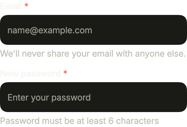
A sign-up pair: each field carries its label, a placeholder and a helper line; required marks the label, obscureText hides the password.
import 'package:your_app/ui/fliin/components/text_field/fl_text_field.dart';
import 'package:your_app/ui/fliin/core/fliin.dart';
import 'package:flutter/widgets.dart';

class TextFieldExample extends StatelessWidget {
  const TextFieldExample({super.key});

  @override
  Widget build(BuildContext context) {
    return Column(
      mainAxisSize: MainAxisSize.min,
      crossAxisAlignment: CrossAxisAlignment.stretch,
      spacing: FlScope.of(context).space.md,
      children: const [
        FlTextField(
          key: ValueKey('email'),
          label: 'Email',
          placeholder: '[email protected]',
          helper: "We'll never share your email with anyone else.",
          required: true,
        ),
        FlTextField(
          key: ValueKey('password'),
          label: 'New password',
          placeholder: 'Enter your password',
          helper: 'Password must be at least 6 characters',
          obscureText: true,
          required: true,
        ),
      ],
    );
  }
}Enabled
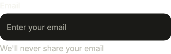
A field at rest: its label above, the placeholder inside until the user types, and a helper line below.
import 'package:your_app/ui/fliin/components/text_field/fl_text_field.dart';
import 'package:flutter/widgets.dart';

class TextFieldEnabledExample extends StatelessWidget {
  const TextFieldEnabledExample({super.key});

  @override
  Widget build(BuildContext context) {
    return const FlTextField(
      label: 'Email',
      placeholder: 'Enter your email',
      helper: "We'll never share your email",
    );
  }
}Focused
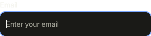
A focused field takes the focus ring and shows its cursor; autofocus focuses it as soon as the screen opens.
import 'package:your_app/ui/fliin/components/text_field/fl_text_field.dart';
import 'package:flutter/widgets.dart';

class TextFieldFocusedExample extends StatelessWidget {
  const TextFieldFocusedExample({super.key});

  @override
  Widget build(BuildContext context) {
    return const FlTextField(
      label: 'Email',
      placeholder: 'Enter your email',
      autofocus: true,
    );
  }
}Selected
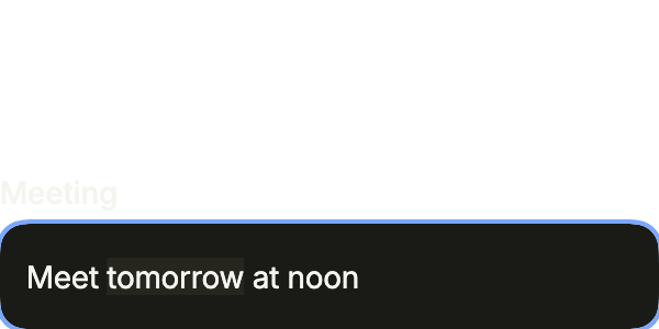
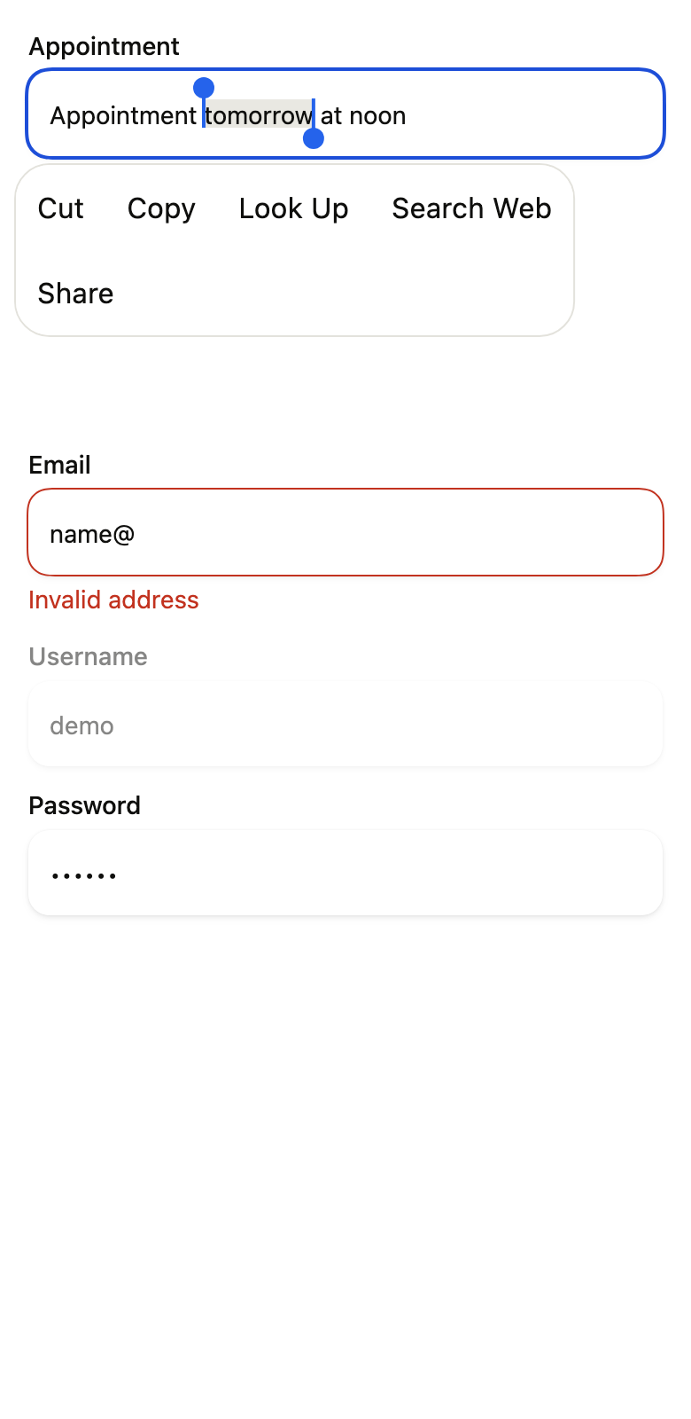
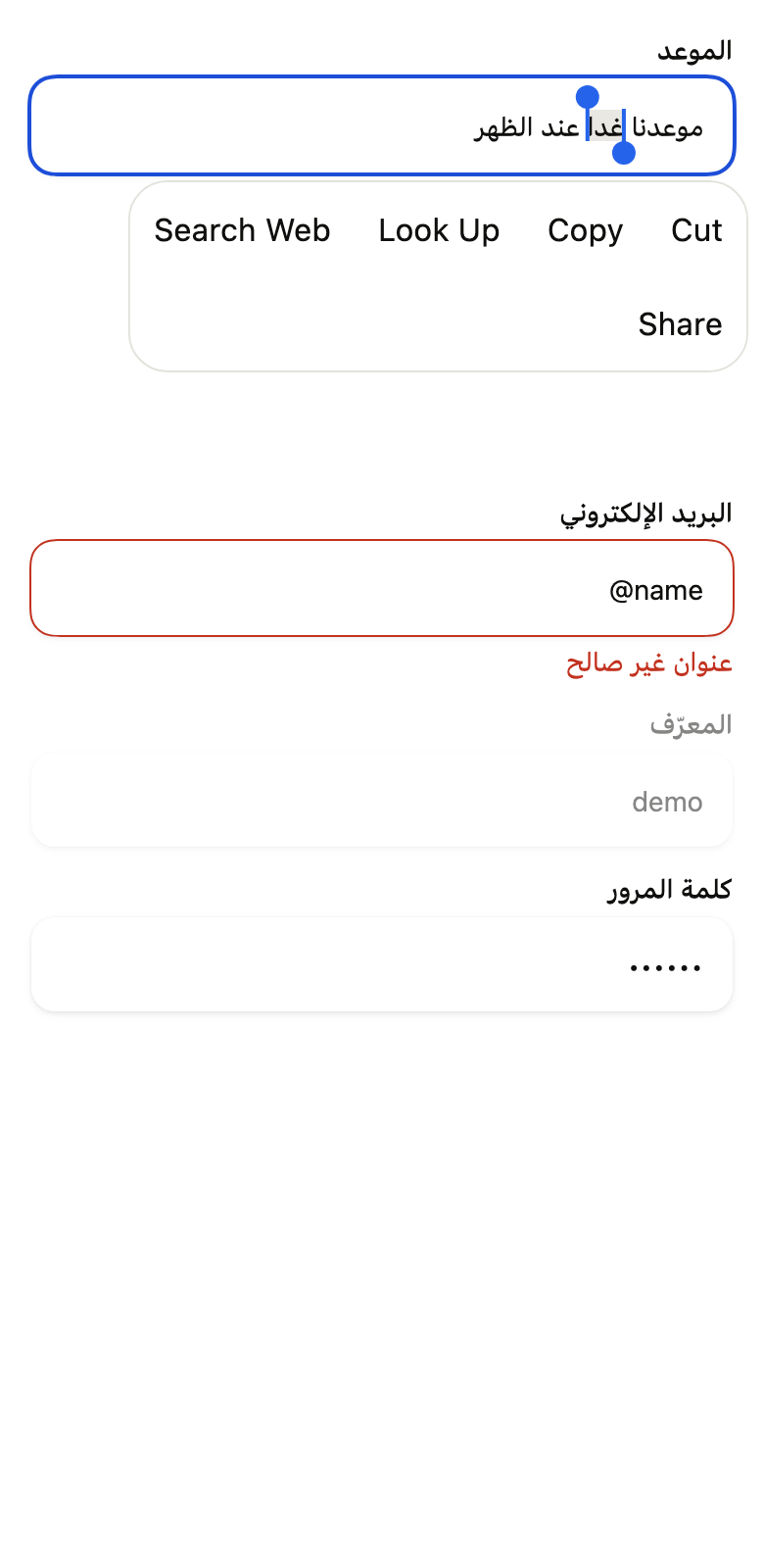
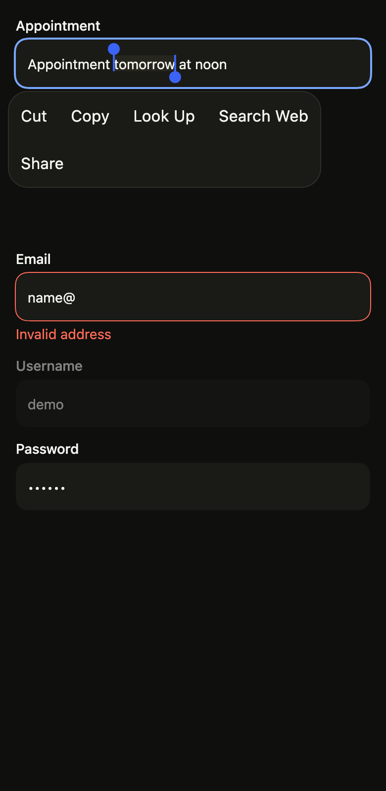
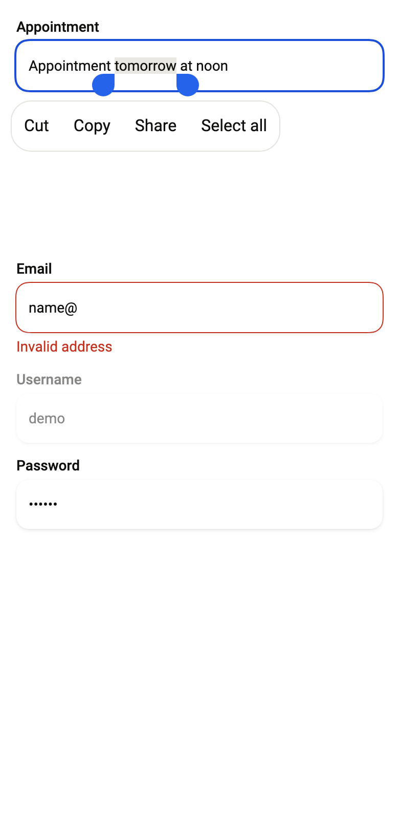
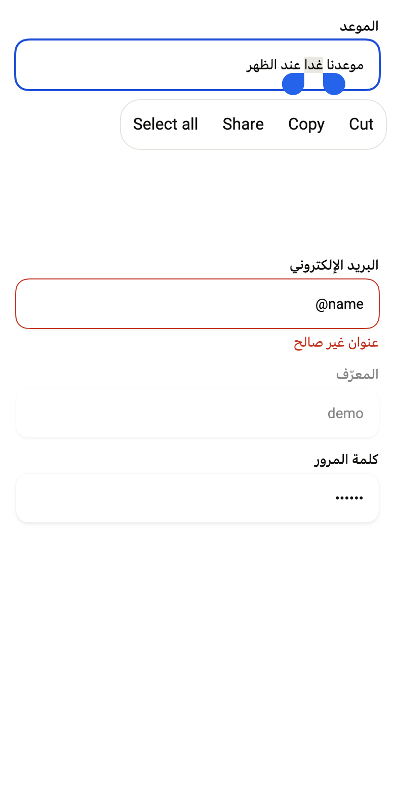
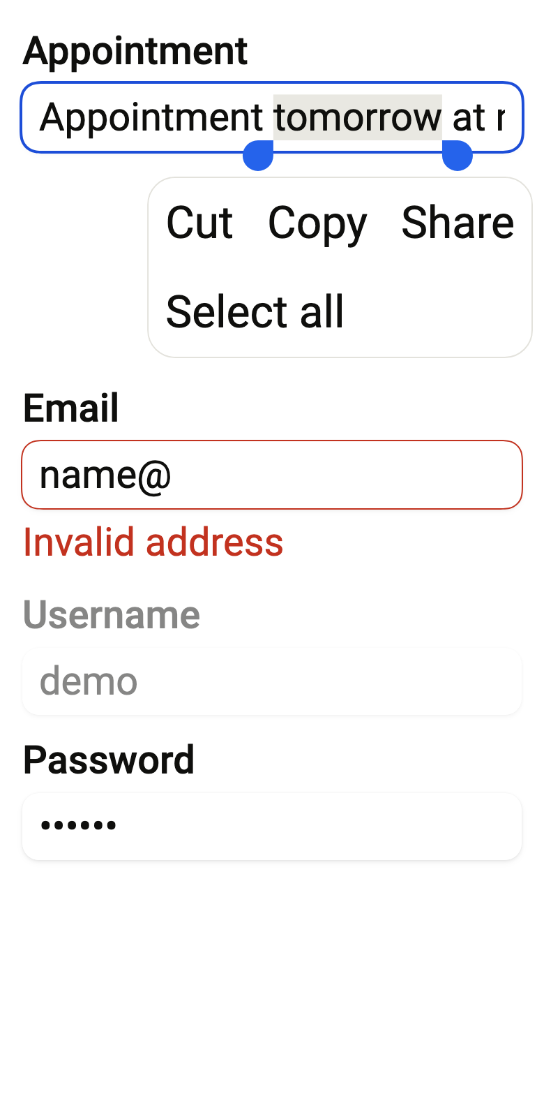
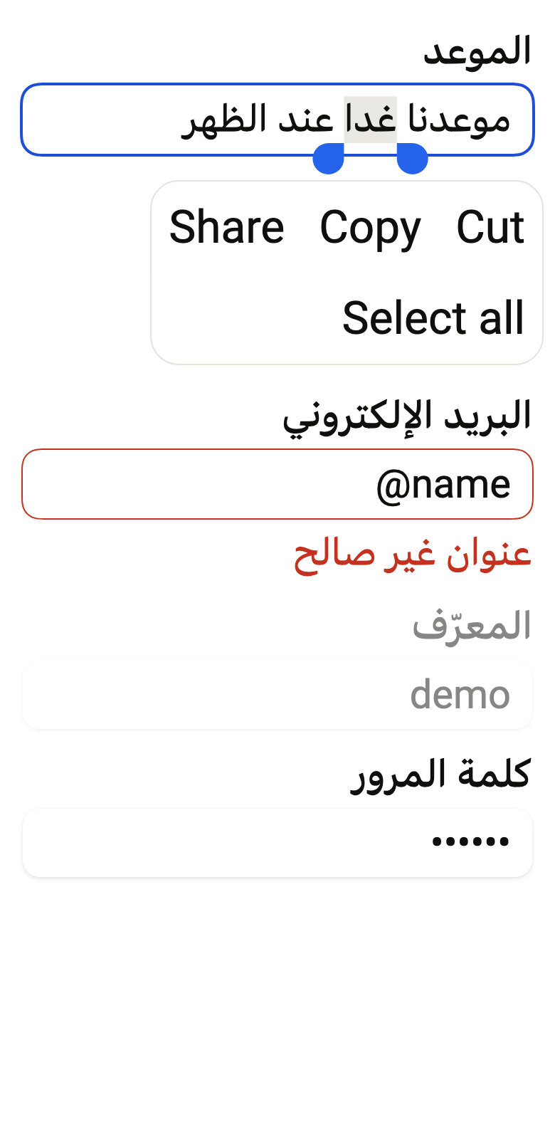
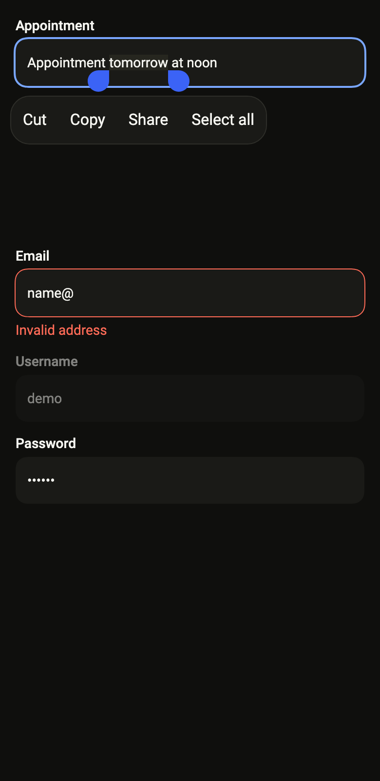
Selected text shows its handles and the platform's edit menu: cut, copy, paste and select all. A controller can start with a selection.
import 'package:your_app/ui/fliin/components/text_field/fl_text_field.dart';
import 'package:flutter/widgets.dart';

class TextFieldSelectedExample extends StatefulWidget {
  const TextFieldSelectedExample({super.key});

  @override
  State<TextFieldSelectedExample> createState() =>
      _TextFieldSelectedExampleState();
}

class _TextFieldSelectedExampleState extends State<TextFieldSelectedExample> {
  late final TextEditingController _controller;

  @override
  void initState() {
    super.initState();
    const text = 'Meet tomorrow at noon';
    final start = text.indexOf('tomorrow');
    _controller = TextEditingController.fromValue(
      TextEditingValue(
        text: text,
        selection: TextSelection(
          baseOffset: start,
          extentOffset: start + 'tomorrow'.length,
        ),
      ),
    );
  }

  @override
  void dispose() {
    _controller.dispose();
    super.dispose();
  }

  @override
  Widget build(BuildContext context) {
    return FlTextField(
      label: 'Meeting',
      controller: _controller,
      autofocus: true,
    );
  }
}Error
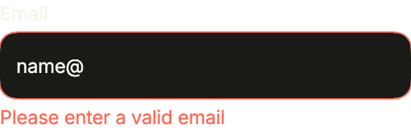
error replaces the helper line with a message and marks the field invalid, for the screen reader too. Show it once the user has typed.
import 'package:your_app/ui/fliin/components/text_field/fl_text_field.dart';
import 'package:flutter/widgets.dart';

class TextFieldErrorExample extends StatefulWidget {
  const TextFieldErrorExample({super.key});

  @override
  State<TextFieldErrorExample> createState() => _TextFieldErrorExampleState();
}

class _TextFieldErrorExampleState extends State<TextFieldErrorExample> {
  final _controller = TextEditingController(text: 'name@');

  @override
  void dispose() {
    _controller.dispose();
    super.dispose();
  }

  @override
  Widget build(BuildContext context) {
    return FlTextField(
      label: 'Email',
      controller: _controller,
      error: 'Please enter a valid email',
    );
  }
}Disabled
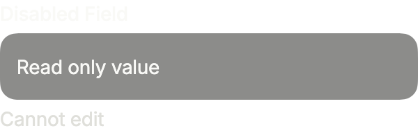
enabled: false greys the field out: its value stays readable but can be neither focused nor edited.
import 'package:your_app/ui/fliin/components/text_field/fl_text_field.dart';
import 'package:flutter/widgets.dart';

class TextFieldDisabledExample extends StatefulWidget {
  const TextFieldDisabledExample({super.key});

  @override
  State<TextFieldDisabledExample> createState() =>
      _TextFieldDisabledExampleState();
}

class _TextFieldDisabledExampleState extends State<TextFieldDisabledExample> {
  final _controller = TextEditingController(text: 'Read only value');

  @override
  void dispose() {
    _controller.dispose();
    super.dispose();
  }

  @override
  Widget build(BuildContext context) {
    return FlTextField(
      label: 'Disabled Field',
      controller: _controller,
      helper: 'Cannot edit',
      enabled: false,
    );
  }
}Obscured
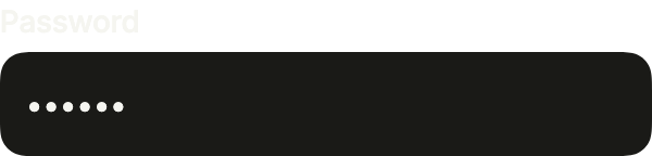
obscureText hides what is typed behind dots, for a password.
import 'package:your_app/ui/fliin/components/text_field/fl_text_field.dart';
import 'package:flutter/widgets.dart';

class TextFieldObscuredExample extends StatefulWidget {
  const TextFieldObscuredExample({super.key});

  @override
  State<TextFieldObscuredExample> createState() =>
      _TextFieldObscuredExampleState();
}

class _TextFieldObscuredExampleState extends State<TextFieldObscuredExample> {
  final _controller = TextEditingController(text: 'secret');

  @override
  void dispose() {
    _controller.dispose();
    super.dispose();
  }

  @override
  Widget build(BuildContext context) {
    return FlTextField(
      label: 'Password',
      controller: _controller,
      obscureText: true,
    );
  }
}Textarea
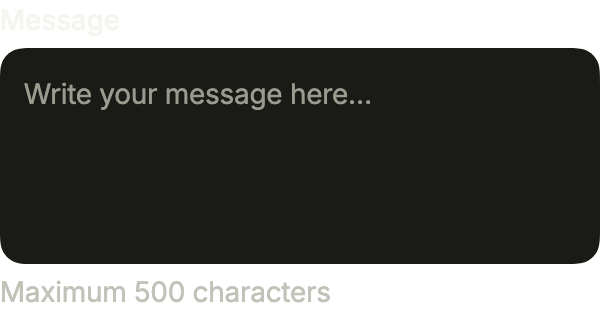
multiline turns the field into a text area; rows sets how many lines it shows before it scrolls, and maxLength cuts what goes beyond.
import 'package:your_app/ui/fliin/components/text_field/fl_text_field.dart';
import 'package:flutter/services.dart';
import 'package:flutter/widgets.dart';

class TextFieldTextareaExample extends StatelessWidget {
  const TextFieldTextareaExample({super.key});

  @override
  Widget build(BuildContext context) {
    return const FlTextField(
      label: 'Message',
      placeholder: 'Write your message here…',
      helper: 'Maximum 500 characters',
      multiline: true,
      rows: 4,
      maxLength: 500,
      textCapitalization: TextCapitalization.sentences,
    );
  }
}Input types
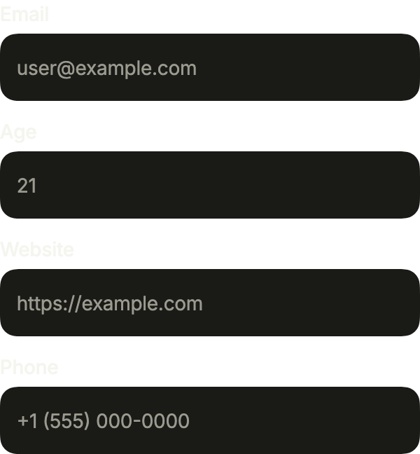
One field per kind of value: keyboardType opens the matching keyboard, autofillHints lets the system suggest it, and inputFormatters keeps only digits in the age.
import 'package:your_app/ui/fliin/components/text_field/fl_text_field.dart';
import 'package:your_app/ui/fliin/core/fliin.dart';
import 'package:flutter/services.dart';
import 'package:flutter/widgets.dart';

class TextFieldInputTypesExample extends StatelessWidget {
  const TextFieldInputTypesExample({super.key});

  @override
  Widget build(BuildContext context) {
    return Column(
      mainAxisSize: MainAxisSize.min,
      crossAxisAlignment: CrossAxisAlignment.stretch,
      spacing: FlScope.of(context).space.md,
      children: [
        const FlTextField(
          label: 'Email',
          placeholder: '[email protected]',
          keyboardType: TextInputType.emailAddress,
          autofillHints: [AutofillHints.email],
        ),
        FlTextField(
          label: 'Age',
          placeholder: '21',
          keyboardType: TextInputType.number,
          inputFormatters: [FilteringTextInputFormatter.digitsOnly],
          maxLength: 3,
        ),
        const FlTextField(
          label: 'Website',
          placeholder: 'https://example.com',
          keyboardType: TextInputType.url,
          textDirection: TextDirection.ltr,
        ),
        const FlTextField(
          label: 'Phone',
          placeholder: '+1 (555) 000-0000',
          keyboardType: TextInputType.phone,
          autofillHints: [AutofillHints.telephoneNumber],
          textDirection: TextDirection.ltr,
        ),
      ],
    );
  }
}Variants
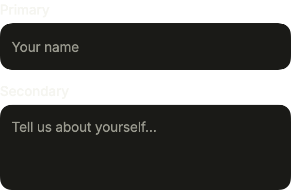
FlInputVariant.primary, white and lifted by a shadow, sits on the page or on a raised surface; secondary, filled with the control grey, suits a white sheet or dialog where a shadow would be too much.
import 'package:your_app/ui/fliin/components/text_field/fl_text_field.dart';
import 'package:your_app/ui/fliin/core/fliin.dart';
import 'package:flutter/widgets.dart';

class TextFieldVariantsExample extends StatelessWidget {
  const TextFieldVariantsExample({super.key});

  @override
  Widget build(BuildContext context) {
    return Column(
      mainAxisSize: MainAxisSize.min,
      crossAxisAlignment: CrossAxisAlignment.stretch,
      spacing: FlScope.of(context).space.md,
      children: const [
        FlTextField(label: 'Primary', placeholder: 'Your name'),
        FlTextField(
          label: 'Secondary',
          placeholder: 'Tell us about yourself…',
          variant: FlInputVariant.secondary,
          multiline: true,
          rows: 3,
        ),
      ],
    );
  }
}Affixes
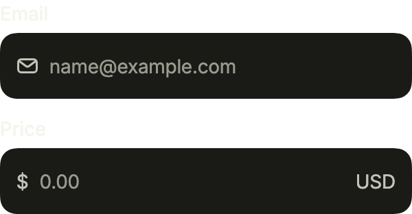
prefix and suffix sit inside the field, muted: an icon that says what goes in, a currency and a unit around an amount.
import 'package:your_app/ui/fliin/components/text_field/fl_text_field.dart';
import 'package:your_app/ui/fliin/core/fliin.dart';
import 'package:your_app/ui/fliin/icons/fl_icons.dart';
import 'package:flutter/services.dart';
import 'package:flutter/widgets.dart';

class TextFieldAffixesExample extends StatelessWidget {
  const TextFieldAffixesExample({super.key});

  @override
  Widget build(BuildContext context) {
    return Column(
      mainAxisSize: MainAxisSize.min,
      crossAxisAlignment: CrossAxisAlignment.stretch,
      spacing: FlScope.of(context).space.md,
      children: [
        FlTextField(
          label: 'Email',
          placeholder: '[email protected]',
          prefix: FlIcon(FlIcons.envelope),
          keyboardType: TextInputType.emailAddress,
        ),
        FlTextField(
          label: 'Price',
          placeholder: '0.00',
          prefix: const Text(r'$'),
          suffix: const Text('USD'),
          keyboardType: const TextInputType.numberWithOptions(decimal: true),
          inputFormatters: [
            FilteringTextInputFormatter.allow(RegExp('[0-9.]')),
          ],
          textDirection: TextDirection.ltr,
        ),
      ],
    );
  }
}Validation
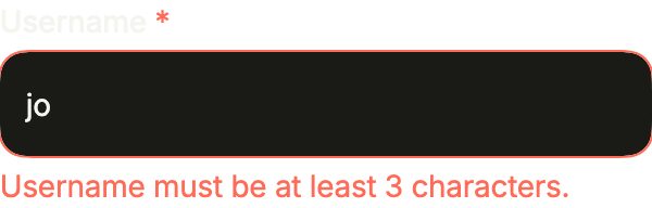
Live validation: the helper line guides while the value is fine, and error takes its place, announced, as soon as it is not.
import 'package:your_app/ui/fliin/components/text_field/fl_text_field.dart';
import 'package:flutter/widgets.dart';

class TextFieldValidationExample extends StatefulWidget {
  const TextFieldValidationExample({super.key});

  @override
  State<TextFieldValidationExample> createState() =>
      _TextFieldValidationExampleState();
}

class _TextFieldValidationExampleState
    extends State<TextFieldValidationExample> {
  final _controller = TextEditingController(text: 'jo');

  @override
  void dispose() {
    _controller.dispose();
    super.dispose();
  }

  @override
  Widget build(BuildContext context) {
    final username = _controller.text;
    final invalid = username.isNotEmpty && username.length < 3;
    return FlTextField(
      label: 'Username',
      controller: _controller,
      placeholder: 'jane_doe',
      required: true,
      helper: 'Choose a unique username for your profile.',
      error: invalid ? 'Username must be at least 3 characters.' : null,
      onChanged: (_) => setState(() {}),
    );
  }
}Usage
The code the reference images render:
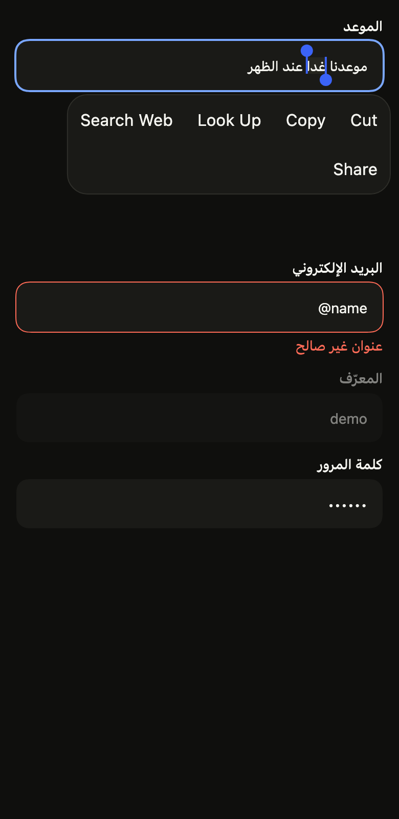
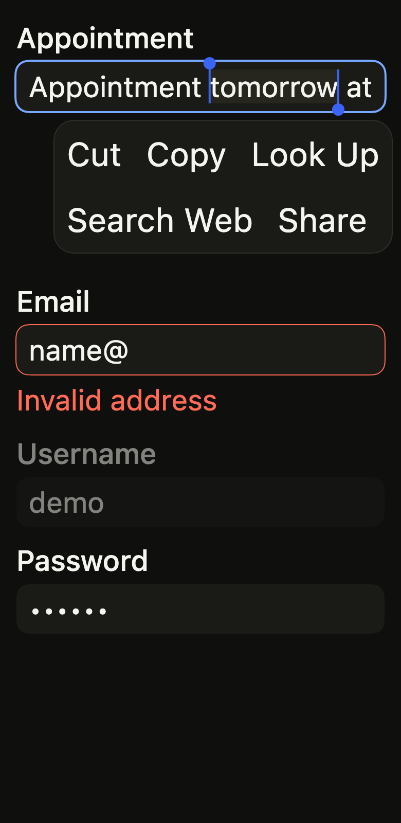
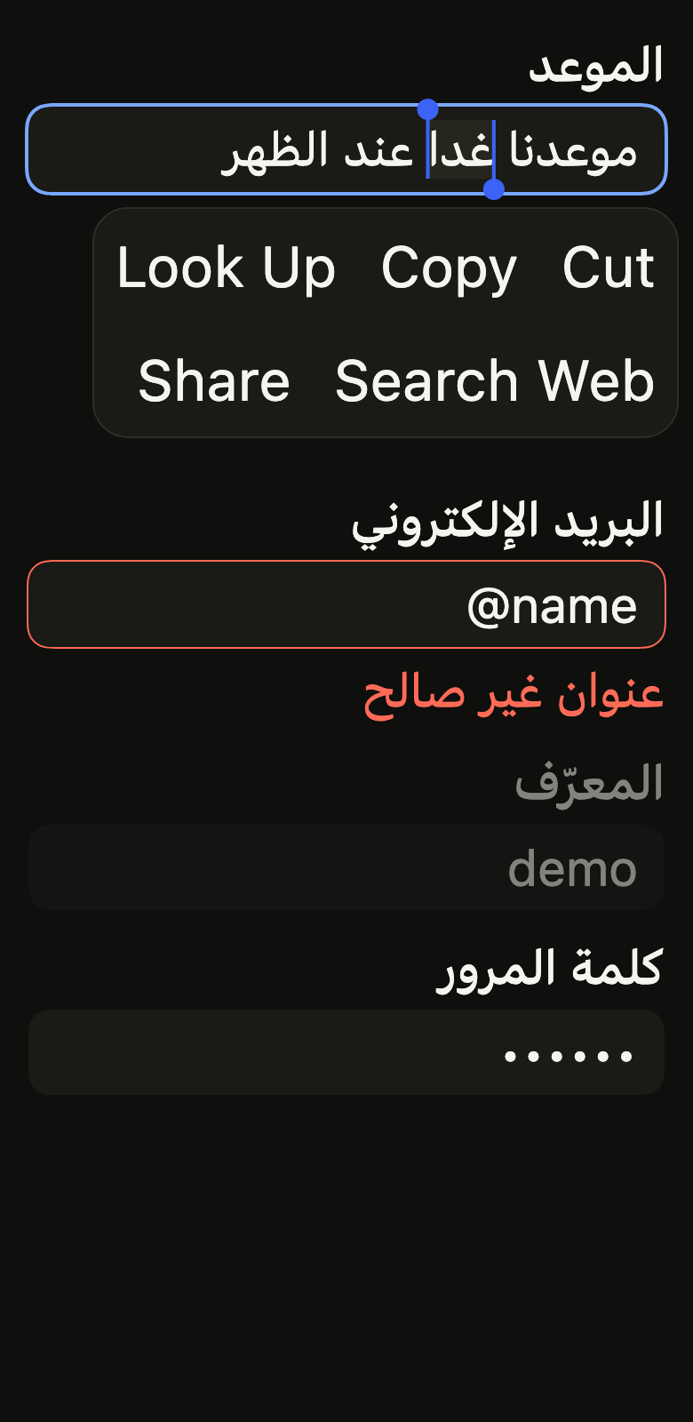
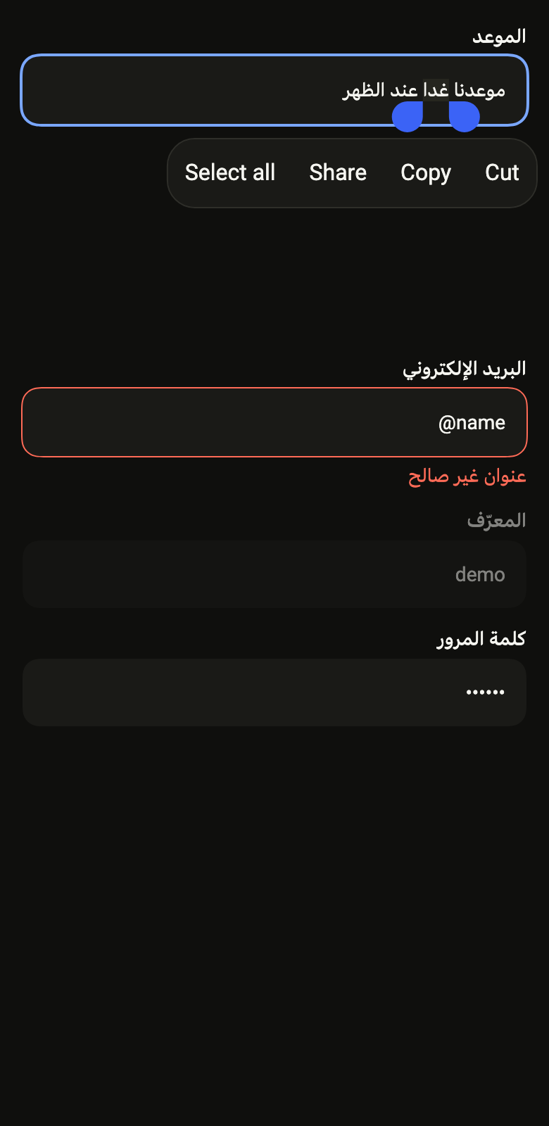
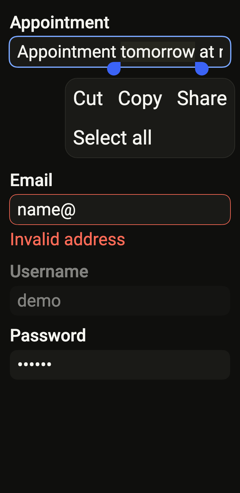
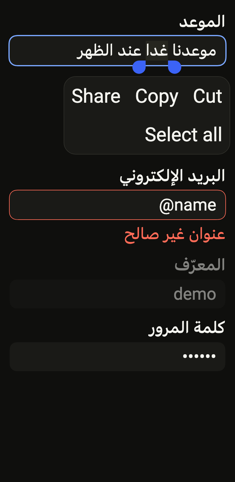
Localizations(locale: const Locale('en'), delegates: const [DefaultWidgetsLocalizations.delegate], child: Directionality(textDirection: variant.dir, child: Overlay(initialEntries: [OverlayEntry(builder: (context) => ColoredBox(color: FlScope.of(context).colors.surface, child: Padding(padding: EdgeInsetsDirectional.all(FlScope.of(context).space.lg), child: Column(crossAxisAlignment: CrossAxisAlignment.stretch, spacing: FlScope.of(context).space.md, children: [Builder(builder: (context) { WidgetsBinding.instance.addPostFrameCallback((_) => WidgetsBinding.instance.addPostFrameCallback((_) { final field = FocusManager.instance.primaryFocus?.context?.findAncestorStateOfType<EditableTextState>(); if (field == null || field.textEditingValue.text.isNotEmpty) return; final (text, word) = variant.dir == TextDirection.rtl ? ('موعدنا غدا عند الظهر', 'غدا') : ('Appointment tomorrow at noon', 'tomorrow'); final start = text.indexOf(word); field..userUpdateTextEditingValue(TextEditingValue(text: text, selection: TextSelection(baseOffset: start, extentOffset: start + word.length)), SelectionChangedCause.longPress)..showToolbar(); })); return FlTextField(label: 'Appointment', autofocus: true); }), const SizedBox(height: 140), FlTextField(label: 'Email', controller: TextEditingController(text: 'name@'), error: 'Invalid address', FlTextField(label: 'Username', controller: TextEditingController(text: 'demo'), enabled: false), FlTextField(label: 'Password', controller: TextEditingController(text: 'secret'), obscureText: true)]))))])))API
flInputAffixExtent: double(FlTheme theme)
FlInputVariant: enum {primary, secondary}
FlInputVariant.primary: static final FlInputVariant
FlInputVariant.secondary: static final FlInputVariant
FlInputFrame: class extends StatelessWidget
FlInputFrame.new: const new({super.key, required FlInputVariant variant, Color? outline, double outlineWidth, bool focused, bool hovered, bool pill, Key? frameKey, required Widget child})
FlInputFrame.hovered: get bool
FlInputFrame.pill: get bool
FlInputFrame.variant: get FlInputVariant
FlInputFrame.outline: get Color?
FlInputFrame.outlineWidth: get double
FlInputFrame.focused: get bool
FlInputFrame.frameKey: get Key?
FlInputFrame.child: get Widget
FlInputFrame.build: Widget(BuildContext context)
FlInputAffixes: class extends InheritedWidget
FlInputAffixes.new: const new({super.key, Widget? prefix, Widget? suffix, bool? disabled, bool fadesWhenDisabled, required super.child})
FlInputAffixes.prefix: get Widget?
FlInputAffixes.suffix: get Widget?
FlInputAffixes.disabled: get bool?
FlInputAffixes.fadesWhenDisabled: get bool
FlInputAffixes.maybeOf: static FlInputAffixes?(BuildContext context)
FlInputAffixes.updateShouldNotify: bool(FlInputAffixes oldWidget)
FlInputAffix: class extends StatelessWidget
FlInputAffix.new: const new({super.key, bool decorative, bool tight, required Widget child})
FlInputAffix.decorative: get bool
FlInputAffix.tight: get bool
FlInputAffix.child: get Widget
FlInputAffix.build: Widget(BuildContext context)
FlInput: class extends StatefulWidget
FlInput.new: const new({super.key, String? label, String? hint, TextEditingController? controller, FocusNode? focusNode, String? placeholder, FlInputVariant variant, bool? invalid, bool? disabled, bool readOnly, bool multiline, int? rows, int maxLines, bool obscureText, bool autofocus, TextInputType? keyboardType, TextInputAction? textInputAction, TextCapitalization textCapitalization, Iterable<String> autofillHints, List<TextInputFormatter>? inputFormatters, int? maxLength, ValueChanged<String>? onChanged, ValueChanged<String>? onSubmitted, TextAlign textAlign, bool compact, WidgetStatesController? statesController})
FlInput.label: get String?
FlInput.hint: get String?
FlInput.controller: get TextEditingController?
FlInput.focusNode: get FocusNode?
FlInput.placeholder: get String?
FlInput.variant: get FlInputVariant
FlInput.invalid: get bool?
FlInput.disabled: get bool?
FlInput.readOnly: get bool
FlInput.multiline: get bool
FlInput.rows: get int?
FlInput.maxLines: get int
FlInput.obscureText: get bool
FlInput.autofocus: get bool
FlInput.keyboardType: get TextInputType?
FlInput.textInputAction: get TextInputAction?
FlInput.textCapitalization: get TextCapitalization
FlInput.autofillHints: get Iterable<String>
FlInput.inputFormatters: get List<TextInputFormatter>?
FlInput.maxLength: get int?
FlInput.onChanged: get ValueChanged<String>?
FlInput.onSubmitted: get ValueChanged<String>?
FlInput.textAlign: get TextAlign
FlInput.compact: get bool
FlInput.statesController: get WidgetStatesController?
FlInput.createState: State<FlInput>()
FlTextField: class extends StatefulWidget
FlTextField.new: const new({super.key, required String label, TextEditingController? controller, FocusNode? focusNode, String? placeholder, String? helper, String? error, Widget? prefix, Widget? suffix, FlInputVariant variant, bool enabled, bool readOnly, bool required, bool multiline, int? rows, int maxLines, bool obscureText, bool autofocus, TextInputType? keyboardType, TextInputAction? textInputAction, TextCapitalization textCapitalization, Iterable<String> autofillHints, List<TextInputFormatter>? inputFormatters, int? maxLength, ValueChanged<String>? onChanged, ValueChanged<String>? onSubmitted, TextDirection? textDirection, String? showLabel, String? hideLabel})
FlTextField.label: get String
FlTextField.controller: get TextEditingController?
FlTextField.focusNode: get FocusNode?
FlTextField.placeholder: get String?
FlTextField.helper: get String?
FlTextField.error: get String?
FlTextField.prefix: get Widget?
FlTextField.suffix: get Widget?
FlTextField.variant: get FlInputVariant
FlTextField.enabled: get bool
FlTextField.readOnly: get bool
FlTextField.required: get bool
FlTextField.multiline: get bool
FlTextField.rows: get int?
FlTextField.maxLines: get int
FlTextField.obscureText: get bool
FlTextField.autofocus: get bool
FlTextField.keyboardType: get TextInputType?
FlTextField.textInputAction: get TextInputAction?
FlTextField.textCapitalization: get TextCapitalization
FlTextField.autofillHints: get Iterable<String>
FlTextField.inputFormatters: get List<TextInputFormatter>?
FlTextField.maxLength: get int?
FlTextField.onChanged: get ValueChanged<String>?
FlTextField.onSubmitted: get ValueChanged<String>?
FlTextField.textDirection: get TextDirection?
FlTextField.showLabel: get String?
FlTextField.hideLabel: get String?
FlTextField.createState: State<FlTextField>()Reference renders
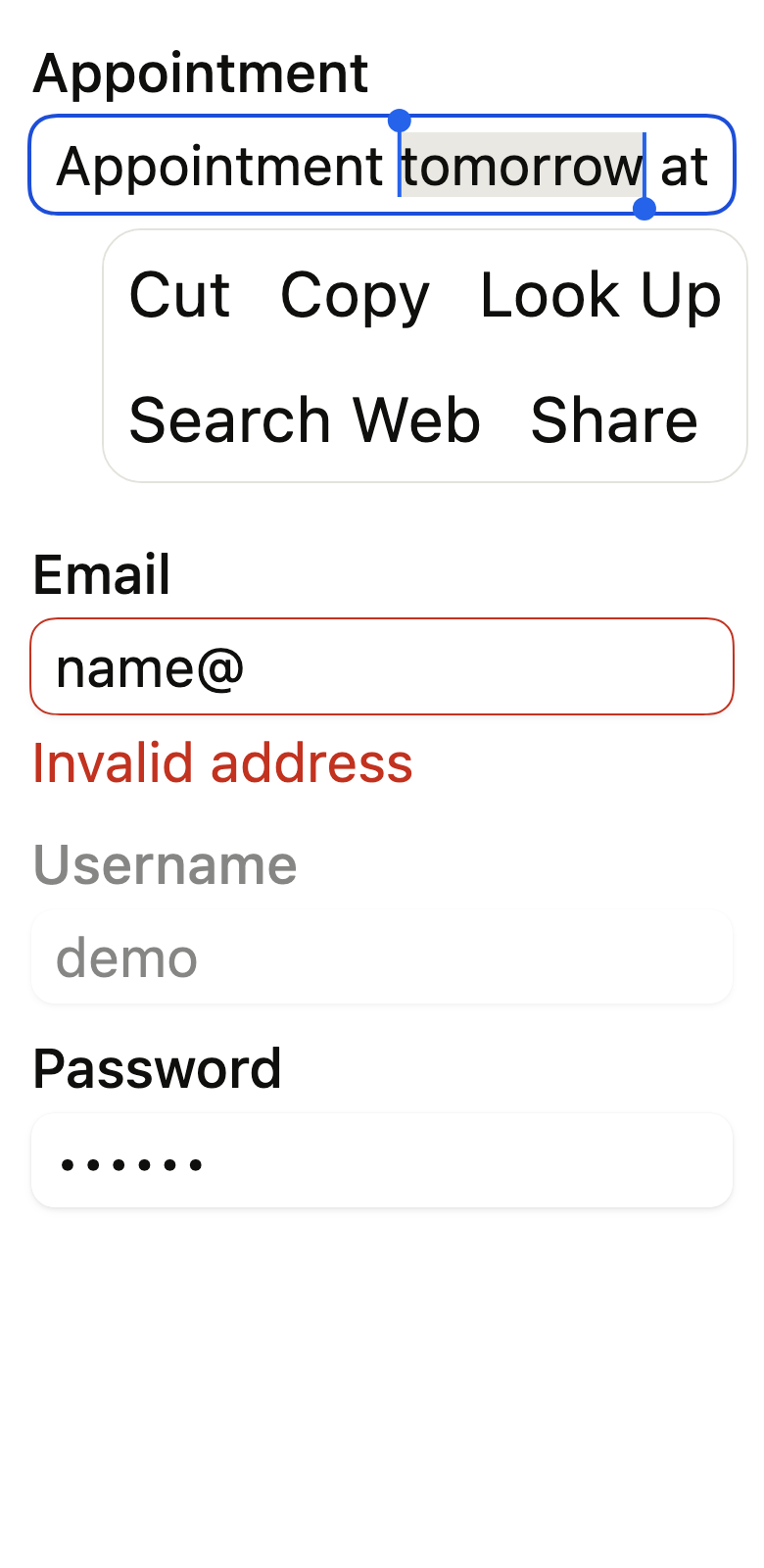
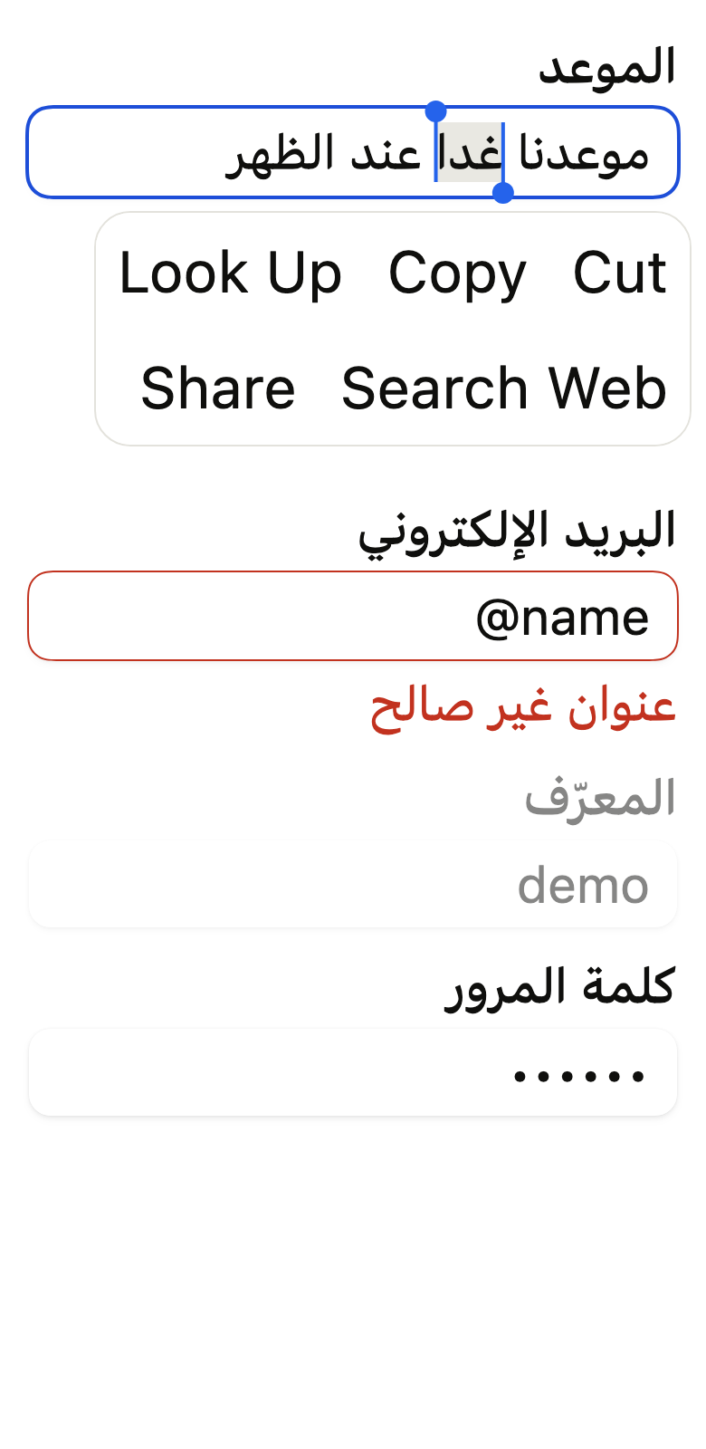
The 16 images published with version 0.2.5, rendered by the shared harness on macOS with Flutter 3.47.7. fliin verify text-field compares your copy to them.
Use it to
- enter text in an input field
- enter an email in a form
- hide a password while typing
- show a validation error under a field
- add a leading or trailing icon or unit
- show helper text under a field
- select and copy text in a field
- enter a multi-line message
- enter a phone number with the matching keyboard
- Not for
- offering suggestions under the field while typing: use a combo box (combo-box)
- States
Source
The files fliin add text-field copies into your app, before your prefix and imports are applied.
text_field/fl_input.dart
// Modified from the Input and TextArea of HeroUI Native 1.0.10, Copyright 2025
// NextUI Inc., licensed under Apache 2.0:
// https://www.apache.org/licenses/LICENSE-2.0
import 'dart:math' as math;

import 'package:flutter/rendering.dart';
import 'package:flutter/services.dart';
import 'package:flutter/widgets.dart';
import 'package:fliin_ui/core/fliin.dart';

/// The share of the width a prefix or suffix may take: beyond it, its text is
/// cut, and the input keeps room for typing.
const double _affixShare = 0.4;

/// The tallest affix that keeps an input at the control height: the input
/// pads its affixes by `space.xs` above and below. A button in a tight
/// suffix takes it as its `extent`: a 32 high button in a 40 high input.
double flInputAffixExtent(FlTheme theme) => theme.controlHeight - 2 * theme.space.xs;

/// The fill of an [FlInput].
enum FlInputVariant {
  /// `field` background, `field` shadow and `fieldBorder` outline: a field
  /// placed on the page.
  primary,

  /// `control` background, without shadow or outline: a field placed on a
  /// surface.
  secondary,
}

/// The frame of an input: the [variant]'s fill, the
/// `field` shadow in `primary`, continuous corners of `shape.radiusControl`,
/// and no outline at rest. Under the pointer ([hovered]) a hairline in
/// `border` appears, and a `secondary` fill darkens
/// slightly; [focused] draws a `size.focusRing` ring in `focusRing` hugging
/// the box, and [outline] a ring of [outlineWidth] in its color (`danger` for
/// an invalid input), thickened to `size.focusRing` when [focused]. The
/// rings paint outside the box, which keeps its
/// size; the fill and the hairline fade in `motion.short3`, the ring shows
/// at once. `FlInput` carries it, and
/// so do the slots of a one-time code and the date fields.
class FlInputFrame extends StatelessWidget {
  /// A frame around [child].
  const FlInputFrame({
    super.key,
    required this.variant,
    this.outline,
    this.outlineWidth = 1,
    this.focused = false,
    this.hovered = false,
    this.pill = false,
    this.frameKey,
    required this.child,
  });

  /// True: under the pointer, a `border` hairline appears inside the edge,
  /// unless the frame has focus or an [outline].
  final bool hovered;

  /// True: a capsule in `control`, without shadow, whatever [variant]: a
  /// messaging composer. It takes the button's shape (`shape.button`): square
  /// or rounded under those presets.
  final bool pill;

  /// The background, and the shadow in `primary`.
  final FlInputVariant variant;

  /// The color of a ring around the frame (`danger` for an invalid input);
  /// when null, none.
  final Color? outline;

  /// The width of the [outline] ring, in logical points, outside the box:
  /// the frame keeps its size. Focus thickens it to `size.focusRing`.
  final double outlineWidth;

  /// True: a ring surrounds the frame, `focusRing`, or the [outline]'s color
  /// when there is one.
  final bool focused;

  /// The fill's key, for whoever needs to measure its rectangle.
  final Key? frameKey;

  /// The content, painted over the background.
  final Widget child;

  @override
  Widget build(BuildContext context) {
    final theme = FlScope.of(context);
    final colors = theme.colors;
    final motion = FlMotion.of(context);
    final outline = this.outline;
    final primary = variant == FlInputVariant.primary && !pill;
    final ring = switch ((outline, focused)) {
      (final color?, _) => (color: color, width: focused ? math.max(outlineWidth, theme.size.focusRing) : outlineWidth),
      (null, true) => (color: colors.focusRing, width: theme.size.focusRing),
      (null, false) => (color: null, width: 0.0),
    };
    final hover = hovered && !focused && outline == null;
    final fill = primary
        ? colors.field
        : hover
        ? Color.lerp(colors.control, colors.controlPressed, 0.5)!
        : colors.control;
    final edge = primary && hover ? colors.border : colors.border.withValues(alpha: 0);
    Widget frame(double radius, {required bool capsule}) => FlShadow(
      layers: primary ? theme.shadows.field : const [],
      // A box-shadow follows the circular corners, even under continuous ones
      // (see FlSurface).
      shape: RoundedRectangleBorder(borderRadius: BorderRadius.circular(radius)),
      child: _AnimatedFrame(
        fill: fill,
        edge: edge,
        ring: ring.color,
        ringWidth: ring.width,
        radius: radius,
        capsule: capsule,
        edgeWidth: theme.size.border,
        duration: motion.reduced ? Duration.zero : theme.motion.short3,
        frameKey: frameKey,
        child: child,
      ),
    );

    if (!pill) return frame(theme.shape.radiusControl, capsule: false);
    // The capsule follows the button's shape: square under a square preset.
    return switch (theme.shape.button) {
      FlButtonShape.square => frame(0, capsule: false),
      FlButtonShape.rounded => frame(theme.shape.radiusButton, capsule: false),
      FlButtonShape.pill => LayoutBuilder(
        builder: (context, constraints) => frame(constraints.maxHeight / 2, capsule: true),
      ),
    };
  }
}

/// The fill and the hover hairline, faded from one state to the next over
/// 150 ms. The ring
/// appears at once: focus shows on the frame the keyboard lands on, without
/// a delay.
class _AnimatedFrame extends ImplicitlyAnimatedWidget {
  const _AnimatedFrame({
    required this.fill,
    required this.edge,
    required this.ring,
    required this.ringWidth,
    required this.radius,
    required this.capsule,
    required this.edgeWidth,
    required super.duration,
    required this.frameKey,
    required this.child,
  }) : super(curve: Curves.easeOut);

  final Color fill;
  final Color edge;
  final Color? ring;
  final double ringWidth;
  final double radius;
  final bool capsule;
  final double edgeWidth;
  final Key? frameKey;
  final Widget child;

  @override
  AnimatedWidgetBaseState<_AnimatedFrame> createState() => _AnimatedFrameState();
}

class _AnimatedFrameState extends AnimatedWidgetBaseState<_AnimatedFrame> {
  ColorTween? _fill;
  ColorTween? _edge;

  @override
  void forEachTween(TweenVisitor<dynamic> visitor) {
    _fill = visitor(_fill, widget.fill, (value) => ColorTween(begin: value as Color)) as ColorTween?;
    _edge = visitor(_edge, widget.edge, (value) => ColorTween(begin: value as Color)) as ColorTween?;
  }

  @override
  Widget build(BuildContext context) {
    final edge = _edge!.evaluate(animation)!;
    final radius = widget.radius;
    final capsule = widget.capsule;
    final ring = widget.ring;
    final side = edge.a == 0 ? BorderSide.none : BorderSide(color: edge, width: widget.edgeWidth);
    return CustomPaint(
      // The ring overflows the box: the active slot of a code thus keeps the
      // size of the others.
      foregroundPainter: ring == null
          ? null
          : _Outline(color: ring, width: widget.ringWidth, radius: radius, capsule: capsule),
      child: DecoratedBox(
        key: widget.frameKey,
        decoration: ShapeDecoration(
          color: _fill!.evaluate(animation),
          shape: capsule ? StadiumBorder(side: side) : FlContinuousBorder(radius: radius, side: side),
        ),
        child: widget.child,
      ),
    );
  }
}

/// The part of a thick outline that overflows the box: a ring of [width]
/// against the inner stroke, with continuous corners like it.
class _Outline extends CustomPainter {
  const _Outline({required this.color, required this.width, required this.radius, this.capsule = false});

  final Color color;
  final double width;
  final double radius;
  final bool capsule;

  @override
  void paint(Canvas canvas, Size size) {
    final box = Offset.zero & size;
    Path outer(Rect rect, double radius) =>
        capsule ? const StadiumBorder().getOuterPath(rect) : FlContinuousBorder(radius: radius).getOuterPath(rect);
    // A ring by the even-odd rule, like FlContinuousBorder: under
    // CanvasKit, `Path.combine` fails on some paths.
    canvas.drawPath(
      Path()
        ..fillType = PathFillType.evenOdd
        ..addPath(outer(box.inflate(width), radius + width), Offset.zero)
        ..addPath(outer(box, radius), Offset.zero),
      Paint()..color = color,
    );
  }

  @override
  bool shouldRepaint(_Outline oldDelegate) =>
      color != oldDelegate.color ||
      width != oldDelegate.width ||
      radius != oldDelegate.radius ||
      capsule != oldDelegate.capsule;
}

/// What a group places at the start and end of the [FlInput] it wraps:
/// `FlTextField` and `FlInputGroup` provide
/// it, `FlSearchField` too. [disabled] disables the input when it says
/// nothing itself.
class FlInputAffixes extends InheritedWidget {
  /// The affixes of the input under [child].
  const FlInputAffixes({
    super.key,
    this.prefix,
    this.suffix,
    this.disabled,
    this.fadesWhenDisabled = true,
    required super.child,
  });

  /// The content at the start of the frame, before the text, which carries
  /// its own padding (`FlInputAffix`): the text starts right after it.
  final Widget? prefix;

  /// The content at the end of the frame, after the text, with its padding.
  final Widget? suffix;

  /// True: the input is disabled; when null, the `FlFieldScope`'s state.
  final bool? disabled;

  /// True: when disabled, the input fades its affixes like itself; false,
  /// they stay fully opaque, like the magnifier and the button of
  /// `FlSearchField`.
  final bool fadesWhenDisabled;

  /// The affixes of the nearest input, null outside a group.
  static FlInputAffixes? maybeOf(BuildContext context) => context.dependOnInheritedWidgetOfExactType<FlInputAffixes>();

  @override
  bool updateShouldNotify(FlInputAffixes oldWidget) =>
      prefix != oldWidget.prefix ||
      suffix != oldWidget.suffix ||
      disabled != oldWidget.disabled ||
      fadesWhenDisabled != oldWidget.fadesWhenDisabled;
}

/// Tells an [FlInputAffix] which end of the input it sits at.
class _AffixSlot extends InheritedWidget {
  const _AffixSlot({required this.start, required super.child});

  final bool start;

  @override
  bool updateShouldNotify(_AffixSlot oldWidget) => start != oldWidget.start;
}

/// An input prefix or suffix: [child]
/// `space.md` from the frame's edge and `space.sm` from the text (Izydesk's
/// `.input` padding and gap), icons and text in `onSurfaceMuted`. [decorative] removes it from the screen reader and lets
/// taps through to the input; [tight] brings a button closer to the edge.
class FlInputAffix extends StatelessWidget {
  /// An affix around [child].
  const FlInputAffix({super.key, this.decorative = false, this.tight = false, required this.child});

  /// True: neither read nor tappable, taps go to the input, which takes focus.
  final bool decorative;

  /// True: `space.xs` from the frame's edge instead of `space.md`, for a
  /// control that carries its own padding (a ghost icon button, a key cap).
  final bool tight;

  /// The icon, the unit or the button.
  final Widget child;

  @override
  Widget build(BuildContext context) {
    final theme = FlScope.of(context);
    final muted = theme.colors.onSurfaceMuted;
    final icon = MediaQuery.textScalerOf(context)
        .clamp(maxScaleFactor: theme.size.iconMaxScale)
        .scale(theme.typography.style(FlTextRole.textBase).size);
    final start = context.dependOnInheritedWidgetOfExactType<_AffixSlot>()?.start;
    final edge = tight ? theme.space.xs : theme.space.md;
    final affix = Padding(
      padding: switch (start) {
        true => EdgeInsetsDirectional.only(start: edge, end: theme.space.sm),
        false => EdgeInsetsDirectional.only(start: theme.space.sm, end: edge),
        null => EdgeInsetsDirectional.symmetric(horizontal: edge),
      },
      child: IconTheme.merge(
        data: IconThemeData(color: muted, size: icon),
        child: DefaultTextStyle.merge(
          style: theme.typography.resolve(FlTextRole.textSm).copyWith(color: muted),
          maxLines: 1,
          softWrap: false,
          overflow: TextOverflow.ellipsis,
          child: child,
        ),
      ),
    );
    return decorative ? IgnorePointer(child: ExcludeSemantics(child: affix)) : affix;
  }
}

/// A text input (a text area when [multiline]),
/// on `EditableText`: the [FlInputFrame] frame, `textSm` text at the
/// font's line height (Izydesk's `.input`), the
/// `fieldPlaceholder` placeholder, the `onField` cursor, the focus ring when
/// it has focus and a `danger` outline when it is invalid, faded to
/// `disabledOpacity` when disabled. The selection, its handles and the edit
/// menu follow the platform (iOS or Android), as do the physical keyboard
/// and autofill. No visible label: `FlTextField` adds one.
class FlInput extends StatefulWidget {
  /// An input. Without [controller] or [focusNode], it creates and disposes of
  /// its own.
  const FlInput({
    super.key,
    this.label,
    this.hint,
    this.controller,
    this.focusNode,
    this.placeholder,
    this.variant = FlInputVariant.primary,
    this.invalid,
    this.disabled,
    this.readOnly = false,
    this.multiline = false,
    this.rows,
    this.maxLines = 1,
    this.obscureText = false,
    this.autofocus = false,
    this.keyboardType,
    this.textInputAction,
    this.textCapitalization = TextCapitalization.none,
    this.autofillHints = const [],
    this.inputFormatters,
    this.maxLength,
    this.onChanged,
    this.onSubmitted,
    this.textAlign = TextAlign.start,
    this.compact = false,
    this.statesController,
  }) : assert(maxLines >= 1, 'at least one line'),
       assert(rows == null || (multiline && rows >= 1), 'rows sets the height of a text area: set multiline'),
       assert(maxLength == null || maxLength > 0, 'maxLength counts at least one character'),
       assert(!compact || !multiline, 'a compact input grows with maxLines, it is not a text area'),
       assert(!multiline || maxLines == 1, 'multiline has a fixed height: maxLines does not grow a text area'),
       assert(!obscureText || maxLines == 1, 'obscured text fits on one line: obscureText rejects maxLines');

  /// The input's name, read by the screen reader; the input does not show it.
  final String? label;

  /// Read as a hint by the screen reader, after the placeholder.
  final String? hint;

  /// The input's text and its selection. When null, the input creates its
  /// own; a provided controller stays with the caller, who disposes of it.
  final TextEditingController? controller;

  /// The focus node. When null, the input creates its own. A provided node
  /// gets its `canRequestFocus` back when the input lets go of it.
  final FocusNode? focusNode;

  /// The example text, in `fieldPlaceholder`, while the input is empty. The
  /// screen reader reads it as a hint.
  final String? placeholder;

  /// The background: `primary` by default.
  final FlInputVariant variant;

  /// Invalid: `danger` outline and cursor. When null, the `FlFieldScope`'s state.
  final bool? invalid;

  /// Disabled: faded to `disabledOpacity`, no focus or selection, read-only.
  /// When null, the state of the group ([FlInputAffixes]) or of the
  /// `FlFieldScope`.
  final bool? disabled;

  /// True: the text can be read, selected and copied, but not edited.
  final bool readOnly;

  /// True: a text area, 128 high, with the text at the top, wrapping and
  /// scrolling.
  final bool multiline;

  /// With [multiline]: the text area shows this many lines before it
  /// scrolls. When null, twice the control height
  /// (Izydesk's `.input-area`), about three lines.
  final int? rows;

  /// More than one: the input starts at the height of one line and grows with
  /// the text up to [maxLines] lines, then scrolls (a messaging composer).
  /// One by default: a single line.
  final int maxLines;

  /// True: hides the typed characters, for a password. Changing it
  /// crossfades the dots and the letters over `short4`, at once under
  /// reduced motion.
  final bool obscureText;

  /// Takes focus on the first build if nothing else in its scope has it.
  final bool autofocus;

  /// The virtual keyboard to open (`TextInputType.emailAddress`…). When null,
  /// the text keyboard, single- or multi-line ([multiline], [maxLines]).
  final TextInputType? keyboardType;

  /// The virtual keyboard's action key. When null, `done` on a single line,
  /// newline with [multiline] or a [maxLines] above one.
  final TextInputAction? textInputAction;

  /// Whether the virtual keyboard starts words or sentences in capitals:
  /// `none` by default, `words` for a name, `sentences` for a message.
  final TextCapitalization textCapitalization;

  /// What the autofill service may suggest (`AutofillHints.email`…). Empty:
  /// the input takes part without a hint.
  final Iterable<String> autofillHints;

  /// Filters or reshapes what the user types, in order
  /// (`FilteringTextInputFormatter.digitsOnly`…), before [maxLength].
  final List<TextInputFormatter>? inputFormatters;

  /// The most characters the input accepts: typing or pasting beyond it is
  /// cut. No counter shows; the field's help text can carry one. When null,
  /// no limit.
  final int? maxLength;

  /// Receives the text on every change by the user.
  final ValueChanged<String>? onChanged;

  /// Receives the text when the user submits with the action key.
  final ValueChanged<String>? onSubmitted;

  /// The alignment of the text and of the placeholder: `start` by default,
  /// `center` for a number between two step buttons.
  final TextAlign textAlign;

  /// True: a capsule in `control`, without outline, `textBase` on lines of
  /// `textSm`'s height, between `space.sm + space.xs / 2` above and below
  /// and `space.md + space.xs / 2` at the ends: 40 high with the default
  /// tokens, Izydesk's `.composer .input`. [variant] no longer applies.
  final bool compact;

  /// The input's states, which the app can read or force (a hovered or
  /// focused preview). The input adds `hovered` under the pointer; a forced
  /// `focused` draws the focus ring without taking focus.
  final WidgetStatesController? statesController;

  @override
  State<FlInput> createState() => _FlInputState();
}

class _FlInputState extends State<FlInput>
    with SingleTickerProviderStateMixin
    implements TextSelectionGestureDetectorBuilderDelegate {
  TextEditingController? _ownController;

  /// The crossfade from the dots to the letters, or back, when [FlInput.obscureText]
  /// changes: 1 at rest.
  late final AnimationController _reveal = AnimationController(vsync: this, value: 1)
    ..addListener(() {
      if (_previous != null) setState(() {});
    });

  /// What the input showed before [FlInput.obscureText] changed, fading out
  /// over the new text; null at rest.
  String? _previous;
  FocusNode? _ownFocusNode;
  late final TextSelectionGestureDetectorBuilder _gestures = TextSelectionGestureDetectorBuilder(delegate: this);

  TextEditingController get _controller => widget.controller ?? (_ownController ??= TextEditingController());

  WidgetStatesController? _ownStates;
  WidgetStatesController get _states => widget.statesController ?? (_ownStates ??= WidgetStatesController());
  FocusNode get _focusNode => widget.focusNode ?? (_ownFocusNode ??= FocusNode());

  /// Disabled by itself, otherwise by its group, otherwise by its field.
  bool _disabled = false;

  @override
  final GlobalKey<EditableTextState> editableTextKey = GlobalKey<EditableTextState>();

  @override
  bool get forcePressEnabled => FlScope.of(context).platform == TargetPlatform.iOS;

  @override
  bool get selectionEnabled => !_disabled;

  /// The handles follow the gesture that set the selection: a tap or a long
  /// press shows them, the mouse and the keyboard do not.
  bool _showSelectionHandles = false;

  bool _shouldShowSelectionHandles(SelectionChangedCause? cause) {
    if (_disabled ||
        cause == SelectionChangedCause.keyboard ||
        !_gestures.shouldShowSelectionToolbar ||
        !_gestures.shouldShowSelectionHandles) {
      return false;
    }
    return cause == SelectionChangedCause.longPress ||
        cause == SelectionChangedCause.stylusHandwriting ||
        _controller.text.isNotEmpty;
  }

  /// Tapping the cursor's drop handle shows or hides the toolbar, like `TextField`.
  void _onHandleTapped() {
    if (_controller.selection.isCollapsed) {
      editableTextKey.currentState?.toggleToolbar();
    }
  }

  final GlobalKey _frameKey = GlobalKey();

  Rect? _frame() {
    final box = _frameKey.currentContext?.findRenderObject() as RenderBox?;
    if (box == null || !box.hasSize) return null;
    return box.localToGlobal(Offset.zero) & box.size;
  }

  void _onSelectionChanged(TextSelection selection, SelectionChangedCause? cause) {
    final show = _shouldShowSelectionHandles(cause);
    if (show != _showSelectionHandles) {
      setState(() => _showSelectionHandles = show);
    }
  }

  /// The `canRequestFocus` of a provided node before the input sets it:
  /// given back to the caller when the input lets go of the node.
  bool _providedCanRequestFocus = true;

  void _adoptFocusNode() {
    if (widget.focusNode case final node?) {
      _providedCanRequestFocus = node.canRequestFocus;
    }
    _focusNode.addListener(_onFocusChange);
  }

  void _syncDisabled() {
    _disabled =
        widget.disabled ??
        FlInputAffixes.maybeOf(context)?.disabled ??
        FlFieldScope.maybeOf(context)?.disabled ??
        false;
    _focusNode.canRequestFocus = !_disabled && _providedCanRequestFocus;
  }

  void _releaseFocusNode(FocusNode node, {required bool provided}) {
    node.removeListener(_onFocusChange);
    if (provided) node.canRequestFocus = _providedCanRequestFocus;
  }

  @override
  void initState() {
    super.initState();
    _adoptFocusNode();
    _states.addListener(_onFocusChange);
  }

  @override
  void didChangeDependencies() {
    super.didChangeDependencies();
    _syncDisabled();
  }

  @override
  void didUpdateWidget(FlInput oldWidget) {
    super.didUpdateWidget(oldWidget);
    if (widget.obscureText != oldWidget.obscureText) {
      _crossfade(wasObscured: oldWidget.obscureText);
    }
    if (widget.focusNode != oldWidget.focusNode) {
      _releaseFocusNode(oldWidget.focusNode ?? _ownFocusNode!, provided: oldWidget.focusNode != null);
      _providedCanRequestFocus = true;
      _adoptFocusNode();
    }
    if (oldWidget.statesController != widget.statesController) {
      (oldWidget.statesController ?? _ownStates)?.removeListener(_onFocusChange);
      _states.addListener(_onFocusChange);
    }
    switch ((oldWidget.controller, widget.controller)) {
      case (final previous?, null):
        _ownController = TextEditingController.fromValue(previous.value);
      case (null, _?):
        _ownController?.dispose();
        _ownController = null;
      case _:
    }
    _syncDisabled();
  }

  /// Revealed, the dots fade out as the letters fade in, over `short4`;
  /// hidden again, the other way round. At once under reduced motion.
  void _crossfade({required bool wasObscured}) {
    final text = _controller.text;
    final motion = FlMotion.of(context);
    if (text.isEmpty || motion.reduced) {
      _reveal.value = 1;
      _previous = null;
      return;
    }
    _previous = wasObscured ? '\u2022' * text.length : text;
    _reveal
      ..duration = motion.tokens.short4
      ..forward(from: 0).whenCompleteOrCancel(() {
        if (mounted && _reveal.value == 1) setState(() => _previous = null);
      });
  }

  @override
  void dispose() {
    _reveal.dispose();
    _releaseFocusNode(_focusNode, provided: widget.focusNode != null);
    _states.removeListener(_onFocusChange);
    _ownStates?.dispose();
    _ownFocusNode?.dispose();
    _ownController?.dispose();
    super.dispose();
  }

  void _onFocusChange() => setState(() {});

  void _requestKeyboard() => editableTextKey.currentState?.requestKeyboard();

  @override
  Widget build(BuildContext context) {
    final theme = FlScope.of(context);
    final colors = theme.colors;
    final motion = FlMotion.of(context);
    final scope = FlFieldScope.maybeOf(context);
    final affixes = FlInputAffixes.maybeOf(context);
    final invalid = widget.invalid ?? scope?.invalid ?? false;
    final disabled = _disabled;
    final ios = theme.platform == TargetPlatform.iOS;
    final multiline = widget.multiline;
    final grows = widget.maxLines > 1;
    final compact = widget.compact;
    final inherited = DefaultTextStyle.of(context).style;
    final role = theme.typography.style(FlTextRole.textSm);
    // Compact: Izydesk's composer writes 16 on lines of 20, `textBase` on
    // `textSm`'s line height.
    final base = theme.typography.resolve(compact ? FlTextRole.textBase : FlTextRole.textSm);
    final style = inherited
        .merge(compact ? base.copyWith(height: role.lineHeight / (base.fontSize ?? role.size)) : base)
        .copyWith(color: colors.onSurface);
    final previous = _previous;
    final reveal = previous == null ? 1.0 : motion.tokens.easeInOutQuad.transform(_reveal.value);
    final textStyle = previous == null
        ? style
        : style.copyWith(color: colors.onSurface.withValues(alpha: colors.onSurface.a * reveal));
    final lineHeight = MediaQuery.textScalerOf(context).scale(role.size) * role.lineHeight / role.size;
    final states = _states.value;
    final hovered = !disabled && states.contains(WidgetState.hovered);
    final focused = _focusNode.hasFocus || (!disabled && states.contains(WidgetState.focused));
    // When disabled, the input also cuts off its affixes: no taps, no focus,
    // no button announced as enabled.
    Widget? inert(Widget? affix) => affix == null || !disabled
        ? affix
        : IgnorePointer(
            child: ExcludeFocus(child: ExcludeSemantics(child: affix)),
          );
    Widget? slot(Widget? affix, {required bool start}) => affix == null ? null : _AffixSlot(start: start, child: affix);
    final prefix = slot(inert(affixes?.prefix), start: true);
    final suffix = slot(inert(affixes?.suffix), start: false);

    final editable = EditableText(
      key: editableTextKey,
      controller: _controller,
      focusNode: _focusNode,
      readOnly: disabled || widget.readOnly,
      autofocus: widget.autofocus,
      obscureText: widget.obscureText,
      maxLines: multiline ? null : widget.maxLines,
      minLines: grows ? 1 : null,
      expands: multiline,
      keyboardType: widget.keyboardType ?? (multiline || grows ? TextInputType.multiline : null),
      textInputAction: widget.textInputAction,
      textCapitalization: widget.textCapitalization,
      autofillHints: widget.autofillHints,
      inputFormatters: [
        ...?widget.inputFormatters,
        if (widget.maxLength case final max?) LengthLimitingTextInputFormatter(max),
      ],
      onChanged: widget.onChanged,
      onSubmitted: widget.onSubmitted,
      style: textStyle,
      textAlign: widget.textAlign,
      cursorColor: invalid ? colors.danger : colors.onField,
      backgroundCursorColor: colors.onSurfaceMuted,
      cursorWidth: theme.size.cursorWidth,
      cursorRadius: ios ? Radius.circular(theme.size.cursorWidth) : null,
      cursorOpacityAnimates: ios && !motion.reduced,
      paintCursorAboveText: ios,
      selectionColor: _focusNode.hasFocus ? colors.selection : null,
      rendererIgnoresPointer: true,
      mouseCursor: MouseCursor.defer,
      enableInteractiveSelection: !disabled,
      showSelectionHandles: _showSelectionHandles,
      onSelectionChanged: _onSelectionChanged,
      selectionControls: FlTextSelectionControls(theme),
      contextMenuBuilder: flTextContextMenuBuilder(context, frame: _frame),
      onSelectionHandleTapped: _onHandleTapped,
    );

    return ValueListenableBuilder<TextEditingValue>(
      valueListenable: _controller,
      builder: (context, value, _) {
        final placeholder = widget.placeholder;
        final showPlaceholder = placeholder != null && value.text.isEmpty;
        final hint = [if (showPlaceholder) placeholder, ?widget.hint].join('\n');
        final line = Stack(
          alignment: multiline ? AlignmentDirectional.topStart : AlignmentDirectional.centerStart,
          children: [
            if (showPlaceholder)
              ExcludeSemantics(
                child: Text(
                  placeholder,
                  textAlign: widget.textAlign,
                  style: style.copyWith(color: colors.fieldPlaceholder),
                  maxLines: multiline ? null : 1,
                  overflow: multiline ? TextOverflow.clip : TextOverflow.ellipsis,
                ),
              ),
            if (previous != null)
              ExcludeSemantics(
                child: IgnorePointer(
                  child: Text(
                    previous,
                    textAlign: widget.textAlign,
                    style: style.copyWith(color: colors.onSurface.withValues(alpha: colors.onSurface.a * (1 - reveal))),
                    maxLines: 1,
                    softWrap: false,
                    overflow: TextOverflow.clip,
                  ),
                ),
              ),
            editable,
          ],
        );
        // The background and the text fade together; the affixes separately,
        // or not at all.
        final box = _InputBox(
          background: FlInputFrame(
            variant: widget.variant,
            pill: compact,
            frameKey: _frameKey,
            outline: invalid ? colors.danger : null,
            focused: focused,
            hovered: hovered,
            child: const SizedBox.expand(),
          ),
          prefix: prefix,
          line: multiline
              ? SizedBox.expand(child: line)
              : ConstrainedBox(
                  constraints: BoxConstraints(minHeight: lineHeight),
                  child: line,
                ),
          suffix: suffix,
          padding: compact
              ? EdgeInsetsDirectional.symmetric(
                  horizontal: theme.space.md + theme.space.xs / 2,
                  vertical: theme.space.sm + theme.space.xs / 2,
                )
              : EdgeInsetsDirectional.only(
                  start: prefix == null ? theme.space.md : 0,
                  end: suffix == null ? theme.space.md : 0,
                  // A text area's first line sits where a single line would.
                  top: multiline ? (theme.controlHeight - lineHeight) / 2 : theme.space.xs,
                  bottom: multiline ? (theme.controlHeight - lineHeight) / 2 : theme.space.xs,
                ),
          opacity: disabled ? theme.size.disabledOpacity : 1,
          affixOpacity: disabled && (affixes?.fadesWhenDisabled ?? true) ? theme.size.disabledOpacity : 1,
        );
        // Izydesk's `.input-area`: twice the control height, or [rows] lines
        // between the paddings that center a single line; a single line
        // keeps the control height as a minimum, and a `space.xs` padding for
        // enlarged text.
        final rows = widget.rows;
        final content = multiline
            ? SizedBox(
                height: rows == null ? theme.controlHeight * 2 : theme.controlHeight + (rows - 1) * lineHeight,
                child: box,
              )
            : compact
            ? box
            : ConstrainedBox(
                constraints: BoxConstraints(minHeight: theme.controlHeight),
                child: box,
              );
        return FlHitTarget(
          child: Semantics(
            label: widget.label,
            hint: hint.isEmpty ? null : hint,
            validationResult: invalid ? SemanticsValidationResult.invalid : SemanticsValidationResult.none,
            enabled: !disabled,
            isRequired: (scope?.required ?? false) ? true : null,
            onTap: disabled ? null : _requestKeyboard,
            onFocus: disabled ? null : _focusNode.requestFocus,
            child: MouseRegion(
              cursor: disabled ? MouseCursor.defer : SystemMouseCursors.text,
              onEnter: (_) => _states.update(WidgetState.hovered, true),
              onExit: (_) => _states.update(WidgetState.hovered, false),
              child: _gestures.buildGestureDetector(
                behavior: HitTestBehavior.translucent,
                // The frame and its affixes are "inside" the field: clicking a
                // suffix button does not take focus away on desktop.
                child: TextFieldTapRegion(child: FlPixelSnap(child: content)),
              ),
            ),
          ),
        );
      },
    );
  }
}

enum _InputSlot { background, prefix, line, suffix }

/// The body of an input: the background at full size, the prefix at the
/// start and the suffix at the end, each at its own size without exceeding
/// `_affixShare` of the width, the text between them, centred vertically in
/// [padding]. The background and the text fade together to [opacity], in a
/// single layer like a React Native view; the affixes, painted on top, to
/// [affixOpacity]. A `RenderObject` rather than a `LayoutBuilder`: an input
/// can then be measured through intrinsics (`IntrinsicHeight`, list row).
class _InputBox extends SlottedMultiChildRenderObjectWidget<_InputSlot, RenderBox> {
  const _InputBox({
    required this.background,
    required this.prefix,
    required this.line,
    required this.suffix,
    required this.padding,
    required this.opacity,
    required this.affixOpacity,
  });

  final Widget background;
  final Widget? prefix;
  final Widget line;
  final Widget? suffix;
  final EdgeInsetsDirectional padding;
  final double opacity;
  final double affixOpacity;

  @override
  Iterable<_InputSlot> get slots => _InputSlot.values;

  @override
  Widget? childForSlot(_InputSlot slot) => switch (slot) {
    _InputSlot.background => background,
    _InputSlot.prefix => prefix,
    _InputSlot.line => line,
    _InputSlot.suffix => suffix,
  };

  @override
  _RenderInputBox createRenderObject(BuildContext context) =>
      _RenderInputBox(Directionality.of(context), padding, opacity, affixOpacity);

  @override
  void updateRenderObject(BuildContext context, _RenderInputBox renderObject) {
    renderObject
      ..textDirection = Directionality.of(context)
      ..padding = padding
      ..opacity = opacity
      ..affixOpacity = affixOpacity;
  }
}

class _RenderInputBox extends RenderBox with SlottedContainerRenderObjectMixin<_InputSlot, RenderBox> {
  _RenderInputBox(this._textDirection, this._padding, this._opacity, this._affixOpacity);

  TextDirection _textDirection;
  set textDirection(TextDirection value) {
    if (value == _textDirection) return;
    _textDirection = value;
    markNeedsLayout();
  }

  EdgeInsetsDirectional _padding;
  set padding(EdgeInsetsDirectional value) {
    if (value == _padding) return;
    _padding = value;
    markNeedsLayout();
  }

  double _opacity;
  set opacity(double value) {
    if (value == _opacity) return;
    final composited = alwaysNeedsCompositing;
    _opacity = value;
    if (composited != alwaysNeedsCompositing) markNeedsCompositingBitsUpdate();
    markNeedsPaint();
  }

  double _affixOpacity;
  set affixOpacity(double value) {
    if (value == _affixOpacity) return;
    final composited = alwaysNeedsCompositing;
    _affixOpacity = value;
    if (composited != alwaysNeedsCompositing) markNeedsCompositingBitsUpdate();
    markNeedsPaint();
  }

  final LayerHandle<OpacityLayer> _bodyLayer = LayerHandle<OpacityLayer>();
  final LayerHandle<OpacityLayer> _affixLayer = LayerHandle<OpacityLayer>();

  @override
  bool get alwaysNeedsCompositing => _opacity < 1 || _affixOpacity < 1;

  EdgeInsets get _insets => _padding.resolve(_textDirection);

  RenderBox get _background => childForSlot(_InputSlot.background)!;
  RenderBox? get _prefix => childForSlot(_InputSlot.prefix);
  RenderBox get _line => childForSlot(_InputSlot.line)!;
  RenderBox? get _suffix => childForSlot(_InputSlot.suffix);

  /// The children laid out in a row, without the background.
  Iterable<RenderBox> get _row => [?_prefix, _line, ?_suffix];

  @override
  double computeMinIntrinsicWidth(double height) =>
      _insets.horizontal + _row.fold(0.0, (sum, child) => sum + child.getMinIntrinsicWidth(height));

  @override
  double computeMaxIntrinsicWidth(double height) =>
      _insets.horizontal + _row.fold(0.0, (sum, child) => sum + child.getMaxIntrinsicWidth(height));

  @override
  double computeMinIntrinsicHeight(double width) =>
      _insets.vertical + _row.fold(0.0, (tallest, child) => math.max(tallest, child.getMinIntrinsicHeight(width)));

  @override
  double computeMaxIntrinsicHeight(double width) =>
      _insets.vertical + _row.fold(0.0, (tallest, child) => math.max(tallest, child.getMaxIntrinsicHeight(width)));

  ({Size prefix, Size line, Size suffix, Size size}) _measure(
    BoxConstraints constraints,
    Size Function(RenderBox child, BoxConstraints constraints) layout,
  ) {
    final insets = _insets;
    final inner = constraints.deflate(insets);
    final width = inner.maxWidth;
    final affix = BoxConstraints(maxWidth: width * _affixShare, maxHeight: inner.maxHeight);
    final prefix = _prefix == null ? Size.zero : layout(_prefix!, affix);
    final suffix = _suffix == null ? Size.zero : layout(_suffix!, affix);
    final rest = math.max(0.0, width - prefix.width - suffix.width);
    final line = layout(_line, BoxConstraints(minWidth: rest, maxWidth: rest, maxHeight: inner.maxHeight));
    final height = [prefix.height, line.height, suffix.height].reduce(math.max);
    final size = constraints.constrain(
      inner.constrain(Size(width, height)) + Offset(insets.horizontal, insets.vertical),
    );
    return (prefix: prefix, line: line, suffix: suffix, size: size);
  }

  @override
  Size computeDryLayout(BoxConstraints constraints) =>
      _measure(constraints, (child, constraints) => child.getDryLayout(constraints)).size;

  @override
  void performLayout() {
    final sizes = _measure(constraints, (child, constraints) {
      child.layout(constraints, parentUsesSize: true);
      return child.size;
    });
    size = sizes.size;
    _background.layout(BoxConstraints.tight(size));
    final insets = _insets;
    final inner = insets.deflateRect(Offset.zero & size);
    final ltr = _textDirection == TextDirection.ltr;
    void place(RenderBox? child, Size childSize, double start) {
      if (child == null) return;
      (child.parentData! as BoxParentData).offset = Offset(
        ltr ? inner.left + start : inner.right - start - childSize.width,
        inner.top + (inner.height - childSize.height) / 2,
      );
    }

    place(_prefix, sizes.prefix, 0);
    place(_line, sizes.line, sizes.prefix.width);
    place(_suffix, sizes.suffix, inner.width - sizes.suffix.width);
  }

  void _paintChild(PaintingContext context, Offset offset, RenderBox? child) {
    if (child != null) {
      context.paintChild(child, offset + (child.parentData! as BoxParentData).offset);
    }
  }

  void _paintBody(PaintingContext context, Offset offset) {
    _paintChild(context, offset, _background);
    _paintChild(context, offset, _line);
  }

  void _paintAffixes(PaintingContext context, Offset offset) {
    _paintChild(context, offset, _prefix);
    _paintChild(context, offset, _suffix);
  }

  OpacityLayer? _paintFaded(
    PaintingContext context,
    Offset offset,
    double opacity,
    PaintingContextCallback painter,
    OpacityLayer? oldLayer,
  ) {
    if (opacity >= 1) {
      painter(context, offset);
      return null;
    }
    return context.pushOpacity(offset, Color.getAlphaFromOpacity(opacity), painter, oldLayer: oldLayer);
  }

  @override
  void paint(PaintingContext context, Offset offset) {
    _bodyLayer.layer = _paintFaded(context, offset, _opacity, _paintBody, _bodyLayer.layer);
    _affixLayer.layer = _paintFaded(context, offset, _affixOpacity, _paintAffixes, _affixLayer.layer);
  }

  @override
  void dispose() {
    _bodyLayer.layer = null;
    _affixLayer.layer = null;
    super.dispose();
  }

  /// The text band belongs to the text, and an affix only receives touches
  /// in its box: the enlarged target of a small affix button
  /// (`FlHitTarget`) takes neither the end nor the start of the text. The
  /// `FlHitTargetHost` does not let a margin pass under what is visited after
  /// the target: the text is visited last, and hit across its whole band.
  @override
  void visitChildren(RenderObjectVisitor visitor) {
    for (final child in [_InputSlot.background, _InputSlot.prefix, _InputSlot.suffix, _InputSlot.line]) {
      if (childForSlot(child) case final child?) visitor(child);
    }
  }

  @override
  void visitChildrenForSemantics(RenderObjectVisitor visitor) {
    for (final child in [?_prefix, _line, ?_suffix, _background]) {
      visitor(child);
    }
  }

  @override
  bool hitTestChildren(BoxHitTestResult result, {required Offset position}) {
    final line = (_line.parentData! as BoxParentData).offset;
    if (position.dx >= line.dx && position.dx < line.dx + _line.size.width) {
      result.addWithPaintOffset(
        offset: line,
        position: position,
        hitTest: (result, transformed) => _line.hitTest(result, position: transformed),
      );
      result.add(BoxHitTestEntry(_line, position - line));
      return true;
    }
    for (final child in [?_suffix, ?_prefix, _background]) {
      final hit = result.addWithPaintOffset(
        offset: (child.parentData! as BoxParentData).offset,
        position: position,
        hitTest: (result, transformed) => child.hitTest(result, position: transformed),
      );
      if (hit) return true;
    }
    return false;
  }
}
text_field/fl_text_field.dart
// Modified from the TextField of HeroUI Native 1.0.10, Copyright 2025 NextUI
// Inc., licensed under Apache 2.0: https://www.apache.org/licenses/LICENSE-2.0
import 'package:flutter/semantics.dart';
import 'package:flutter/services.dart';
import 'package:flutter/widgets.dart';
import 'package:fliin_ui/components/button/fl_button.dart';
import 'package:fliin_ui/components/field/fl_field.dart';
import 'package:fliin_ui/components/link_button/fl_link_button.dart';
import 'package:fliin_ui/components/text_field/fl_input.dart';
import 'package:fliin_ui/core/fliin.dart';

export 'package:fliin_ui/components/text_field/fl_input.dart';

/// A text field: the `FlLabel` label, the [FlInput] input with
/// its [prefix] and [suffix], then the `FlDescription` help text or the
/// `FlFieldError` error, `flFieldGap` apart. The screen reader reads a
/// single node: the label, the input, and the help text or error as a hint.
class FlTextField extends StatefulWidget {
  /// Creates a field named [label]. Without [controller] or [focusNode], the
  /// field creates and disposes of its own.
  const FlTextField({
    super.key,
    required this.label,
    this.controller,
    this.focusNode,
    this.placeholder,
    this.helper,
    this.error,
    this.prefix,
    this.suffix,
    this.variant = FlInputVariant.primary,
    this.enabled = true,
    this.readOnly = false,
    this.required = false,
    this.multiline = false,
    this.rows,
    this.maxLines = 1,
    this.obscureText = false,
    this.autofocus = false,
    this.keyboardType,
    this.textInputAction,
    this.textCapitalization = TextCapitalization.none,
    this.autofillHints = const [],
    this.inputFormatters,
    this.maxLength,
    this.onChanged,
    this.onSubmitted,
    this.textDirection,
    this.showLabel,
    this.hideLabel,
  }) : assert(showLabel == null || obscureText, 'showLabel reveals an obscured text: set obscureText'),
       assert(hideLabel == null || showLabel != null, 'hideLabel goes with showLabel');

  /// The field's name, shown above the input and read by the screen
  /// reader.
  final String label;

  /// The field's text and its selection. When null, the field creates its
  /// own; a provided controller stays with the caller, who disposes of it.
  final TextEditingController? controller;

  /// The field's focus node. When null, the field creates its own. A
  /// provided node gets its `canRequestFocus` back when the field lets go of
  /// it.
  final FocusNode? focusNode;

  /// The example text shown while the field is empty. The screen reader reads
  /// it as a hint.
  final String? placeholder;

  /// The help text under the field, muted, read as a hint by the screen
  /// reader. Hidden while [error] is non-null.
  final String? helper;

  /// Non-null: the field is invalid, and this text replaces [helper].
  final String? error;

  /// A widget at the start of the input, before the text, most often an icon,
  /// in a `FlInputAffix`.
  final Widget? prefix;

  /// A widget at the end of the input, after the text, in a `FlInputAffix`.
  final Widget? suffix;

  /// The input's background: `primary` by default, `secondary` on a surface.
  final FlInputVariant variant;

  /// False: the field is half opaque, read-only, with no focus or selection.
  /// True by default.
  final bool enabled;

  /// True: the text can be read, selected and copied, but not edited.
  final bool readOnly;

  /// True: an asterisk follows the label, and the screen reader announces the
  /// field as required.
  final bool required;

  /// True: a multi-line text area, twice the control height, or [rows]
  /// lines high.
  final bool multiline;

  /// With [multiline]: the lines the text area shows before it scrolls,
  /// When null, twice the control height.
  final int? rows;

  /// More than one: the input grows with the text up to [maxLines] lines,
  /// then scrolls. One by default.
  final int maxLines;

  /// True: hides the typed characters, for a password.
  final bool obscureText;

  /// Takes focus on the first build if nothing else in its scope has it.
  final bool autofocus;

  /// The virtual keyboard to open (`TextInputType.emailAddress`…).
  final TextInputType? keyboardType;

  /// The virtual keyboard's action key (`TextInputAction.next`…).
  final TextInputAction? textInputAction;

  /// Capitals the virtual keyboard starts with: `words` for a name,
  /// `sentences` for a message; `none` by default.
  final TextCapitalization textCapitalization;

  /// What the autofill service may suggest
  /// (`AutofillHints.email`…).
  final Iterable<String> autofillHints;

  /// Filters or reshapes what the user types
  /// (`FilteringTextInputFormatter.digitsOnly`…).
  final List<TextInputFormatter>? inputFormatters;

  /// The most characters the field accepts; beyond it, typing and pasting
  /// are cut. No counter shows: [helper] can carry one. When null, no limit.
  final int? maxLength;

  /// Receives the text on every change by the user.
  final ValueChanged<String>? onChanged;

  /// Receives the text when the user submits with the keyboard's action
  /// key.
  final ValueChanged<String>? onSubmitted;

  /// The direction of the input and its affixes; when null, the page's. An
  /// identifier (username, address, number) is written left to right even on
  /// an Arabic page: its prefix stays at the start of the text. The label, the
  /// help text and the error always follow the page.
  final TextDirection? textDirection;

  /// With [obscureText]: a muted text button at the end of the input
  /// ("Show"), Izydesk's sign-in form, that reveals the password, then reads
  /// [hideLabel] ("Hide") and hides it again: the dots fade out as the
  /// letters fade in, and back. It replaces [suffix]. When null, no button.
  final String? showLabel;

  /// The button's word while the password shows; when null, [showLabel].
  final String? hideLabel;

  @override
  State<FlTextField> createState() => _FlTextFieldState();
}

class _FlTextFieldState extends State<FlTextField> {
  bool _revealed = false;

  @override
  void didUpdateWidget(FlTextField oldWidget) {
    super.didUpdateWidget(oldWidget);
    if (widget.error case final error? when oldWidget.error == null && MediaQuery.supportsAnnounceOf(context)) {
      SemanticsService.sendAnnouncement(View.of(context), error, Directionality.of(context));
    }
  }

  @override
  Widget build(BuildContext context) {
    final theme = FlScope.of(context);
    final announces = MediaQuery.supportsAnnounceOf(context);
    final error = widget.error;
    final helper = widget.helper;
    // The error is read once: in the field's hint where it can be announced
    // when it appears, otherwise through its live region.
    final described = error == null ? helper : (announces ? error : null);
    final prefix = widget.prefix;
    final showLabel = widget.showLabel;
    final suffix = showLabel == null
        ? widget.suffix
        : FlLinkButton(
            label: _revealed ? widget.hideLabel ?? showLabel : showLabel,
            size: FlButtonSize.sm,
            underline: true,
            tone: FlLinkButtonTone.muted,
            onPressed: () => setState(() => _revealed = !_revealed),
          );
    final input = FlInput(
      label: widget.label,
      hint: described,
      controller: widget.controller,
      focusNode: widget.focusNode,
      placeholder: widget.placeholder,
      variant: widget.variant,
      readOnly: widget.readOnly,
      multiline: widget.multiline,
      rows: widget.rows,
      maxLines: widget.maxLines,
      obscureText: widget.obscureText && !_revealed,
      autofocus: widget.autofocus,
      keyboardType: widget.keyboardType,
      textInputAction: widget.textInputAction,
      textCapitalization: widget.textCapitalization,
      autofillHints: widget.autofillHints,
      inputFormatters: widget.inputFormatters,
      maxLength: widget.maxLength,
      onChanged: widget.onChanged,
      onSubmitted: widget.onSubmitted,
    );
    return FlFieldScope(
      invalid: error != null,
      disabled: !widget.enabled,
      required: widget.required,
      child: Column(
        mainAxisSize: MainAxisSize.min,
        crossAxisAlignment: CrossAxisAlignment.stretch,
        // Izydesk's `.field` gap.
        spacing: flFieldGap(theme),
        children: [
          // Tight around its text, like the error below: at full width, the
          // label of a compact field took the top of the input as its text
          // colour in the contrast check.
          Align(
            alignment: AlignmentDirectional.centerStart,
            child: ExcludeSemantics(child: FlLabel(widget.label)),
          ),
          // Always present: the input keeps its state when an affix appears.
          Directionality(
            textDirection: widget.textDirection ?? Directionality.of(context),
            child: FlInputAffixes(
              prefix: prefix == null ? null : FlInputAffix(child: prefix),
              suffix: suffix == null ? null : FlInputAffix(child: suffix),
              child: input,
            ),
          ),
          if (helper != null && error == null) ExcludeSemantics(child: FlDescription(helper)),
          if (error != null)
            announces
                ? ExcludeSemantics(child: FlFieldError(error))
                // The node tight around the text: at full width, it took the
                // bottom of the input's shadow as the text colour.
                : Align(
                    alignment: AlignmentDirectional.centerStart,
                    child: Semantics(container: true, child: FlFieldError(error)),
                  ),
        ],
      ),
    );
  }
}