Components / actions
Button group
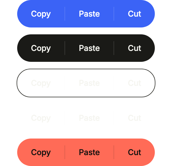
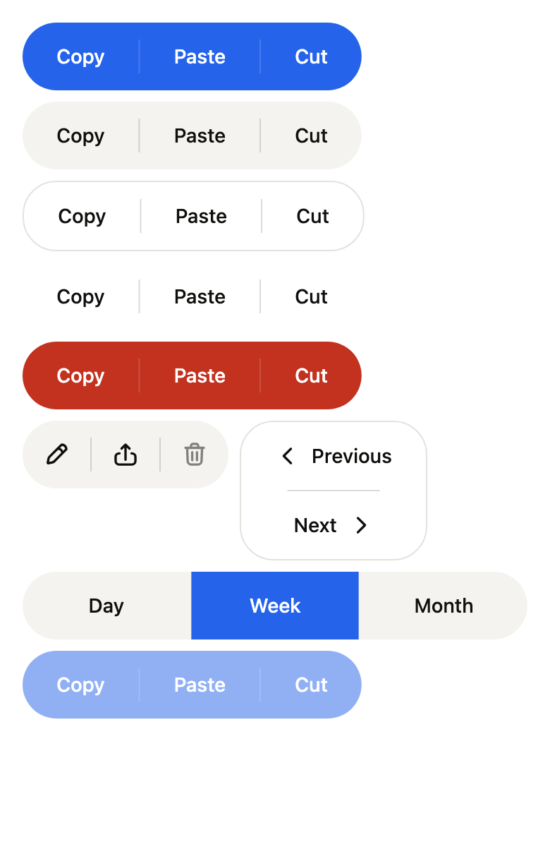
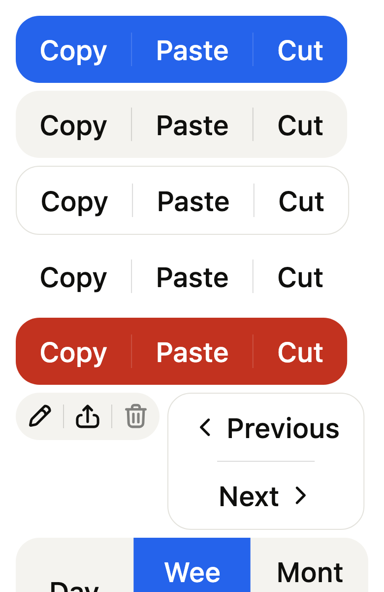
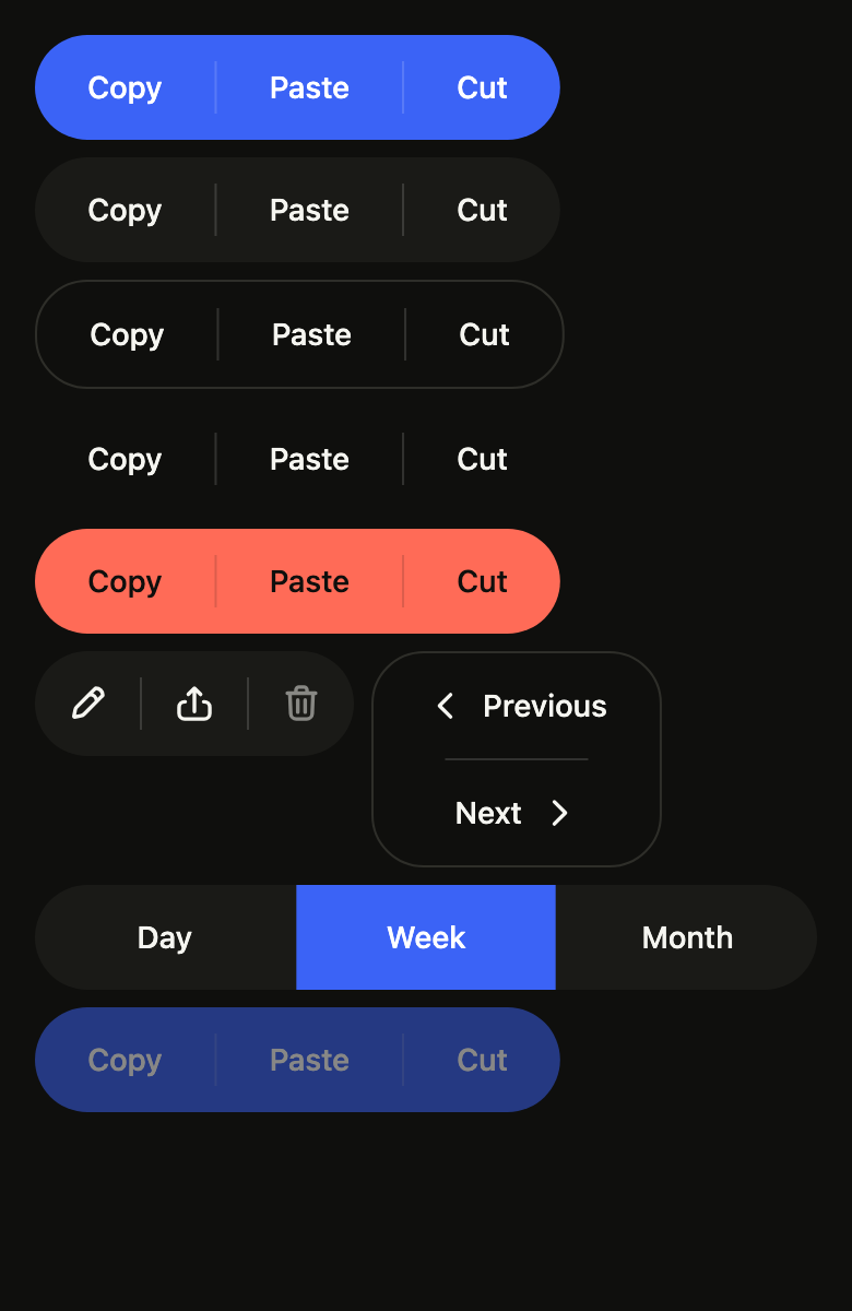
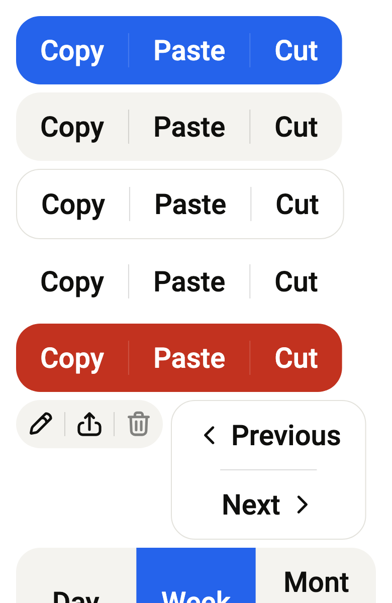
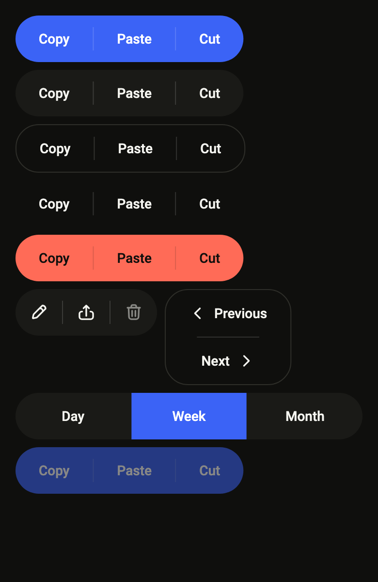
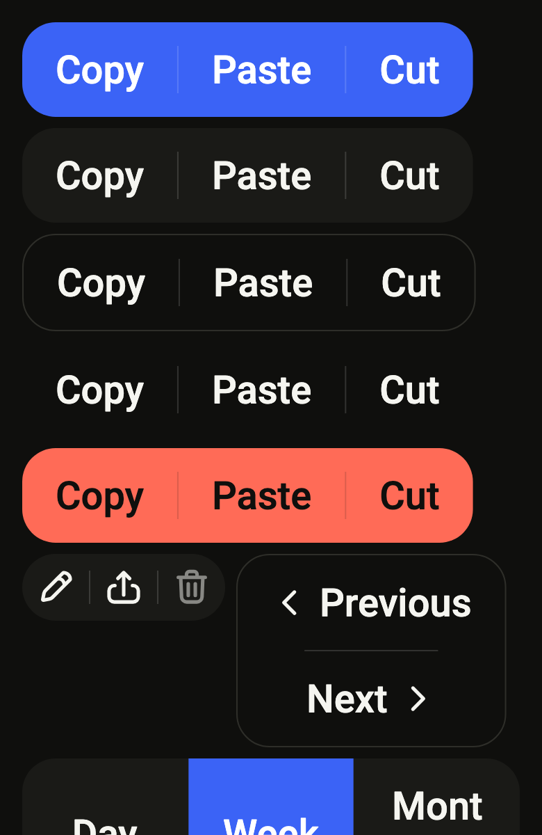
Joins related actions into one bar of attached buttons, such as copy, paste and cut: rounded only at both ends, hairlines between the buttons.
Import
In a Flutter app where fliin init has run:
Examples
Variants
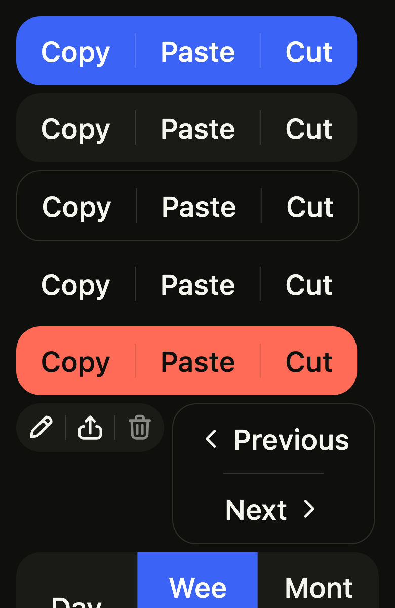
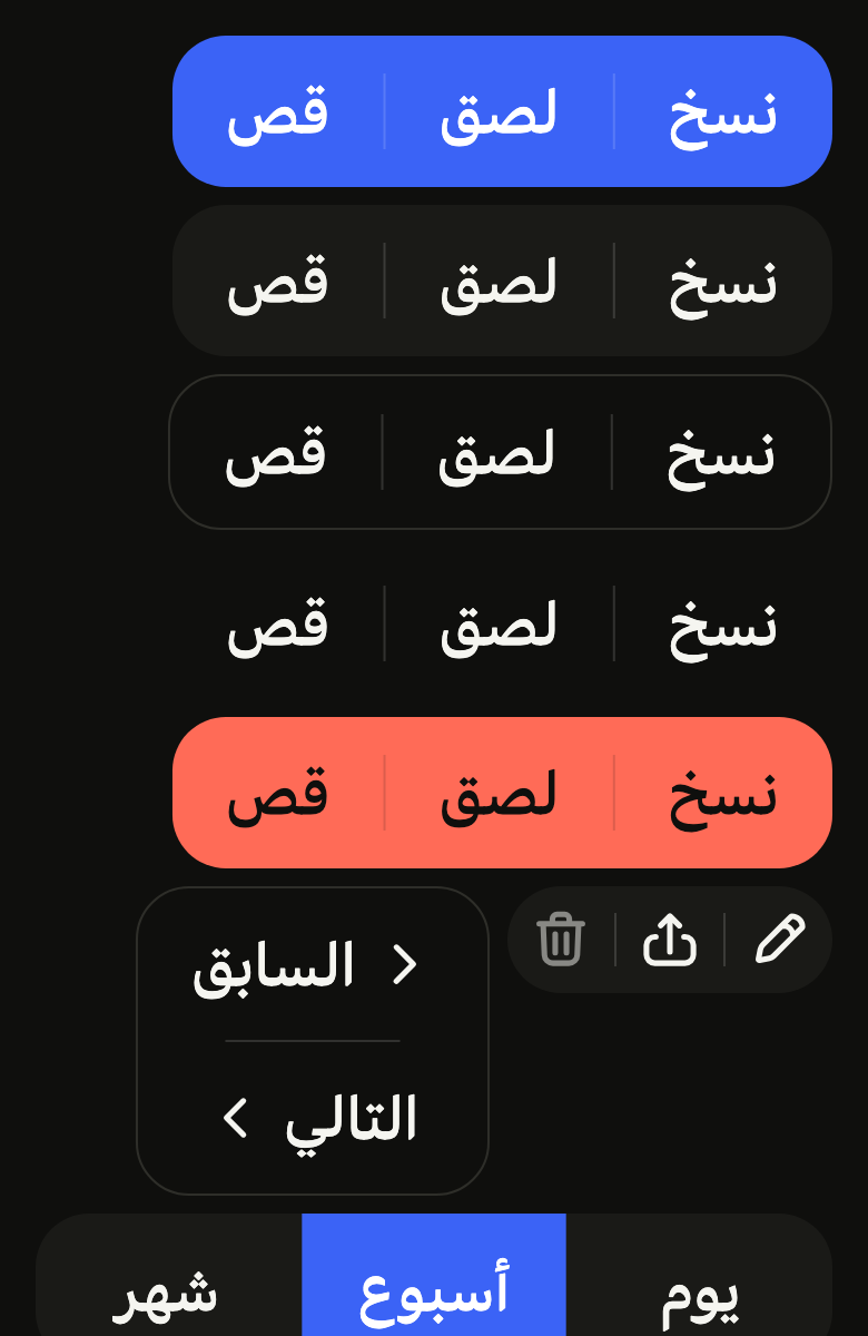
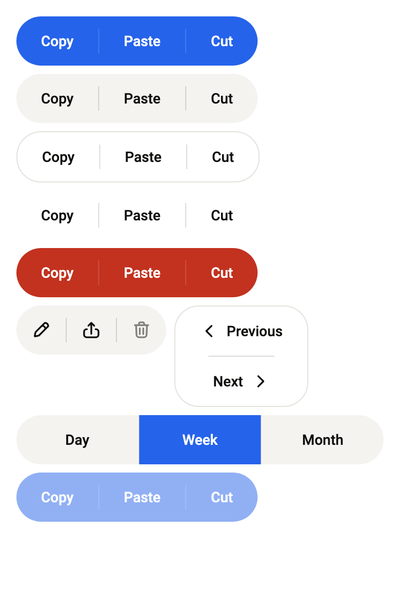
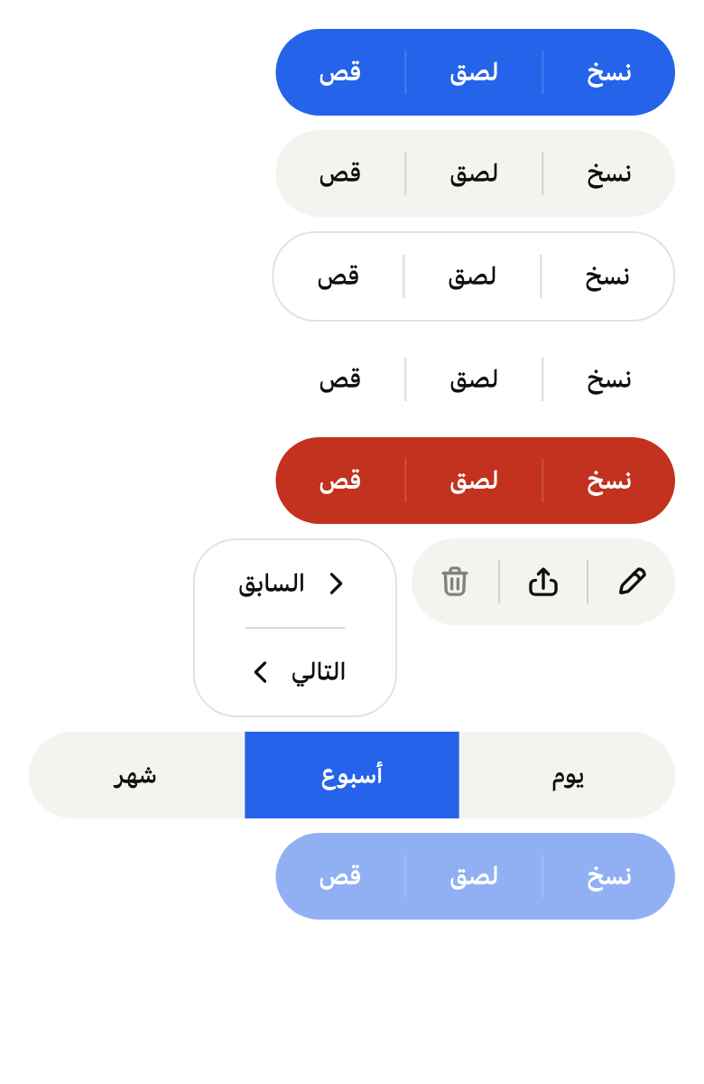
Buttons joined into one control, in the button variants: primary, tertiary, outline, ghost and danger.
import 'package:your_app/ui/fliin/components/button/fl_button.dart';
import 'package:your_app/ui/fliin/components/button_group/fl_button_group.dart';
import 'package:your_app/ui/fliin/core/fliin.dart';
import 'package:flutter/widgets.dart';

class ButtonGroupVariantsExample extends StatelessWidget {
  const ButtonGroupVariantsExample({super.key});

  @override
  Widget build(BuildContext context) {
    return Column(
      mainAxisSize: MainAxisSize.min,
      spacing: FlScope.of(context).space.md,
      children: [
        for (final variant in [
          FlButtonVariant.primary,
          FlButtonVariant.tertiary,
          FlButtonVariant.outline,
          FlButtonVariant.ghost,
          FlButtonVariant.danger,
        ])
          FlButtonGroup(
            variant: variant,
            items: [
              FlButtonGroupItem(label: 'Copy', onPressed: () {}),
              FlButtonGroupItem(label: 'Paste', onPressed: () {}),
              FlButtonGroupItem(label: 'Cut', onPressed: () {}),
            ],
          ),
      ],
    );
  }
}Icons
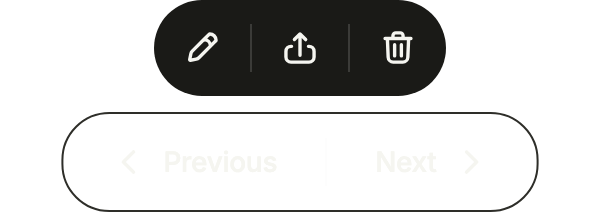
FlButtonGroupItem.icon for icon-only items, named by label, leading for an icon before the text and trailing after it. semanticLabel names the whole group.
import 'package:your_app/ui/fliin/components/button/fl_button.dart';
import 'package:your_app/ui/fliin/components/button_group/fl_button_group.dart';
import 'package:your_app/ui/fliin/core/fliin.dart';
import 'package:your_app/ui/fliin/icons/fl_icons.dart';
import 'package:flutter/widgets.dart';

class ButtonGroupIconsExample extends StatelessWidget {
  const ButtonGroupIconsExample({super.key});

  @override
  Widget build(BuildContext context) {
    final space = FlScope.of(context).space;
    return Wrap(
      alignment: WrapAlignment.center,
      crossAxisAlignment: WrapCrossAlignment.center,
      spacing: space.sm,
      runSpacing: space.sm,
      children: [
        FlButtonGroup(
          semanticLabel: 'Editing',
          items: [
            FlButtonGroupItem.icon(label: 'Edit', icon: FlIcon(FlIcons.pencil), onPressed: () {}),
            FlButtonGroupItem.icon(label: 'Share', icon: FlIcon(FlIcons.arrowUpFromSquare), onPressed: () {}),
            FlButtonGroupItem.icon(label: 'Delete', icon: FlIcon(FlIcons.trashBin), onPressed: () {}),
          ],
        ),
        FlButtonGroup(
          variant: FlButtonVariant.outline,
          items: [
            FlButtonGroupItem(label: 'Previous', leading: FlIcon(FlIcons.chevronLeft), onPressed: () {}),
            FlButtonGroupItem(label: 'Next', trailing: FlIcon(FlIcons.chevronRight), onPressed: () {}),
          ],
        ),
      ],
    );
  }
}Vertical
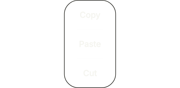
axis: Axis.vertical stacks the items, for a short list of actions in a narrow column.
import 'package:your_app/ui/fliin/components/button/fl_button.dart';
import 'package:your_app/ui/fliin/components/button_group/fl_button_group.dart';
import 'package:flutter/widgets.dart';

class ButtonGroupVerticalExample extends StatelessWidget {
  const ButtonGroupVerticalExample({super.key});

  @override
  Widget build(BuildContext context) {
    return Center(
      child: FlButtonGroup(
        axis: Axis.vertical,
        variant: FlButtonVariant.outline,
        items: [
          FlButtonGroupItem(label: 'Copy', onPressed: () {}),
          FlButtonGroupItem(label: 'Paste', onPressed: () {}),
          FlButtonGroupItem(label: 'Cut', onPressed: () {}),
        ],
      ),
    );
  }
}Full width
expanded: true stretches the group to its parent and shares the width equally between the items.

import 'package:your_app/ui/fliin/components/button_group/fl_button_group.dart';
import 'package:your_app/ui/fliin/core/fliin.dart';
import 'package:flutter/widgets.dart';

class ButtonGroupFullWidthExample extends StatelessWidget {
  const ButtonGroupFullWidthExample({super.key});

  @override
  Widget build(BuildContext context) {
    return Column(
      mainAxisSize: MainAxisSize.min,
      crossAxisAlignment: CrossAxisAlignment.stretch,
      spacing: FlScope.of(context).space.md,
      children: [
        FlButtonGroup(
          expanded: true,
          items: [
            FlButtonGroupItem(label: 'Copy', onPressed: () {}),
            FlButtonGroupItem(label: 'Paste', onPressed: () {}),
            FlButtonGroupItem(label: 'Cut', onPressed: () {}),
          ],
        ),
      ],
    );
  }
}Disabled
enabled: false disables every item of the group at once.

import 'package:your_app/ui/fliin/components/button/fl_button.dart';
import 'package:your_app/ui/fliin/components/button_group/fl_button_group.dart';
import 'package:flutter/widgets.dart';

class ButtonGroupDisabledExample extends StatelessWidget {
  const ButtonGroupDisabledExample({super.key});

  @override
  Widget build(BuildContext context) {
    return Center(
      child: FlButtonGroup(
        enabled: false,
        variant: FlButtonVariant.primary,
        items: [
          FlButtonGroupItem(label: 'Copy', onPressed: () {}),
          FlButtonGroupItem(label: 'Paste', onPressed: () {}),
          FlButtonGroupItem(label: 'Cut', onPressed: () {}),
        ],
      ),
    );
  }
}Sizes
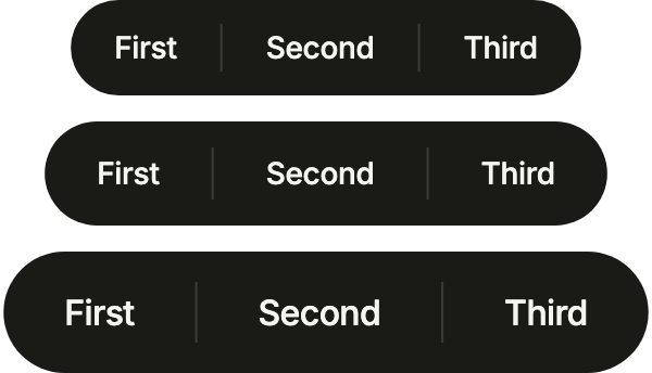
The three FlButtonSizes, the heights of a lone button: a group lines up with the buttons next to it.
import 'package:your_app/ui/fliin/components/button/fl_button.dart';
import 'package:your_app/ui/fliin/components/button_group/fl_button_group.dart';
import 'package:your_app/ui/fliin/core/fliin.dart';
import 'package:flutter/widgets.dart';

class ButtonGroupSizesExample extends StatelessWidget {
  const ButtonGroupSizesExample({super.key});

  @override
  Widget build(BuildContext context) {
    return Column(
      mainAxisSize: MainAxisSize.min,
      spacing: FlScope.of(context).space.md,
      children: [
        for (final size in FlButtonSize.values)
          FlButtonGroup(
            size: size,
            variant: FlButtonVariant.secondary,
            items: [
              FlButtonGroupItem(label: 'First', onPressed: () {}),
              FlButtonGroupItem(label: 'Second', onPressed: () {}),
              FlButtonGroupItem(label: 'Third', onPressed: () {}),
            ],
          ),
      ],
    );
  }
}Split
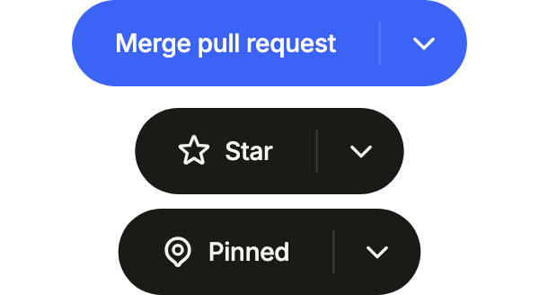
A split button: the main action, then a chevron that opens its other options (a menu, a sheet). The same shape joins an action to its quick companion.
import 'package:your_app/ui/fliin/components/button/fl_button.dart';
import 'package:your_app/ui/fliin/components/button_group/fl_button_group.dart';
import 'package:your_app/ui/fliin/core/fliin.dart';
import 'package:your_app/ui/fliin/icons/fl_icons.dart';
import 'package:flutter/widgets.dart';

class ButtonGroupSplitExample extends StatelessWidget {
  const ButtonGroupSplitExample({super.key});

  @override
  Widget build(BuildContext context) {
    final space = FlScope.of(context).space;
    return Column(
      mainAxisSize: MainAxisSize.min,
      spacing: space.md,
      children: [
        FlButtonGroup(
          variant: FlButtonVariant.primary,
          items: [
            FlButtonGroupItem(label: 'Merge pull request', onPressed: () {}),
            FlButtonGroupItem.icon(label: 'More merge options', icon: FlIcon(FlIcons.chevronDown), onPressed: () {}),
          ],
        ),
        Wrap(
          alignment: WrapAlignment.center,
          spacing: space.sm,
          runSpacing: space.sm,
          children: [
            FlButtonGroup(
              items: [
                FlButtonGroupItem(label: 'Star', leading: FlIcon(FlIcons.star), onPressed: () {}),
                FlButtonGroupItem.icon(label: 'More star options', icon: FlIcon(FlIcons.chevronDown), onPressed: () {}),
              ],
            ),
            FlButtonGroup(
              items: [
                FlButtonGroupItem(label: 'Pinned', leading: FlIcon(FlIcons.mapPin), onPressed: () {}),
                FlButtonGroupItem.icon(label: 'More pin options', icon: FlIcon(FlIcons.chevronDown), onPressed: () {}),
              ],
            ),
          ],
        ),
      ],
    );
  }
}Toggles
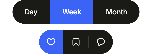
selected makes each item a toggle: one at a time for a choice, any number for options. Your state says which are on.
import 'package:your_app/ui/fliin/components/button_group/fl_button_group.dart';
import 'package:your_app/ui/fliin/core/fliin.dart';
import 'package:your_app/ui/fliin/icons/fl_icons.dart';
import 'package:flutter/widgets.dart';

class ButtonGroupTogglesExample extends StatefulWidget {
  const ButtonGroupTogglesExample({super.key});

  @override
  State<ButtonGroupTogglesExample> createState() => _ButtonGroupTogglesExampleState();
}

class _ButtonGroupTogglesExampleState extends State<ButtonGroupTogglesExample> {
  var _range = 'Week';
  final _alerts = {'Likes'};

  @override
  Widget build(BuildContext context) {
    return Column(
      mainAxisSize: MainAxisSize.min,
      spacing: FlScope.of(context).space.md,
      children: [
        FlButtonGroup(
          semanticLabel: 'Range',
          items: [
            for (final range in ['Day', 'Week', 'Month'])
              FlButtonGroupItem(
                label: range,
                selected: _range == range,
                onPressed: () => setState(() => _range = range),
              ),
          ],
        ),
        FlButtonGroup(
          semanticLabel: 'Alerts',
          items: [
            for (final (name, icon) in [
              ('Likes', FlIcons.heart),
              ('Saves', FlIcons.bookmark),
              ('Replies', FlIcons.comment),
            ])
              FlButtonGroupItem.icon(
                label: name,
                icon: FlIcon(icon),
                selected: _alerts.contains(name),
                onPressed: () => setState(() => _alerts.contains(name) ? _alerts.remove(name) : _alerts.add(name)),
              ),
          ],
        ),
      ],
    );
  }
}Without separator
separated: false drops the hairlines: the shared fill alone joins the buttons.

import 'package:your_app/ui/fliin/components/button_group/fl_button_group.dart';
import 'package:flutter/widgets.dart';

class ButtonGroupWithoutSeparatorExample extends StatelessWidget {
  const ButtonGroupWithoutSeparatorExample({super.key});

  @override
  Widget build(BuildContext context) {
    return Center(
      child: FlButtonGroup(
        separated: false,
        items: [
          FlButtonGroupItem(label: 'First', onPressed: () {}),
          FlButtonGroupItem(label: 'Second', onPressed: () {}),
          FlButtonGroupItem(label: 'Third', onPressed: () {}),
        ],
      ),
    );
  }
}Usage
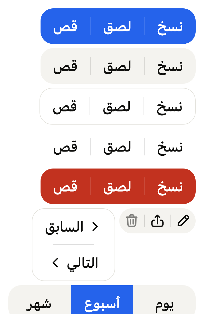
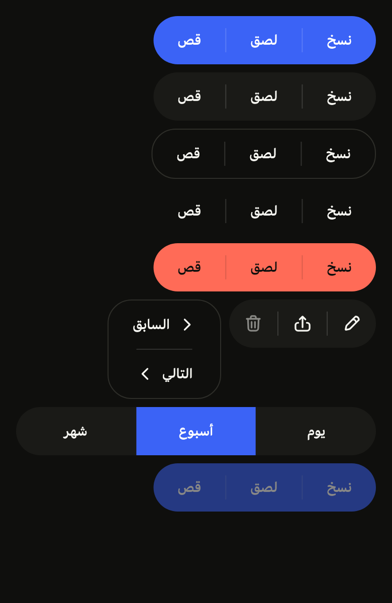
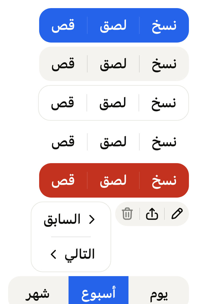
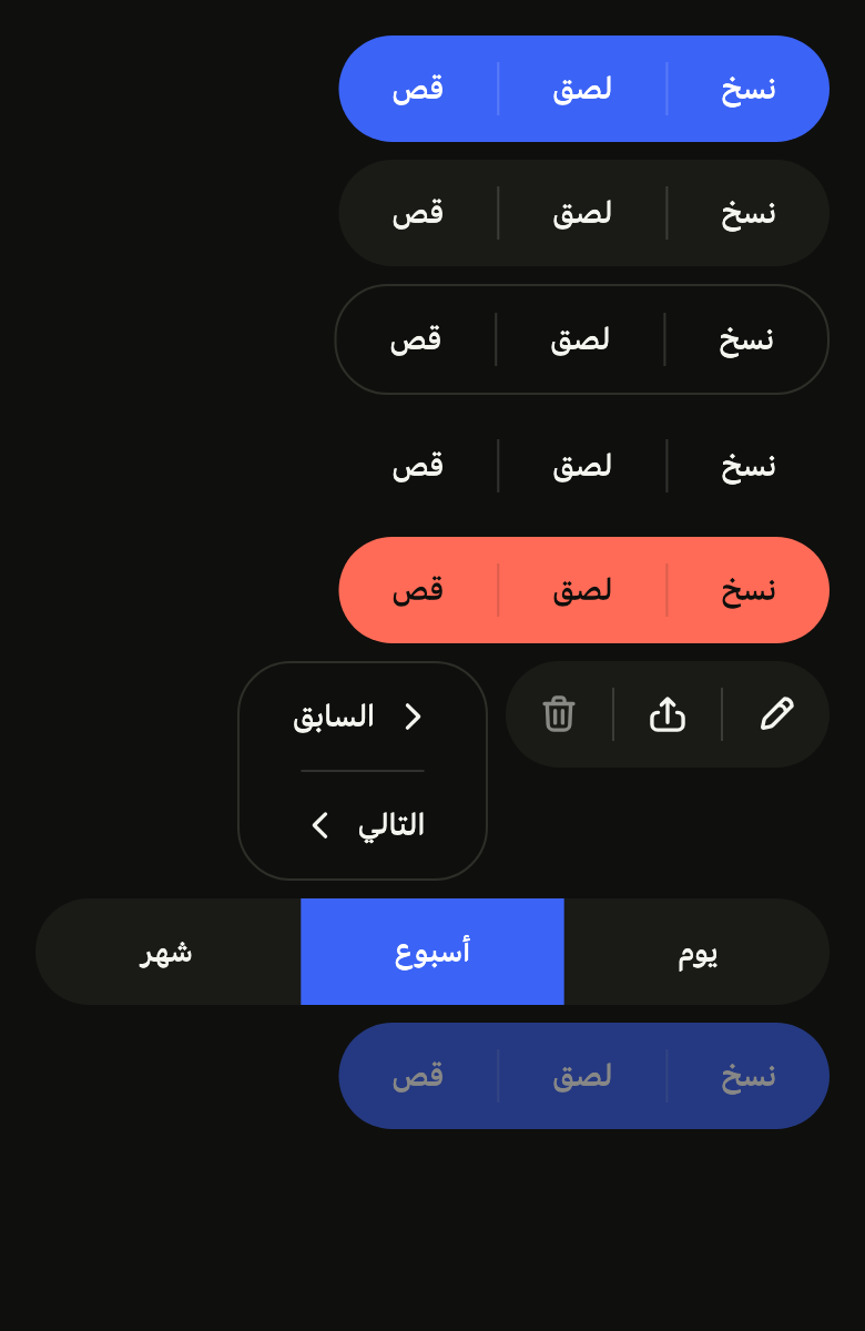
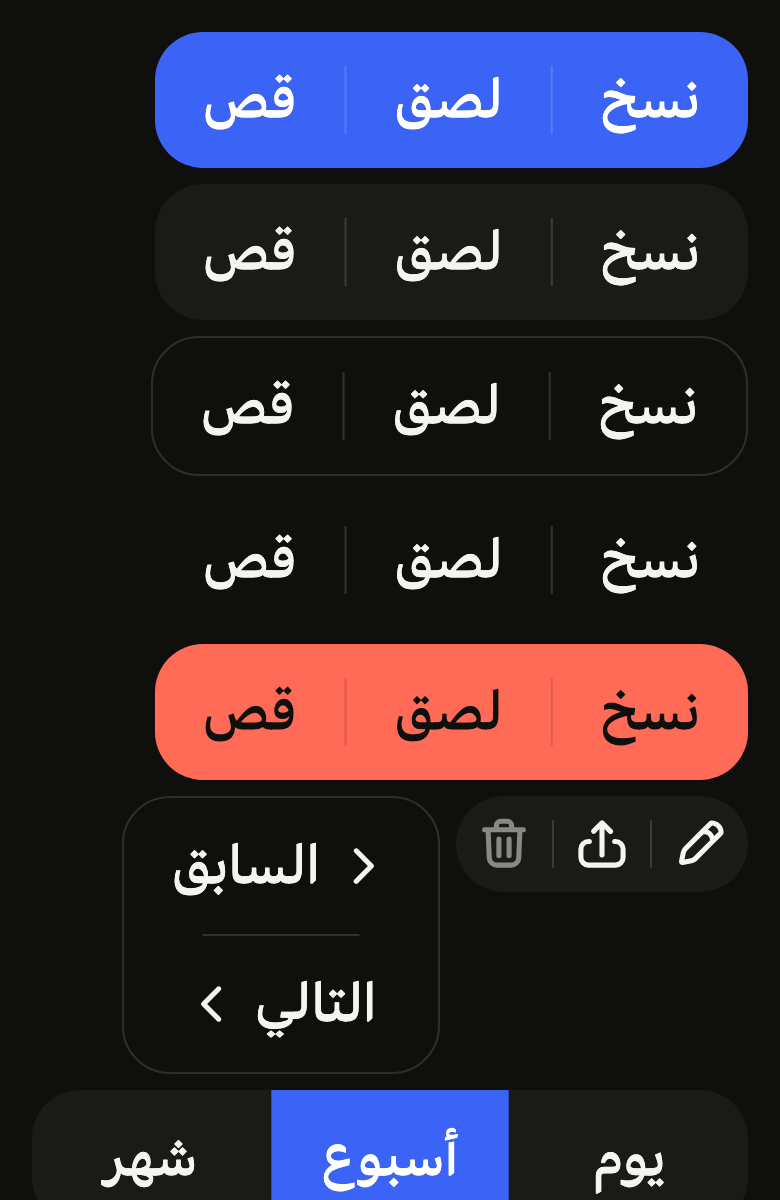
The code the reference images render:
final example = ColoredBox(
  color: FlScope.of(context).colors.surface,
  child: SingleChildScrollView(
    padding: EdgeInsetsDirectional.all(FlScope.of(context).space.lg),
    child: Column(
      crossAxisAlignment: CrossAxisAlignment.stretch,
      spacing: FlScope.of(context).space.sm,
      children: [
        Wrap(
          spacing: FlScope.of(context).space.sm,
          runSpacing: FlScope.of(context).space.sm,
          children: [
            for (final look in [
              FlButtonVariant.primary,
              FlButtonVariant.tertiary,
              FlButtonVariant.outline,
              FlButtonVariant.ghost,
              FlButtonVariant.danger,
            ])
              FlButtonGroup(
                variant: look,
                items: [
                  FlButtonGroupItem(label: 'Copy', onPressed: () {}),
                  FlButtonGroupItem(label: 'Paste', onPressed: () {}),
                  FlButtonGroupItem(label: 'Cut', onPressed: () {}),
                ],
              ),
            FlButtonGroup(
              semanticLabel: 'Edit',
              items: [
                FlButtonGroupItem.icon(
                  label: 'Edit',
                  icon: FlIcon(FlIcons.pencil),
                  onPressed: () {},
                ),
                FlButtonGroupItem.icon(
                  label: 'Share',
                  icon: FlIcon(FlIcons.arrowUpFromSquare),
                  onPressed: () {},
                ),
                FlButtonGroupItem.icon(
                  label: 'Delete',
                  icon: FlIcon(FlIcons.trashBin),
                  onPressed: null,
                ),
              ],
            ),
            FlButtonGroup(
              axis: Axis.vertical,
              variant: FlButtonVariant.outline,
              items: [
                FlButtonGroupItem(
                  label: 'Previous',
                  leading: FlIcon(FlIcons.chevronLeft),
                  onPressed: () {},
                ),
                FlButtonGroupItem(
                  label: 'Next',
                  trailing: FlIcon(FlIcons.chevronRight),
                  onPressed: () {},
                ),
              ],
            ),
          ],
        ),
        FlButtonGroup(
          expanded: true,
          items: [
            FlButtonGroupItem(label: 'Day', selected: false, onPressed: () {}),
            FlButtonGroupItem(label: 'Week', selected: true, onPressed: () {}),
            FlButtonGroupItem(
              label: 'Month',
              selected: false,
              onPressed: () {},
            ),
          ],
        ),
        Align(
          alignment: AlignmentDirectional.centerStart,
          child: FlButtonGroup(
            enabled: false,
            variant: FlButtonVariant.primary,
            items: [
              FlButtonGroupItem(label: 'Copy', onPressed: () {}),
              FlButtonGroupItem(label: 'Paste', onPressed: () {}),
              FlButtonGroupItem(label: 'Cut', onPressed: () {}),
            ],
          ),
        ),
      ],
    ),
  ),
);API
FlButtonGroupItem: final class
FlButtonGroupItem.new: const new({required String label, required VoidCallback? onPressed, Widget? leading, Widget? trailing, bool? selected})
FlButtonGroupItem.icon: get Widget?
FlButtonGroupItem.label: get String
FlButtonGroupItem.leading: get Widget?
FlButtonGroupItem.trailing: get Widget?
FlButtonGroupItem.selected: get bool?
FlButtonGroupItem.onPressed: get VoidCallback?
FlButtonGroup: class extends StatelessWidget
FlButtonGroup.new: const new({super.key, required List<FlButtonGroupItem> items, FlButtonVariant variant, FlButtonSize? size, Axis axis, bool expanded, bool separated, bool enabled, String? semanticLabel})
FlButtonGroup.items: get List<FlButtonGroupItem>
FlButtonGroup.variant: get FlButtonVariant
FlButtonGroup.size: get FlButtonSize?
FlButtonGroup.axis: get Axis
FlButtonGroup.expanded: get bool
FlButtonGroup.separated: get bool
FlButtonGroup.enabled: get bool
FlButtonGroup.semanticLabel: get String?
FlButtonGroup.build: Widget(BuildContext context)Reference renders
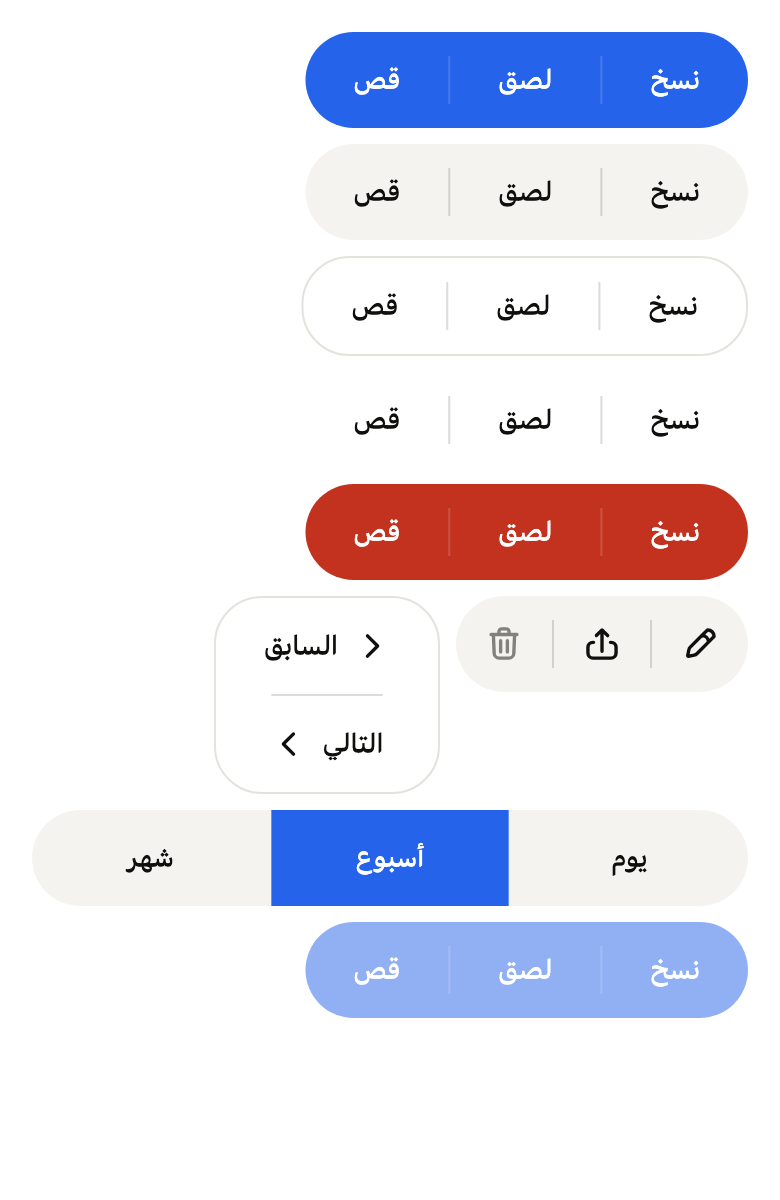
The 16 images published with version 0.1.1, rendered by the shared harness on macOS with Flutter 3.47.7. fliin verify button-group compares your copy to them.
Use it to
- keep copy, paste and cut joined in one strip
- offer edit, share and delete side by side on a document
- keep back and forward actions attached side by side
- make a split row of related actions
- keep attached buttons inside one shared shape
- present related actions stacked in one block
- Not for
- a single choice among several options: use the segmented control (segmented)
- a toolbar with keyboard navigation: use the toolbar (toolbar)
- a single action: use a button (button)
- States
Source
The files fliin add button-group copies into your app, before your prefix and imports are applied.
button_group/fl_button_group.dart
// Modified from the ButtonGroup of HeroUI React v3, Copyright 2025 NextUI Inc.,
// licensed under Apache 2.0: https://www.apache.org/licenses/LICENSE-2.0
import 'package:flutter/widgets.dart';
import 'package:fliin_ui/components/button/fl_button.dart';
import 'package:fliin_ui/core/fliin.dart';

/// A button of an [FlButtonGroup]: its [label], optional [leading] and
/// [trailing] icons, or an [icon] alone, and what it does. With [selected],
/// it is a toggle of the group: bold, italic,
/// underline.
final class FlButtonGroupItem {
  /// A labeled button.
  const FlButtonGroupItem({required this.label, required this.onPressed, this.leading, this.trailing, this.selected})
    : icon = null;

  /// A square button that shows only [icon]; [label] remains what the screen
  /// reader reads.
  const FlButtonGroupItem.icon({required this.label, required Widget this.icon, required this.onPressed, this.selected})
    : leading = null,
      trailing = null;

  /// The text shown, and read by the screen reader.
  final String label;

  /// An icon before the text, in the text's tint.
  final Widget? leading;

  /// An icon after the text, in the text's tint: a chevron that opens a
  /// menu, a next arrow.
  final Widget? trailing;

  /// The icon of an icon-only button.
  final Widget? icon;

  /// On or off, for a toggle; null for an action. On, the button takes the
  /// `selected` fill and `onSelected` tint, like [FlButton]'s selected
  /// state, and the screen reader reads it as selected; the app keeps the
  /// state (one item on for an exclusive choice, any number for options).
  final bool? selected;

  /// Called when the button is pressed; null disables this button alone, at
  /// `size.disabledOpacity`.
  final VoidCallback? onPressed;
}

typedef _Paint = ({Color? fill, Color? border, Color foreground, Color highlight, Color? hover});

/// Related actions joined into one control: two to
/// five [items] side by side, or stacked when [axis] is vertical, sharing
/// one [variant] fill and one outer shape; only the ends of the row are
/// rounded, by the theme's button shape. A hairline at half the height, in
/// the text color at 15 %, separates two buttons unless [separated] is
/// false. The buttons do not shrink when pressed: their fill
/// steps to the hovered state, then the press veil appears.
///
/// The same heights as [FlButton], so a group lines up with a lone button.
/// Items with `selected` make it a group of toggles: text styles, filters.
/// For one exclusive choice among views, `segmented` slides its thumb.
///
/// ```dart
/// FlButtonGroup(items: [
///   FlButtonGroupItem(label: 'Merge', onPressed: merge),
///   FlButtonGroupItem.icon(label: 'More', icon: FlIcon(FlIcons.chevronDown), onPressed: openMenu),
/// ])
/// ```
class FlButtonGroup extends StatelessWidget {
  /// A group of [items], `tertiary` by default.
  const FlButtonGroup({
    super.key,
    required this.items,
    this.variant = FlButtonVariant.tertiary,
    this.size,
    this.axis = Axis.horizontal,
    this.expanded = false,
    this.separated = true,
    this.enabled = true,
    this.semanticLabel,
  }) : assert(items.length >= 2 && items.length <= 5, 'two to five buttons');

  /// The buttons, in reading order.
  final List<FlButtonGroupItem> items;

  /// The fill and the text color of the whole group, those of [FlButton].
  final FlButtonVariant variant;

  /// The height, the padding and the text size; null follows the theme's
  /// density.
  final FlButtonSize? size;

  /// A row, or a column whose buttons share the widest one's width.
  final Axis axis;

  /// True: the group takes the full width, its buttons share it equally
  /// A row only.
  final bool expanded;

  /// False: no hairline between the buttons.
  final bool separated;

  /// False: the whole group is faded, with neither touch nor focus.
  final bool enabled;

  /// The group's name for the screen reader ("Text alignment"); null, the
  /// buttons are read one after another.
  final String? semanticLabel;

  /// The colors of [variant], as in [FlButton]; [_Paint.hover] is the fill a
  /// button takes under the pointer, null when it keeps the group's.
  _Paint _paint(FlTheme theme) {
    final c = theme.colors;
    final k = theme.size.hoverBrightness;
    Color darker(Color fill) => Color.from(alpha: fill.a, red: fill.r * k, green: fill.g * k, blue: fill.b * k);
    final subtle = c.controlPressed.withValues(alpha: theme.size.pressedOverlayOpacity);
    return switch (variant) {
      FlButtonVariant.primary => (
        fill: c.accent,
        border: null,
        foreground: c.onAccent,
        highlight: c.accentPressed,
        hover: darker(c.accent),
      ),
      FlButtonVariant.secondary => (
        fill: c.control,
        border: null,
        foreground: c.onAccentSoft,
        highlight: c.controlPressed,
        hover: c.controlPressed,
      ),
      FlButtonVariant.tertiary => (
        fill: c.control,
        border: null,
        foreground: c.onControl,
        highlight: c.controlPressed,
        hover: c.controlPressed,
      ),
      FlButtonVariant.outline => (
        fill: null,
        border: c.border,
        foreground: c.onControl,
        highlight: subtle,
        hover: c.controlPressed,
      ),
      FlButtonVariant.ghost => (
        fill: null,
        border: null,
        foreground: c.onControl,
        highlight: subtle,
        hover: c.controlPressed,
      ),
      FlButtonVariant.danger => (
        fill: c.dangerFill,
        border: null,
        foreground: c.onDanger,
        highlight: c.dangerPressed,
        hover: darker(c.dangerFill),
      ),
      FlButtonVariant.dangerSoft => (
        fill: c.dangerSoft,
        border: null,
        foreground: c.onDangerSoft,
        highlight: c.dangerSoftPressed,
        hover: null,
      ),
      FlButtonVariant.inverse => (
        fill: c.selected,
        border: null,
        foreground: c.onSelected,
        highlight: Color.alphaBlend(c.onSelected.withValues(alpha: theme.size.pressedOverlayOpacity), c.selected),
        hover: darker(c.selected),
      ),
    };
  }

  @override
  Widget build(BuildContext context) {
    final theme = FlScope.of(context);
    final s = theme.size;
    final metrics = switch (size ?? FlButtonSize.of(theme.density)) {
      FlButtonSize.sm => (
        height: s.controlCompact,
        padding: s.buttonPaddingSm,
        gap: s.buttonGapSm,
        icon: s.buttonIconSm,
        text: FlTextRole.controlSm,
        radius: theme.shape.radiusButton,
      ),
      FlButtonSize.md => (
        height: s.controlComfortable,
        padding: s.buttonPaddingMd,
        gap: s.buttonGapMd,
        icon: s.buttonIconMd,
        text: FlTextRole.controlMd,
        radius: theme.shape.radiusButton,
      ),
      FlButtonSize.lg => (
        height: s.controlSpacious,
        padding: s.buttonPaddingLg,
        gap: s.buttonGapLg,
        icon: s.buttonIconLg,
        text: FlTextRole.controlLg,
        radius: theme.shape.radiusButtonLarge,
      ),
    };
    final paint = _paint(theme);
    final radius = switch (theme.shape.button) {
      FlButtonShape.square => 0.0,
      FlButtonShape.rounded => metrics.radius,
      // Half a button's height: a stadium in a row, the same round ends on
      // a column.
      FlButtonShape.pill => metrics.height / 2,
    };
    final border = paint.border;
    final inset = border == null ? 0.0 : s.border;
    final inner = Radius.circular((radius - inset).clamp(0, double.infinity));
    final horizontal = axis == Axis.horizontal;
    BorderRadiusDirectional corners(int i) {
      final first = i == 0;
      final last = i == items.length - 1;
      return horizontal
          ? BorderRadiusDirectional.horizontal(start: first ? inner : Radius.zero, end: last ? inner : Radius.zero)
          : BorderRadiusDirectional.vertical(top: first ? inner : Radius.zero, bottom: last ? inner : Radius.zero);
    }

    final iconSize = MediaQuery.textScalerOf(context).clamp(maxScaleFactor: s.iconMaxScale).scale(metrics.icon);
    final iconTheme = IconThemeData(color: paint.foreground, size: iconSize);
    final textStyle = theme.typography.resolve(metrics.text).copyWith(color: paint.foreground);
    final strut = theme.typography.strut(metrics.text, inheritedFamily: DefaultTextStyle.of(context).style.fontFamily);
    final block = (metrics.height - theme.typography.style(metrics.text).lineHeight) / 2;
    final motion = FlMotion.of(context);
    final scaler = MediaQuery.textScalerOf(context);

    // A button's width on one line: shares of the row in proportion to it
    // leave every label whole when the row fits, and shrink them alike when
    // it does not.
    double natural(FlButtonGroupItem item) {
      if (item.icon != null) return metrics.height;
      final painter = TextPainter(
        text: TextSpan(text: item.label, style: DefaultTextStyle.of(context).style.merge(textStyle)),
        strutStyle: strut,
        textScaler: scaler,
        textDirection: Directionality.of(context),
        maxLines: 1,
      )..layout();
      final width = painter.width;
      painter.dispose();
      final icons = [item.leading, item.trailing].nonNulls.length;
      return width + 2 * metrics.padding + icons * (iconSize + metrics.gap);
    }

    final c = theme.colors;
    // A selected toggle of a neutral group: the `selected` fill of FlButton's
    // toggles; a filled group keeps its colors and says it by its icon.
    final neutral = switch (variant) {
      FlButtonVariant.secondary || FlButtonVariant.tertiary || FlButtonVariant.outline || FlButtonVariant.ghost => true,
      _ => false,
    };
    bool on(int i) => neutral && items[i].selected == true;
    final onPaint = (
      fill: c.selected,
      border: null,
      foreground: c.onSelected,
      highlight: Color.alphaBlend(c.onSelected.withValues(alpha: s.pressedOverlayOpacity), c.selected),
      hover: c.selected,
    );

    Widget button(int i) {
      final item = items[i];
      final icon = item.icon;
      final leading = item.leading;
      final trailing = item.trailing;
      final selected = on(i);
      final look = selected ? onPaint : paint;
      final tint = selected ? IconThemeData(color: c.onSelected, size: iconSize) : iconTheme;
      final shape = RoundedRectangleBorder(borderRadius: corners(i));
      Widget glyph(Widget child) => FlPixelSnap(
        child: IconTheme.merge(data: tint, child: child),
      );
      final content = icon != null
          ? glyph(icon)
          : Row(
              mainAxisSize: MainAxisSize.min,
              spacing: metrics.gap,
              children: [
                if (leading != null) glyph(leading),
                Flexible(
                  child: Text(
                    item.label,
                    textAlign: TextAlign.center,
                    style: selected ? textStyle.copyWith(color: c.onSelected) : textStyle,
                    strutStyle: strut,
                  ),
                ),
                if (trailing != null) glyph(trailing),
              ],
            );
      return FlPressable(
        onPressed: enabled ? item.onPressed : null,
        label: item.label,
        selected: item.selected,
        borderRadius: corners(i),
        scaleOnPress: false,
        builder: (context, states) {
          final hovered =
              !states.contains(WidgetState.disabled) &&
              (states.contains(WidgetState.hovered) || states.contains(WidgetState.pressed));
          final hover = look.hover;
          return Opacity(
            // A disabled group fades once, as a whole.
            opacity: enabled && states.contains(WidgetState.disabled) ? s.disabledOpacity : 1,
            child: ConstrainedBox(
              constraints: BoxConstraints(minHeight: metrics.height, minWidth: icon == null ? 0 : metrics.height),
              // The hover fill fades in over 100 ms.
              child: TweenAnimationBuilder<Color?>(
                tween: ColorTween(
                  end: selected
                      ? c.selected
                      : hovered && hover != null
                      ? hover
                      : hover?.withValues(alpha: 0),
                ),
                duration: motion.reduced ? Duration.zero : theme.motion.short2,
                curve: theme.motion.easeOut,
                builder: (context, fill, child) => DecoratedBox(
                  decoration: ShapeDecoration(color: fill, shape: shape),
                  child: child,
                ),
                child: Stack(
                  alignment: Alignment.center,
                  children: [
                    Positioned.fill(
                      child: ClipPath(
                        clipper: ShapeBorderClipper(shape: shape, textDirection: Directionality.of(context)),
                        child: FlPressHighlight(color: look.highlight),
                      ),
                    ),
                    Padding(
                      padding: EdgeInsetsDirectional.symmetric(
                        horizontal: icon == null ? metrics.padding : 0,
                        vertical: icon == null ? block : 0,
                      ),
                      child: content,
                    ),
                  ],
                ),
              ),
            ),
          );
        },
      );
    }

    final hairline = paint.foreground.withValues(alpha: paint.foreground.a * 0.15);
    Widget separator() => horizontal
        ? SizedBox(
            width: s.border,
            child: FractionallySizedBox(heightFactor: 0.5, child: ColoredBox(color: hairline)),
          )
        : SizedBox(
            height: s.border,
            child: FractionallySizedBox(widthFactor: 0.5, child: ColoredBox(color: hairline)),
          );

    final children = [
      for (var i = 0; i < items.length; i++) ...[
        // Next to a selected toggle, its fill already marks the edge.
        if (i > 0 && separated)
          if (on(i - 1) || on(i))
            SizedBox(width: horizontal ? s.border : null, height: horizontal ? null : s.border)
          else
            separator(),
        // Loose otherwise: under large text, a label wraps rather than
        // pushing the group past its row.
        if (horizontal)
          (expanded ? Expanded(child: button(i)) : Flexible(flex: natural(items[i]).ceil(), child: button(i)))
        else
          button(i),
      ],
    ];
    final Widget line = horizontal
        ? IntrinsicHeight(
            child: Row(
              mainAxisSize: expanded ? MainAxisSize.max : MainAxisSize.min,
              crossAxisAlignment: CrossAxisAlignment.stretch,
              children: children,
            ),
          )
        : IntrinsicWidth(
            child: Column(
              mainAxisSize: MainAxisSize.min,
              crossAxisAlignment: CrossAxisAlignment.stretch,
              children: children,
            ),
          );
    final group = DecoratedBox(
      decoration: ShapeDecoration(
        color: paint.fill,
        shape: RoundedRectangleBorder(
          borderRadius: BorderRadius.circular(radius),
          side: border == null ? BorderSide.none : BorderSide(color: border, width: s.border),
        ),
      ),
      child: Padding(padding: EdgeInsetsDirectional.all(inset), child: line),
    );
    return Semantics(
      container: semanticLabel != null,
      label: semanticLabel,
      explicitChildNodes: true,
      child: Opacity(opacity: enabled ? 1 : s.disabledOpacity, child: group),
    );
  }
}