Components / navigation
Tab bar
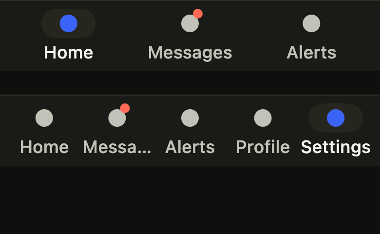
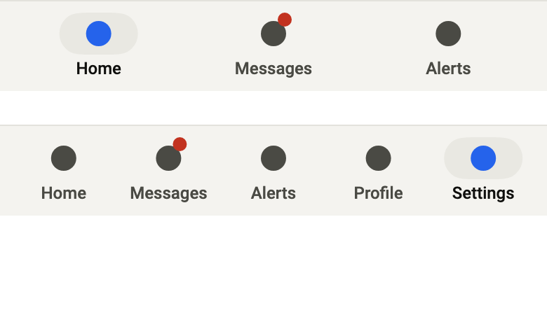
Switches between the main sections of an app from the bottom of the screen: three to five tabs with icon, label and badge, and a selection that springs from tab to tab.
Import
In a Flutter app where fliin init has run:
Examples
Selected
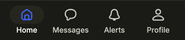
The bottom navigation: four tabs, the current one in the accent. onSelected gives the touched index; the screen keeps it.
import 'package:your_app/ui/fliin/components/tab_bar/fl_tab_bar.dart';
import 'package:your_app/ui/fliin/core/fliin.dart';
import 'package:your_app/ui/fliin/icons/fl_icons.dart';
import 'package:flutter/widgets.dart';

class TabBarSelectedExample extends StatefulWidget {
  const TabBarSelectedExample({super.key});

  @override
  State<TabBarSelectedExample> createState() => _TabBarSelectedExampleState();
}

class _TabBarSelectedExampleState extends State<TabBarSelectedExample> {
  var _index = 0;

  @override
  Widget build(BuildContext context) {
    return FlBottomTabBar(
      index: _index,
      onSelected: (index) => setState(() => _index = index),
      tabs: [
        FlBottomTab(icon: FlIcon(FlIcons.house), label: 'Home'),
        FlBottomTab(
          icon: FlIcon(FlIcons.comment),
          label: 'Messages',
        ),
        FlBottomTab(icon: FlIcon(FlIcons.bell), label: 'Alerts'),
        FlBottomTab(icon: FlIcon(FlIcons.person), label: 'Profile'),
      ],
    );
  }
}Badge
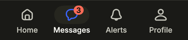
A tab can carry a badge at the corner of its icon, here the unread count, read out by the screen reader through its own label.
import 'package:your_app/ui/fliin/components/tab_bar/fl_tab_bar.dart';
import 'package:your_app/ui/fliin/core/fliin.dart';
import 'package:your_app/ui/fliin/icons/fl_icons.dart';
import 'package:flutter/widgets.dart';

class TabBarBadgeExample extends StatefulWidget {
  const TabBarBadgeExample({super.key});

  @override
  State<TabBarBadgeExample> createState() => _TabBarBadgeExampleState();
}

class _TabBarBadgeExampleState extends State<TabBarBadgeExample> {
  var _index = 1;

  @override
  Widget build(BuildContext context) {
    return FlBottomTabBar(
      index: _index,
      onSelected: (index) => setState(() => _index = index),
      tabs: [
        FlBottomTab(icon: FlIcon(FlIcons.house), label: 'Home'),
        FlBottomTab(
          icon: FlIcon(FlIcons.comment),
          label: 'Messages',
          badge: const _Count('3 unread', '3'),
        ),
        FlBottomTab(icon: FlIcon(FlIcons.bell), label: 'Alerts'),
        FlBottomTab(icon: FlIcon(FlIcons.person), label: 'Profile'),
      ],
    );
  }
}

/// A count at the corner of a tab icon, named by [label].
class _Count extends StatelessWidget {
  const _Count(this.label, this.count);

  final String label;
  final String count;

  @override
  Widget build(BuildContext context) {
    final theme = FlScope.of(context);
    return Semantics(
      label: label,
      excludeSemantics: true,
      child: Container(
        constraints: BoxConstraints(minWidth: theme.space.lg),
        padding: EdgeInsetsDirectional.symmetric(horizontal: theme.space.xs),
        decoration: ShapeDecoration(color: theme.colors.dangerFill, shape: const StadiumBorder()),
        child: Text(
          count,
          textAlign: TextAlign.center,
          textScaler: TextScaler.noScaling,
          style: theme.typography
              .resolve(FlTextRole.caption)
              .copyWith(color: theme.colors.onDanger, fontWeight: theme.tokens.typography.weight.semibold),
        ),
      ),
    );
  }
}Usage
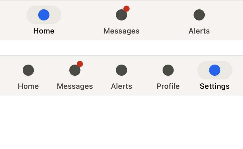
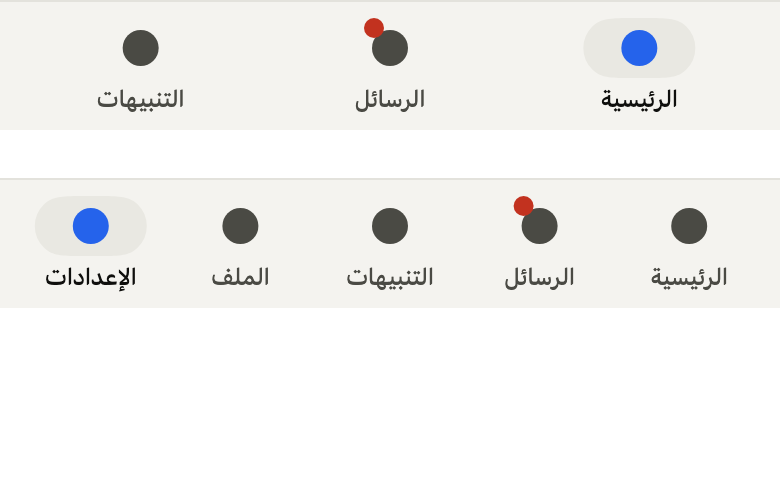
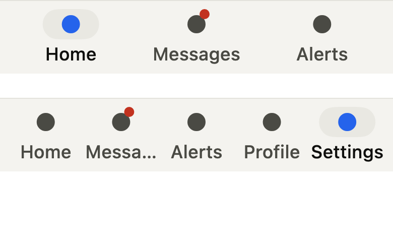
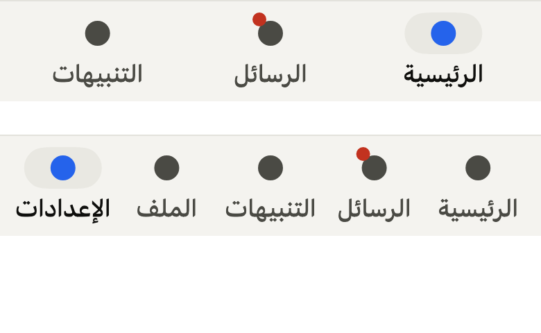
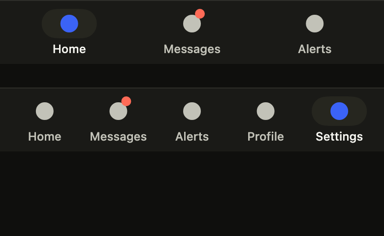
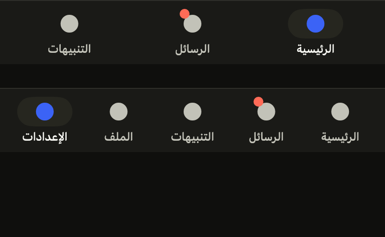
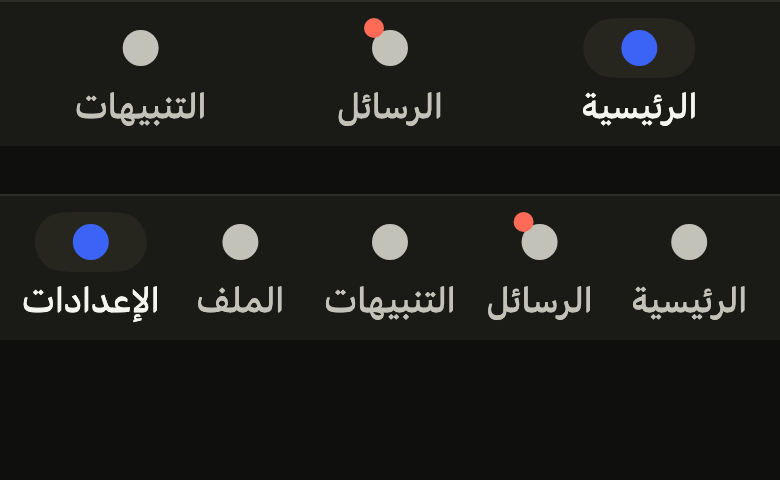
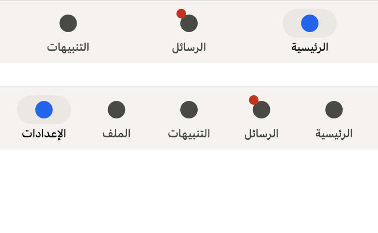
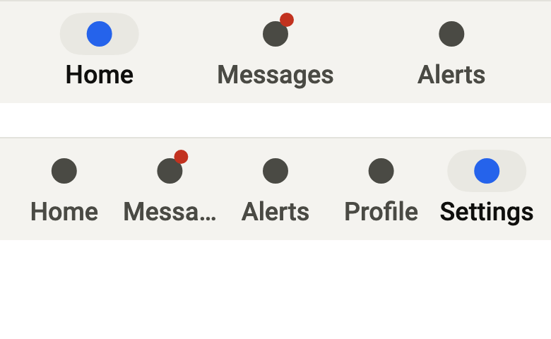
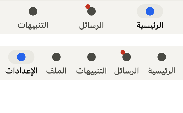
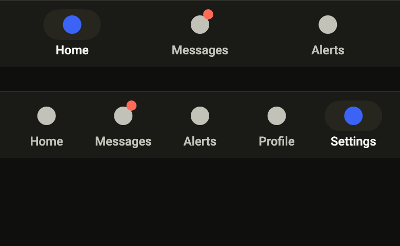
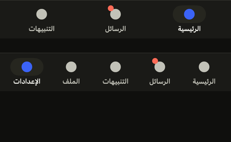
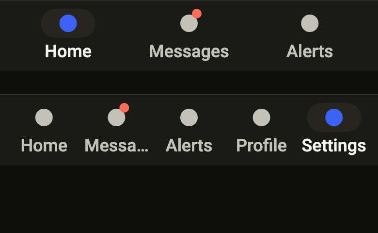
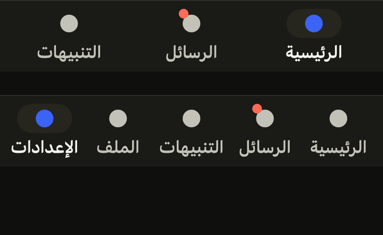
The code the reference images render:
final example = ColoredBox(
  color: FlScope.of(context).colors.surface,
  child: Column(
    crossAxisAlignment: CrossAxisAlignment.stretch,
    spacing: FlScope.of(context).space.xl,
    children: [
      for (final (count, index) in [(3, 0), (5, 4)])
        FlBottomTabBar(
          index: index,
          onSelected: (_) {},
          tabs: [
            for (final (fr, ar) in [
              ('Home', 'الرئيسية'),
              ('Messages', 'الرسائل'),
              ('Alerts', 'التنبيهات'),
              ('Profile', 'الملف'),
              ('Settings', 'الإعدادات'),
            ].take(count))
              FlBottomTab(
                label: fr,
                badge: fr == 'Messages'
                    ? Semantics(
                        label: 'Unread',
                        child: SizedBox.square(
                          dimension: 10,
                          child: DecoratedBox(
                            decoration: ShapeDecoration(
                              color: FlScope.of(context).colors.dangerFill,
                              shape: const CircleBorder(),
                            ),
                          ),
                        ),
                      )
                    : null,
                icon: Builder(
                  builder: (context) => SizedBox.square(
                    dimension: 18,
                    child: DecoratedBox(
                      decoration: ShapeDecoration(
                        color: IconTheme.of(context).color,
                        shape: const CircleBorder(),
                      ),
                    ),
                  ),
                ),
              ),
          ],
        ),
    ],
  ),
);API
FlBottomTab: final class
FlBottomTab.new: const new({required Widget icon, required String label, Widget? badge})
FlBottomTab.icon: get Widget
FlBottomTab.label: get String
FlBottomTab.badge: get Widget?
FlBottomTabBar: class extends StatefulWidget
FlBottomTabBar.new: const new({super.key, required List<FlBottomTab> tabs, required int index, required ValueChanged<int> onSelected})
FlBottomTabBar.tabs: get List<FlBottomTab>
FlBottomTabBar.index: get int
FlBottomTabBar.onSelected: get ValueChanged<int>
FlBottomTabBar.createState: State<FlBottomTabBar>()Reference renders
The 16 images published with version 0.2.3, rendered by the shared harness on macOS with Flutter 3.47.7. fliin verify tab-bar compares your copy to them.
Use it to
- switch between the main sections of the app
- add icon tabs with labels for the main sections
- show unread messages on a tab
- switch from home to profile in one tap
- keep the main sections within thumb reach
- Not for
- views of the same screen: use tabs (tabs)
- a screen's actions: use the app bar (app-bar)
- navigation tucked into a side panel: use a drawer (drawer)
- States
Source
The files fliin add tab-bar copies into your app, before your prefix and imports are applied.
tab_bar/fl_tab_bar.dart
// The sliding pill is modified from the Tabs indicator of HeroUI Native 1.0.10,
// Copyright 2025 NextUI Inc., licensed under Apache 2.0:
// https://www.apache.org/licenses/LICENSE-2.0
import 'package:flutter/semantics.dart' show SemanticsRole;
import 'package:flutter/services.dart' show LogicalKeyboardKey;
import 'package:flutter/widgets.dart';
import 'package:fliin_ui/core/fliin.dart';

/// A tab of an [FlBottomTabBar].
final class FlBottomTab {
  /// The [label] tab, drawn by [icon], with a [badge].
  const FlBottomTab({required this.icon, required this.label, this.badge});

  /// The icon, which reads its color and size from the `IconTheme`.
  final Widget icon;

  /// The label under the icon, read by the screen reader.
  final String label;

  /// A badge at the icon's corner (a count, a dot); its semantics are added
  /// to the tab's label.
  final Widget? badge;
}

/// The side of the tab icons, Izydesk's `.tab .i`.
const _iconSize = 22.0;

/// The pill of the selected tab, around the icon: Izydesk's `.tab-pill`.
const _pillWidth = 56.0;
const _pillHeight = 30.0;

/// An app's bottom navigation: three to five [tabs] side by side, the icon
/// above its label, above the bottom safe area.
///
/// The chosen tab [index] carries a `controlPressed` pill under its icon,
/// drawn in `selected`, and its `onSurface` label; the others are muted.
/// The pill slides to the chosen tab
/// with the `segment` spring of the tabs' indicator; under reduced motion,
/// it fades in in place.
///
/// The tabs follow one another by keyboard (tab and arrows) and activate
/// with Enter or Space; the screen reader reads a tab bar with exactly one
/// selected. The bar does not change tabs by itself: [onSelected] receives
/// the tapped index, even the one already selected, which the app can use
/// to scroll its list back to the top.
class FlBottomTabBar extends StatefulWidget {
  /// A bar of [tabs], with tab [index] selected.
  const FlBottomTabBar({super.key, required this.tabs, required this.index, required this.onSelected})
    : assert(tabs.length >= 3 && tabs.length <= 5, 'three to five tabs'),
      assert(index >= 0 && index < tabs.length);

  /// The tabs, in reading order.
  final List<FlBottomTab> tabs;

  /// The selected tab.
  final int index;

  /// Called with the index of the tapped tab.
  final ValueChanged<int> onSelected;

  @override
  State<FlBottomTabBar> createState() => _FlBottomTabBarState();
}

class _FlBottomTabBarState extends State<FlBottomTabBar> with TickerProviderStateMixin {
  late final AnimationController _position = AnimationController.unbounded(vsync: this, value: widget.index.toDouble());
  late final AnimationController _fade = AnimationController(vsync: this, value: 1);

  @override
  void didUpdateWidget(FlBottomTabBar oldWidget) {
    super.didUpdateWidget(oldWidget);
    if (oldWidget.index == widget.index) return;
    final motion = FlMotion.of(context);
    if (motion.reduced) {
      _position.value = widget.index.toDouble();
      _fade.value = 0;
      _fade.driveTo(1, FlFadeMotion(motion.tokens.short3));
    } else {
      _position.driveTo(widget.index.toDouble(), FlSpringMotion(motion.tokens.segment));
    }
  }

  @override
  void dispose() {
    _position.dispose();
    _fade.dispose();
    super.dispose();
  }

  @override
  Widget build(BuildContext context) {
    final theme = FlScope.of(context);
    final colors = theme.colors;
    final rtl = Directionality.of(context) == TextDirection.rtl;
    return DecoratedBox(
      decoration: BoxDecoration(
        color: colors.surfaceRaised,
        border: Border(
          top: BorderSide(color: colors.separator, width: theme.size.border),
        ),
      ),
      child: Padding(
        padding: EdgeInsetsDirectional.only(
          top: theme.size.border,
          bottom: MediaQuery.paddingOf(context).bottom,
          start: theme.space.sm,
          end: theme.space.sm,
        ),
        child: SafeArea(
          top: false,
          bottom: false,
          child: FocusTraversalGroup(
            child: Shortcuts(
              shortcuts: const {
                SingleActivator(LogicalKeyboardKey.arrowLeft): DirectionalFocusIntent(TraversalDirection.left),
                SingleActivator(LogicalKeyboardKey.arrowRight): DirectionalFocusIntent(TraversalDirection.right),
              },
              child: Actions(
                actions: {DirectionalFocusIntent: DirectionalFocusAction()},
                child: CustomPaint(
                  painter: _PillPainter(
                    position: _position,
                    fade: _fade,
                    count: widget.tabs.length,
                    rtl: rtl,
                    top: theme.space.sm,
                    radius: theme.shape.radiusCard,
                    color: colors.controlPressed,
                  ),
                  child: Semantics(
                    container: true,
                    role: SemanticsRole.tabBar,
                    explicitChildNodes: true,
                    child: Row(
                      crossAxisAlignment: CrossAxisAlignment.start,
                      children: [
                        for (final (i, tab) in widget.tabs.indexed)
                          Expanded(
                            child: _Tab(
                              tab: tab,
                              selected: i == widget.index,
                              nearness: _position,
                              index: i,
                              onPressed: () => widget.onSelected(i),
                            ),
                          ),
                      ],
                    ),
                  ),
                ),
              ),
            ),
          ),
        ),
      ),
    );
  }
}

class _Tab extends StatelessWidget {
  const _Tab({
    required this.tab,
    required this.selected,
    required this.nearness,
    required this.index,
    required this.onPressed,
  });

  final FlBottomTab tab;
  final bool selected;

  /// The pill's position, from which the tab derives its color.
  final Animation<double> nearness;
  final int index;
  final VoidCallback onPressed;

  @override
  Widget build(BuildContext context) {
    final theme = FlScope.of(context);
    final colors = theme.colors;
    const role = FlTextRole.caption;
    final badge = tab.badge;
    return FlPressable(
      onPressed: onPressed,
      role: SemanticsRole.tab,
      borderRadius: BorderRadius.circular(theme.shape.radiusCard),
      scaleOnPress: false,
      overlay: FlPressOverlay.none,
      focusRing: FlFocusRingPlacement.inside,
      builder: (context, states) {
        // Hovered or pressed, a tab not chosen shows the pill in
        // `surfaceSecondary`, under the sliding one.
        final touched = !selected && (states.contains(WidgetState.hovered) || states.contains(WidgetState.pressed));
        return Semantics(
          selected: selected,
          child: AnimatedBuilder(
            animation: nearness,
            builder: (context, _) {
              final t = (1 - (nearness.value - index).abs()).clamp(0.0, 1.0);
              return Padding(
                padding: EdgeInsets.symmetric(vertical: theme.space.sm),
                // The label comes first in the tree, so that the screen reader
                // reads it before the badge; it is displayed below.
                child: Column(
                  mainAxisSize: MainAxisSize.min,
                  verticalDirection: VerticalDirection.up,
                  spacing: theme.space.xs / 2,
                  children: [
                    Text(
                      tab.label,
                      maxLines: 1,
                      overflow: TextOverflow.ellipsis,
                      softWrap: false,
                      textAlign: TextAlign.center,
                      textScaler: MediaQuery.textScalerOf(context).clamp(maxScaleFactor: theme.size.iconMaxScale),
                      style: theme.typography
                          .resolve(role)
                          .copyWith(
                            color: Color.lerp(colors.onSurfaceMuted, colors.onSurface, t),
                            // Medium, not Izydesk's regular: at 12, regular
                            // Arabic labels fail the measured contrast.
                            fontWeight: theme.tokens.typography.weight.medium,
                          ),
                      strutStyle: theme.typography.strut(
                        role,
                        inheritedFamily: DefaultTextStyle.of(context).style.fontFamily,
                      ),
                    ),
                    Container(
                      height: _pillHeight,
                      width: _pillWidth,
                      decoration: touched
                          ? ShapeDecoration(
                              color: colors.surfaceSecondary,
                              shape: FlContinuousBorder(radius: _pillRadius(theme.shape.radiusCard)),
                            )
                          : null,
                      child: Center(
                        child: Stack(
                          clipBehavior: Clip.none,
                          children: [
                            IconTheme.merge(
                              data: IconThemeData(
                                size: _iconSize,
                                // The chosen tab's icon in `selected`, the
                                // selection color; its label stays in
                                // `onSurface`, which text contrast needs.
                                color: Color.lerp(colors.onSurfaceMuted, colors.selected, t),
                              ),
                              child: SizedBox.square(
                                dimension: _iconSize,
                                child: Center(child: tab.icon),
                              ),
                            ),
                            if (badge != null)
                              PositionedDirectional(
                                top: -theme.space.xs,
                                start: _iconSize - theme.space.sm,
                                child: badge,
                              ),
                          ],
                        ),
                      ),
                    ),
                  ],
                ),
              );
            },
          ),
        );
      },
    );
  }
}

/// The pill's corners: `shape.radiusCard`, a capsule at most.
double _pillRadius(double radius) => radius < _pillHeight / 2 ? radius : _pillHeight / 2;

/// The pill under the icon of the tab that [position] designates, halfway
/// between two tabs during the spring.
class _PillPainter extends CustomPainter {
  _PillPainter({
    required this.position,
    required this.fade,
    required this.count,
    required this.rtl,
    required this.top,
    required this.radius,
    required this.color,
  }) : super(repaint: Listenable.merge([position, fade]));

  final Animation<double> position;
  final Animation<double> fade;
  final int count;
  final bool rtl;
  final double top;
  final double radius;
  final Color color;

  @override
  void paint(Canvas canvas, Size size) {
    final slot = size.width / count;
    final along = (position.value + 0.5) * slot;
    final center = Offset(rtl ? size.width - along : along, top + _pillHeight / 2);
    final rect = Rect.fromCenter(center: center, width: _pillWidth, height: _pillHeight);
    canvas.drawPath(
      FlContinuousBorder.pathFor(rect, _pillRadius(radius)),
      Paint()..color = color.withValues(alpha: color.a * fade.value.clamp(0.0, 1.0)),
    );
  }

  @override
  bool shouldRepaint(_PillPainter oldDelegate) =>
      count != oldDelegate.count ||
      rtl != oldDelegate.rtl ||
      top != oldDelegate.top ||
      radius != oldDelegate.radius ||
      color != oldDelegate.color;
}