Components / navigation
Pagination
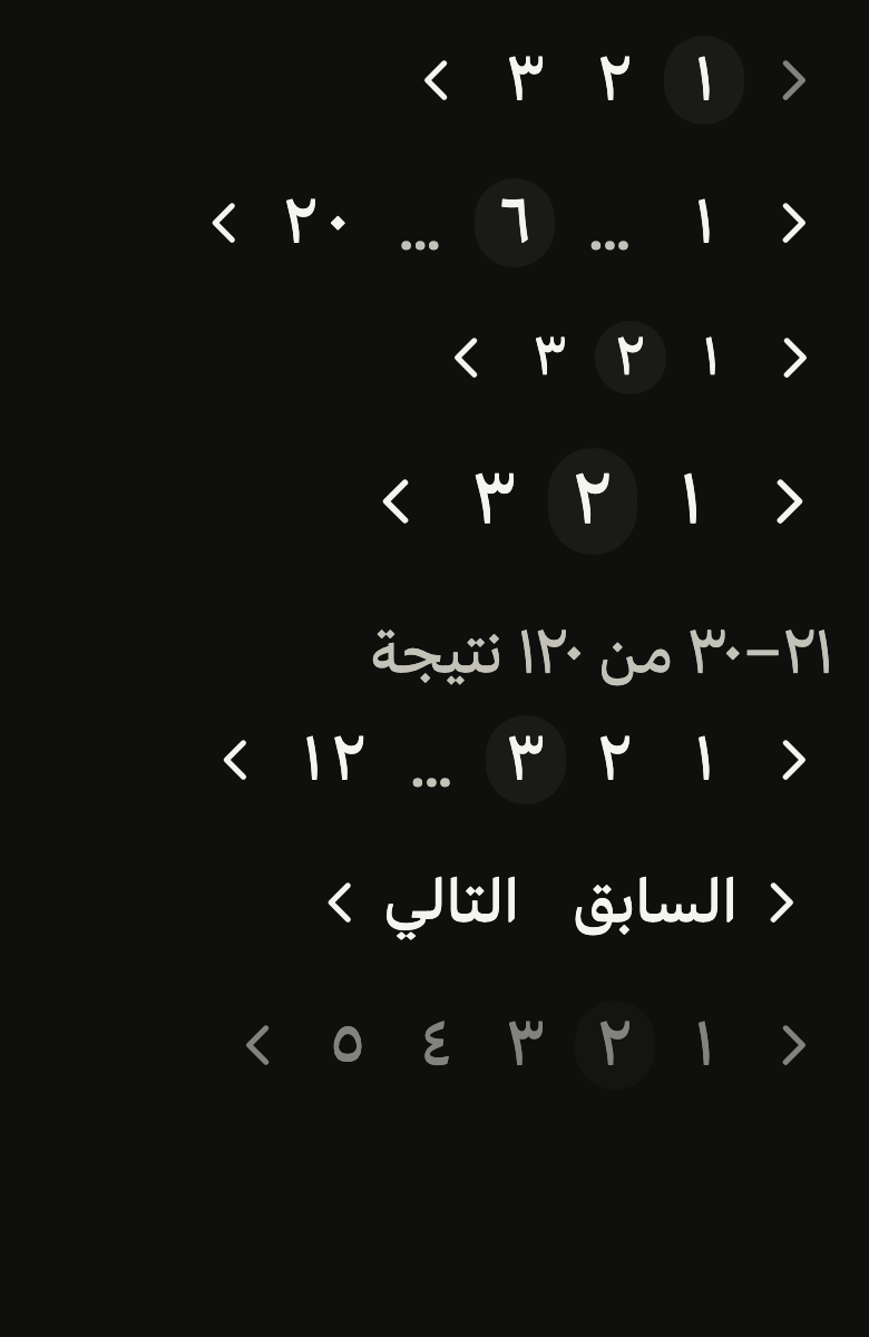
Moves from one page of results to another: previous, numbers with ellipses, next, and a summary; compact on a phone, it folds what does not fit.
Import
In a Flutter app where fliin init has run:
Examples
First
On the first page, showNavLabels writes Previous and Next beside the arrows, and Previous is disabled.

import 'package:your_app/ui/fliin/components/pagination/fl_pagination.dart';
import 'package:flutter/widgets.dart';

class PaginationFirstExample extends StatefulWidget {
  const PaginationFirstExample({super.key});

  @override
  State<PaginationFirstExample> createState() => _PaginationFirstExampleState();
}

class _PaginationFirstExampleState extends State<PaginationFirstExample> {
  var _page = 1;

  @override
  Widget build(BuildContext context) {
    return Center(
      child: FlPagination(
        page: _page,
        pageCount: 3,
        onChanged: (page) => setState(() => _page = page),
        previousLabel: 'Previous',
        nextLabel: 'Next',
        pageLabel: (n) => 'Page $n',
        showNavLabels: true,
      ),
    );
  }
}Middle
Among many pages, the first, the last and the neighbors of the current one stay visible; ellipses stand for the rest.

import 'package:your_app/ui/fliin/components/pagination/fl_pagination.dart';
import 'package:flutter/widgets.dart';

class PaginationMiddleExample extends StatefulWidget {
  const PaginationMiddleExample({super.key});

  @override
  State<PaginationMiddleExample> createState() => _PaginationMiddleExampleState();
}

class _PaginationMiddleExampleState extends State<PaginationMiddleExample> {
  var _page = 6;

  @override
  Widget build(BuildContext context) {
    return Center(
      child: FlPagination(
        page: _page,
        pageCount: 20,
        onChanged: (page) => setState(() => _page = page),
        previousLabel: 'Previous',
        nextLabel: 'Next',
        pageLabel: (n) => 'Page $n',
      ),
    );
  }
}Sizes
Three sizes, from sm to lg, to match the density of the list above.
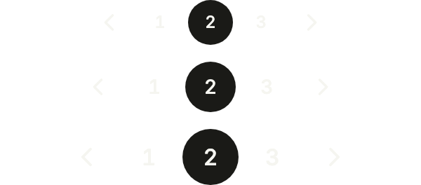
import 'package:your_app/ui/fliin/components/pagination/fl_pagination.dart';
import 'package:your_app/ui/fliin/core/fliin.dart';
import 'package:flutter/widgets.dart';

class PaginationSizesExample extends StatefulWidget {
  const PaginationSizesExample({super.key});

  @override
  State<PaginationSizesExample> createState() => _PaginationSizesExampleState();
}

class _PaginationSizesExampleState extends State<PaginationSizesExample> {
  var _page = 2;

  @override
  Widget build(BuildContext context) {
    return Column(
      mainAxisSize: MainAxisSize.min,
      spacing: FlScope.of(context).space.md,
      children: [
        for (final size in FlPaginationSize.values)
          FlPagination(
            page: _page,
            pageCount: 3,
            onChanged: (page) => setState(() => _page = page),
            previousLabel: 'Previous',
            nextLabel: 'Next',
            pageLabel: (n) => 'Page $n',
            size: size,
          ),
      ],
    );
  }
}Summary
summary says which results the page shows, before the controls; compute it from the page your state holds.

import 'package:your_app/ui/fliin/components/pagination/fl_pagination.dart';
import 'package:flutter/widgets.dart';

class PaginationSummaryExample extends StatefulWidget {
  const PaginationSummaryExample({super.key});

  @override
  State<PaginationSummaryExample> createState() => _PaginationSummaryExampleState();
}

class _PaginationSummaryExampleState extends State<PaginationSummaryExample> {
  var _page = 3;

  @override
  Widget build(BuildContext context) {
    return FlPagination(
      page: _page,
      pageCount: 12,
      onChanged: (page) => setState(() => _page = page),
      previousLabel: 'Previous',
      nextLabel: 'Next',
      pageLabel: (n) => 'Page $n',
      summary: 'Showing ${(_page - 1) * 10 + 1}–${_page * 10} of 120 results',
    );
  }
}Previous next
showPages: false keeps only the arrows, when the number of pages does not matter.

import 'package:your_app/ui/fliin/components/pagination/fl_pagination.dart';
import 'package:flutter/widgets.dart';

class PaginationPreviousNextExample extends StatefulWidget {
  const PaginationPreviousNextExample({super.key});

  @override
  State<PaginationPreviousNextExample> createState() => _PaginationPreviousNextExampleState();
}

class _PaginationPreviousNextExampleState extends State<PaginationPreviousNextExample> {
  var _page = 2;

  @override
  Widget build(BuildContext context) {
    return Center(
      child: FlPagination(
        page: _page,
        pageCount: 5,
        onChanged: (page) => setState(() => _page = page),
        previousLabel: 'Previous',
        nextLabel: 'Next',
        pageLabel: (n) => 'Page $n',
        showPages: false,
      ),
    );
  }
}Disabled
onChanged: null disables every control while the page loads.

import 'package:your_app/ui/fliin/components/pagination/fl_pagination.dart';
import 'package:flutter/widgets.dart';

class PaginationDisabledExample extends StatefulWidget {
  const PaginationDisabledExample({super.key});

  @override
  State<PaginationDisabledExample> createState() => _PaginationDisabledExampleState();
}

class _PaginationDisabledExampleState extends State<PaginationDisabledExample> {
  final _page = 2;

  @override
  Widget build(BuildContext context) {
    return Center(
      child: FlPagination(
        page: _page,
        pageCount: 5,
        onChanged: null,
        previousLabel: 'Previous',
        nextLabel: 'Next',
        pageLabel: (n) => 'Page $n',
      ),
    );
  }
}Custom icons
previousIcon and nextIcon replace the chevrons, here with arrows beside Back and Forward; they take the text color and flip in RTL.

import 'package:your_app/ui/fliin/components/pagination/fl_pagination.dart';
import 'package:your_app/ui/fliin/core/fliin.dart';
import 'package:your_app/ui/fliin/icons/fl_icons.dart';
import 'package:flutter/widgets.dart';

class PaginationCustomIconsExample extends StatefulWidget {
  const PaginationCustomIconsExample({super.key});

  @override
  State<PaginationCustomIconsExample> createState() => _PaginationCustomIconsExampleState();
}

class _PaginationCustomIconsExampleState extends State<PaginationCustomIconsExample> {
  var _page = 1;

  @override
  Widget build(BuildContext context) {
    return Center(
      child: FlPagination(
        page: _page,
        pageCount: 3,
        onChanged: (page) => setState(() => _page = page),
        previousLabel: 'Back',
        nextLabel: 'Forward',
        pageLabel: (n) => 'Page $n',
        showNavLabels: true,
        previousIcon: FlIcon(FlIcons.arrowLeft),
        nextIcon: FlIcon(FlIcons.arrowRight),
      ),
    );
  }
}Usage
The code the reference images render:
final example = ColoredBox(
  color: FlScope.of(context).colors.surface,
  child: SingleChildScrollView(
    padding: EdgeInsetsDirectional.all(FlScope.of(context).space.lg),
    child: Column(
      crossAxisAlignment: CrossAxisAlignment.stretch,
      spacing: FlScope.of(context).space.sm,
      children: [
        Column(
          crossAxisAlignment: CrossAxisAlignment.stretch,
          spacing: FlScope.of(context).space.xl,
          children: [
            FlPagination(
              page: 1,
              pageCount: 3,
              onChanged: (_) {},
              previousLabel: 'Previous',
              nextLabel: 'Next',
              pageLabel: (int n) => variant.dir == TextDirection.rtl
                  ? 'الصفحة ${String.fromCharCodes('$n'.codeUnits.map((c) => c + 1584))}'
                  : 'Page $n',
              format: (int n) => variant.dir == TextDirection.rtl
                  ? String.fromCharCodes('$n'.codeUnits.map((c) => c + 1584))
                  : '$n',
              size: FlPaginationSize.md,
              showNavLabels: true,
              showPages: true,
            ),
            FlPagination(
              page: 6,
              pageCount: 20,
              onChanged: (_) {},
              previousLabel: 'Previous',
              nextLabel: 'Next',
              pageLabel: (int n) => variant.dir == TextDirection.rtl
                  ? 'الصفحة ${String.fromCharCodes('$n'.codeUnits.map((c) => c + 1584))}'
                  : 'Page $n',
              format: (int n) => variant.dir == TextDirection.rtl
                  ? String.fromCharCodes('$n'.codeUnits.map((c) => c + 1584))
                  : '$n',
              size: FlPaginationSize.md,
              showNavLabels: false,
              showPages: true,
            ),
            FlPagination(
              page: 2,
              pageCount: 3,
              onChanged: (_) {},
              previousLabel: 'Previous',
              nextLabel: 'Next',
              pageLabel: (int n) => variant.dir == TextDirection.rtl
                  ? 'الصفحة ${String.fromCharCodes('$n'.codeUnits.map((c) => c + 1584))}'
                  : 'Page $n',
              format: (int n) => variant.dir == TextDirection.rtl
                  ? String.fromCharCodes('$n'.codeUnits.map((c) => c + 1584))
                  : '$n',
              size: FlPaginationSize.sm,
              showNavLabels: false,
              showPages: true,
            ),
            FlPagination(
              page: 2,
              pageCount: 3,
              onChanged: (_) {},
              previousLabel: 'Previous',
              nextLabel: 'Next',
              pageLabel: (int n) => variant.dir == TextDirection.rtl
                  ? 'الصفحة ${String.fromCharCodes('$n'.codeUnits.map((c) => c + 1584))}'
                  : 'Page $n',
              format: (int n) => variant.dir == TextDirection.rtl
                  ? String.fromCharCodes('$n'.codeUnits.map((c) => c + 1584))
                  : '$n',
              size: FlPaginationSize.lg,
              showNavLabels: false,
              showPages: true,
            ),
            FlPagination(
              page: 3,
              pageCount: 12,
              onChanged: (_) {},
              previousLabel: 'Previous',
              nextLabel: 'Next',
              pageLabel: (int n) => variant.dir == TextDirection.rtl
                  ? 'الصفحة ${String.fromCharCodes('$n'.codeUnits.map((c) => c + 1584))}'
                  : 'Page $n',
              format: (int n) => variant.dir == TextDirection.rtl
                  ? String.fromCharCodes('$n'.codeUnits.map((c) => c + 1584))
                  : '$n',
              size: FlPaginationSize.md,
              showNavLabels: false,
              showPages: true,
              summary: '21–30 of 120 results',
            ),
            FlPagination(
              page: 2,
              pageCount: 5,
              onChanged: (_) {},
              previousLabel: 'Previous',
              nextLabel: 'Next',
              pageLabel: (int n) => variant.dir == TextDirection.rtl
                  ? 'الصفحة ${String.fromCharCodes('$n'.codeUnits.map((c) => c + 1584))}'
                  : 'Page $n',
              format: (int n) => variant.dir == TextDirection.rtl
                  ? String.fromCharCodes('$n'.codeUnits.map((c) => c + 1584))
                  : '$n',
              size: FlPaginationSize.md,
              showNavLabels: false,
              showPages: false,
            ),
            FlPagination(
              page: 2,
              pageCount: 5,
              onChanged: null,
              previousLabel: 'Previous',
              nextLabel: 'Next',
              pageLabel: (int n) => variant.dir == TextDirection.rtl
                  ? 'الصفحة ${String.fromCharCodes('$n'.codeUnits.map((c) => c + 1584))}'
                  : 'Page $n',
              format: (int n) => variant.dir == TextDirection.rtl
                  ? String.fromCharCodes('$n'.codeUnits.map((c) => c + 1584))
                  : '$n',
              size: FlPaginationSize.md,
              showNavLabels: false,
              showPages: true,
            ),
          ],
        ),
      ],
    ),
  ),
);API
FlPaginationSize: enum {sm, md, lg}
FlPaginationSize.sm: static final FlPaginationSize
FlPaginationSize.md: static final FlPaginationSize
FlPaginationSize.lg: static final FlPaginationSize
FlPagination: class extends StatelessWidget
FlPagination.new: const new({super.key, required int page, required int pageCount, required ValueChanged<int>? onChanged, required String previousLabel, required String nextLabel, String Function(int page)? pageLabel, String Function(int page)? format, int siblings, int boundaries, FlPaginationSize size, bool showNavLabels, bool showPages, String? summary, String? semanticLabel, Widget? previousIcon, Widget? nextIcon})
FlPagination.page: get int
FlPagination.pageCount: get int
FlPagination.onChanged: get ValueChanged<int>?
FlPagination.previousLabel: get String
FlPagination.nextLabel: get String
FlPagination.pageLabel: get String Function(int page)?
FlPagination.format: get String Function(int page)?
FlPagination.siblings: get int
FlPagination.boundaries: get int
FlPagination.size: get FlPaginationSize
FlPagination.showNavLabels: get bool
FlPagination.showPages: get bool
FlPagination.summary: get String?
FlPagination.semanticLabel: get String?
FlPagination.previousIcon: get Widget?
FlPagination.nextIcon: get Widget?
FlPagination.build: Widget(BuildContext context)Reference renders
The 16 images published with version 0.1.1, rendered by the shared harness on macOS with Flutter 3.47.7. fliin verify pagination compares your copy to them.
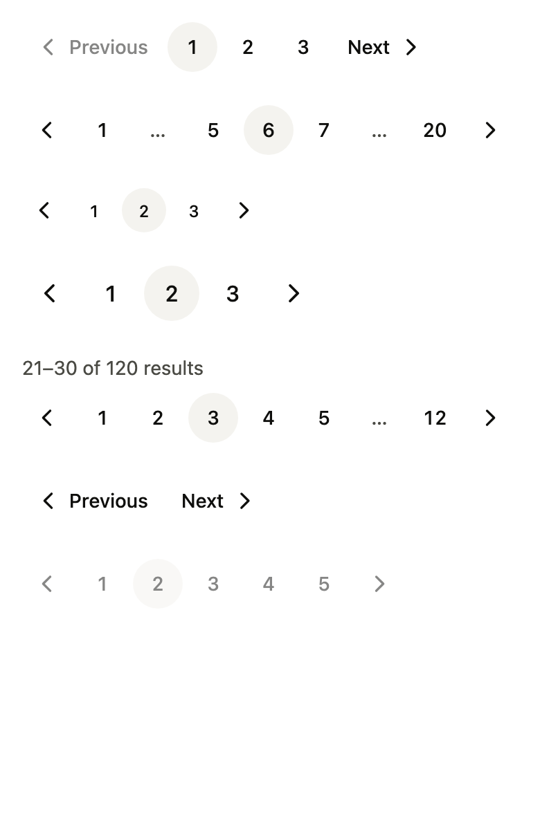
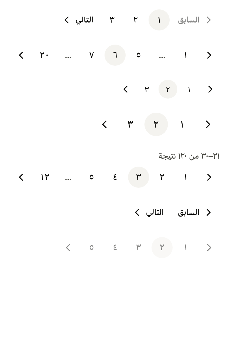
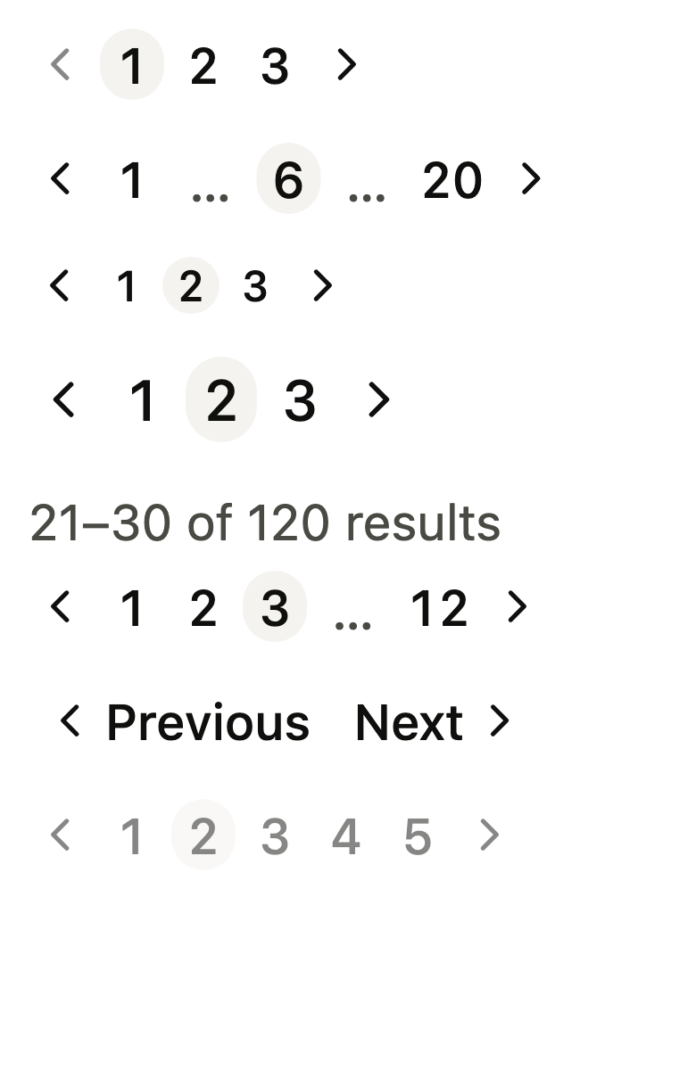
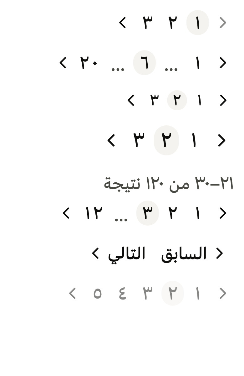
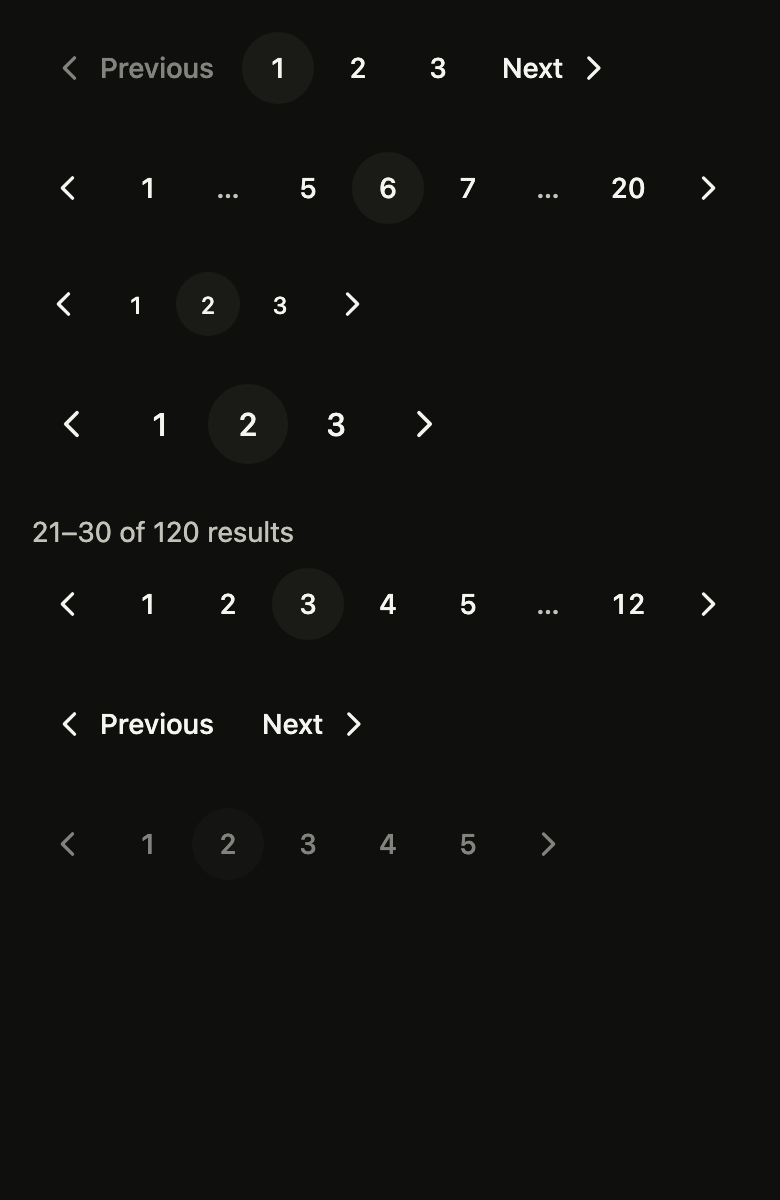
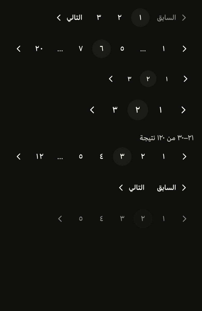
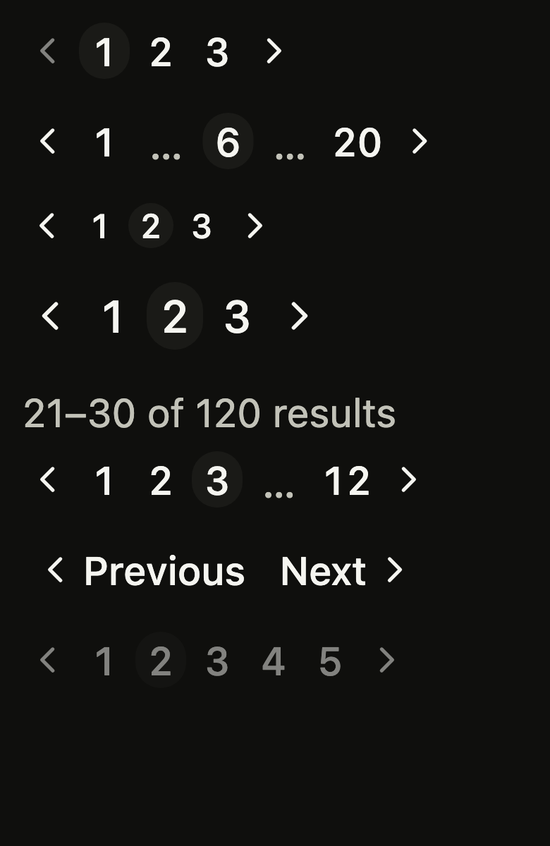
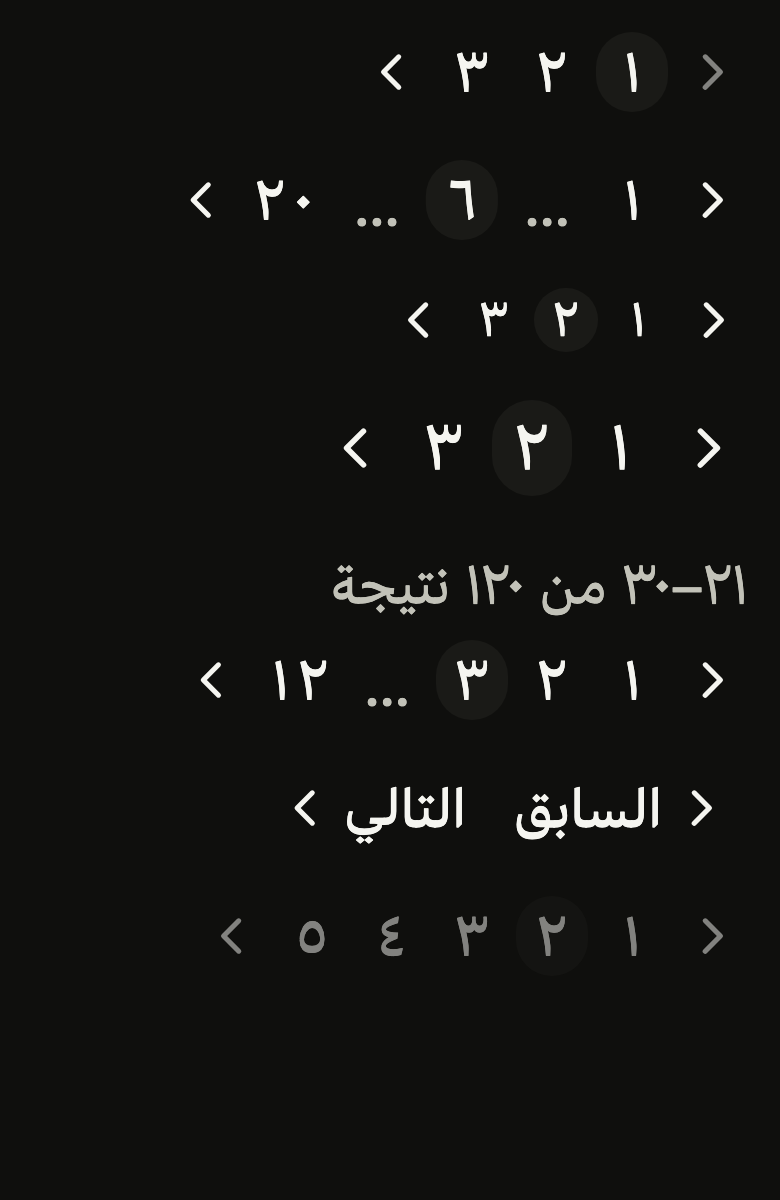
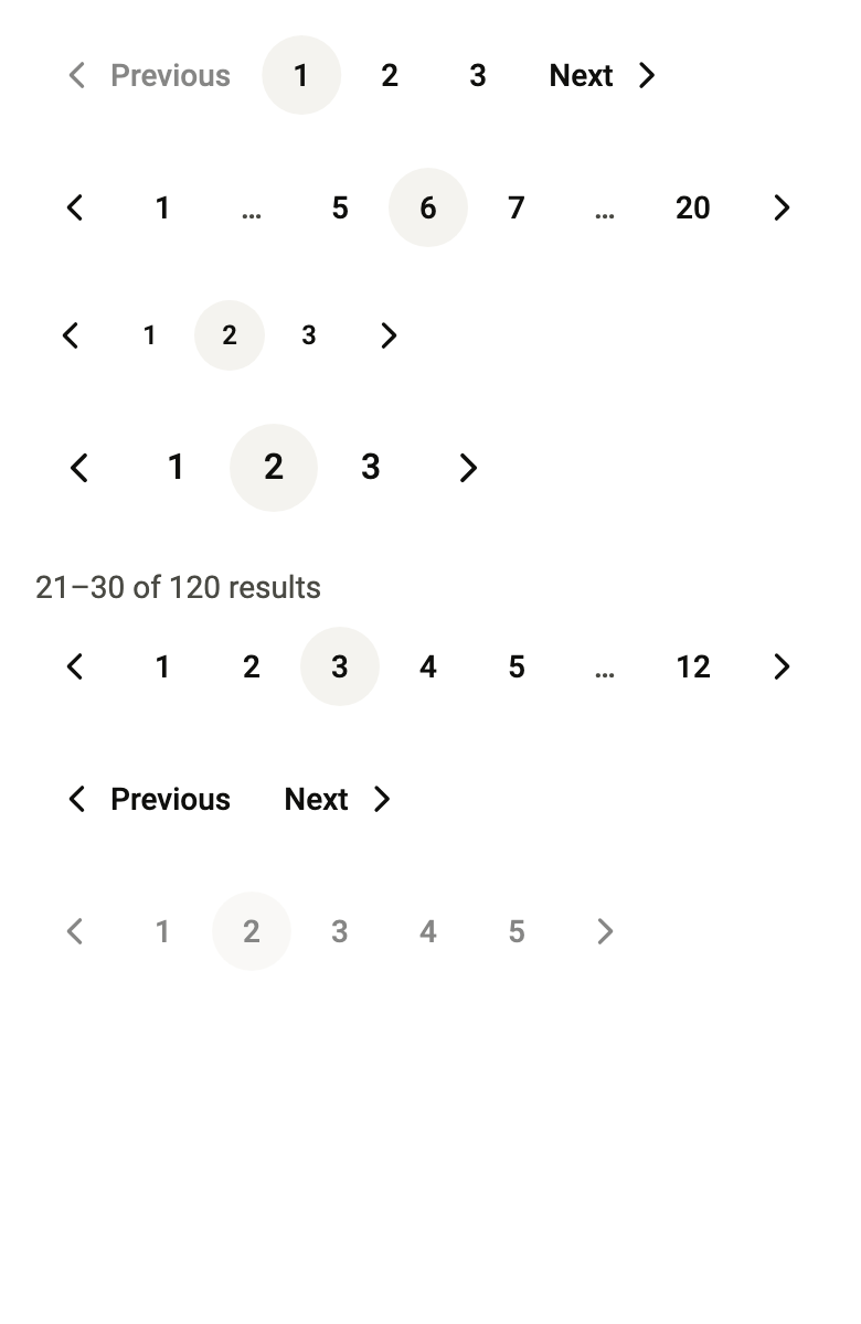
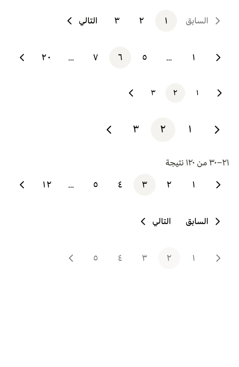
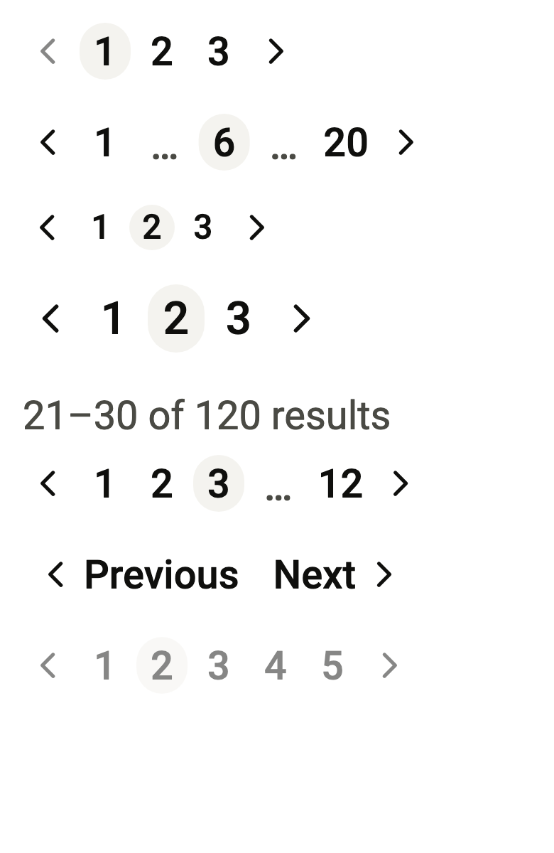
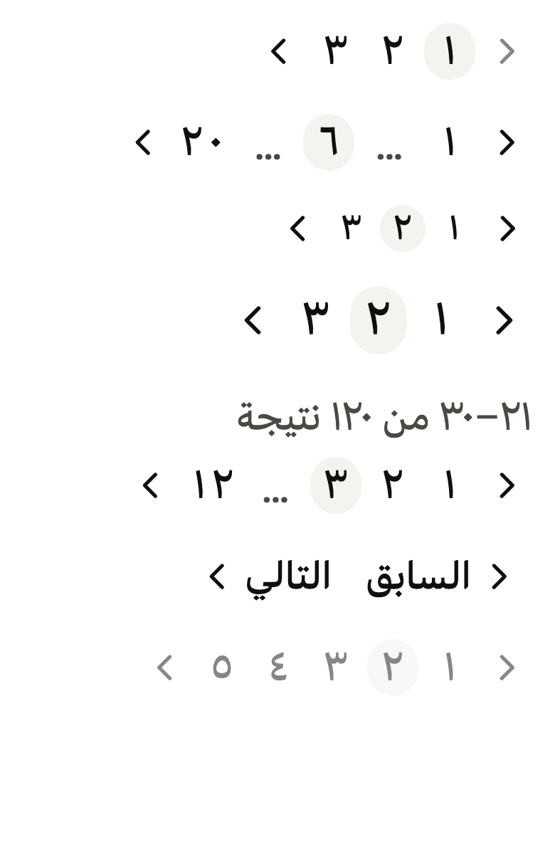
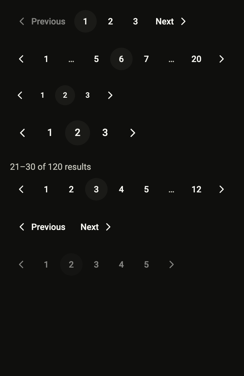
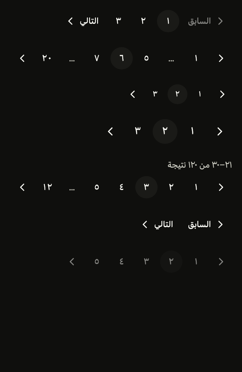
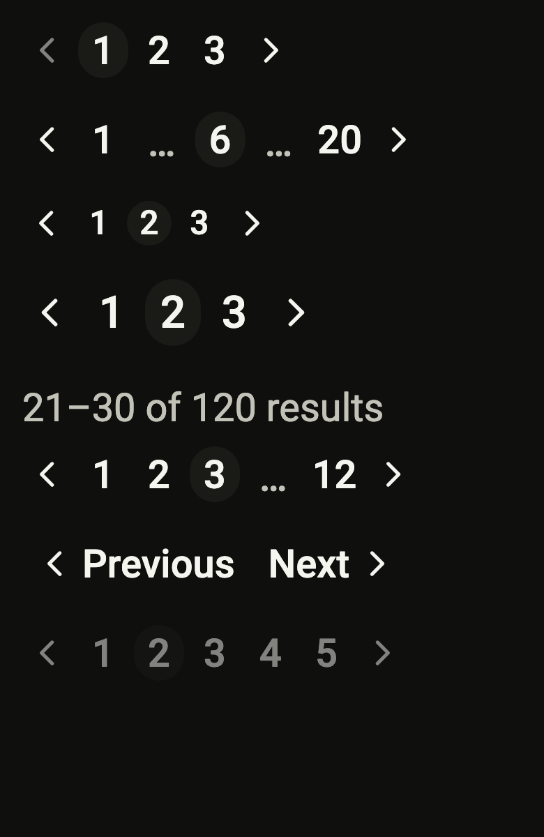
Use it to
- move to the next page of results
- pick page ten of a table directly
- navigate an order history page by page
- show page numbers with ellipses for the gaps
- explain how many results are shown out of the total
- offer previous and next page links under a long list
- Not for
- the dots of a carousel or an onboarding: use the page indicator (page-indicator)
- a list that loads as it scrolls: use a list row (list-row)
- States
Source
The files fliin add pagination copies into your app, before your prefix and imports are applied.
pagination/fl_pagination.dart
// Modified from the Pagination of HeroUI React v3, Copyright 2025 NextUI Inc.,
// licensed under Apache 2.0: https://www.apache.org/licenses/LICENSE-2.0
import 'dart:math' as math;

import 'package:flutter/widgets.dart';
import 'package:fliin_ui/core/fliin.dart';
import 'package:fliin_ui/icons/fl_icons.dart';

/// The size of an [FlPagination]'s buttons.
enum FlPaginationSize {
  /// Buttons of 32, `textXs`.
  sm,

  /// Buttons of 36, `textSm`.
  md,

  /// Buttons of 40, `textBase`.
  lg,
}

/// A slot of the row: a page, or an ellipsis standing for the hidden ones.
typedef _Slot = int?;

/// The pages shown around [page] out of [count], with [boundaries] at each
/// end and [siblings] on each side of the current one, the gaps as null.
/// Always the same number of slots once [count] exceeds them, so that the
/// row keeps its width from one page to the next.
List<_Slot> _slots(int page, int count, int siblings, int boundaries) {
  final total = 2 * boundaries + 2 * siblings + 3;
  if (count <= total) return [for (var n = 1; n <= count; n++) n];
  final start = math.max(math.min(page - siblings, count - boundaries - 2 * siblings - 1), boundaries + 2);
  final end = math.min(math.max(page + siblings, boundaries + 2 * siblings + 2), count - boundaries - 1);
  return [
    for (var n = 1; n <= boundaries; n++) n,
    if (start > boundaries + 2) null else boundaries + 1,
    for (var n = start; n <= end; n++) n,
    if (end < count - boundaries - 1) null else count - boundaries,
    for (var n = count - boundaries + 1; n <= count; n++) n,
  ];
}

/// Moves through numbered pages: previous, the
/// pages with ellipses for the gaps, next. Each page is a ghost button,
/// the current one on a `control` fill; previous and next turn off at
/// the ends.
///
/// Compact on a phone: previous and next show their chevron alone unless
/// [showNavLabels], and when the row does not fit its width, the labels go
/// first, then the pages around the current one, down to the first, the
/// current and the last; only then does it wrap. [summary] ("21–30 of 120")
/// goes above the row, at the start, as on narrow screens.
///
/// [previousIcon] and [nextIcon] replace the chevrons (arrows, "Back" and
/// "Forward"), in the text color and the chevron's size.
///
/// The screen reader reads each page by [pageLabel], the current one as
/// selected, and previous and next by their labels.
///
/// ```dart
/// FlPagination(page: page, pageCount: 12, onChanged: setPage,
///     previousLabel: 'Previous', nextLabel: 'Next')
/// ```
class FlPagination extends StatelessWidget {
  /// Pages 1 to [pageCount], [page] being the current one.
  const FlPagination({
    super.key,
    required this.page,
    required this.pageCount,
    required this.onChanged,
    required this.previousLabel,
    required this.nextLabel,
    this.pageLabel,
    this.format,
    this.siblings = 1,
    this.boundaries = 1,
    this.size = FlPaginationSize.md,
    this.showNavLabels = false,
    this.showPages = true,
    this.summary,
    this.semanticLabel,
    this.previousIcon,
    this.nextIcon,
  }) : assert(pageCount >= 1, 'at least one page'),
       assert(page >= 1 && page <= pageCount, 'page within 1 and pageCount'),
       assert(siblings >= 0 && boundaries >= 1, 'non-negative siblings, a page at each end');

  /// The current page, from 1.
  final int page;

  /// How many pages there are.
  final int pageCount;

  /// Receives the page pressed, or the one before or after; null disables
  /// the whole row.
  final ValueChanged<int>? onChanged;

  /// The previous button's text, and its name for the screen reader.
  final String previousLabel;

  /// The next button's text, and its name for the screen reader.
  final String nextLabel;

  /// A page's name for the screen reader ("Page 3"); null reads the number.
  final String Function(int page)? pageLabel;

  /// A page number as written ("٣" in Arabic); null, in Latin digits.
  final String Function(int page)? format;

  /// The pages shown on each side of the current one; 1 by default, fewer
  /// when the row does not fit.
  final int siblings;

  /// The pages always shown at each end; 1 by default.
  final int boundaries;

  /// The buttons' size; `md` by default.
  final FlPaginationSize size;

  /// True: previous and next carry their text after and before their
  /// chevron when the row has room.
  final bool showNavLabels;

  /// False: previous and next alone, with their text.
  final bool showPages;

  /// A line above the row, in `onSurfaceMuted` ("21–30 of 120 results").
  final String? summary;

  /// The row's name for the screen reader ("Pages").
  final String? semanticLabel;

  /// The previous button's icon in place of the chevron; a direction-aware
  /// icon flips in RTL like the chevron does.
  final Widget? previousIcon;

  /// The next button's icon in place of the chevron.
  final Widget? nextIcon;

  @override
  Widget build(BuildContext context) {
    final theme = FlScope.of(context);
    final xs = theme.space.xs;
    final (extent, role) = switch (size) {
      FlPaginationSize.sm => (xs * 8, FlTextRole.textXs),
      FlPaginationSize.md => (xs * 9, FlTextRole.textSm),
      FlPaginationSize.lg => (xs * 10, FlTextRole.textBase),
    };
    final style = theme.typography
        .resolve(role)
        .copyWith(
          color: theme.colors.onControl,
          fontWeight: theme.tokens.typography.weight.medium,
          fontFeatures: const [FontFeature.tabularFigures()],
        );
    final strut = theme.typography.strut(role, inheritedFamily: DefaultTextStyle.of(context).style.fontFamily);
    final scaler = MediaQuery.textScalerOf(context);
    final iconSize = scaler
        .clamp(maxScaleFactor: theme.size.iconMaxScale)
        // A chevron is a thin stroke: below the md icon, the contrast
        // check reads its antialiased edge as its color.
        .scale(size == FlPaginationSize.lg ? theme.size.buttonIconLg : theme.size.buttonIconMd);
    final radius = switch (theme.shape.button) {
      FlButtonShape.square => 0.0,
      FlButtonShape.rounded => theme.shape.radiusButton,
      FlButtonShape.pill => extent,
    };
    final corners = BorderRadius.circular(radius);
    final shape = RoundedRectangleBorder(borderRadius: corners);
    final gap = xs;
    final navPadding = theme.space.sm + xs / 2;
    final navGap = xs * 1.5;
    String written(int n) => format?.call(n) ?? '$n';
    final onChanged = this.onChanged;
    final motion = FlMotion.of(context);

    double measure(String text) {
      final painter = TextPainter(
        text: TextSpan(text: text, style: DefaultTextStyle.of(context).style.merge(style)),
        strutStyle: strut,
        textScaler: scaler,
        textDirection: Directionality.of(context),
        maxLines: 1,
      )..layout();
      final width = painter.width;
      painter.dispose();
      return width;
    }

    // The buttons are squares; a number wider than its square, under large
    // text, widens its own.
    final pageWidth = math.max(extent, measure(written(pageCount)) + 2 * xs);
    double navWidth(String label, {required bool labeled}) =>
        labeled ? navPadding * 2 + iconSize + navGap + measure(label) : math.max(extent, iconSize + 2 * xs);
    double rowWidth(int slots, {required bool labeled}) =>
        slots * pageWidth +
        navWidth(previousLabel, labeled: labeled) +
        navWidth(nextLabel, labeled: labeled) +
        (slots + 1) * gap;

    Widget button({
      required String label,
      required VoidCallback? onPressed,
      required Widget child,
      bool current = false,
      double? padding,
    }) => FlPressable(
      onPressed: onPressed,
      label: label,
      selected: current ? true : null,
      borderRadius: corners,
      overlay: FlPressOverlay.none,
      builder: (context, states) {
        final disabled = states.contains(WidgetState.disabled);
        final hovered = !disabled && (states.contains(WidgetState.hovered) || states.contains(WidgetState.pressed));
        final fill = current
            ? (hovered ? theme.colors.controlPressed : theme.colors.control)
            : hovered
            ? theme.colors.controlPressed
            : theme.colors.controlPressed.withValues(alpha: 0);
        return Opacity(
          opacity: disabled ? theme.size.disabledOpacity : 1,
          // The hover fill fades in over 100 ms.
          child: TweenAnimationBuilder<Color?>(
            tween: ColorTween(end: fill),
            duration: motion.reduced ? Duration.zero : theme.motion.short2,
            curve: theme.motion.easeOut,
            builder: (context, fill, child) => DecoratedBox(
              decoration: ShapeDecoration(color: fill, shape: shape),
              child: child,
            ),
            child: ConstrainedBox(
              constraints: BoxConstraints(minWidth: extent, minHeight: extent),
              child: Padding(
                padding: EdgeInsetsDirectional.symmetric(horizontal: padding ?? xs),
                child: Center(widthFactor: 1, child: child),
              ),
            ),
          ),
        );
      },
    );

    Widget nav({required bool next, required bool labeled}) {
      final label = next ? nextLabel : previousLabel;
      final target = next ? page + 1 : page - 1;
      final reachable = onChanged != null && target >= 1 && target <= pageCount;
      final chevron = IconTheme.merge(
        data: IconThemeData(color: style.color, size: iconSize),
        child: (next ? nextIcon : previousIcon) ?? FlIcon(next ? FlIcons.chevronRight : FlIcons.chevronLeft),
      );
      return button(
        label: label,
        onPressed: reachable ? () => onChanged(target) : null,
        padding: labeled ? navPadding : null,
        child: labeled
            ? Row(
                mainAxisSize: MainAxisSize.min,
                spacing: navGap,
                children: [
                  if (!next) chevron,
                  Text(label, style: style, strutStyle: strut, maxLines: 1),
                  if (next) chevron,
                ],
              )
            : chevron,
      );
    }

    Widget numbered(int n) => button(
      label: pageLabel?.call(n) ?? written(n),
      onPressed: onChanged == null ? null : () => onChanged(n),
      current: n == page,
      child: Text(written(n), style: style, strutStyle: strut, maxLines: 1),
    );

    final ellipsis = ExcludeSemantics(
      child: SizedBox(
        width: pageWidth,
        height: extent,
        child: Center(
          child: Text(
            '…',
            style: style.copyWith(color: theme.colors.onSurfaceMuted),
            strutStyle: strut,
          ),
        ),
      ),
    );

    final row = LayoutBuilder(
      builder: (context, constraints) {
        final available = constraints.maxWidth;
        if (!showPages) {
          return Wrap(
            spacing: gap,
            runSpacing: gap,
            children: [nav(next: false, labeled: true), nav(next: true, labeled: true)],
          );
        }
        // The roomiest layout that fits: labels, then fewer siblings.
        var labeled = showNavLabels;
        var near = siblings;
        bool fits() => rowWidth(_slots(page, pageCount, near, boundaries).length, labeled: labeled) <= available;
        if (labeled && !fits()) labeled = false;
        while (near > 0 && !fits()) {
          near--;
        }
        final children = [
          nav(next: false, labeled: labeled),
          for (final slot in _slots(page, pageCount, near, boundaries))
            if (slot == null) ellipsis else numbered(slot),
          nav(next: true, labeled: labeled),
        ];
        return fits()
            ? Row(mainAxisSize: MainAxisSize.min, spacing: gap, children: children)
            : Wrap(spacing: gap, runSpacing: gap, children: children);
      },
    );

    final summary = this.summary;
    return Semantics(
      container: true,
      label: semanticLabel,
      explicitChildNodes: true,
      child: Column(
        mainAxisSize: MainAxisSize.min,
        crossAxisAlignment: CrossAxisAlignment.start,
        spacing: theme.space.sm,
        children: [
          if (summary != null)
            Text(
              summary,
              style: theme.typography.resolve(role).copyWith(color: theme.colors.onSurfaceMuted),
              strutStyle: strut,
            ),
          row,
        ],
      ),
    );
  }
}