Components / overlays
Bottom sheet
Opens a panel from the bottom of the screen for a short task, dragged or closed. Spring snap points, icon, title, text, actions, close button, scrim, trapped focus and Escape.
Import
In a Flutter app where fliin init has run:
Examples
Open
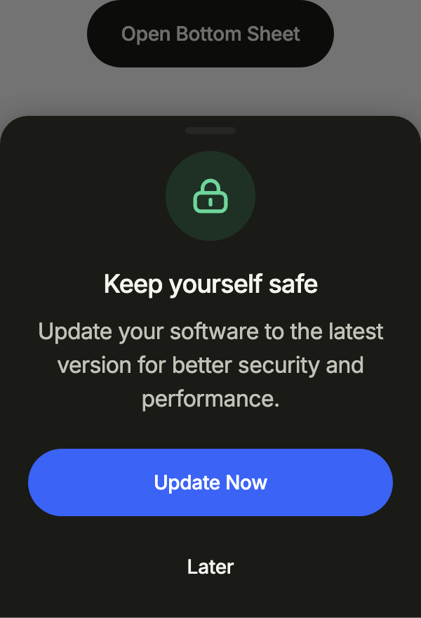
showFlSheet raises a bottom sheet as tall as its content: an icon, a title, a description and full-width buttons at the bottom; dragging it down or touching the barrier closes it.
import 'package:your_app/ui/fliin/components/button/fl_button.dart';
import 'package:your_app/ui/fliin/components/sheet/fl_sheet.dart';
import 'package:your_app/ui/fliin/core/fliin.dart';
import 'package:your_app/ui/fliin/icons/fl_icons.dart';
import 'package:flutter/widgets.dart';

class SheetOpenExample extends StatelessWidget {
  const SheetOpenExample({super.key});

  @override
  Widget build(BuildContext context) {
    return FlButton(
      label: 'Open Bottom Sheet',
      variant: FlButtonVariant.secondary,
      onPressed: () => showUpdateSheet(context),
    );
  }
}

Future<void> showUpdateSheet(BuildContext context) {
  return showFlSheet<void>(
    context,
    label: 'Keep yourself safe',
    barrierLabel: 'Close sheet',
    fitContent: true,
    icon: FlIcon(FlIcons.lock),
    iconTone: FlSheetIconTone.success,
    title: 'Keep yourself safe',
    description: 'Update your software to the latest version for better security and performance.',
    actions: [
      FlButton(label: 'Update Now', onPressed: () => Navigator.pop(context)),
      FlButton(label: 'Later', variant: FlButtonVariant.tertiary, onPressed: () => Navigator.pop(context)),
    ],
  );
}Usage
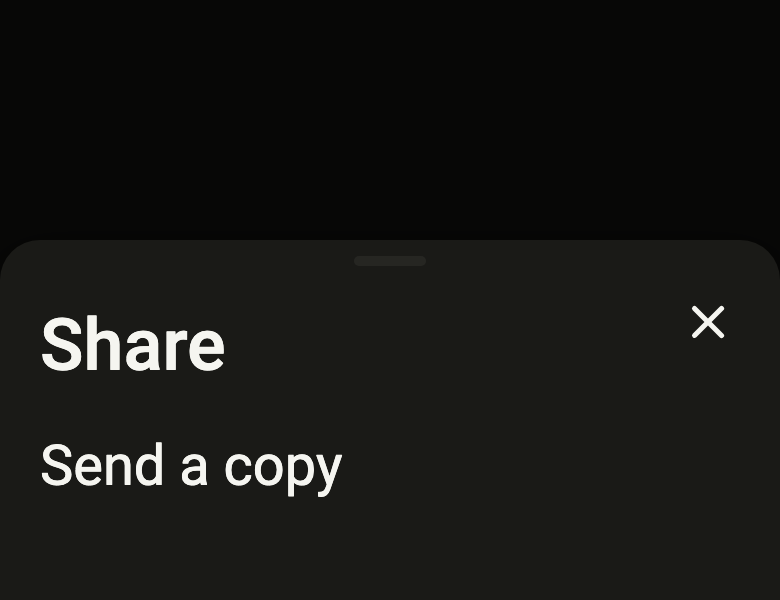
The code the reference images render:
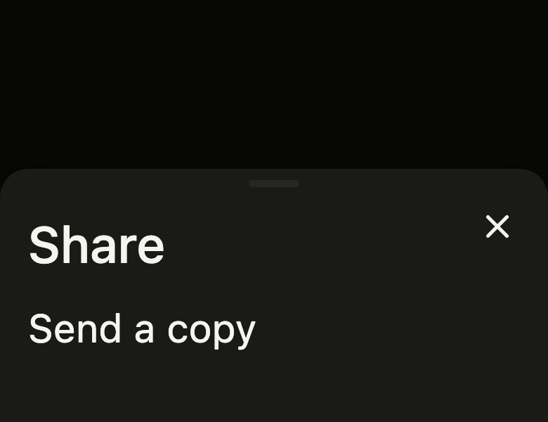
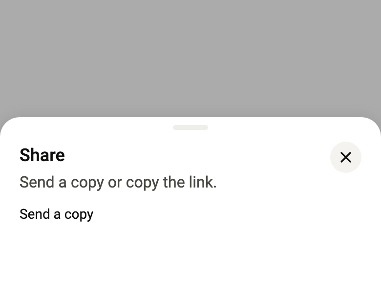
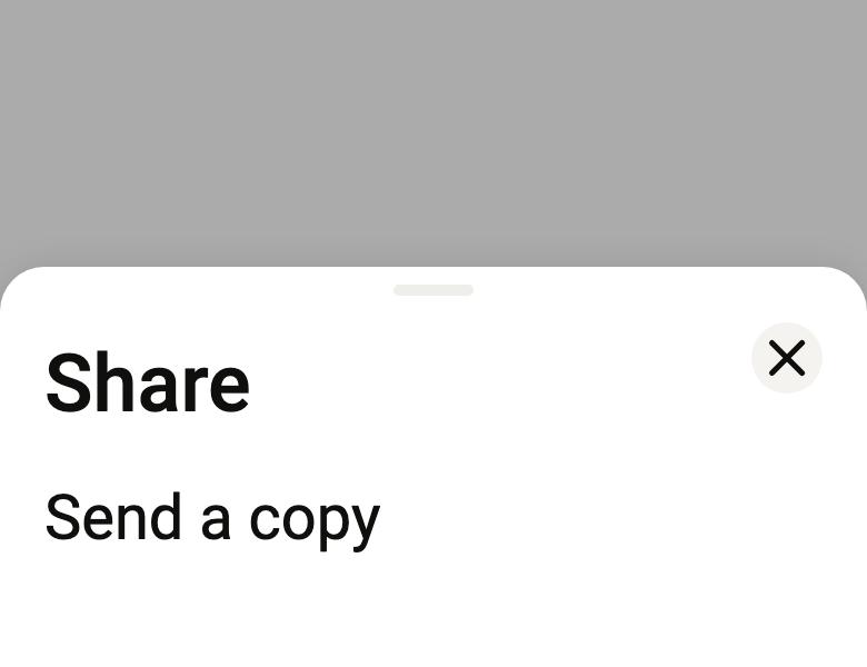
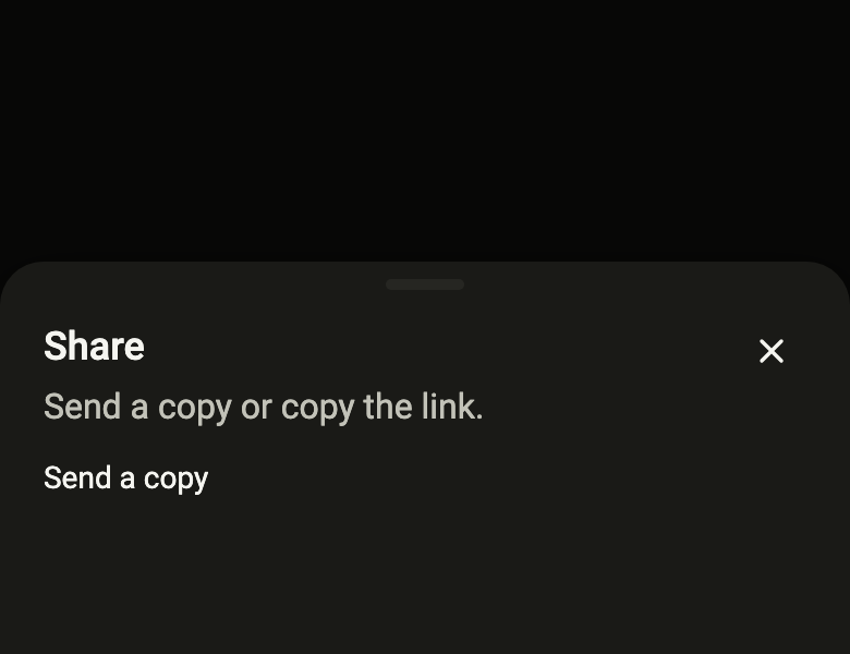
final example = Stack(
  fit: StackFit.expand,
  children: [
    ColoredBox(color: FlScope.of(context).colors.surface),
    FlSheet(
      label: 'Share',
      title: 'Share',
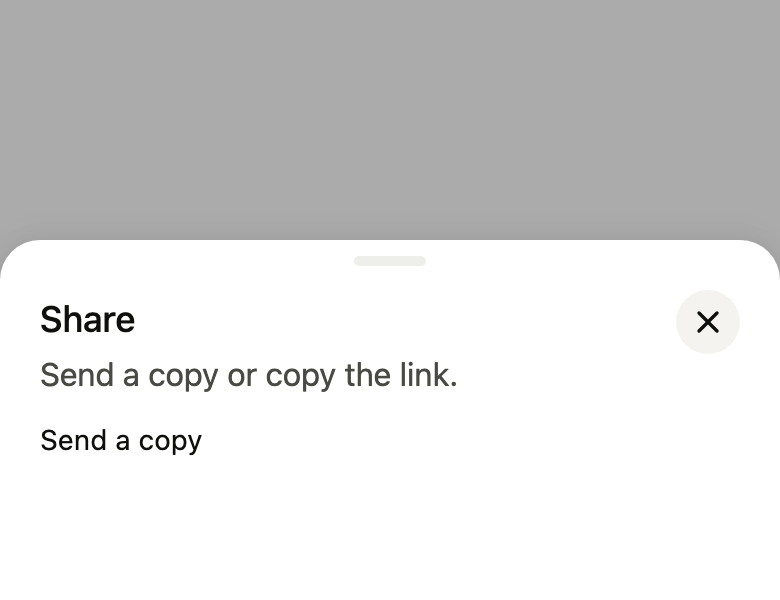
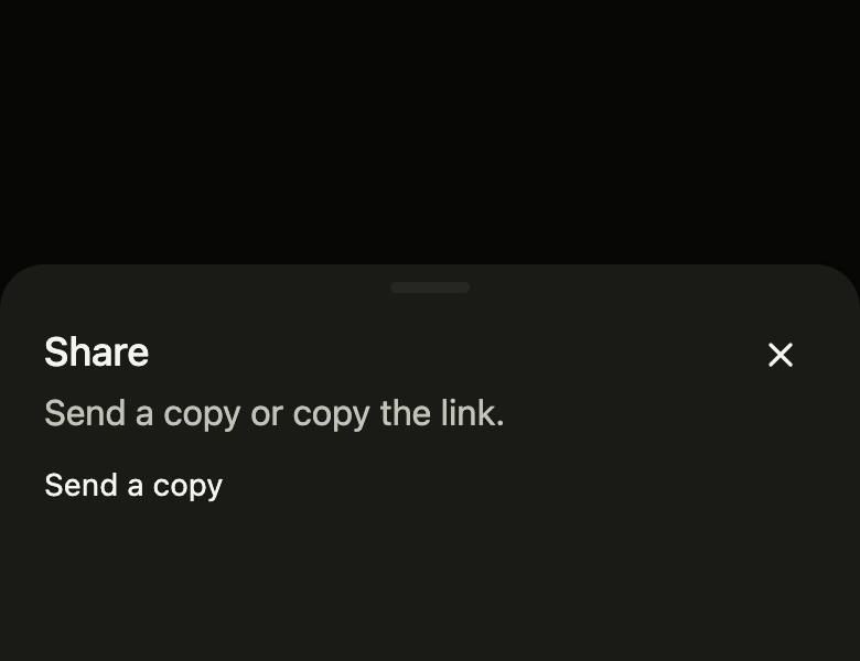
      description: 'Send a copy or copy the link.',
      closeLabel: 'Close',
      barrierLabel: 'Close the sheet',
      snaps: const [0.6, 1],
      onDismiss: () {},
      child: Align(
        alignment: AlignmentDirectional.topStart,
        child: Text(
          'Send a copy',
          style: TextStyle(color: FlScope.of(context).colors.onSurface),
        ),
      ),
    ),
  ],
);API
FlSheet: class extends StatefulWidget
FlSheet.new: const new({super.key, required String label, Widget child, String? title, String? description, String? closeLabel, Widget? icon, FlSheetIconTone iconTone, List<Widget> actions, List<double> snaps, int initialSnap, VoidCallback? onDismiss, String? barrierLabel, bool modal, bool animateIn, bool fitContent})
FlSheet.label: get String
FlSheet.child: get Widget
FlSheet.title: get String?
FlSheet.description: get String?
FlSheet.closeLabel: get String?
FlSheet.icon: get Widget?
FlSheet.iconTone: get FlSheetIconTone
FlSheet.actions: get List<Widget>
FlSheet.snaps: get List<double>
FlSheet.initialSnap: get int
FlSheet.onDismiss: get VoidCallback?
FlSheet.barrierLabel: get String?
FlSheet.modal: get bool
FlSheet.animateIn: get bool
FlSheet.fitContent: get bool
FlSheet.createState: State<FlSheet>()
showFlSheet: Future<T?><T>(BuildContext context, {required String label, required String barrierLabel, WidgetBuilder? builder, String? title, String? description, String? closeLabel, Widget? icon, FlSheetIconTone iconTone, List<Widget> actions, List<double> snaps, int initialSnap, bool fitContent})
FlSheetIconTone: enum {neutral, success, danger}
FlSheetIconTone.neutral: static final FlSheetIconTone
FlSheetIconTone.success: static final FlSheetIconTone
FlSheetIconTone.danger: static final FlSheetIconToneReference renders
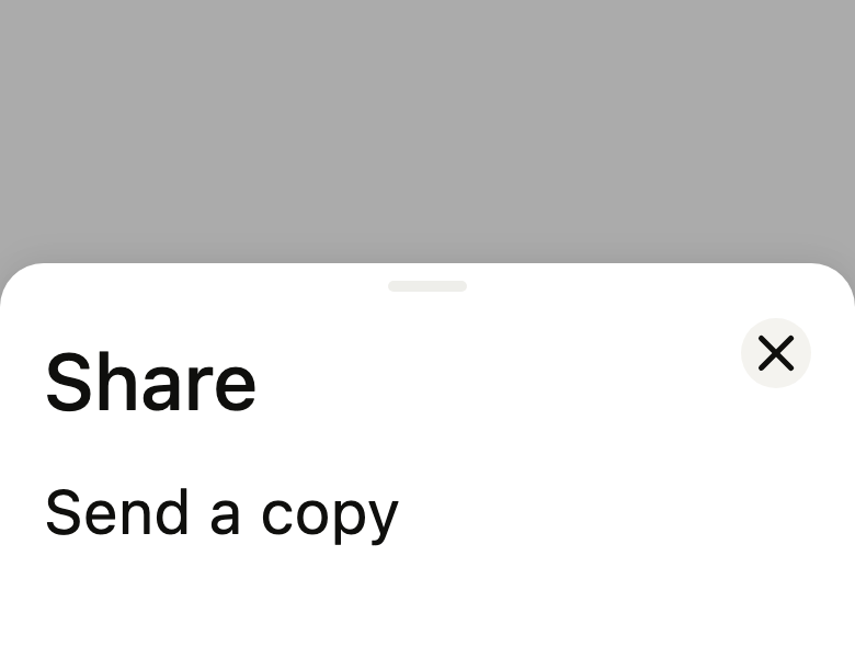
The 16 images published with version 0.2.3, rendered by the shared harness on macOS with Flutter 3.47.7. fliin verify sheet compares your copy to them.








Use it to
- open a bottom sheet
- show share options in a panel
- offer a quick action without leaving the page
- drag a sheet down to dismiss it
- add a half-height modal sheet
- Not for
- an on/off choice in a settings list: use a list row (list-row)
- the page's main action: use a button (button)
- States
Source
The files fliin add sheet copies into your app, before your prefix and imports are applied.
sheet/fl_sheet.dart
// Modified from the BottomSheet of HeroUI Native 1.0.10, Copyright 2025 NextUI
// Inc., licensed under Apache 2.0: https://www.apache.org/licenses/LICENSE-2.0
import 'dart:math' as math;
import 'package:flutter/foundation.dart' show listEquals;
import 'package:flutter/gestures.dart' show kMinFlingVelocity;
import 'package:flutter/rendering.dart' show RenderProxyBox;
import 'package:flutter/semantics.dart' show SemanticsRole;
import 'package:flutter/services.dart';
import 'package:flutter/widgets.dart';
import 'package:fliin_ui/components/close_button/fl_close_button.dart';
import 'package:fliin_ui/core/fliin.dart';
/// A bottom sheet, placed above the content it covers (in a `Stack`, or
/// through [showFlSheet]). It stops at the heights in [snaps], increasing
/// fractions of the available height, above the keyboard and below the top
/// safe area. It is dragged by its handle or its content; once released, it
/// springs to the neighboring stop, starting from the finger's velocity
/// (DESIGN.md §2.4).
///
/// With [onDismiss], it closes by dragging below the first stop, tapping
/// the barrier, pressing Escape, or the screen reader's dismiss gesture;
/// [onDismiss] is called once the sheet is out. [modal] adds the barrier,
/// keeps focus inside the sheet and hides what it covers from the screen
/// reader.
///
/// At rest, the content has the visible height: at a low stop, a list
/// scrolls down to its last item. With the keyboard, Alt+↑ and Alt+↓ move to
/// the neighboring stop; the screen reader has the increase and decrease
/// actions.
///
/// Under reduced motion, the sheet fades in and out, and lands on the
/// chosen stop without sliding.
class FlSheet extends StatefulWidget {
/// Creates a sheet placed by the caller, open at the stop
/// `snaps[initialSnap]`. A modal sheet that closes (non-null [onDismiss])
/// requires [barrierLabel].
const FlSheet({
super.key,
required this.label,
this.child = const SizedBox.shrink(),
this.title,
this.description,
this.closeLabel,
this.icon,
this.iconTone = FlSheetIconTone.neutral,
this.actions = const [],
this.snaps = const [1],
this.initialSnap = 0,
this.onDismiss,
this.barrierLabel,
this.modal = true,
this.animateIn = false,
this.fitContent = false,
}) : _routed = false,
assert(snaps.length > 0),
assert(initialSnap >= 0 && initialSnap < snaps.length),
assert(onDismiss == null || !modal || barrierLabel != null, 'a barrier that closes must be named');
const FlSheet._routed({
required this.label,
required this.child,
required this.title,
required this.description,
required this.closeLabel,
required this.icon,
required this.iconTone,
required this.actions,
required this.snaps,
required this.initialSnap,
required this.barrierLabel,
required this.fitContent,
}) : _routed = true,
modal = true,
animateIn = true,
onDismiss = null;
/// The sheet's name, announced when it opens.
final String label;
/// The sheet's content, between the header and [actions]. At rest, it
/// receives the sheet's visible height at the current stop, minus the
/// header and the actions. Nothing by default.
final Widget child;
/// The title at the top (`BottomSheet.Title`), in medium-weight `textLg`;
/// null, no title.
final String? title;
/// The text under the title (`BottomSheet.Description`), in muted
/// `textBase`; null, no text.
final String? description;
/// The close button's name (`BottomSheet.Close`), placed in the header, at
/// the end of the line; null, no button. It requires a sheet that closes.
final String? closeLabel;
/// An icon above the title, in a disc of `space.xxl * 2` (64 with the
/// default tokens); decorative,
/// never read. With an icon, the header is centered. When null, none.
final Widget? icon;
/// The disc's colors: neutral by default.
final FlSheetIconTone iconTone;
/// The bottom buttons, stacked at full width, `space.md` apart, fixed below
/// the content, which scrolls above them. Empty by default.
final List<Widget> actions;
/// The stop heights, as strictly increasing fractions of the available
/// height, in ]0, 1]. `[1]` by default: a single stop, at full height.
final List<double> snaps;
/// The index in [snaps] of the stop where the sheet opens; 0 by default,
/// the lowest stop.
final int initialSnap;
/// Called once the sheet is out after the user closes it; the caller then
/// removes it from the tree. Null, the sheet doesn't close by itself: it
/// doesn't go below the first stop, and the barrier, Escape and the screen
/// reader gesture have no effect. System back still belongs to the page:
/// it removes the route holding the sheet, and the sheet leaves with it.
final VoidCallback? onDismiss;
/// The barrier's name for the screen reader ("Close the sheet").
final String? barrierLabel;
/// True by default: adds the barrier, keeps focus inside the sheet and
/// hides what it covers from the screen reader. False: no barrier, and the
/// content below stays reachable.
final bool modal;
/// Enters from the bottom on the first frame; otherwise, the sheet is
/// rendered open right away.
final bool animateIn;
/// True: the sheet has a single stop, the height of its content, at most the available height, beyond which the content
/// scrolls. It follows the content when it changes, and the space when
/// the keyboard or orientation changes it; [snaps] is ignored.
final bool fitContent;
/// In the [showFlSheet] route: closing means removing the route, and the
/// exit follows the removal.
final bool _routed;
@override
State<FlSheet> createState() => _FlSheetState();
}
/// Pushes a modal [FlSheet] in a route, with [builder]'s content (none when
/// null), and returns the value passed to `Navigator.pop(context, value)`,
/// once the sheet is out. The barrier, Escape, dragging down and system back
/// close it without a value, with the same exit.
Future<T?> showFlSheet<T>(
BuildContext context, {
required String label,
required String barrierLabel,
WidgetBuilder? builder,
String? title,
String? description,
String? closeLabel,
Widget? icon,
FlSheetIconTone iconTone = FlSheetIconTone.neutral,
List<Widget> actions = const [],
List<double> snaps = const [1],
int initialSnap = 0,
bool fitContent = false,
}) async {
final route = _FlSheetRoute<T>(
label: label,
sheetBarrierLabel: barrierLabel,
builder: builder,
title: title,
description: description,
closeLabel: closeLabel,
icon: icon,
iconTone: iconTone,
actions: actions,
snaps: snaps,
initialSnap: initialSnap,
fitContent: fitContent,
exit: FlScope.of(context).motion.medium2,
);
final result = await Navigator.of(context).push(route);
await route.completed;
return result;
}
/// The disc behind an [FlSheet]'s icon.
enum FlSheetIconTone {
/// `control` disc, `onSurfaceMuted` icon.
neutral,
/// `successSoft` disc, `onSuccessSoft` icon: a reassurance.
success,
/// `dangerSoft` disc, `onDangerSoft` icon: a destructive confirmation.
danger,
}
class _FlSheetRoute<T> extends PopupRoute<T> {
_FlSheetRoute({
required this.label,
required this.sheetBarrierLabel,
required this.builder,
required this.title,
required this.description,
required this.closeLabel,
required this.icon,
required this.iconTone,
required this.actions,
required this.snaps,
required this.initialSnap,
required this.fitContent,
required this.exit,
});
final String label;
/// The barrier's name; the sheet paints and names the barrier, so the
/// route's stays null.
final String sheetBarrierLabel;
final WidgetBuilder? builder;
final String? title;
final String? description;
final String? closeLabel;
final Widget? icon;
final FlSheetIconTone iconTone;
final List<Widget> actions;
final List<double> snaps;
final int initialSnap;
final bool fitContent;
/// The time left for the exit before the route leaves: at least the
/// settling of `spring.spatialSlow` (≈ 260 ms) and the reduced fade.
final Duration exit;
@override
Color? get barrierColor => null;
@override
bool get barrierDismissible => false;
@override
String? get barrierLabel => null;
@override
Duration get transitionDuration => Duration.zero;
@override
Duration get reverseTransitionDuration => exit;
@override
Widget buildPage(BuildContext context, Animation<double> animation, Animation<double> secondaryAnimation) =>
FlSheet._routed(
label: label,
title: title,
description: description,
closeLabel: closeLabel,
icon: icon,
iconTone: iconTone,
actions: actions,
barrierLabel: sheetBarrierLabel,
snaps: snaps,
initialSnap: initialSnap,
fitContent: fitContent,
child: switch (builder) {
final builder? => Builder(builder: builder),
null => const SizedBox.shrink(),
},
);
}
class _FlSheetState extends State<FlSheet> with TickerProviderStateMixin {
/// The visible height, as a fraction of the available height.
late final AnimationController _extent = AnimationController.unbounded(
vsync: this,
value: widget.animateIn ? 0 : _snap,
);
/// The opacity of the sheet and the barrier: the reduced-motion fade.
late final AnimationController _opacity = AnimationController.unbounded(vsync: this, value: 1);
/// The barrier darkens with the sheet up to the first stop, and follows the reduced-motion fade.
late final Animation<double> _veil = _Veil(_extent, _opacity, () => _snaps.first);
/// The [FlSheet.fitContent] stop: the content height, measured at each
/// layout; the full height before the first measurement.
double _fitted = 1;
List<double> get _snaps => widget.fitContent ? [_fitted] : widget.snaps;
final FocusScopeNode _scope = FocusScopeNode(debugLabel: 'FlSheet');
bool _entered = false;
bool _closing = false;
double _available = 0;
/// The stop where the sheet rests or is heading: the content height (see
/// [_SheetLayout]).
late double _rest = _snap;
Animation<double>? _route;
double? _exitVelocity;
double get _snap => widget.fitContent ? _fitted : widget.snaps[widget.initialSnap];
bool get _dismissible => widget._routed || widget.onDismiss != null;
@override
void didChangeDependencies() {
super.didChangeDependencies();
if (widget._routed) {
_route?.removeStatusListener(_routeStatus);
_route = ModalRoute.of(context)?.animation?..addStatusListener(_routeStatus);
}
if (_entered) {
return;
}
_entered = true;
if (widget.modal) {
WidgetsBinding.instance.addPostFrameCallback((_) {
if (mounted) {
_scope.requestFocus();
}
});
}
if (!widget.animateIn) {
return;
}
switch (FlMotion.of(context).spring(FlSpring.spatialSlow)) {
case final FlSpringMotion spring:
_extent.driveTo(_snap, spring);
case final FlFadeMotion fade:
_extent.value = _snap;
_opacity.value = 0;
_opacity.driveTo(1, fade);
}
}
@override
void didUpdateWidget(FlSheet oldWidget) {
super.didUpdateWidget(oldWidget);
final snaps = widget.snaps;
if (_closing || listEquals(snaps, oldWidget.snaps) || snaps.contains(_rest)) {
return;
}
_settle(snaps.reduce((a, b) => (a - _rest).abs() <= (b - _rest).abs() ? a : b));
}
@override
void dispose() {
_route?.removeStatusListener(_routeStatus);
_scope.dispose();
_opacity.dispose();
_extent.dispose();
super.dispose();
}
/// In a route, closing removes the route and the exit follows its removal
/// ([_routeStatus]); on its own, the sheet exits then calls `onDismiss`.
void _close({double? velocity}) {
if (!_dismissible) {
return;
}
if (widget._routed) {
_exitVelocity = velocity;
Navigator.of(context).pop();
return;
}
_leave(velocity).then((reached) {
if (reached) {
widget.onDismiss?.call();
}
});
}
void _routeStatus(AnimationStatus status) {
if (status == AnimationStatus.reverse && !_closing) {
_leave(_exitVelocity);
}
}
Future<bool> _leave(double? velocity) {
_closing = true;
final motion = FlMotion.of(context).spring(velocity == null ? FlSpring.spatialSlow : FlSpring.release);
return switch (motion) {
FlSpringMotion() => _extent.driveTo(0, motion, velocity: velocity),
FlFadeMotion() => _opacity.driveTo(0, motion),
};
}
/// Brings the [FlSheet.fitContent] stop to the height where [content] fits
/// in the [slot] it received: the sheet grows or shrinks by their
/// difference, without exceeding the available height.
void _fit(double content, double slot) {
if (_closing || _available <= 0) {
return;
}
final panel = _available * math.min(_snaps.last, math.max(_rest, _extent.value));
final target = ((panel - slot + content) / _available).clamp(0.05, 1.0);
if ((target - _fitted).abs() * _available < 0.5) {
return;
}
WidgetsBinding.instance.addPostFrameCallback((_) {
if (!mounted || _closing) {
return;
}
setState(() => _fitted = target);
_settle(target);
});
}
/// The neighboring stop, from the keyboard or the screen reader.
void _step(int by) {
final snaps = _snaps;
final i = snaps.indexOf(_rest);
final next = (i < 0 ? 0 : i + by).clamp(0, snaps.length - 1);
if (!_closing && snaps[next] != _rest) {
_settle(snaps[next]);
}
}
void _settle(double target, {double? velocity}) {
if (target == 0) {
return _close(velocity: velocity);
}
setState(() => _rest = target);
final motion = FlMotion.of(context).spring(velocity == null ? FlSpring.spatialSlow : FlSpring.release);
switch (motion) {
case FlSpringMotion():
_extent.driveTo(target, motion, velocity: velocity);
case FlFadeMotion():
_extent.value = target;
}
}
void _dragStart(DragStartDetails details) {
if (!_closing) {
_extent.stop();
}
}
void _dragUpdate(DragUpdateDetails details) {
if (_closing || _available <= 0) {
return;
}
final floor = _dismissible ? 0.0 : _snaps.first;
_extent.value = (_extent.value - details.primaryDelta! / _available).clamp(floor, _snaps.last);
}
/// Flung, the sheet goes to the next stop in the gesture's direction, or
/// closes downward below the first; released at rest, it goes to the
/// nearest stop, closing counting as a stop at 0.
void _dragEnd(DragEndDetails details) {
if (_closing || _available <= 0) {
return;
}
final down = details.primaryVelocity ?? 0;
final x = _extent.value;
final stops = [if (_dismissible) 0.0, ..._snaps];
final double target;
double? velocity;
if (down.abs() > kMinFlingVelocity) {
velocity = -down / _available;
target = down > 0
? stops.lastWhere((stop) => stop < x, orElse: () => stops.first)
: stops.firstWhere((stop) => stop > x, orElse: () => stops.last);
} else {
target = stops.reduce((a, b) => (a - x).abs() <= (b - x).abs() ? a : b);
}
_settle(target, velocity: velocity);
}
@override
Widget build(BuildContext context) {
assert(
widget.snaps.first > 0 &&
widget.snaps.last <= 1 &&
[for (var i = 1; i < widget.snaps.length; i++) widget.snaps[i - 1] < widget.snaps[i]].every((up) => up),
'snaps: strictly increasing fractions in ]0, 1], not ${widget.snaps}',
);
final theme = FlScope.of(context);
final media = MediaQuery.of(context);
final keyboard = media.viewInsets.bottom;
Widget sheet = _panel(theme, media);
if (widget.modal) {
sheet = FocusScope(node: _scope, child: sheet);
}
sheet = Shortcuts(
shortcuts: {
if (_dismissible) const SingleActivator(LogicalKeyboardKey.escape): const DismissIntent(),
const SingleActivator(LogicalKeyboardKey.arrowUp, alt: true): const _StepIntent(1),
const SingleActivator(LogicalKeyboardKey.arrowDown, alt: true): const _StepIntent(-1),
},
child: Actions(
actions: {
DismissIntent: CallbackAction<DismissIntent>(onInvoke: (_) => _close()),
_StepIntent: CallbackAction<_StepIntent>(onInvoke: (intent) => _step(intent.by)),
},
child: sheet,
),
);
if (_dismissible && !widget._routed) {
sheet = PopScope<Object?>(
canPop: false,
onPopInvokedWithResult: (didPop, _) {
if (!didPop) {
_close();
}
},
child: sheet,
);
}
return LayoutBuilder(
builder: (context, constraints) {
_available = math.max(0, constraints.maxHeight - keyboard - media.viewPadding.top);
return Stack(
fit: StackFit.expand,
children: [
if (widget.modal)
BlockSemantics(
child: FlPopupOverlay(
animation: _veil,
onDismiss: _dismissible ? _close : null,
dismissLabel: widget.barrierLabel,
),
),
CustomSingleChildLayout(
delegate: _SheetLayout(
extent: _extent,
available: _available,
keyboard: keyboard,
rest: _rest,
tallest: _snaps.last,
),
child: RepaintBoundary(
child: FadeTransition(opacity: _opacity, child: sheet),
),
),
],
);
},
);
}
Widget _panel(FlTheme theme, MediaQueryData media) {
final radius = theme.shape.radiusSheet;
// bottom-sheet__content-container: p-5, i.e. calc(var(--spacing) * 5).
final padding = theme.space.xs * 5;
final closeLabel = widget.closeLabel;
final title = widget.title;
final description = widget.description;
// Beside the title, at the end of its line, as in Izydesk's sheet.
final close = closeLabel == null
? null
: Align(
alignment: AlignmentDirectional.topEnd,
widthFactor: 1,
heightFactor: 1,
child: FlCloseButton(label: closeLabel, onPressed: _dismissible ? _close : null),
);
final colors = theme.colors;
final icon = widget.icon;
final centered = icon != null;
final align = centered ? TextAlign.center : null;
final heading = title == null && description == null && icon == null
? null
: Column(
crossAxisAlignment: centered ? CrossAxisAlignment.center : CrossAxisAlignment.stretch,
spacing: centered ? theme.space.sm : theme.space.xs / 2,
children: [
if (icon != null)
Padding(
// `space.lg` from the disc to the title, `space.sm` already
// given by the column.
padding: EdgeInsetsDirectional.only(bottom: theme.space.lg - theme.space.sm),
child: _disc(theme, icon, widget.iconTone),
),
if (title != null)
_text(
context,
FlTextRole.textLg,
color: colors.onSurface,
weight: theme.tokens.typography.weight.medium,
heading: true,
align: align,
text: title,
),
if (description != null)
_text(context, FlTextRole.textBase, color: colors.onSurfaceMuted, align: align, text: description),
],
);
return Semantics(
container: true,
explicitChildNodes: true,
scopesRoute: widget.modal,
namesRoute: widget.modal,
role: widget.modal ? SemanticsRole.dialog : null,
label: widget.label,
onDismiss: _dismissible ? _close : null,
onIncrease: _rest < _snaps.last ? () => _step(1) : null,
onDecrease: _rest > _snaps.first ? () => _step(-1) : null,
child: GestureDetector(
behavior: HitTestBehavior.opaque,
excludeFromSemantics: true,
onVerticalDragStart: _dragStart,
onVerticalDragUpdate: _dragUpdate,
onVerticalDragEnd: _dragEnd,
child: FlShadow(
layers: theme.shadows.overlay,
// React Native shadows a view from its circular corners (FlSurface).
shape: _SheetShadowShape(radius),
child: CustomPaint(
painter: _SheetBackground(color: theme.colors.surfaceOverlay, radius: radius),
child: Column(
crossAxisAlignment: CrossAxisAlignment.stretch,
children: [
// Izydesk's grabber: 36 × 5, `separator` at 60 %, `space.sm`
// from the top edge.
Padding(
padding: EdgeInsetsDirectional.only(top: theme.space.sm),
child: Center(
child: FlPixelSnap(
child: DecoratedBox(
decoration: BoxDecoration(
color: theme.colors.separator.withValues(alpha: theme.colors.separator.a * _grabberOpacity),
borderRadius: BorderRadius.circular(theme.space.xs),
),
child: SizedBox(width: theme.space.xs * 9, height: theme.space.xs * 1.25),
),
),
),
),
Expanded(
child: Padding(
// pb-safe-offset-3: the safe area plus calc(var(--spacing) * 3).
padding: EdgeInsetsDirectional.fromSTEB(
padding,
theme.space.md,
padding,
(media.viewInsets.bottom > 0 ? 0 : media.viewPadding.bottom) + theme.space.xs * 3,
),
child: Column(
crossAxisAlignment: CrossAxisAlignment.stretch,
children: [
Expanded(
child: widget.fitContent
? _fittedBody(theme, heading, close, centered: centered)
: _snappedBody(theme, heading, close),
),
if (widget.actions.isNotEmpty)
Padding(
// With the header's `space.md`, `space.xl` from the
// text to the buttons when there is no content.
padding: EdgeInsetsDirectional.only(top: theme.space.xl - theme.space.md),
child: Column(
crossAxisAlignment: CrossAxisAlignment.stretch,
spacing: theme.space.md,
children: widget.actions,
),
),
],
),
),
),
],
),
),
),
),
);
}
/// The header scrolls beyond half the height (enlarged text): the content
/// keeps at least the other half.
Widget _snappedBody(FlTheme theme, Widget? heading, Widget? close) => LayoutBuilder(
builder: (context, constraints) => Column(
crossAxisAlignment: CrossAxisAlignment.stretch,
children: [
ConstrainedBox(
constraints: BoxConstraints(maxHeight: constraints.maxHeight / 2),
// The close button stays outside the scrolling view: it would clip
// its touch target.
child: Column(
mainAxisSize: MainAxisSize.min,
crossAxisAlignment: CrossAxisAlignment.stretch,
children: [
if (heading != null)
Flexible(
child: Padding(
// gap-3 of Izydesk's sheet, under the header.
padding: EdgeInsetsDirectional.only(bottom: theme.space.md),
child: Row(
crossAxisAlignment: CrossAxisAlignment.start,
spacing: theme.space.md,
children: [
Expanded(child: SingleChildScrollView(child: heading)),
?close,
],
),
),
)
else
?close,
],
),
),
Expanded(child: widget.child),
],
),
);
/// The header scrolls with the content and is measured with it, so that
/// the sheet takes the height of both; the close button stays above, at
/// the end of the first line.
Widget _fittedBody(FlTheme theme, Widget? heading, Widget? close, {required bool centered}) => Stack(
children: [
_FitContent(
onMeasured: _fit,
child: Column(
crossAxisAlignment: CrossAxisAlignment.stretch,
children: [
if (heading != null)
Padding(
padding: EdgeInsetsDirectional.only(
bottom: theme.space.md,
// Centered under its disc, the title clears the close button.
end: close == null || centered ? 0 : theme.size.closeButton + theme.space.md,
),
child: heading,
)
else if (close != null)
SizedBox(height: theme.size.closeButton + theme.space.md),
widget.child,
],
),
),
if (close != null) PositionedDirectional(top: 0, end: 0, child: close),
],
);
}
/// [text] in the [role] role: the role's line height forced on the system
/// font (see FlText), as a minimum for a named font.
Widget _text(
BuildContext context,
FlTextRole role, {
required Color color,
FontWeight? weight,
bool? heading,
TextAlign? align,
required String text,
}) {
final scale = FlScope.of(context).typography;
final metrics = scale.style(role);
final style = scale.resolve(role, heading: heading).copyWith(color: color, fontWeight: weight);
return Text(
text,
textAlign: align,
style: scale.familyOf(role, heading: heading) == null
? style.copyWith(height: metrics.lineHeight / metrics.size, leadingDistribution: TextLeadingDistribution.even)
: style,
strutStyle: scale.strut(role, inheritedFamily: DefaultTextStyle.of(context).style.fontFamily, heading: heading),
);
}
/// [icon] centered in the disc of [FlSheet.icon], in [FlSheet.iconTone]'s
/// colors.
Widget _disc(FlTheme theme, Widget icon, FlSheetIconTone tone) {
final colors = theme.colors;
return ExcludeSemantics(
child: SizedBox.square(
dimension: theme.space.xxl * 2,
child: DecoratedBox(
decoration: ShapeDecoration(
// A disc by default, square under a square preset, like an avatar.
shape: FlContinuousBorder(radius: theme.shape.radiusButtonLarge),
color: switch (tone) {
FlSheetIconTone.neutral => colors.control,
FlSheetIconTone.success => colors.successSoft,
FlSheetIconTone.danger => colors.dangerSoft,
},
),
child: Center(
child: IconTheme.merge(
data: IconThemeData(
size: theme.space.xl + theme.space.xs,
color: switch (tone) {
FlSheetIconTone.neutral => colors.onSurfaceMuted,
FlSheetIconTone.success => colors.onSuccessSoft,
FlSheetIconTone.danger => colors.onDangerSoft,
},
),
child: icon,
),
),
),
),
);
}
/// The shape the shadow follows: circular corners at the top, extended
/// below the bottom edge like the background, so that neither the shadow
/// nor the dark theme's inner rim runs along the bottom of the screen.
class _SheetShadowShape extends ShapeBorder {
const _SheetShadowShape(this.radius);
final double radius;
Path _path(Rect rect) => Path()
..addRRect(
RRect.fromRectAndCorners(
Rect.fromLTRB(rect.left, rect.top, rect.right, rect.bottom + 2 * radius),
topLeft: Radius.circular(radius),
topRight: Radius.circular(radius),
),
);
@override
EdgeInsetsGeometry get dimensions => EdgeInsets.zero;
@override
Path getInnerPath(Rect rect, {TextDirection? textDirection}) => _path(rect);
@override
Path getOuterPath(Rect rect, {TextDirection? textDirection}) => _path(rect);
@override
void paint(Canvas canvas, Rect rect, {TextDirection? textDirection}) {}
@override
ShapeBorder scale(double t) => _SheetShadowShape(radius * t);
}
/// The sheet's background: circular corners at the top, extended below its
/// bottom edge so the bottom corners never show. Circular, not continuous:
/// React Native only draws continuous corners when all four radii are equal
/// (measured on the bench: outline from 0.64 px down to 0.35).
class _SheetBackground extends CustomPainter {
const _SheetBackground({required this.color, required this.radius});
final Color color;
final double radius;
@override
void paint(Canvas canvas, Size size) {
canvas
..save()
..clipRect(Offset.zero & size)
..drawRRect(
RRect.fromRectAndCorners(
Offset.zero & Size(size.width, size.height + 2 * radius),
topLeft: Radius.circular(radius),
topRight: Radius.circular(radius),
),
Paint()..color = color,
)
..restore();
}
@override
bool shouldRepaint(_SheetBackground oldDelegate) => color != oldDelegate.color || radius != oldDelegate.radius;
}
/// The content of a sheet sized to its content: it scrolls beyond the
/// space it receives, and each layout reports its height and that space to
/// [onMeasured].
class _FitContent extends StatelessWidget {
const _FitContent({required this.onMeasured, required this.child});
final void Function(double content, double slot) onMeasured;
final Widget child;
@override
Widget build(BuildContext context) => LayoutBuilder(
builder: (context, box) => SingleChildScrollView(
child: _Measured(onHeight: (height) => onMeasured(height, box.maxHeight), child: child),
),
);
}
class _Measured extends SingleChildRenderObjectWidget {
const _Measured({required this.onHeight, super.child});
final ValueChanged<double> onHeight;
@override
RenderObject createRenderObject(BuildContext context) => _RenderMeasured(onHeight);
@override
void updateRenderObject(BuildContext context, _RenderMeasured renderObject) => renderObject.onHeight = onHeight;
}
class _RenderMeasured extends RenderProxyBox {
_RenderMeasured(this.onHeight);
ValueChanged<double> onHeight;
@override
void performLayout() {
super.performLayout();
onHeight(size.height);
}
}
class _StepIntent extends Intent {
const _StepIntent(this.by);
final int by;
}
/// The sheet has the height of the stop it rests at, [rest], and follows
/// the visible height only above it: at rest the content fits in what is
/// visible; an entry, an exit or a downward drag moves it without
/// re-running the content's layout.
class _SheetLayout extends SingleChildLayoutDelegate {
_SheetLayout({
required this.extent,
required this.available,
required this.keyboard,
required this.rest,
required this.tallest,
}) : super(relayout: extent);
final Animation<double> extent;
final double available;
final double keyboard;
final double rest;
final double tallest;
@override
BoxConstraints getConstraintsForChild(BoxConstraints constraints) => BoxConstraints.tightFor(
width: constraints.maxWidth,
height: available * math.min(tallest, math.max(rest, extent.value)),
);
@override
Offset getPositionForChild(Size size, Size childSize) => Offset(0, size.height - keyboard - extent.value * available);
@override
bool shouldRelayout(_SheetLayout oldDelegate) =>
extent != oldDelegate.extent ||
available != oldDelegate.available ||
keyboard != oldDelegate.keyboard ||
rest != oldDelegate.rest ||
tallest != oldDelegate.tallest;
}
/// The openness the barrier follows: the visible height over the first
/// stop's, capped at 1, times the fade opacity.
class _Veil extends CompoundAnimation<double> {
_Veil(Animation<double> extent, Animation<double> opacity, this.firstSnap) : super(first: extent, next: opacity);
final double Function() firstSnap;
@override
double get value => (first.value / firstSnap()).clamp(0.0, 1.0) * next.value.clamp(0.0, 1.0);
}
/// The grabber's opacity over `separator`, Izydesk's `.grabber`.
const double _grabberOpacity = 0.6;