Components / lists
Section header
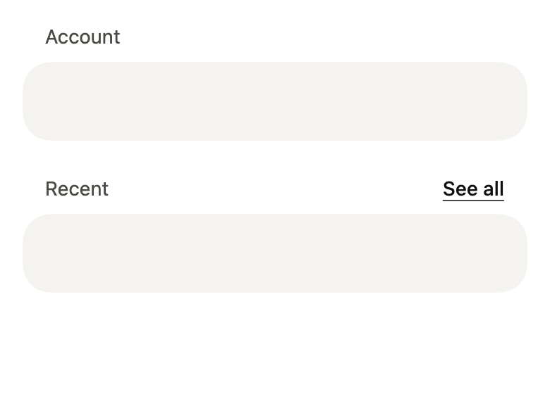
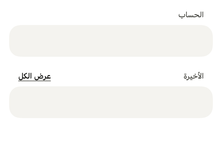
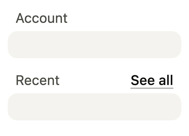
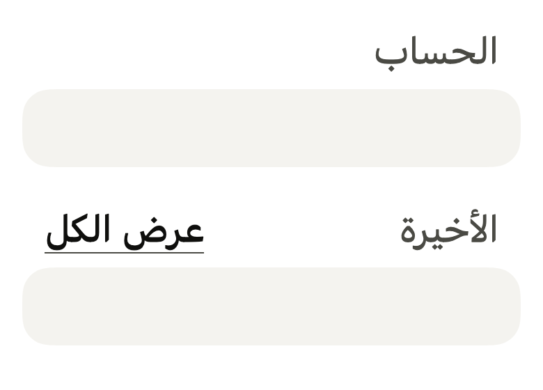
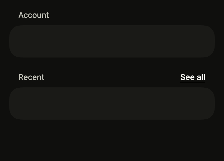
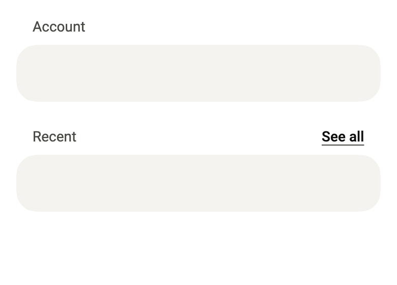
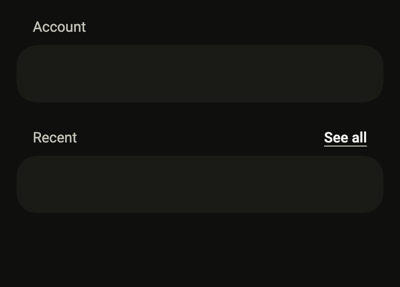
Names the group of rows or the grid below it: a muted title aligned with the group, and an optional see all link.
Import
In a Flutter app where fliin init has run:
Examples
Plain
A title above a group of rows, to split a long list into sections.
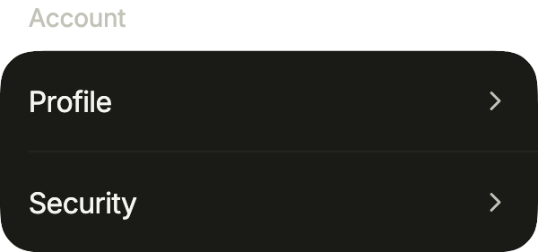
import 'package:your_app/ui/fliin/components/list_row/fl_list_row.dart';
import 'package:your_app/ui/fliin/components/section_header/fl_section_header.dart';
import 'package:flutter/widgets.dart';

class SectionHeaderPlainExample extends StatelessWidget {
  const SectionHeaderPlainExample({super.key});

  @override
  Widget build(BuildContext context) {
    return Column(
      mainAxisSize: MainAxisSize.min,
      crossAxisAlignment: CrossAxisAlignment.stretch,
      children: [
        const FlSectionHeader(title: 'Account'),
        FlListGroup(
          children: [
            FlListRow(title: 'Profile', trailing: const FlListRowChevron(), onPressed: () {}),
            FlListRow(title: 'Security', trailing: const FlListRowChevron(), onPressed: () {}),
          ],
        ),
      ],
    );
  }
}Action
An action at the end of the header leads to the rest of the section, like “See all” above a preview.
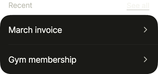
import 'package:your_app/ui/fliin/components/list_row/fl_list_row.dart';
import 'package:your_app/ui/fliin/components/section_header/fl_section_header.dart';
import 'package:flutter/widgets.dart';

class SectionHeaderActionExample extends StatelessWidget {
  const SectionHeaderActionExample({super.key});

  @override
  Widget build(BuildContext context) {
    return Column(
      mainAxisSize: MainAxisSize.min,
      crossAxisAlignment: CrossAxisAlignment.stretch,
      children: [
        FlSectionHeader(
          title: 'Recent',
          action: FlSectionHeaderAction(label: 'See all', onPressed: () {}),
        ),
        FlListGroup(
          children: [
            FlListRow(title: 'March invoice', trailing: const FlListRowChevron(), onPressed: () {}),
            FlListRow(title: 'Gym membership', trailing: const FlListRowChevron(), onPressed: () {}),
          ],
        ),
      ],
    );
  }
}Large
size: large titles a part of a screen, a store's or a feed's, and description says what it holds; the action leads to the rest.
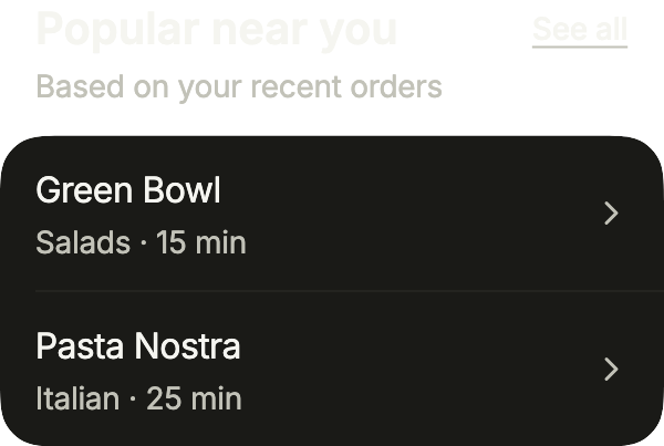
import 'package:your_app/ui/fliin/components/list_row/fl_list_row.dart';
import 'package:your_app/ui/fliin/components/section_header/fl_section_header.dart';
import 'package:flutter/widgets.dart';

class SectionHeaderLargeExample extends StatelessWidget {
  const SectionHeaderLargeExample({super.key});

  @override
  Widget build(BuildContext context) {
    return Column(
      mainAxisSize: MainAxisSize.min,
      crossAxisAlignment: CrossAxisAlignment.stretch,
      children: [
        FlSectionHeader(
          title: 'Popular near you',
          size: FlSectionHeaderSize.large,
          description: 'Based on your recent orders',
          action: FlSectionHeaderAction(label: 'See all', onPressed: () {}),
        ),
        FlListGroup(
          children: [
            FlListRow(title: 'Green Bowl', subtitle: 'Salads · 15 min', trailing: const FlListRowChevron(), onPressed: () {}),
            FlListRow(title: 'Pasta Nostra', subtitle: 'Italian · 25 min', trailing: const FlListRowChevron(), onPressed: () {}),
          ],
        ),
      ],
    );
  }
}Trailing
trailing puts another widget than a link at the end of the title, here the number of unread notifications.
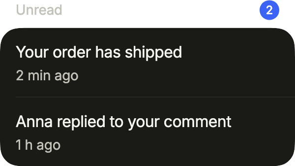
import 'package:your_app/ui/fliin/components/badge/fl_badge.dart';
import 'package:your_app/ui/fliin/components/list_row/fl_list_row.dart';
import 'package:your_app/ui/fliin/components/section_header/fl_section_header.dart';
import 'package:flutter/widgets.dart';

class SectionHeaderTrailingExample extends StatelessWidget {
  const SectionHeaderTrailingExample({super.key});

  @override
  Widget build(BuildContext context) {
    return Column(
      mainAxisSize: MainAxisSize.min,
      crossAxisAlignment: CrossAxisAlignment.stretch,
      children: [
        const FlSectionHeader(
          title: 'Unread',
          trailing: FlBadge.count(count: 2, semanticLabel: '2 unread', color: FlBadgeColor.accent),
        ),
        FlListGroup(
          children: [
            FlListRow(title: 'Your order has shipped', subtitle: '2 min ago', onPressed: () {}),
            FlListRow(title: 'Anna replied to your comment', subtitle: '1 h ago', onPressed: () {}),
          ],
        ),
      ],
    );
  }
}Usage
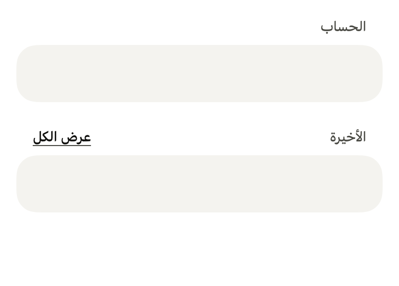
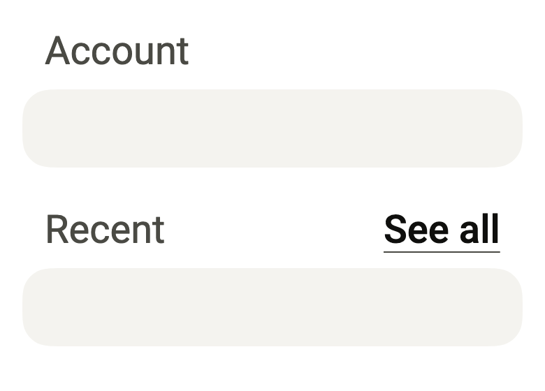
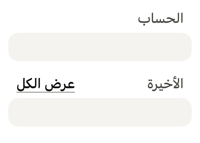
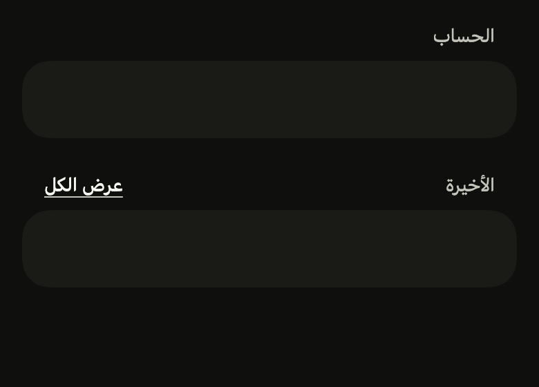
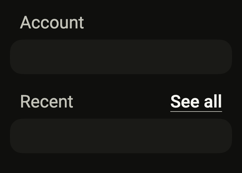
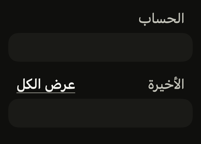
The code the reference images render:
final example = ColoredBox(
  color: FlScope.of(context).colors.surface,
  child: Padding(
    padding: EdgeInsetsDirectional.all(FlScope.of(context).space.lg),
    child: Column(
      crossAxisAlignment: CrossAxisAlignment.stretch,
      children: [
        FlSectionHeader(title: 'Account'),
        SizedBox(
          height: 56,
          child: DecoratedBox(
            decoration: ShapeDecoration(
              color: FlScope.of(context).colors.surfaceRaised,
              shape: FlContinuousBorder(
                radius: FlScope.of(context).shape.radiusCard,
              ),
            ),
          ),
        ),
        SizedBox(height: FlScope.of(context).space.xl),
        FlSectionHeader(
          title: 'Recent',
          action: FlSectionHeaderAction(label: 'See all', onPressed: () {}),
        ),
        SizedBox(
          height: 56,
          child: DecoratedBox(
            decoration: ShapeDecoration(
              color: FlScope.of(context).colors.surfaceRaised,
              shape: FlContinuousBorder(
                radius: FlScope.of(context).shape.radiusCard,
              ),
            ),
          ),
        ),
      ],
    ),
  ),
);API
FlSectionHeaderAction: final class
FlSectionHeaderAction.new: const new({required String label, required VoidCallback? onPressed})
FlSectionHeaderAction.label: get String
FlSectionHeaderAction.onPressed: get VoidCallback?
FlSectionHeaderSize: enum {small, large}
FlSectionHeaderSize.small: static final FlSectionHeaderSize
FlSectionHeaderSize.large: static final FlSectionHeaderSize
FlSectionHeader: class extends StatelessWidget
FlSectionHeader.new: const new({super.key, required String title, FlSectionHeaderAction? action, FlSectionHeaderSize size, String? description, Widget? trailing})
FlSectionHeader.title: get String
FlSectionHeader.action: get FlSectionHeaderAction?
FlSectionHeader.size: get FlSectionHeaderSize
FlSectionHeader.description: get String?
FlSectionHeader.trailing: get Widget?
FlSectionHeader.build: Widget(BuildContext context)Reference renders
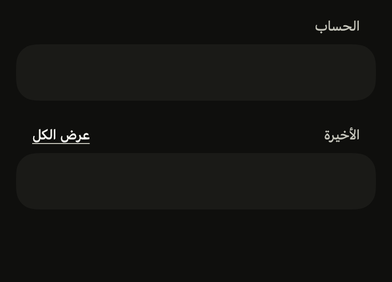
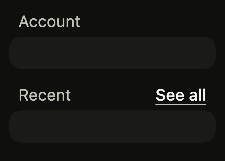
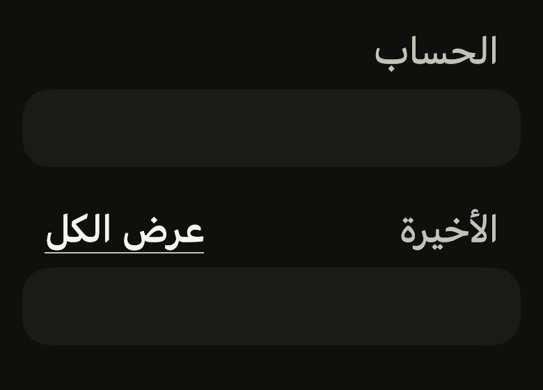
The 16 images published with version 0.2.2, rendered by the shared harness on macOS with Flutter 3.47.7. fliin verify section-header compares your copy to them.
Use it to
- describe each group of rows on a page
- add a see all link at the end of a heading
- separate the sections of a page with headings
- present a list of favorites under its heading
- show what a group of settings is about
- Not for
- the screen's title: use the app bar (app-bar)
- States
Source
The files fliin add section-header copies into your app, before your prefix and imports are applied.
section_header/fl_section_header.dart
// The title is modified from the ListGroup examples of HeroUI Native 1.0.10,
// Copyright 2025 NextUI Inc., licensed under Apache 2.0:
// https://www.apache.org/licenses/LICENSE-2.0
import 'package:flutter/widgets.dart';
import 'package:fliin_ui/components/button/fl_button.dart';
import 'package:fliin_ui/components/link_button/fl_link_button.dart';
import 'package:fliin_ui/core/fliin.dart';

/// The action of an [FlSectionHeader]: a "See all" link at the end of the
/// title.
final class FlSectionHeaderAction {
  /// A link that shows [label] and calls [onPressed].
  const FlSectionHeaderAction({required this.label, required this.onPressed});

  /// The link text, read as is by the screen reader.
  final String label;

  /// Called when the link is pressed; null disables the link.
  final VoidCallback? onPressed;
}

/// The size of an [FlSectionHeader]'s title.
enum FlSectionHeaderSize {
  /// Muted `textSm`, above a group of rows: a settings screen's "Account".
  small,

  /// `title3` in `onSurface`, above a carousel or a grid that opens a part
  /// of the app: a store's "Popular near you".
  large,
}

/// The title of a section placed above an `FlListGroup` or a grid: [title] in
/// muted `textSm`, inset by `space.lg` from the group's edges, so that it
/// lines up with the rows' text, `space.sm` above it. An optional [action]
/// sits at the end, as an `sm` link in the text color, or below
/// when the two do not fit on one line.
///
/// [size] `large` makes it the title of a part of a screen, `space.md`
/// above its content, and [description] adds a muted line under it;
/// [trailing] puts another widget than a link at the end (a count, an icon
/// button).
///
/// The title is announced as a header: the screen reader jumps from section
/// to section.
class FlSectionHeader extends StatelessWidget {
  /// The [title], and an [action] at the end.
  const FlSectionHeader({
    super.key,
    required this.title,
    this.action,
    this.size = FlSectionHeaderSize.small,
    this.description,
    this.trailing,
  }) : assert(action == null || trailing == null, 'an action or a trailing widget, not both');

  /// The section name.
  final String title;

  /// The link at the end of the title; null leaves the title alone.
  final FlSectionHeaderAction? action;

  /// Muted `textSm` above rows by default, or `large` above a carousel.
  final FlSectionHeaderSize size;

  /// A muted line under the title, across the whole width: what the
  /// section holds, or why ("Based on your recent orders"). When null,
  /// none.
  final String? description;

  /// A widget at the end of the title instead of [action], centered on its
  /// line: a count, an `sm` icon button. It brings its own semantics. When
  /// null, none.
  final Widget? trailing;

  @override
  Widget build(BuildContext context) {
    final theme = FlScope.of(context);
    final large = size == FlSectionHeaderSize.large;
    final role = large ? FlTextRole.title3 : FlTextRole.textSm;
    final action = this.action;
    final description = this.description;
    final family = DefaultTextStyle.of(context).style.fontFamily;
    final end = switch ((action, trailing)) {
      (final action?, _) => FlLinkButton(
        label: action.label,
        onPressed: action.onPressed,
        size: FlButtonSize.sm,
        underline: true,
      ),
      (null, final trailing?) => trailing,
      (null, null) => null,
    };
    // The link moves under the heading when they don't fit on one line:
    // beside it, the heading would be cut mid-word. The header node hugs
    // the text, so the contrast measurement finds the text there rather
    // than the group's background and shadow.
    final heading = OverflowBar(
      alignment: MainAxisAlignment.spaceBetween,
      spacing: theme.space.md,
      overflowSpacing: theme.space.xs,
      overflowAlignment: OverflowBarAlignment.start,
      children: [
        Semantics(
          header: true,
          child: Text(
            title,
            style: theme.typography
                .resolve(role, heading: true)
                .copyWith(color: large ? theme.colors.onSurface : theme.colors.onSurfaceMuted),
            strutStyle: theme.typography.strut(role, inheritedFamily: family, heading: true),
          ),
        ),
        ?end,
      ],
    );
    final descriptionRole = large ? FlTextRole.textSm : FlTextRole.textXs;
    return Padding(
      padding: EdgeInsetsDirectional.only(
        start: theme.space.lg,
        end: theme.space.lg,
        bottom: large ? theme.space.md : theme.space.sm,
      ),
      child: description == null
          ? heading
          : Column(
              mainAxisSize: MainAxisSize.min,
              crossAxisAlignment: CrossAxisAlignment.stretch,
              spacing: large ? theme.space.xs : 0,
              children: [
                heading,
                Text(
                  description,
                  style: theme.typography.resolve(descriptionRole).copyWith(color: theme.colors.onSurfaceMuted),
                  strutStyle: theme.typography.strut(descriptionRole, inheritedFamily: family),
                ),
              ],
            ),
    );
  }
}