Components / forms
Time field
Types a time on the keyboard, hours and minutes, with AM or PM when the language counts twelve hours; the value counts as soon as it is complete.
Import
In a Flutter app where fliin init has run:
Examples
Example
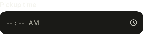
A time typed in hours and minutes, on the 12 or 24 hour clock of the user's locale.
import 'package:your_app/ui/fliin/components/time_field/fl_time_field.dart';
import 'package:flutter/widgets.dart';

class TimeFieldExample extends StatefulWidget {
  const TimeFieldExample({super.key});

  @override
  State<TimeFieldExample> createState() => _TimeFieldExampleState();
}

class _TimeFieldExampleState extends State<TimeFieldExample> {
  FlTime? _value;

  @override
  Widget build(BuildContext context) {
    return FlTimeField(
      label: 'Pickup time',
      value: _value,
      onChanged: (time) => setState(() => _value = time),
    );
  }
}Focused
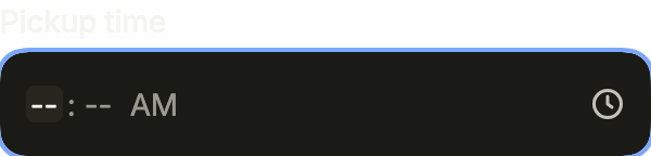
Focused, its hours ready for digits.
import 'package:your_app/ui/fliin/components/time_field/fl_time_field.dart';
import 'package:flutter/widgets.dart';

class TimeFieldFocusedExample extends StatefulWidget {
  const TimeFieldFocusedExample({super.key});

  @override
  State<TimeFieldFocusedExample> createState() => _TimeFieldFocusedExampleState();
}

class _TimeFieldFocusedExampleState extends State<TimeFieldFocusedExample> {
  FlTime? _value;

  @override
  Widget build(BuildContext context) {
    return FlTimeField(
      label: 'Pickup time',
      value: _value,
      onChanged: (time) => setState(() => _value = time),
      autofocus: true,
    );
  }
}Filled
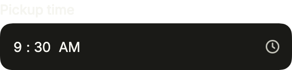
A complete time. FlTime holds the hour and the minute, without a date.
import 'package:your_app/ui/fliin/components/time_field/fl_time_field.dart';
import 'package:flutter/widgets.dart';

class TimeFieldFilledExample extends StatefulWidget {
  const TimeFieldFilledExample({super.key});

  @override
  State<TimeFieldFilledExample> createState() => _TimeFieldFilledExampleState();
}

class _TimeFieldFilledExampleState extends State<TimeFieldFilledExample> {
  FlTime? _value = const FlTime(9, 30);

  @override
  Widget build(BuildContext context) {
    return FlTimeField(
      label: 'Pickup time',
      value: _value,
      onChanged: (time) => setState(() => _value = time),
    );
  }
}Placeholder
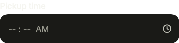
Empty: each segment shows what it expects.
import 'package:your_app/ui/fliin/components/time_field/fl_time_field.dart';
import 'package:flutter/widgets.dart';

class TimeFieldPlaceholderExample extends StatefulWidget {
  const TimeFieldPlaceholderExample({super.key});

  @override
  State<TimeFieldPlaceholderExample> createState() => _TimeFieldPlaceholderExampleState();
}

class _TimeFieldPlaceholderExampleState extends State<TimeFieldPlaceholderExample> {
  FlTime? _value;

  @override
  Widget build(BuildContext context) {
    return FlTimeField(
      label: 'Pickup time',
      value: _value,
      onChanged: (time) => setState(() => _value = time),
    );
  }
}Invalid
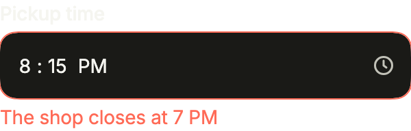
error turns the field red and says why, below it.
import 'package:your_app/ui/fliin/components/time_field/fl_time_field.dart';
import 'package:flutter/widgets.dart';

class TimeFieldInvalidExample extends StatefulWidget {
  const TimeFieldInvalidExample({super.key});

  @override
  State<TimeFieldInvalidExample> createState() => _TimeFieldInvalidExampleState();
}

class _TimeFieldInvalidExampleState extends State<TimeFieldInvalidExample> {
  FlTime? _value = const FlTime(20, 15);

  @override
  Widget build(BuildContext context) {
    return FlTimeField(
      label: 'Pickup time',
      value: _value,
      onChanged: (time) => setState(() => _value = time),
      error: 'The shop closes at 7 PM',
    );
  }
}Disabled
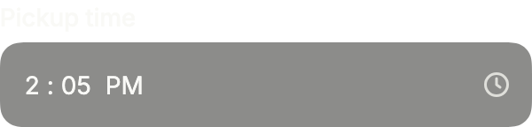
onChanged: null disables the field: the time stays readable.
import 'package:your_app/ui/fliin/components/time_field/fl_time_field.dart';
import 'package:flutter/widgets.dart';

class TimeFieldDisabledExample extends StatelessWidget {
  const TimeFieldDisabledExample({super.key});

  @override
  Widget build(BuildContext context) {
    return FlTimeField(
      label: 'Pickup time',
      value: const FlTime(14, 5),
      onChanged: null,
    );
  }
}On surface
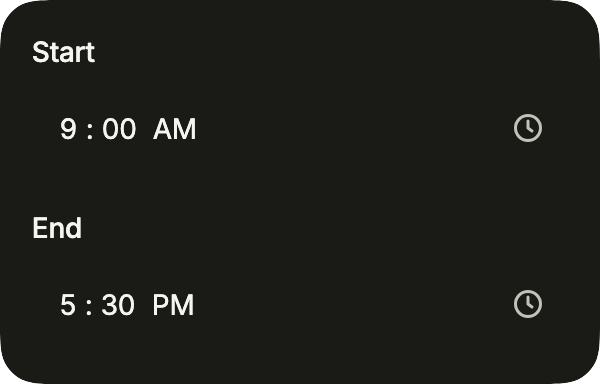
Two times on a card, in FlInputVariant.secondary: the fields fill instead of casting a shadow on the surface.
import 'package:your_app/ui/fliin/components/surface/fl_surface.dart';
import 'package:your_app/ui/fliin/components/time_field/fl_time_field.dart';
import 'package:your_app/ui/fliin/core/fliin.dart';
import 'package:flutter/widgets.dart';

class TimeFieldOnSurfaceExample extends StatefulWidget {
  const TimeFieldOnSurfaceExample({super.key});

  @override
  State<TimeFieldOnSurfaceExample> createState() => _TimeFieldOnSurfaceExampleState();
}

class _TimeFieldOnSurfaceExampleState extends State<TimeFieldOnSurfaceExample> {
  FlTime? _start = const FlTime(9, 0);
  FlTime? _end = const FlTime(17, 30);

  @override
  Widget build(BuildContext context) {
    return FlSurface(
      child: Column(
        mainAxisSize: MainAxisSize.min,
        crossAxisAlignment: CrossAxisAlignment.stretch,
        spacing: FlScope.of(context).space.lg,
        children: [
          FlTimeField(
            label: 'Start',
            variant: FlInputVariant.secondary,
            value: _start,
            onChanged: (time) => setState(() => _start = time),
          ),
          FlTimeField(
            label: 'End',
            variant: FlInputVariant.secondary,
            value: _end,
            onChanged: (time) => setState(() => _end = time),
          ),
        ],
      ),
    );
  }
}Prefix
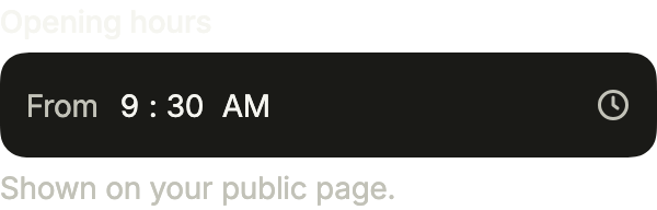
leading takes a short word before the segments, here what the time is for; the clock stays at the end.
import 'package:your_app/ui/fliin/components/time_field/fl_time_field.dart';
import 'package:flutter/widgets.dart';

class TimeFieldPrefixExample extends StatefulWidget {
  const TimeFieldPrefixExample({super.key});

  @override
  State<TimeFieldPrefixExample> createState() => _TimeFieldPrefixExampleState();
}

class _TimeFieldPrefixExampleState extends State<TimeFieldPrefixExample> {
  FlTime? _value = const FlTime(9, 30);

  @override
  Widget build(BuildContext context) {
    return FlTimeField(
      label: 'Opening hours',
      leading: const Text('From'),
      description: 'Shown on your public page.',
      value: _value,
      onChanged: (time) => setState(() => _value = time),
    );
  }
}Usage
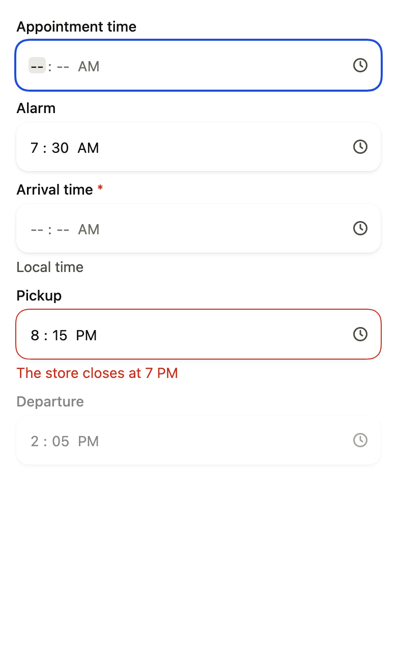
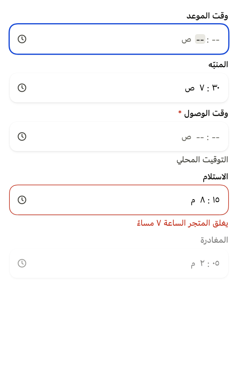
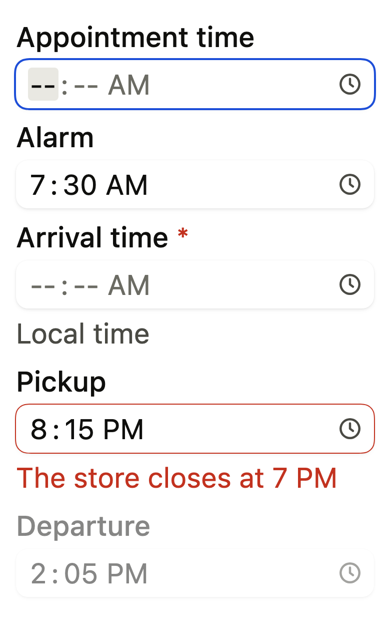
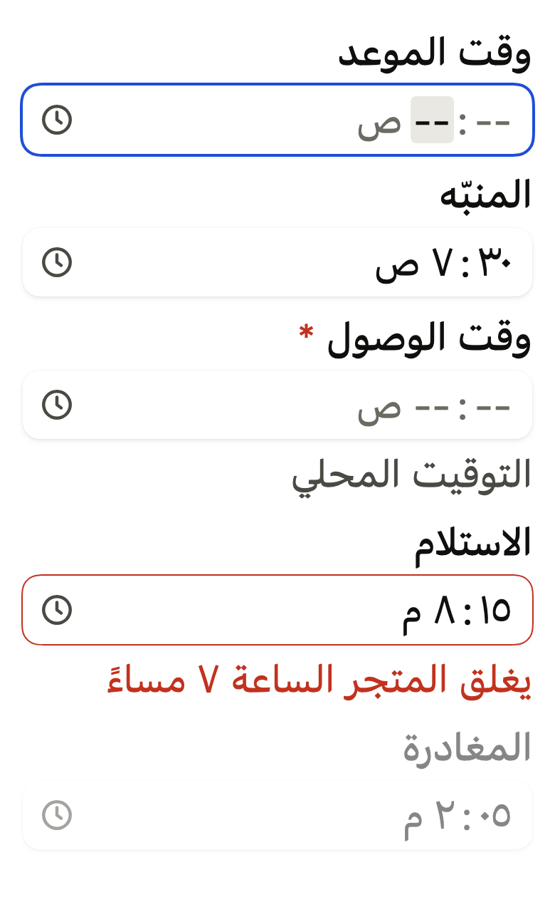
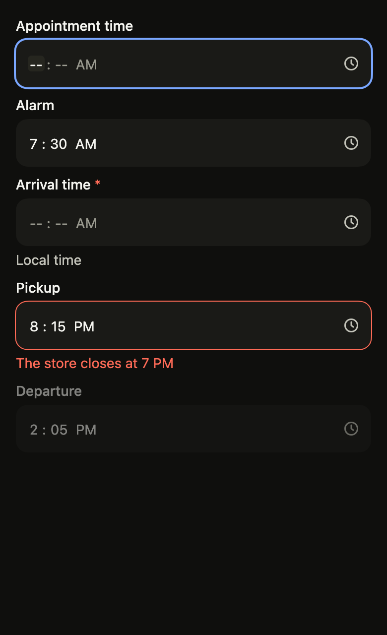
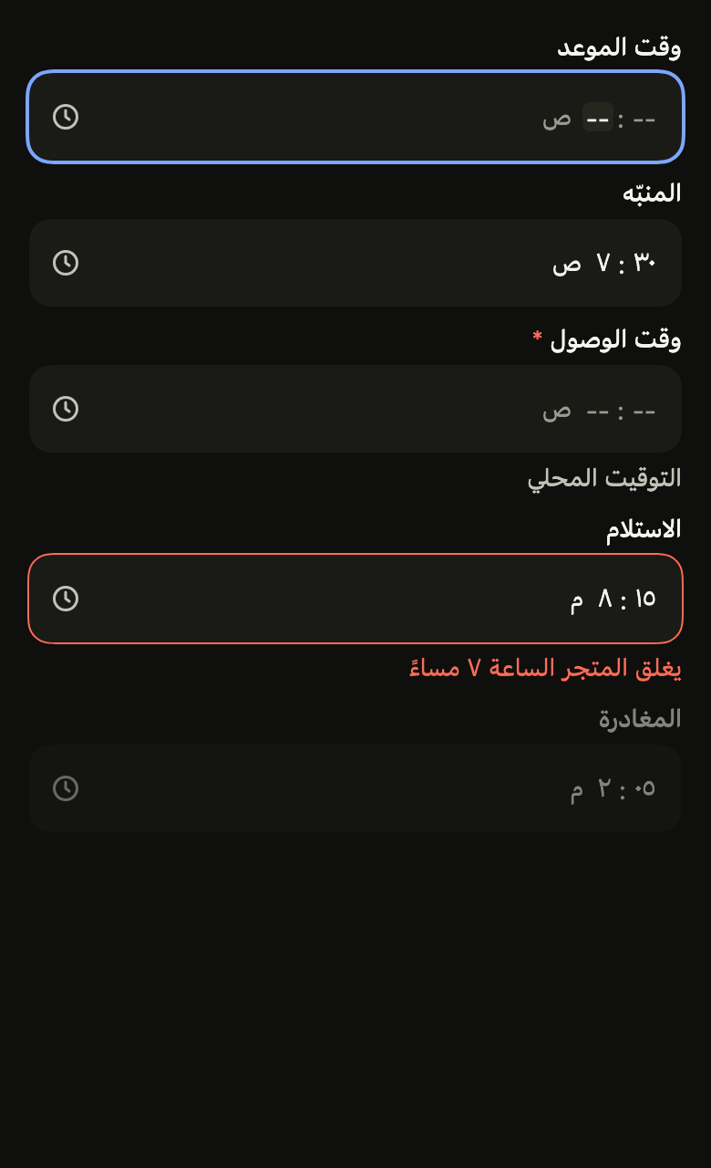
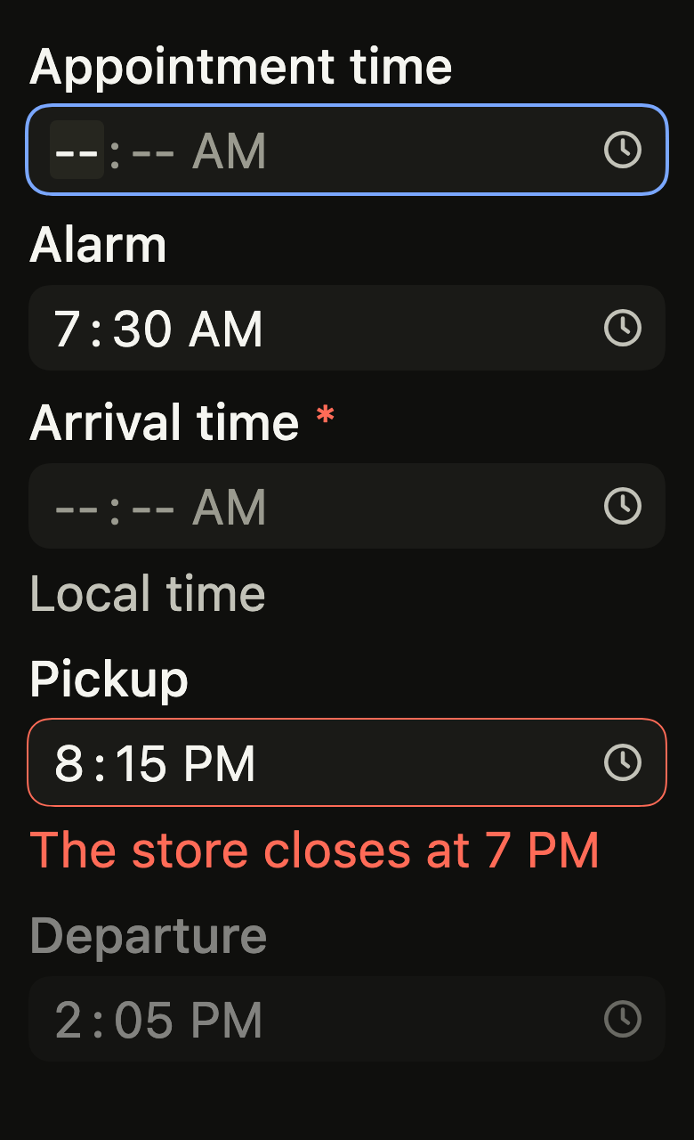
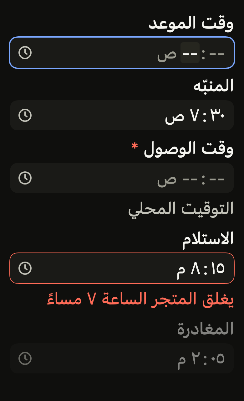
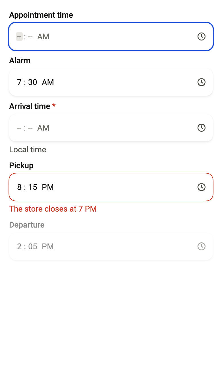
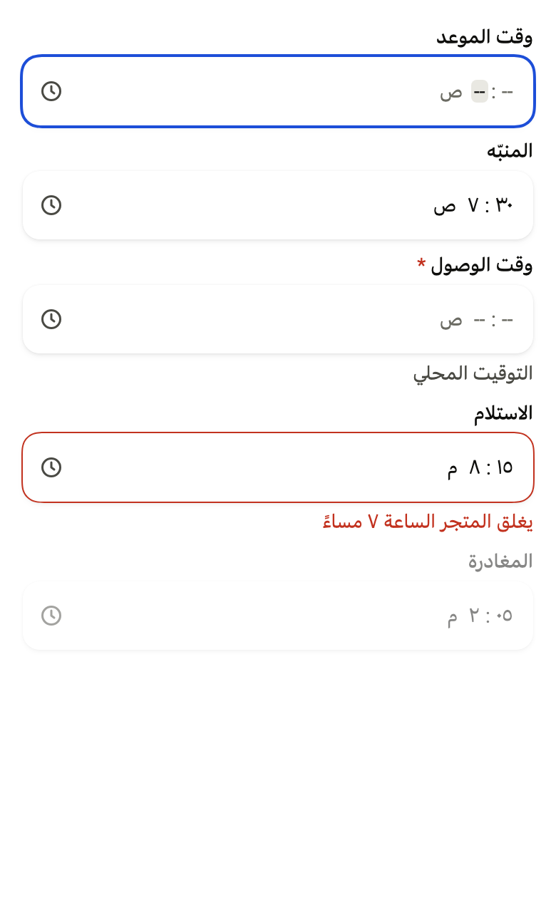
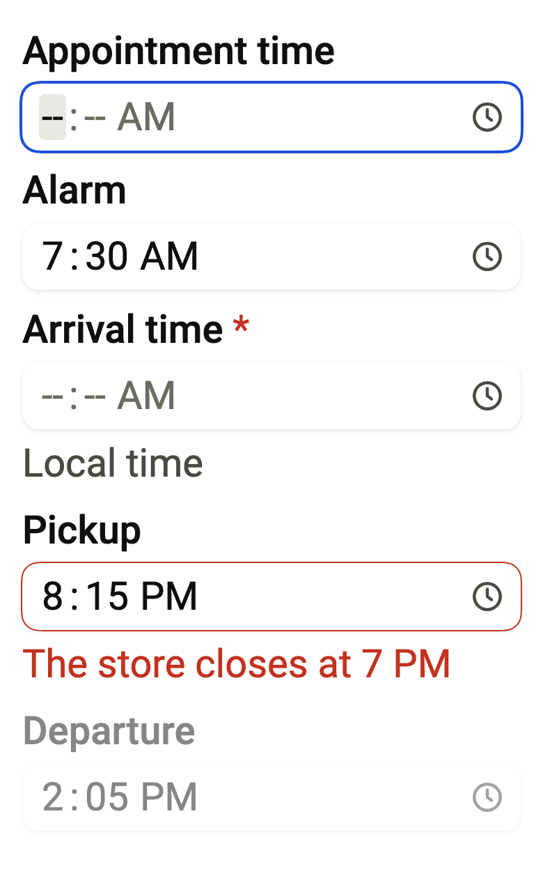
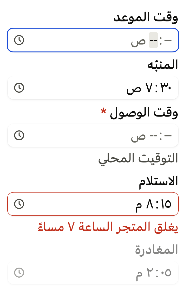
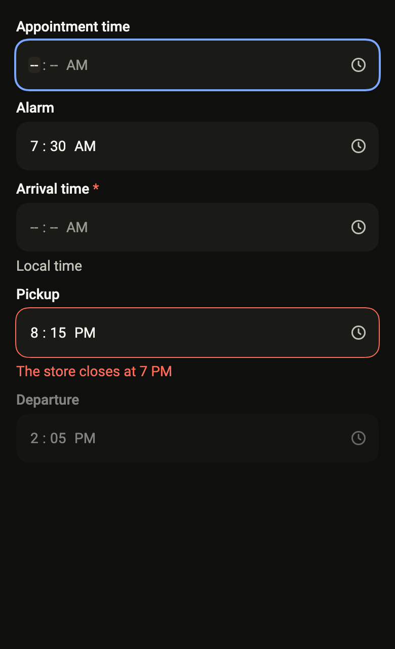
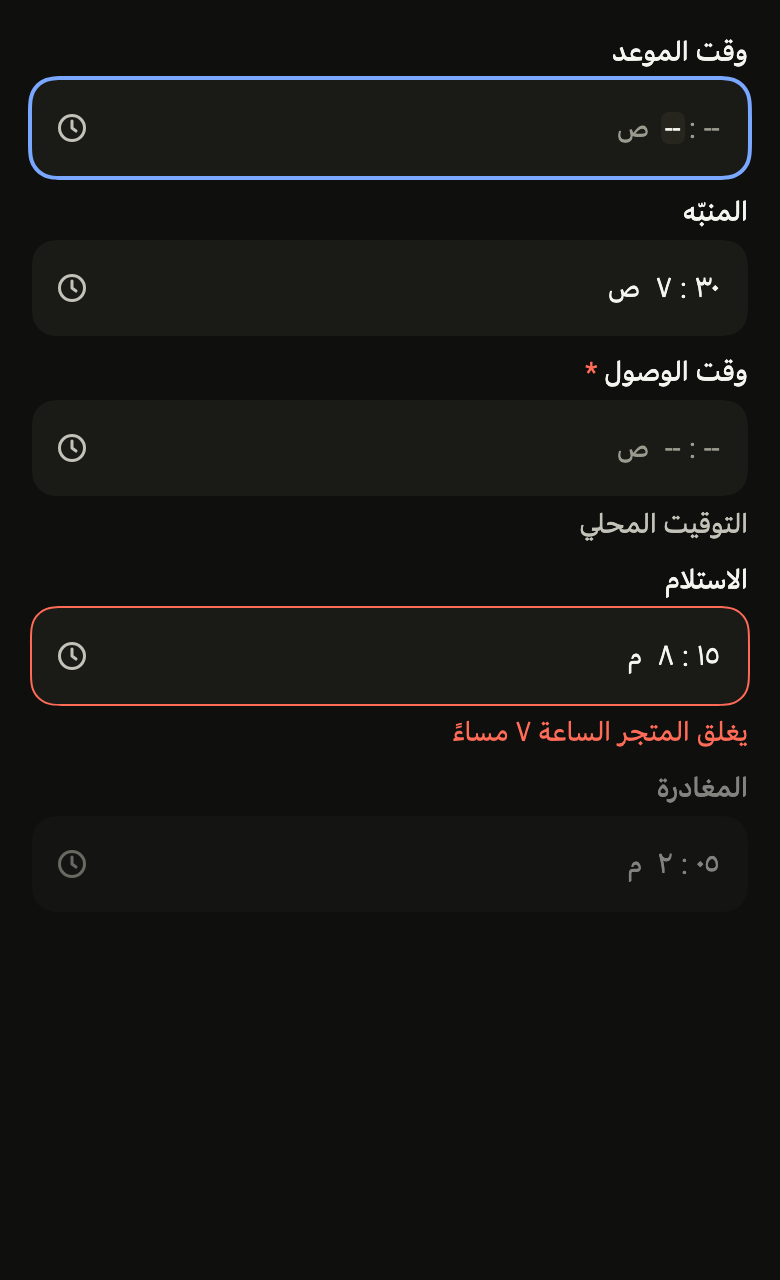
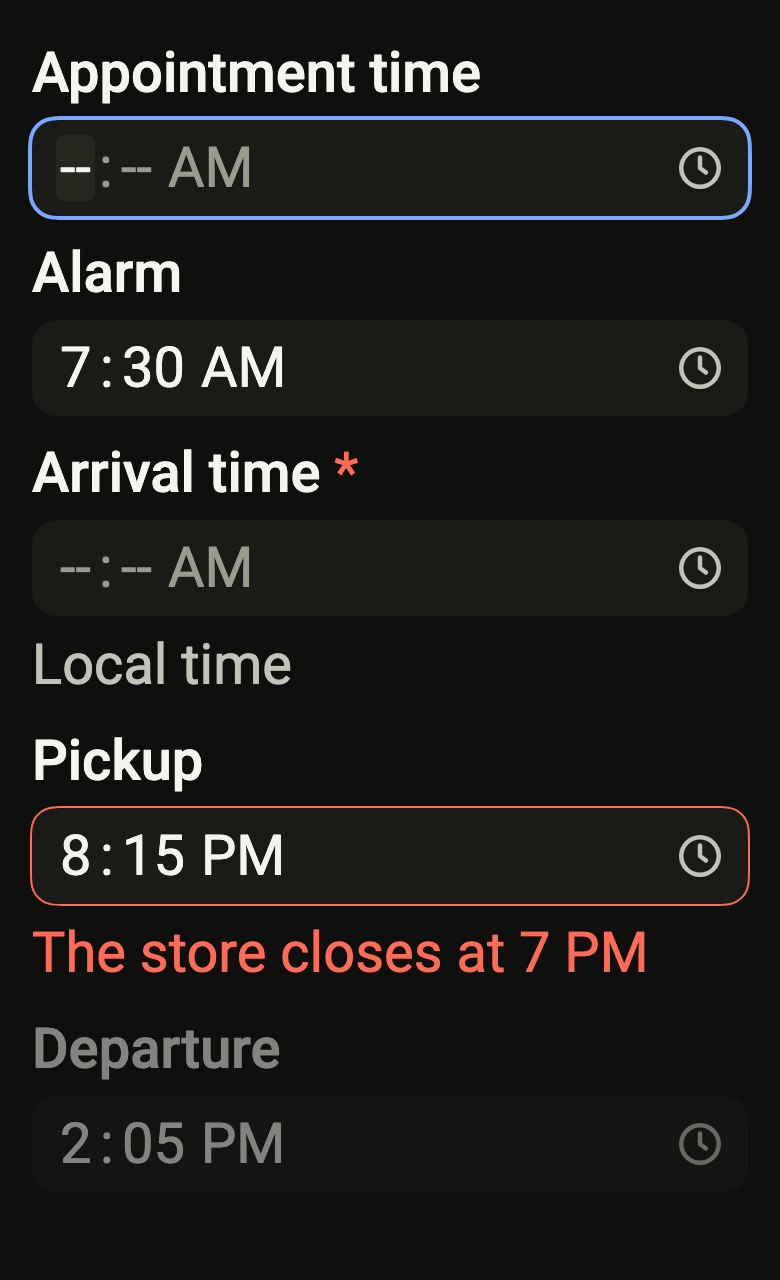
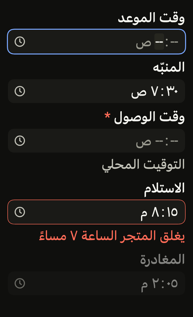
The code the reference images render:
ColoredBox(color: FlScope.of(context).colors.surface, child: SingleChildScrollView(padding: EdgeInsetsDirectional.all(FlScope.of(context).space.lg), child: Column(crossAxisAlignment: CrossAxisAlignment.stretch, spacing: FlScope.of(context).space.sm, children: [FlTimeField(label: 'Appointment time', value: null, onChanged: (_) {}, autofocus: true, strings: FlDateFieldStrings.language'en'), FlTimeField(label: 'Alarm', value: const FlTime(7, 30), onChanged: (_) {}, strings: FlDateFieldStrings.language'en'), FlTimeField(label: 'Arrival time', description: 'Local time', required: true, value: null, onChanged: (_) {}, strings: FlDateFieldStrings.language'en'), FlTimeField(label: 'Pickup', error: 'The store closes at 7 PM', value: const FlTime(20, 15), onChanged: (_) {}, strings: FlDateFieldStrings.language'en'), FlTimeField(label: 'Departure', value: const FlTime(14, 5), onChanged: null, strings: FlDateFieldStrings.language'en')])))API
FlTime: final class
FlTime.new: const new(int hour, int minute)
FlTime.hour: get int
FlTime.minute: get int
FlTime.on: DateTime(DateTime day)
FlTime.operator ==: bool(Object other)
FlTime.hashCode: get int
FlTime.toString: String()
FlTimeField: class extends StatelessWidget
FlTimeField.new: const new({super.key, required String label, required FlTime? value, required ValueChanged<FlTime?>? onChanged, String? description, String? error, bool required, bool autofocus, FlDateFieldStrings? strings, Widget? leading, bool showIcon, FlInputVariant variant})
FlTimeField.autofocus: get bool
FlTimeField.label: get String
FlTimeField.value: get FlTime?
FlTimeField.onChanged: get ValueChanged<FlTime?>?
FlTimeField.description: get String?
FlTimeField.error: get String?
FlTimeField.required: get bool
FlTimeField.strings: get FlDateFieldStrings?
FlTimeField.leading: get Widget?
FlTimeField.showIcon: get bool
FlTimeField.variant: get FlInputVariant
FlTimeField.build: Widget(BuildContext context)Reference renders
The 16 images published with version 0.2.4, rendered by the shared harness on macOS with Flutter 3.47.7. fliin verify time-field compares your copy to them.
Use it to
- ask for a pickup time in a form
- make an input for hours and minutes
- collect an arrival time
- adjust an alarm time to the minute
- switch between AM and PM for an hour
- Not for
- a duration or a countdown: use a number field (number-field)
- a calendar date: use a date field (date-field)
- States
Source
The files fliin add time-field copies into your app, before your prefix and imports are applied.
time_field/fl_time_field.dart
// Modified from the TimeField of HeroUI React v3, Copyright 2020 Next UI Inc.,
// licensed under the MIT license below and under Apache 2.0:
// https://www.apache.org/licenses/LICENSE-2.0
//
// Permission is hereby granted, free of charge, to any person obtaining a copy
// of this software and associated documentation files (the "Software"), to
// deal in the Software without restriction, including without limitation the
// rights to use, copy, modify, merge, publish, distribute, sublicense, and/or
// sell copies of the Software, and to permit persons to whom the Software is
// furnished to do so, subject to the following conditions:
//
// The above copyright notice and this permission notice shall be included in
// all copies or substantial portions of the Software.
//
// THE SOFTWARE IS PROVIDED "AS IS", WITHOUT WARRANTY OF ANY KIND, EXPRESS OR
// IMPLIED, INCLUDING BUT NOT LIMITED TO THE WARRANTIES OF MERCHANTABILITY,
// FITNESS FOR A PARTICULAR PURPOSE AND NONINFRINGEMENT. IN NO EVENT SHALL THE
// AUTHORS OR COPYRIGHT HOLDERS BE LIABLE FOR ANY CLAIM, DAMAGES OR OTHER
// LIABILITY, WHETHER IN AN ACTION OF CONTRACT, TORT OR OTHERWISE, ARISING
// FROM, OUT OF OR IN CONNECTION WITH THE SOFTWARE OR THE USE OR OTHER DEALINGS
// IN THE SOFTWARE.
import 'package:flutter/widgets.dart';
import 'package:fliin_ui/components/date_field/fl_segmented_field.dart';
import 'package:fliin_ui/icons/fl_icons.dart';

export 'package:fliin_ui/components/date_field/fl_segmented_field.dart';

/// A time of day, with no date or time zone: `widgets.dart` lacks material's
/// `TimeOfDay`.
@immutable
final class FlTime {
  /// [hour] from 0 to 23, [minute] from 0 to 59.
  const FlTime(this.hour, this.minute)
    : assert(hour >= 0 && hour < 24, 'from 0 to 23'),
      assert(minute >= 0 && minute < 60, 'from 0 to 59');

  /// The hour, from 0 to 23.
  final int hour;

  /// The minute, from 0 to 59.
  final int minute;

  /// That day, at this time, in local time, through `DateTime`: a time that
  /// does not exist that day (the switch to daylight saving time, midnight in
  /// Santiago on 6 September 2026) is moved forward one hour, and a time that
  /// exists twice takes the first. For a time displayed as is (an
  /// appointment), keep the date and `FlTime` separate up to the server.
  DateTime on(DateTime day) => DateTime(day.year, day.month, day.day, hour, minute);

  @override
  bool operator ==(Object other) => other is FlTime && other.hour == hour && other.minute == minute;

  @override
  int get hashCode => Object.hash(hour, minute);

  @override
  String toString() => 'FlTime($hour:${minute.toString().padLeft(2, '0')})';
}

/// Keyboard entry of a time, by segments: the
/// hour and the minute, then AM or PM when the language uses a 12-hour clock
/// ("9:05 AM" in English, "09:05" in French). The hour and the minute read
/// left to right, even in Arabic.
///
/// Entry and keyboard are those of `FlSegmentedField`. On a 12-hour clock,
/// the typed hour sets AM, which a tap, the arrows or `p` change: the number
/// pad has no letters. The time goes to [onChanged] as soon as every segment
/// is filled; a segment emptied afterwards yields `null`.
class FlTimeField extends StatelessWidget {
  /// A field whose time is [value].
  const FlTimeField({
    super.key,
    required this.label,
    required this.value,
    required this.onChanged,
    this.description,
    this.error,
    this.required = false,
    this.autofocus = false,
    this.strings,
    this.leading,
    this.showIcon = true,
    this.variant = FlInputVariant.primary,
  });

  /// True: the first empty segment takes focus on the first build.
  final bool autofocus;

  /// The field's name, shown above and read by the screen reader.
  final String label;

  /// The time; null when empty.
  final FlTime? value;

  /// Receives the time when it is complete, or `null` when it stops being so;
  /// null disables the field.
  final ValueChanged<FlTime?>? onChanged;

  /// The help text under the field, hidden by [error].
  final String? description;

  /// Non-null: the field is invalid, and this text replaces [description].
  final String? error;

  /// True: an asterisk follows the label, and the field is announced as required.
  final bool required;

  /// The 12- or 24-hour clock, the texts and the digits; those of the app's
  /// language by default.
  final FlDateFieldStrings? strings;

  /// See [FlSegmentedField.leading]: an icon or a word before the segments.
  final Widget? leading;

  /// True: the `clock` icon at the end of the field; false,
  /// none, for a field that carries its own [leading].
  final bool showIcon;

  /// See [FlSegmentedField.variant].
  final FlInputVariant variant;

  @override
  Widget build(BuildContext context) {
    final strings = this.strings ?? FlDateFieldStrings.of(context);
    final hour12 = strings.hour12;
    final value = this.value;
    final onChanged = this.onChanged;
    Map<FlDateSegment, int> segments(FlTime time) => hour12
        ? {
            FlDateSegment.hour: time.hour % 12 == 0 ? 12 : time.hour % 12,
            FlDateSegment.minute: time.minute,
            FlDateSegment.dayPeriod: time.hour < 12 ? 0 : 1,
          }
        : {FlDateSegment.hour: time.hour, FlDateSegment.minute: time.minute};
    FlTime time(Map<FlDateSegment, int> values) {
      final hour = values[FlDateSegment.hour]!;
      final minute = values[FlDateSegment.minute]!;
      if (!hour12) return FlTime(hour, minute);
      return FlTime(hour % 12 + 12 * values[FlDateSegment.dayPeriod]!, minute);
    }

    return FlSegmentedField(
      label: label,
      segments: [FlDateSegment.hour, FlDateSegment.minute, if (hour12) FlDateSegment.dayPeriod],
      values: value == null ? const {} : segments(value),
      strings: strings,
      description: description,
      error: error,
      icon: showIcon ? FlIcons.clock : null,
      leading: leading,
      variant: variant,
      required: required,
      autofocus: autofocus,
      onChanged: onChanged == null ? null : (values) => onChanged(values == null ? null : time(values)),
    );
  }
}