Blocks / account
Account card
Introduces the signed-in person above the topics of their account: avatar, name and address, and opens the account on tap.
Import
Account card is part of Fliin Pro. With a license key, sign in once with fliin login, then add it in a Flutter app where fliin init has run:
fliin login
fliin add profile-cardExamples
Pressable
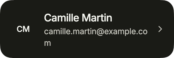
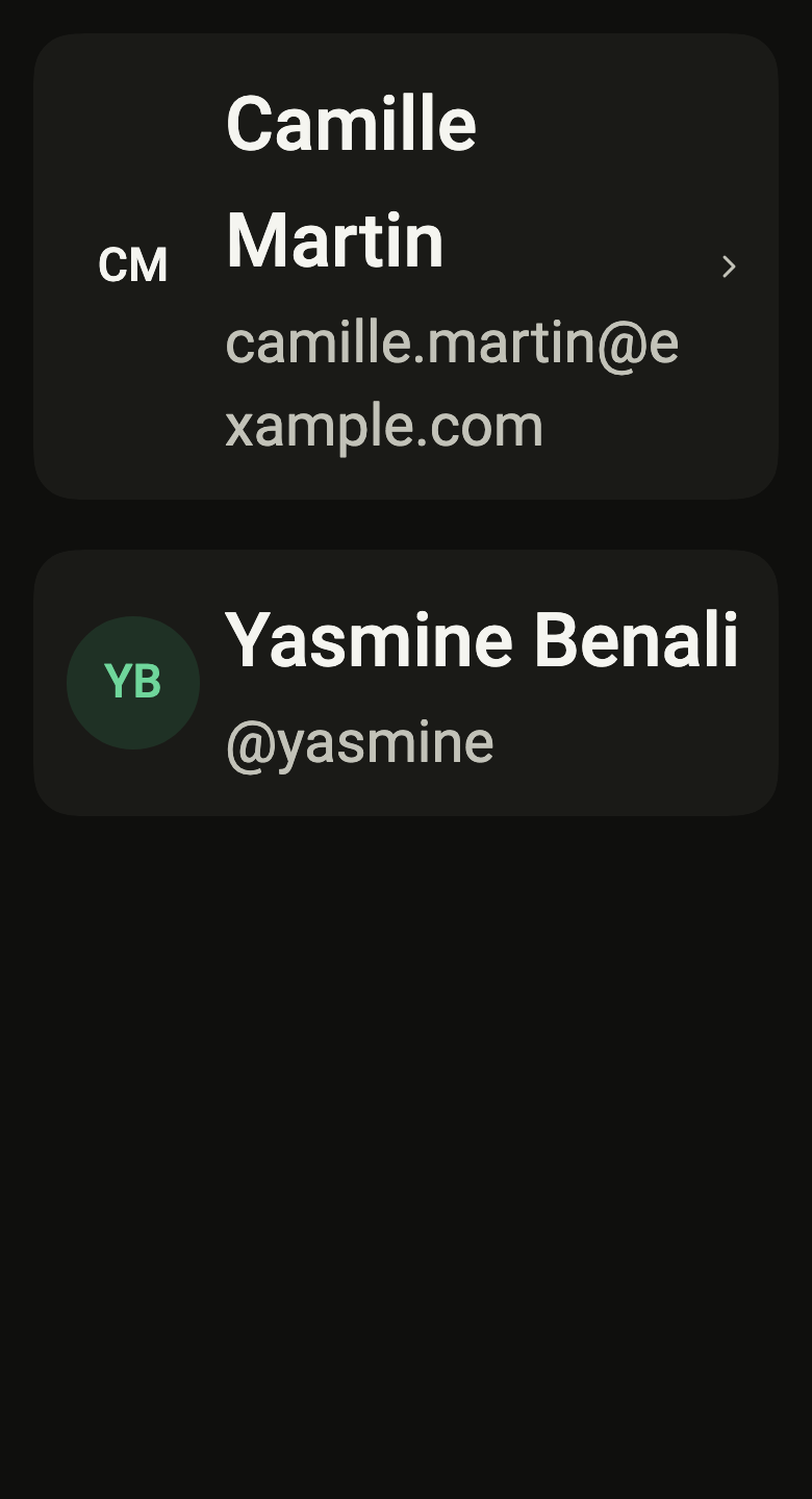
The account at the top of a settings screen: avatar, name and email. With onPressed, it opens the profile.
import 'package:your_app/ui/fliin/components/avatar/fl_avatar.dart';
import 'package:your_app/ui/fliin/components/profile_card/fl_profile_card.dart';
import 'package:flutter/widgets.dart';

class ProfileCardPressableExample extends StatelessWidget {
  const ProfileCardPressableExample({super.key});

  @override
  Widget build(BuildContext context) {
    return FlProfileCard(
      avatar: const FlAvatar(initials: 'CM', semanticLabel: 'Camille Martin'),
      name: 'Camille Martin',
      detail: '[email protected]',
      onPressed: () {},
    );
  }
}Static
Without onPressed, the card only shows who it is about: someone else’s profile, a member of a list.

import 'package:your_app/ui/fliin/components/avatar/fl_avatar.dart';
import 'package:your_app/ui/fliin/components/profile_card/fl_profile_card.dart';
import 'package:flutter/widgets.dart';

class ProfileCardStaticExample extends StatelessWidget {
  const ProfileCardStaticExample({super.key});

  @override
  Widget build(BuildContext context) {
    return const FlProfileCard(
      avatar: FlAvatar(
        initials: 'YB',
        semanticLabel: 'Yasmine Benali',
        color: FlAvatarColor.success,
        variant: FlAvatarVariant.soft,
      ),
      name: 'Yasmine Benali',
      detail: '@yasmine',
    );
  }
}Trailing
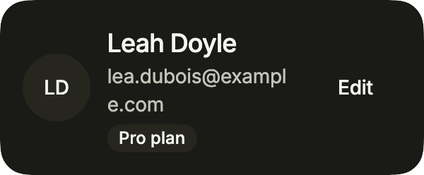
A member with their plan in tag and an action in trailing, in place of the chevron: the button keeps its own node, the card reads the rest.
import 'package:your_app/ui/fliin/components/avatar/fl_avatar.dart';
import 'package:your_app/ui/fliin/components/button/fl_button.dart';
import 'package:your_app/ui/fliin/components/chip/fl_chip.dart';
import 'package:your_app/ui/fliin/components/profile_card/fl_profile_card.dart';
import 'package:flutter/widgets.dart';

class ProfileCardTrailingExample extends StatelessWidget {
  const ProfileCardTrailingExample({super.key});

  @override
  Widget build(BuildContext context) {
    return FlProfileCard(
      avatar: const FlAvatar(
        initials: 'LD',
        semanticLabel: 'Leah Doyle',
        color: FlAvatarColor.accent,
        variant: FlAvatarVariant.soft,
      ),
      name: 'Leah Doyle',
      detail: '[email protected]',
      tag: const FlChip(label: 'Pro plan', variant: FlChipVariant.soft, size: FlChipSize.sm),
      trailing: FlButton(label: 'Edit', size: FlButtonSize.sm, variant: FlButtonVariant.tertiary, onPressed: () {}),
    );
  }
}Usage
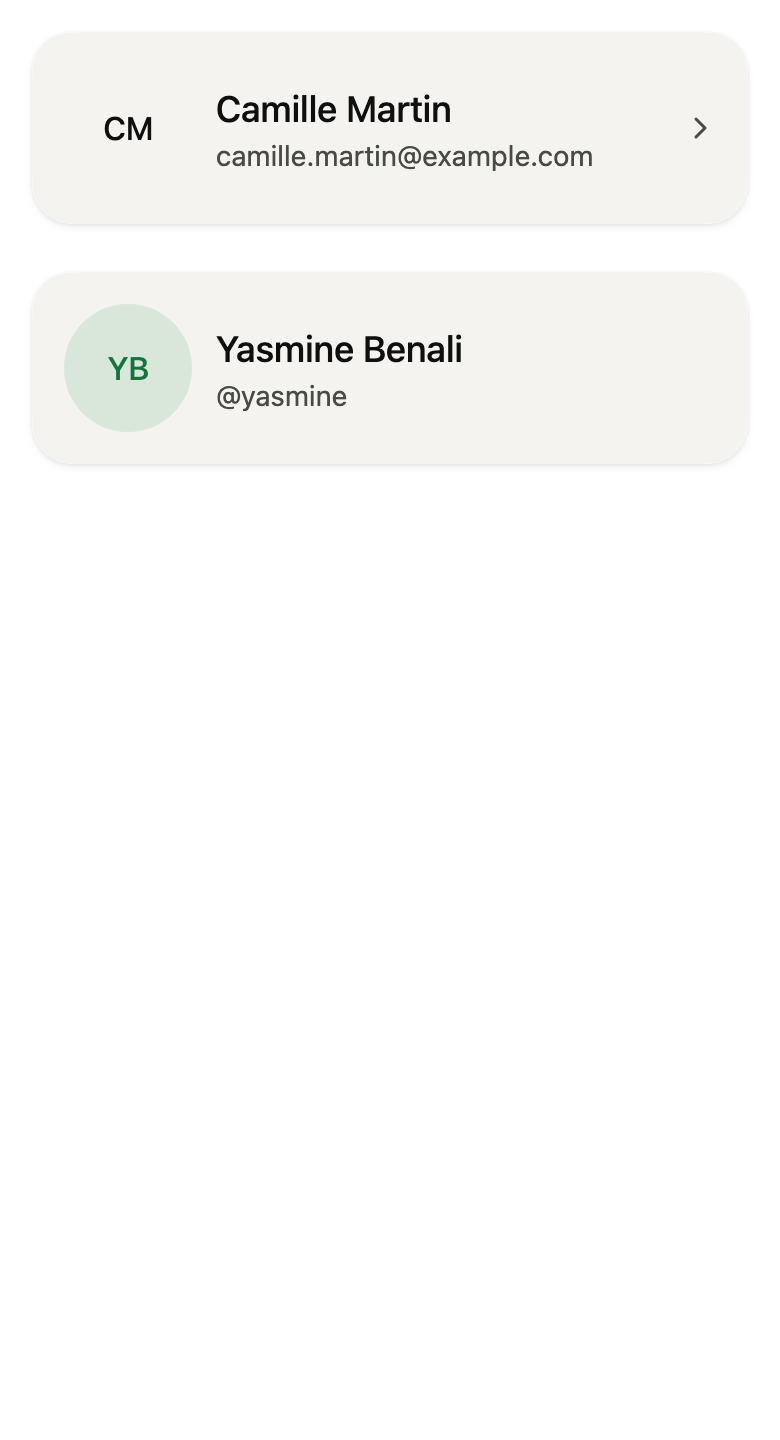
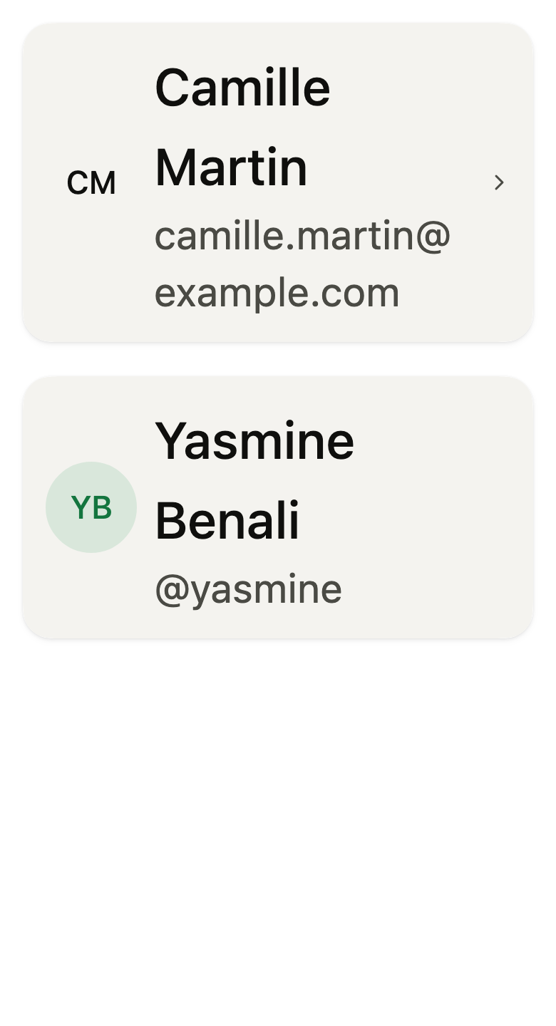
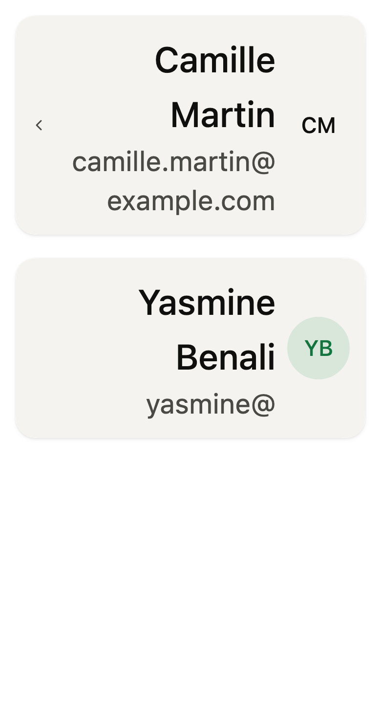
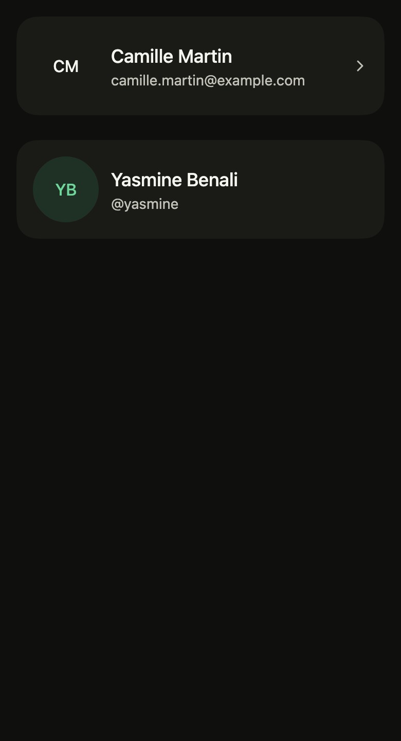
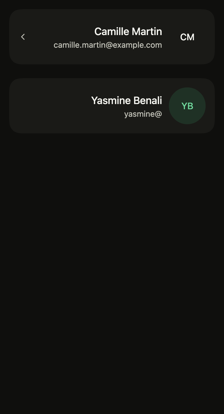
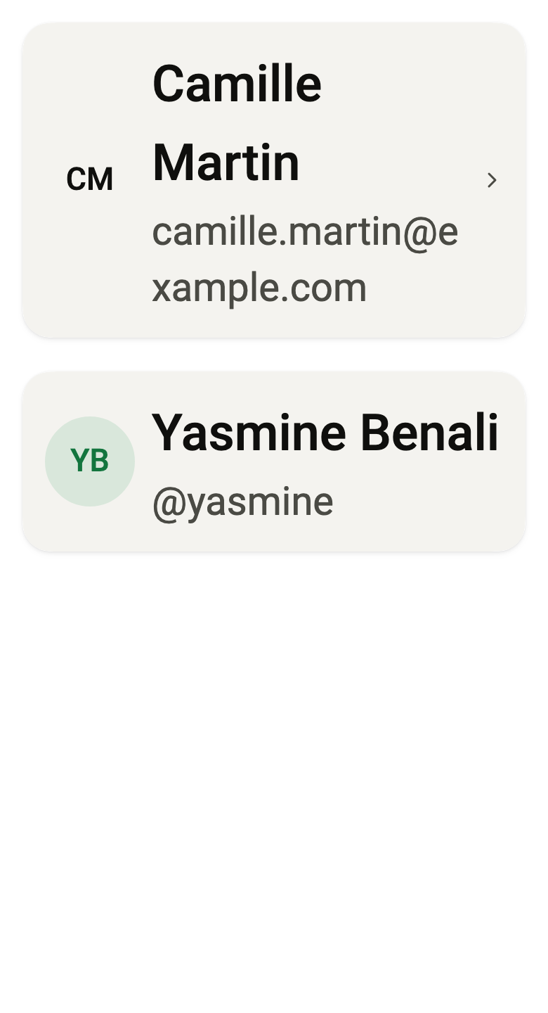
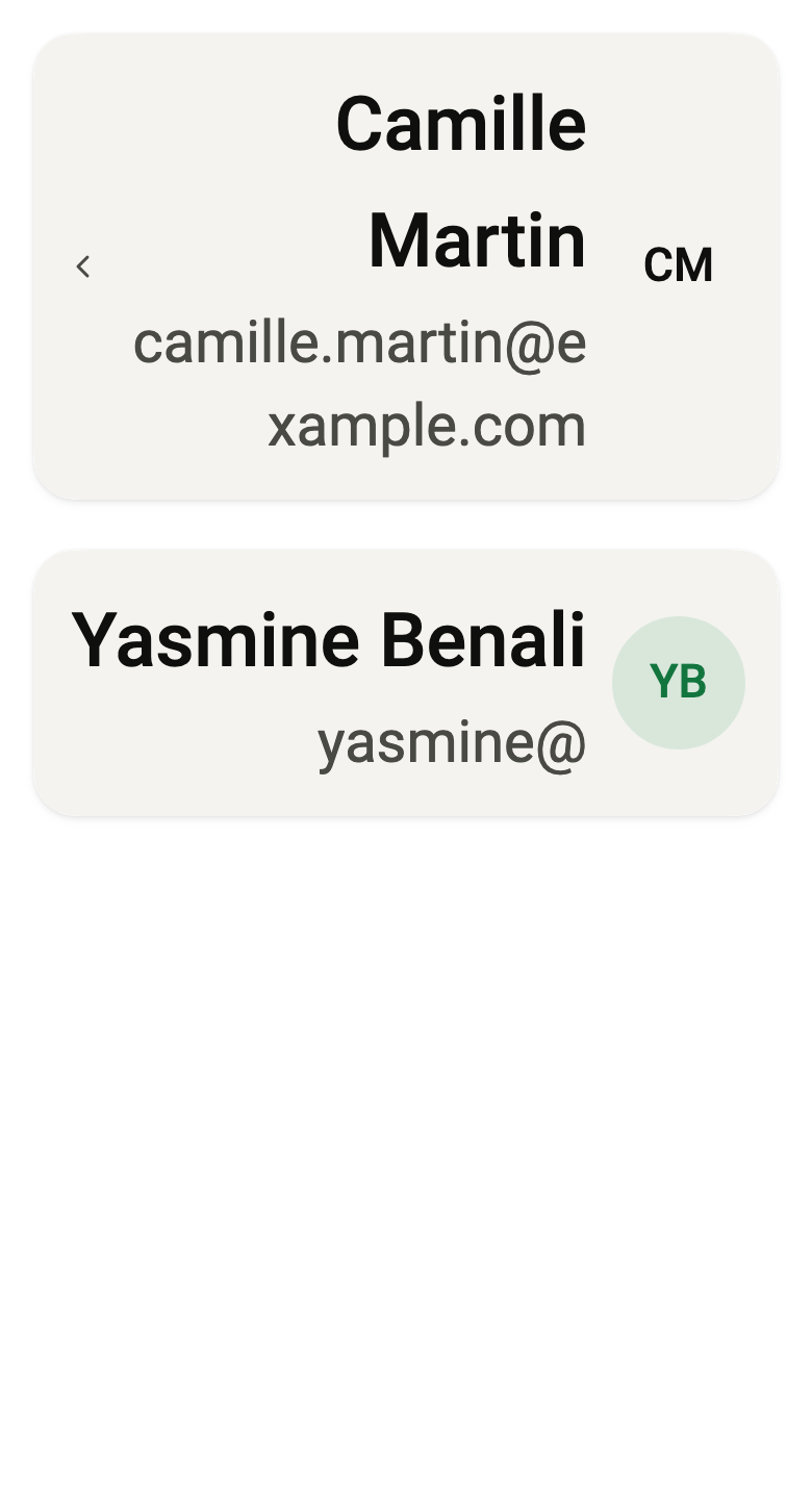
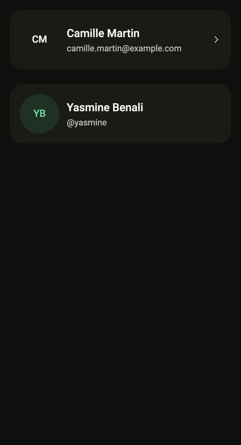
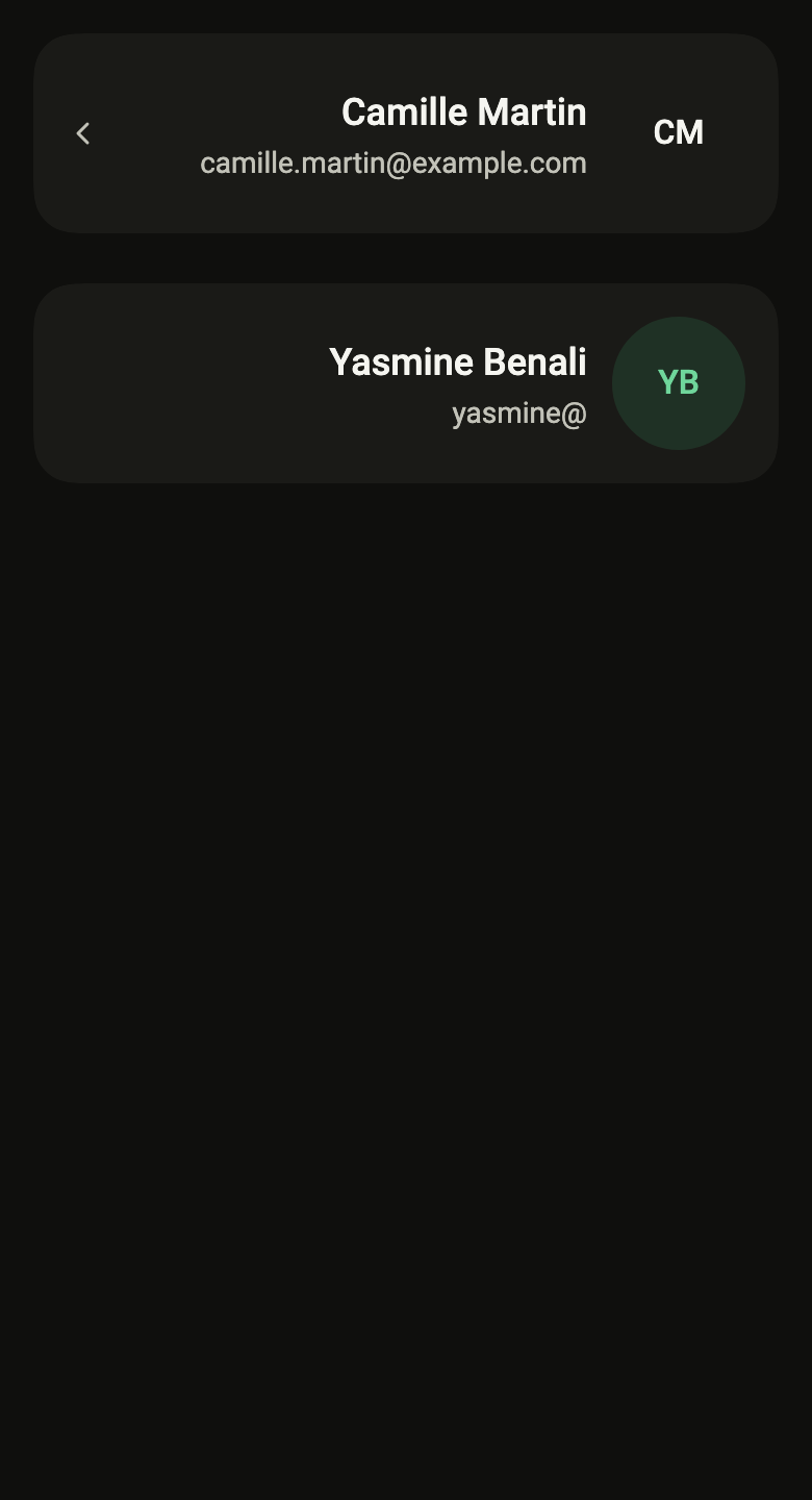
The code the reference images render:
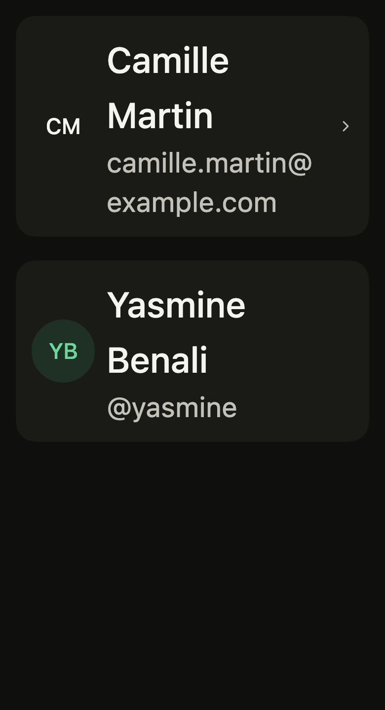
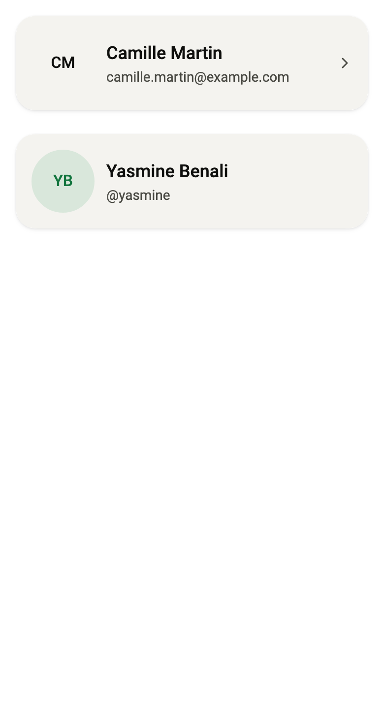
final example = ColoredBox(
  color: FlScope.of(context).colors.surface,
  child: Padding(
    padding: EdgeInsetsDirectional.all(FlScope.of(context).space.lg),
    child: Column(
      crossAxisAlignment: CrossAxisAlignment.stretch,
      spacing: FlScope.of(context).space.xl,
      children: [
        FlProfileCard(
          avatar: const FlAvatar(
            initials: "CM",
            semanticLabel: "Camille Martin",
            size: FlAvatarSize.lg,
          ),
          name: "Camille Martin",
          detail: "[email protected]",
          onPressed: () {},
        ),
        FlProfileCard(
          avatar: const FlAvatar(
            initials: "YB",
            semanticLabel: "Yasmine Benali",
            size: FlAvatarSize.lg,
            color: FlAvatarColor.success,
            variant: FlAvatarVariant.soft,
          ),
          name: "Yasmine Benali",
          detail: "@yasmine",
        ),
      ],
    ),
  ),
);API
FlProfileCard: class extends StatelessWidget
FlProfileCard.new: const new({super.key, required Widget avatar, required String name, String? detail, Widget? tag, bool compact, VoidCallback? onPressed, Widget? trailing, FlSurfaceVariant variant})
FlProfileCard.avatar: get Widget
FlProfileCard.name: get String
FlProfileCard.detail: get String?
FlProfileCard.onPressed: get VoidCallback?
FlProfileCard.tag: get Widget?
FlProfileCard.compact: get bool
FlProfileCard.trailing: get Widget?
FlProfileCard.variant: get FlSurfaceVariant
FlProfileCard.build: Widget(BuildContext context)Reference renders
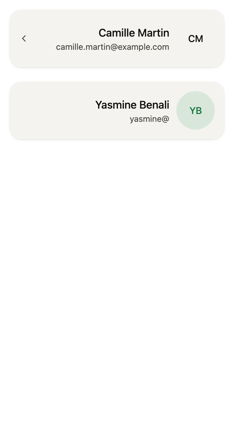
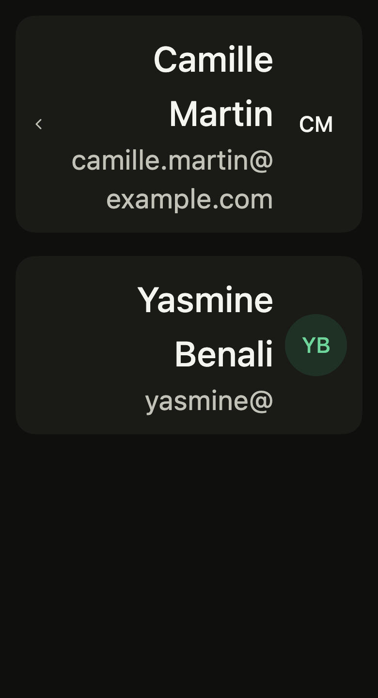
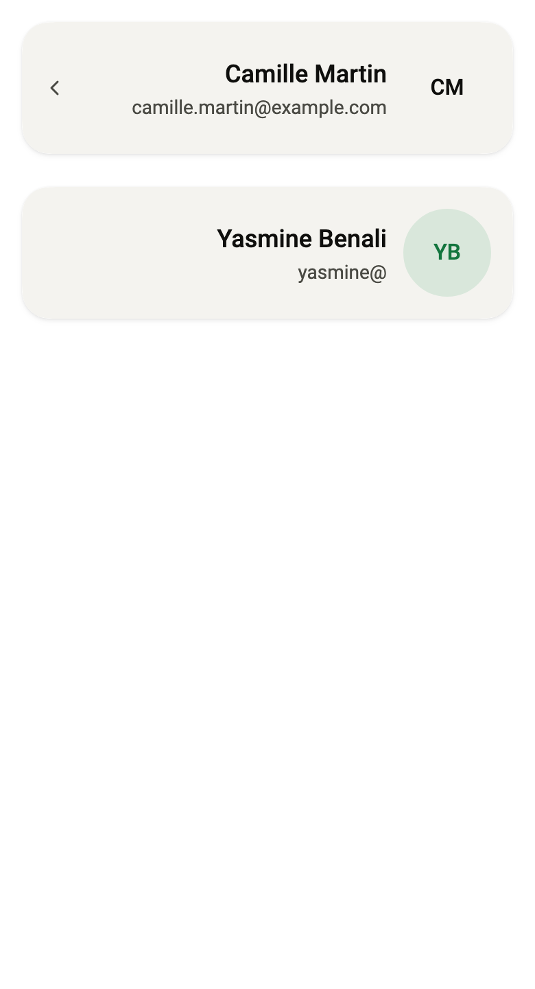
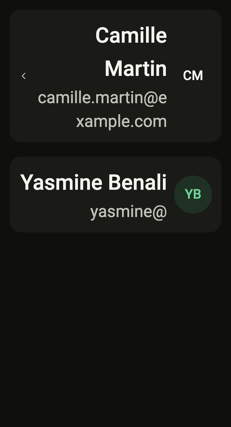
The 16 images published with version 0.2.3, rendered by the shared harness on macOS with Flutter 3.47.7. fliin verify profile-card compares your copy to them.
Use it to
- show the signed-in person above the account topics
- open the account from the card at the top
- show the name and email address of the signed-in user
- navigate to account editing from the card
- present the account holder first
- Not for
- a photo alone: use an avatar (avatar)
- a list of people: use a list row (list-row)
- States