Blocks / auth
Provider sign-in
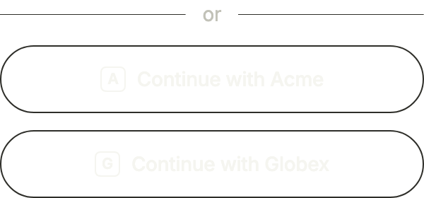
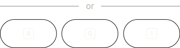
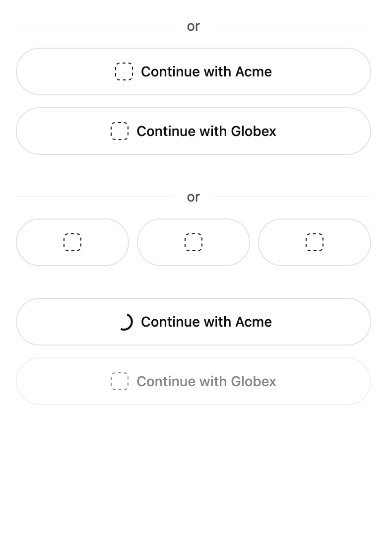
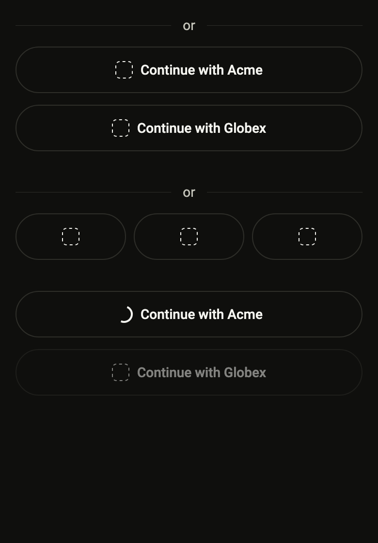
Lets people sign in with Apple, Google or another identity provider: one outlined button per provider, in a column or a row of logos, under an "or" divider.
Import
Provider sign-in is part of Fliin Pro. With a license key, sign in once with fliin login, then add it in a Flutter app where fliin init has run:
fliin login
fliin add social-sign-inExamples
Column
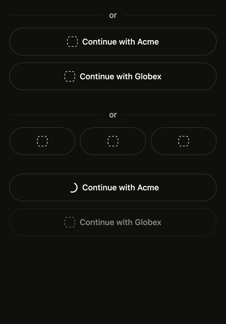
One full-width button per provider, then a divider and its label before the form. Put each provider's official logo in icon.
import 'package:your_app/ui/fliin/components/social_sign_in/fl_social_sign_in.dart';
import 'package:your_app/ui/fliin/core/fliin.dart';
import 'package:flutter/widgets.dart';

class SocialSignInColumnExample extends StatelessWidget {
  const SocialSignInColumnExample({super.key});

  @override
  Widget build(BuildContext context) {
    return FlSocialSignIn(
      dividerLabel: 'or',
      providers: [
        FlSocialProvider(label: 'Continue with Acme', icon: const _Monogram('Acme'), onPressed: () {}),
        FlSocialProvider(label: 'Continue with Globex', icon: const _Monogram('Globex'), onPressed: () {}),
      ],
    );
  }
}

/// Stands in for a provider's logo until the app puts in the official one:
/// its initial in a square, at the size and color of the icon.
class _Monogram extends StatelessWidget {
  const _Monogram(this.name);

  final String name;

  @override
  Widget build(BuildContext context) {
    final icon = IconTheme.of(context);
    final theme = FlScope.of(context);
    final size = icon.size!;
    return ExcludeSemantics(
      child: SizedBox.square(
        dimension: size,
        child: DecoratedBox(
          decoration: ShapeDecoration(
            shape: FlContinuousBorder(
              radius: theme.shape.radiusXs,
              side: BorderSide(color: icon.color!, width: theme.size.border),
            ),
          ),
          child: Center(
            child: Text(
              name[0].toUpperCase(),
              textScaler: TextScaler.noScaling,
              style: TextStyle(
                color: icon.color,
                fontSize: size * 0.6,
                height: 1,
                fontWeight: theme.tokens.typography.weight.semibold,
              ),
            ),
          ),
        ),
      ),
    );
  }
}Row
FlSocialSignInLayout.row sets three or more providers side by side, each named by its logo; the label stays for the screen reader.
import 'package:your_app/ui/fliin/components/social_sign_in/fl_social_sign_in.dart';
import 'package:your_app/ui/fliin/core/fliin.dart';
import 'package:flutter/widgets.dart';

class SocialSignInRowExample extends StatelessWidget {
  const SocialSignInRowExample({super.key});

  @override
  Widget build(BuildContext context) {
    return FlSocialSignIn(
      layout: FlSocialSignInLayout.row,
      dividerLabel: 'or',
      providers: [
        FlSocialProvider(label: 'Continue with Acme', icon: const _Monogram('Acme'), onPressed: () {}),
        FlSocialProvider(label: 'Continue with Globex', icon: const _Monogram('Globex'), onPressed: () {}),
        FlSocialProvider(label: 'Continue with Initech', icon: const _Monogram('Initech'), onPressed: () {}),
      ],
    );
  }
}

/// Stands in for a provider's logo until the app puts in the official one:
/// its initial in a square, at the size and color of the icon.
class _Monogram extends StatelessWidget {
  const _Monogram(this.name);

  final String name;

  @override
  Widget build(BuildContext context) {
    final icon = IconTheme.of(context);
    final theme = FlScope.of(context);
    final size = icon.size!;
    return ExcludeSemantics(
      child: SizedBox.square(
        dimension: size,
        child: DecoratedBox(
          decoration: ShapeDecoration(
            shape: FlContinuousBorder(
              radius: theme.shape.radiusXs,
              side: BorderSide(color: icon.color!, width: theme.size.border),
            ),
          ),
          child: Center(
            child: Text(
              name[0].toUpperCase(),
              textScaler: TextScaler.noScaling,
              style: TextStyle(
                color: icon.color,
                fontSize: size * 0.6,
                height: 1,
                fontWeight: theme.tokens.typography.weight.semibold,
              ),
            ),
          ),
        ),
      ),
    );
  }
}Loading
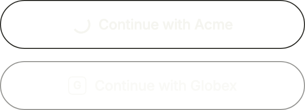
While a provider signs in, its button shows a spinner and the others are disabled with onPressed: null.
import 'package:your_app/ui/fliin/components/social_sign_in/fl_social_sign_in.dart';
import 'package:your_app/ui/fliin/core/fliin.dart';
import 'package:flutter/widgets.dart';

class SocialSignInLoadingExample extends StatelessWidget {
  const SocialSignInLoadingExample({super.key});

  @override
  Widget build(BuildContext context) {
    return FlSocialSignIn(
      providers: [
        const FlSocialProvider(label: 'Continue with Acme', icon: _Monogram('Acme'), loading: true, onPressed: null),
        const FlSocialProvider(label: 'Continue with Globex', icon: _Monogram('Globex'), onPressed: null),
      ],
    );
  }
}

/// Stands in for a provider's logo until the app puts in the official one:
/// its initial in a square, at the size and color of the icon.
class _Monogram extends StatelessWidget {
  const _Monogram(this.name);

  final String name;

  @override
  Widget build(BuildContext context) {
    final icon = IconTheme.of(context);
    final theme = FlScope.of(context);
    final size = icon.size!;
    return ExcludeSemantics(
      child: SizedBox.square(
        dimension: size,
        child: DecoratedBox(
          decoration: ShapeDecoration(
            shape: FlContinuousBorder(
              radius: theme.shape.radiusXs,
              side: BorderSide(color: icon.color!, width: theme.size.border),
            ),
          ),
          child: Center(
            child: Text(
              name[0].toUpperCase(),
              textScaler: TextScaler.noScaling,
              style: TextStyle(
                color: icon.color,
                fontSize: size * 0.6,
                height: 1,
                fontWeight: theme.tokens.typography.weight.semibold,
              ),
            ),
          ),
        ),
      ),
    );
  }
}Tertiary
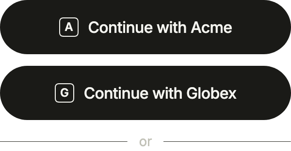
Filled buttons with variant: FlButtonVariant.tertiary, at the size of the main button with size, above the form: the divider goes after.
import 'package:your_app/ui/fliin/components/button/fl_button.dart';
import 'package:your_app/ui/fliin/components/social_sign_in/fl_social_sign_in.dart';
import 'package:your_app/ui/fliin/core/fliin.dart';
import 'package:flutter/widgets.dart';

class SocialSignInTertiaryExample extends StatelessWidget {
  const SocialSignInTertiaryExample({super.key});

  @override
  Widget build(BuildContext context) {
    return FlSocialSignIn(
      variant: FlButtonVariant.tertiary,
      size: FlButtonSize.lg,
      dividerLabel: 'or',
      divider: FlSocialSignInDivider.after,
      providers: [
        FlSocialProvider(label: 'Continue with Acme', icon: const _Monogram('Acme'), onPressed: () {}),
        FlSocialProvider(label: 'Continue with Globex', icon: const _Monogram('Globex'), onPressed: () {}),
      ],
    );
  }
}

/// Stands in for a provider's logo until the app puts in the official one:
/// its initial in a square, at the size and color of the icon.
class _Monogram extends StatelessWidget {
  const _Monogram(this.name);

  final String name;

  @override
  Widget build(BuildContext context) {
    final icon = IconTheme.of(context);
    final theme = FlScope.of(context);
    final size = icon.size!;
    return ExcludeSemantics(
      child: SizedBox.square(
        dimension: size,
        child: DecoratedBox(
          decoration: ShapeDecoration(
            shape: FlContinuousBorder(
              radius: theme.shape.radiusXs,
              side: BorderSide(color: icon.color!, width: theme.size.border),
            ),
          ),
          child: Center(
            child: Text(
              name[0].toUpperCase(),
              textScaler: TextScaler.noScaling,
              style: TextStyle(
                color: icon.color,
                fontSize: size * 0.6,
                height: 1,
                fontWeight: theme.tokens.typography.weight.semibold,
              ),
            ),
          ),
        ),
      ),
    );
  }
}Usage
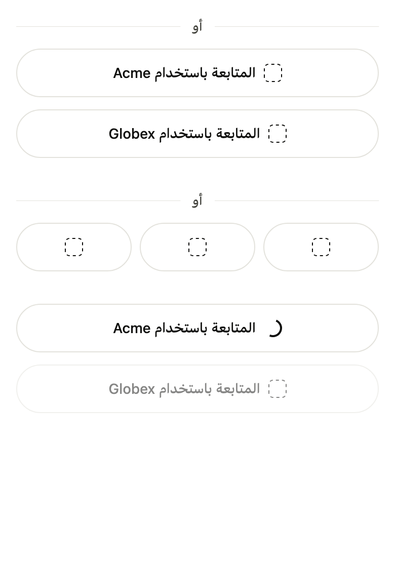
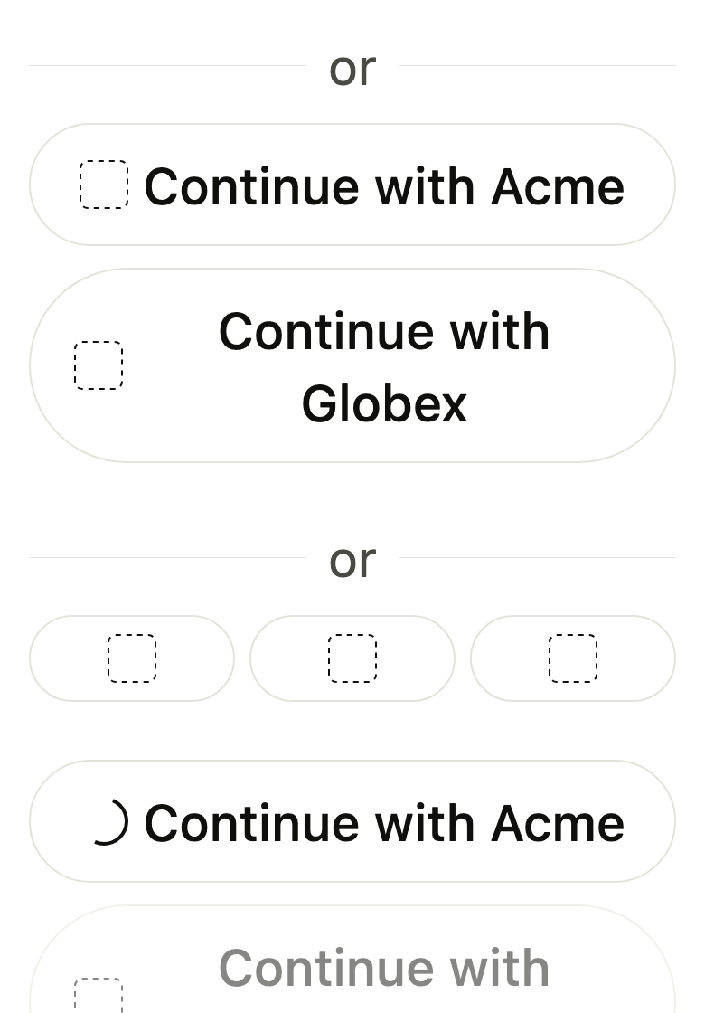
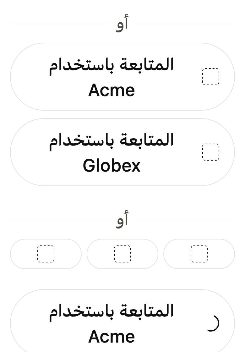
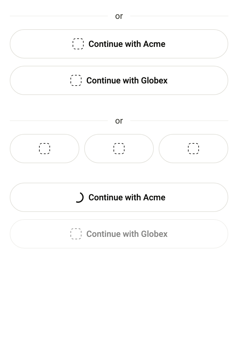
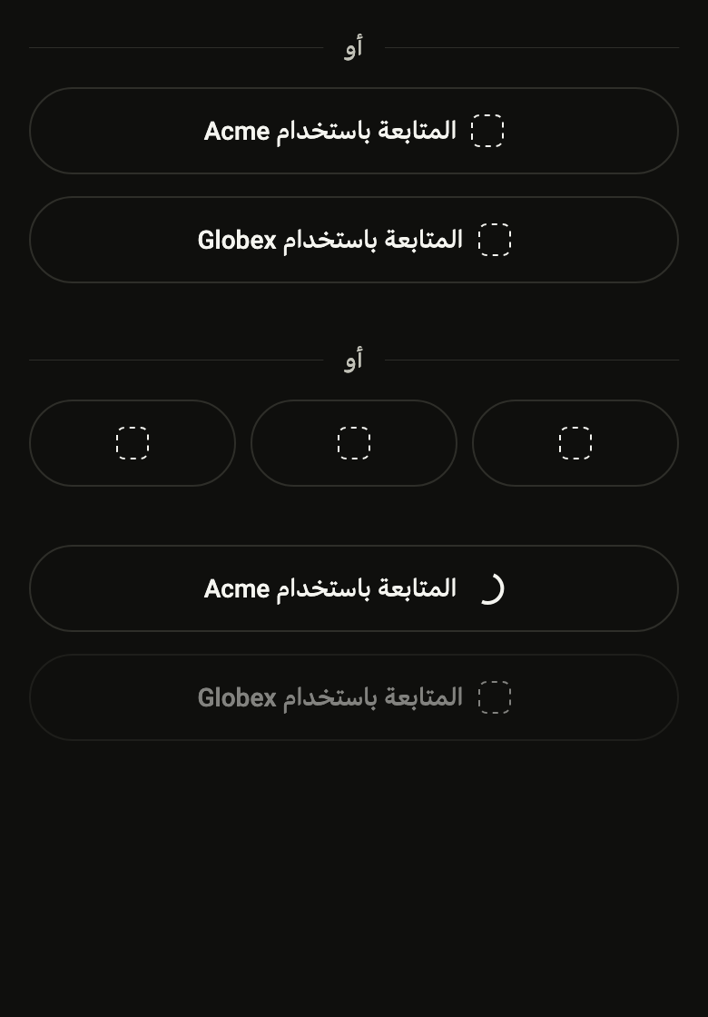
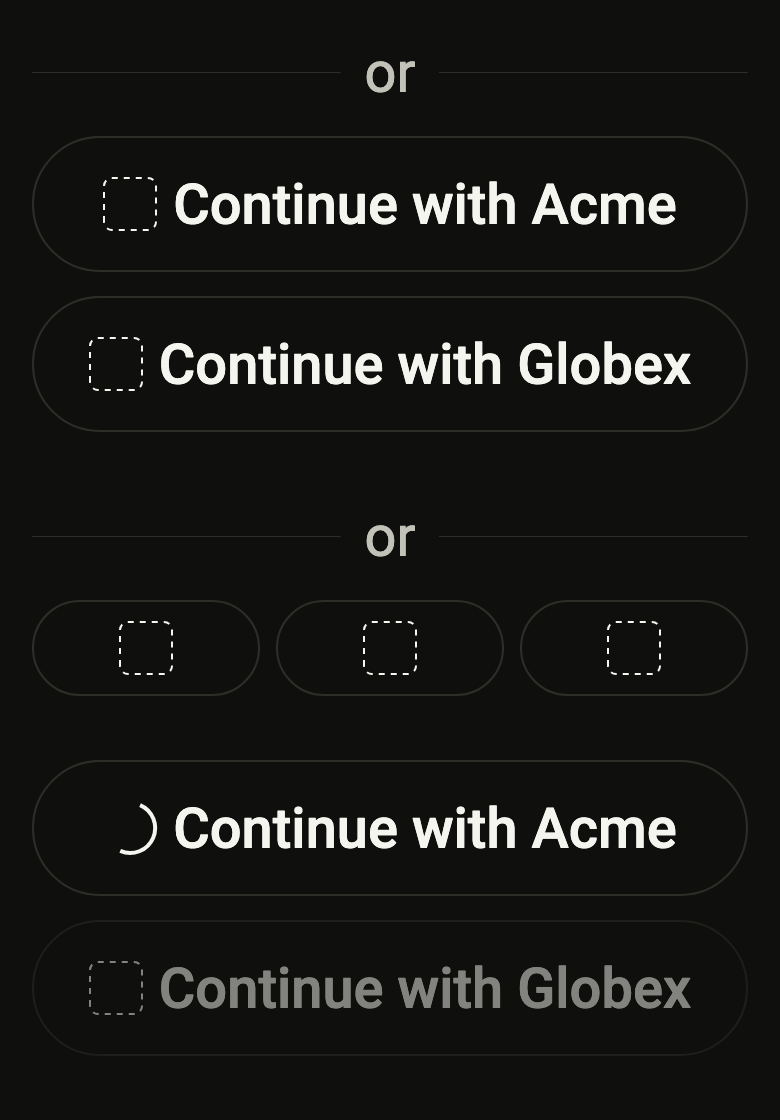
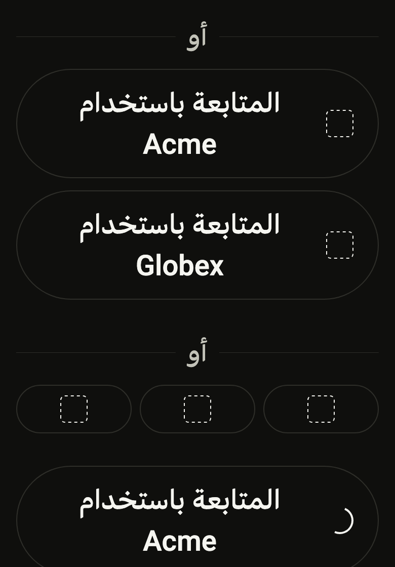
The code the reference images render:
final example = ColoredBox(
  color: FlScope.of(context).colors.surface,
  child: SingleChildScrollView(
    padding: EdgeInsetsDirectional.all(FlScope.of(context).space.lg),
    child: Column(
      crossAxisAlignment: CrossAxisAlignment.stretch,
      spacing: FlScope.of(context).space.xxl,
      children: [
        FlSocialSignIn(
          dividerLabel: 'or',
          providers: [
            FlSocialProvider(
              label: 'Continue with Acme',
              icon: const FlLogoSlot(),
              onPressed: () {},
            ),
            FlSocialProvider(
              label: 'Continue with Globex',
              icon: const FlLogoSlot(),
              onPressed: () {},
            ),
          ],
        ),
        FlSocialSignIn(
          layout: FlSocialSignInLayout.row,
          dividerLabel: 'or',
          providers: [
            FlSocialProvider(
              label: 'Continue with Acme',
              icon: const FlLogoSlot(),
              onPressed: () {},
            ),
            FlSocialProvider(
              label: 'Continue with Globex',
              icon: const FlLogoSlot(),
              onPressed: () {},
            ),
            FlSocialProvider(
              label: 'Continue with Initech',
              icon: const FlLogoSlot(),
              onPressed: () {},
            ),
          ],
        ),
        FlSocialSignIn(
          providers: [
            FlSocialProvider(
              label: 'Continue with Acme',
              icon: const FlLogoSlot(),
              onPressed: null,
              loading: true,
            ),
            FlSocialProvider(
              label: 'Continue with Globex',
              icon: const FlLogoSlot(),
              onPressed: null,
              loading: false,
            ),
          ],
        ),
      ],
    ),
  ),
);API
FlSocialProvider: final class
FlSocialProvider.new: const new({required String label, required Widget icon, required VoidCallback? onPressed, bool loading, String? shortLabel})
FlSocialProvider.label: get String
FlSocialProvider.icon: get Widget
FlSocialProvider.onPressed: get VoidCallback?
FlSocialProvider.loading: get bool
FlSocialProvider.shortLabel: get String?
FlSocialSignInLayout: enum {column, row}
FlSocialSignInLayout.column: static final FlSocialSignInLayout
FlSocialSignInLayout.row: static final FlSocialSignInLayout
FlSocialSignInDivider: enum {before, after}
FlSocialSignInDivider.before: static final FlSocialSignInDivider
FlSocialSignInDivider.after: static final FlSocialSignInDivider
FlSocialSignIn: class extends StatelessWidget
FlSocialSignIn.new: const new({super.key, required List<FlSocialProvider> providers, String? dividerLabel, FlSocialSignInDivider divider, FlSocialSignInLayout layout, FlButtonVariant variant, FlButtonSize? size})
FlSocialSignIn.providers: get List<FlSocialProvider>
FlSocialSignIn.dividerLabel: get String?
FlSocialSignIn.divider: get FlSocialSignInDivider
FlSocialSignIn.layout: get FlSocialSignInLayout
FlSocialSignIn.variant: get FlButtonVariant
FlSocialSignIn.size: get FlButtonSize?
FlSocialSignIn.build: Widget(BuildContext context)
FlLogoSlot: class extends StatelessWidget
FlLogoSlot.new: const new({super.key})
FlLogoSlot.build: Widget(BuildContext context)Reference renders
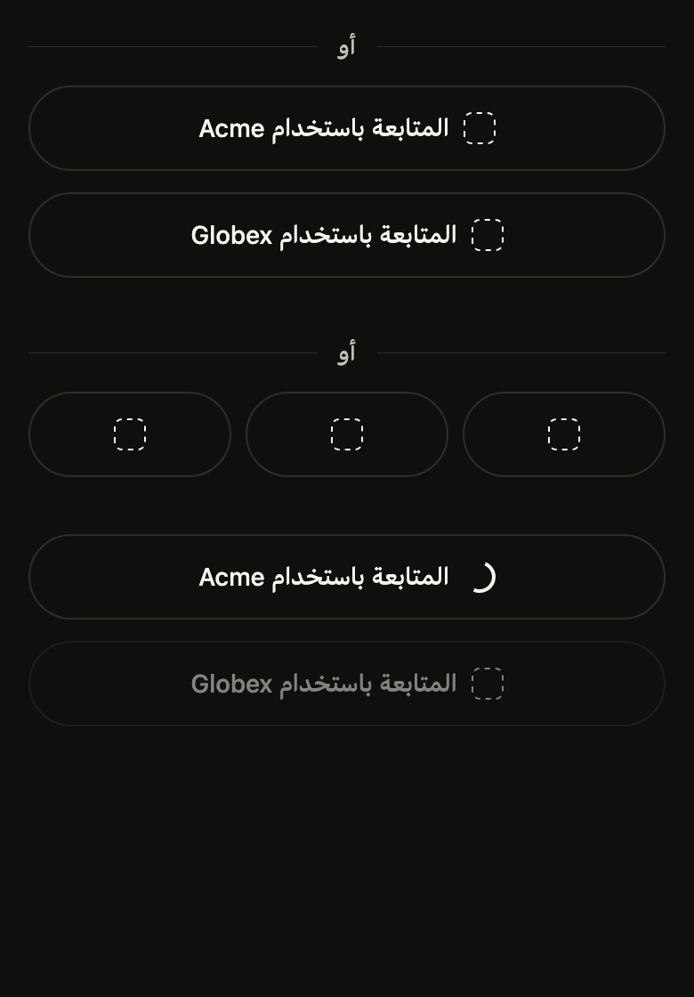
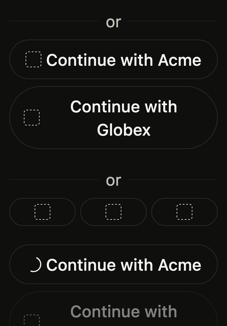
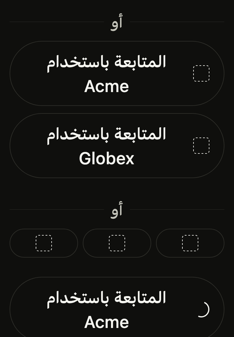
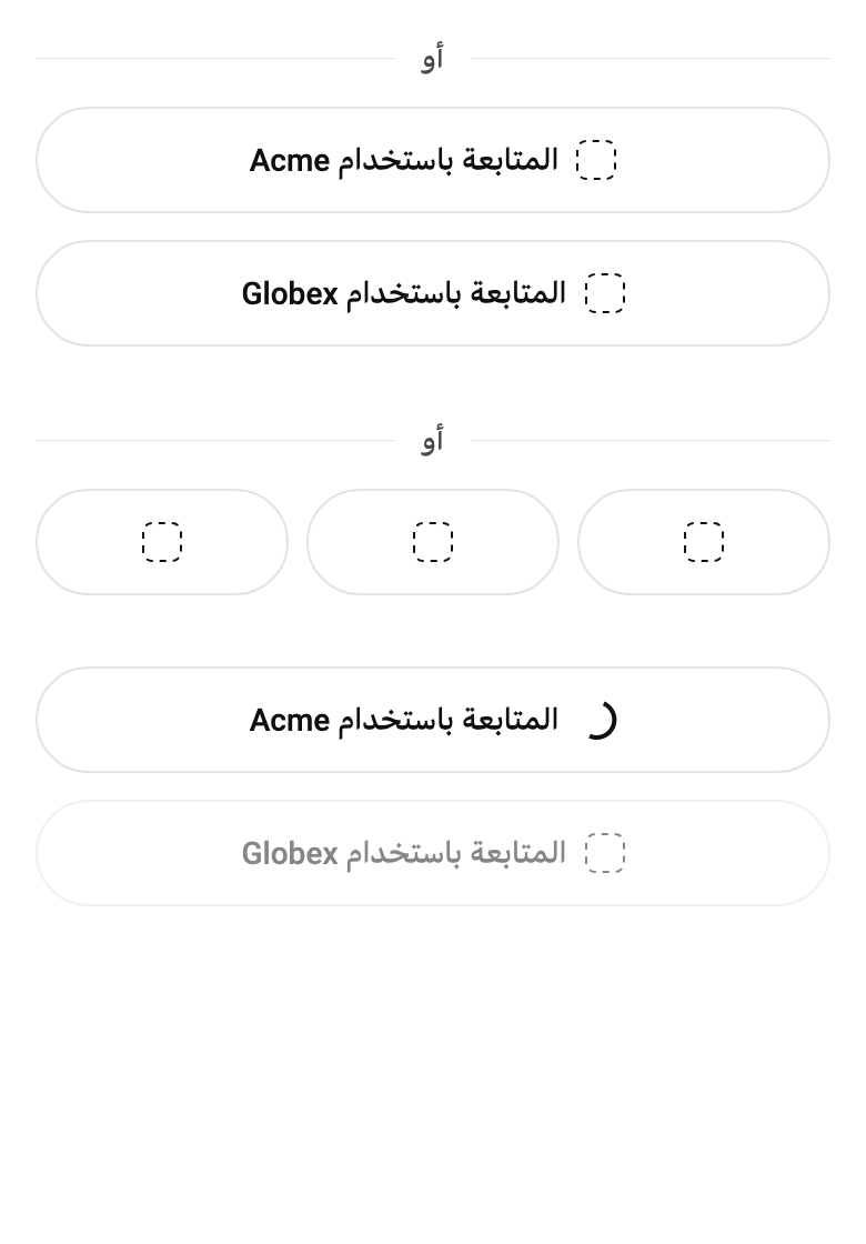
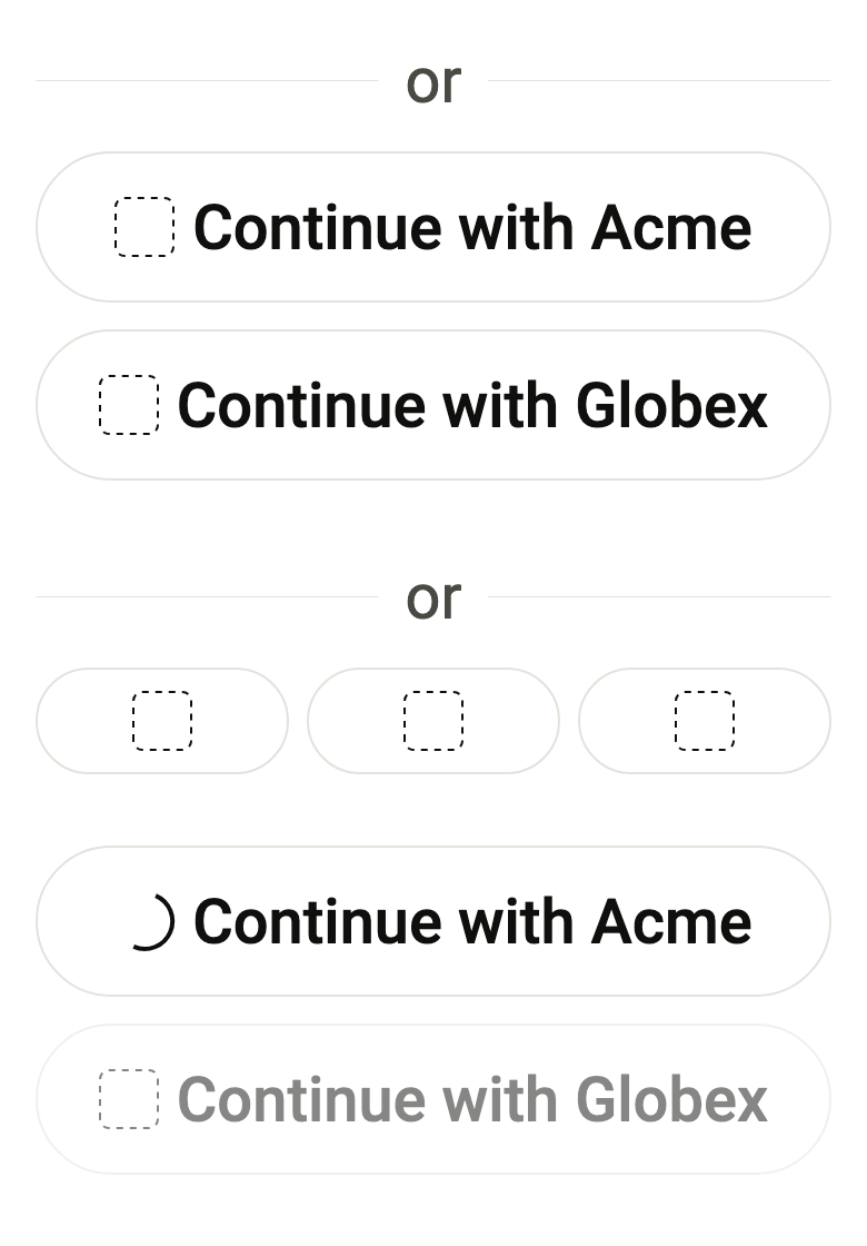
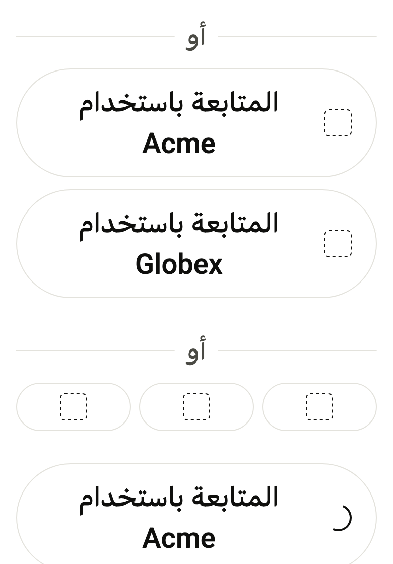
The 16 images published with version 0.2.4, rendered by the shared harness on macOS with Flutter 3.47.7. fliin verify social-sign-in compares your copy to them.
Use it to
- offer sign in with Apple or Google below a form
- separate the form from identity providers with an or divider
- show provider logos side by side
- show that a provider sign in is in progress
- let users sign up with an existing provider account
- Not for
- an ordinary action button: use a button (button)
- a line between two pieces of content: use a separator (separator)
- States