Blocks / auth
Access header
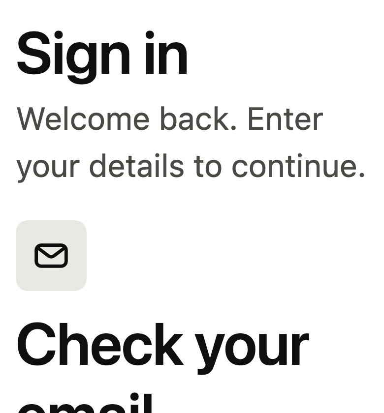
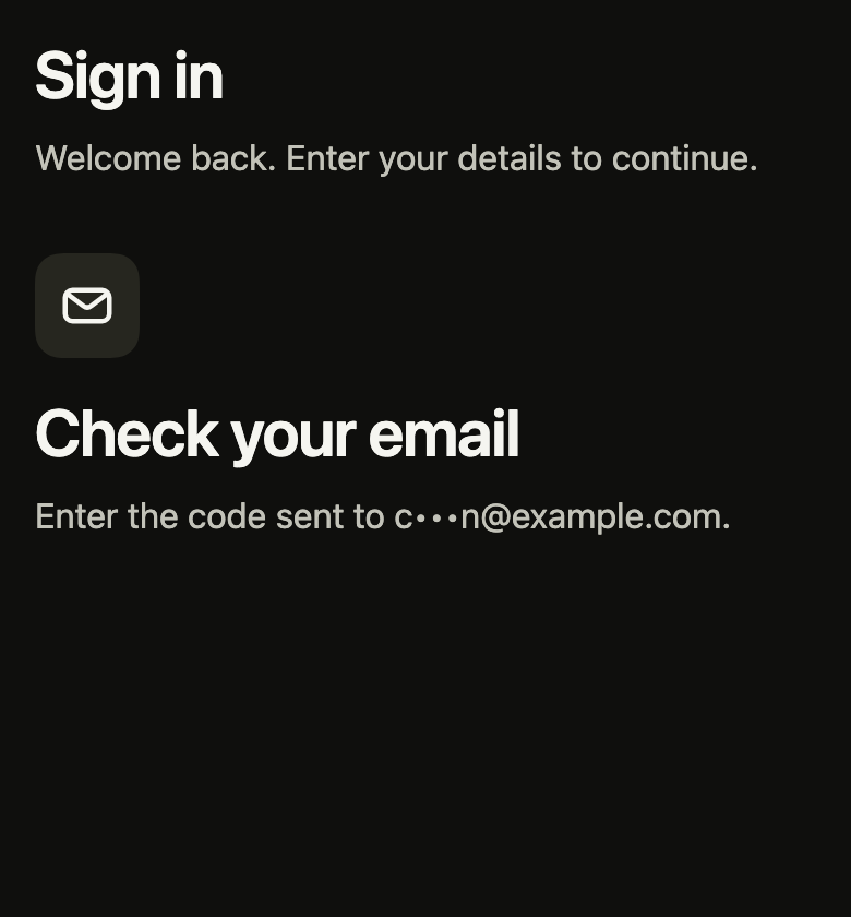
Tells people which access screen they are on: the app mark or an icon, the title, the only announced heading, and a sentence on what to do, centered.
Import
Access header is part of Fliin Pro. With a license key, sign in once with fliin login, then add it in a Flutter app where fliin init has run:
fliin login
fliin add auth-headerExamples
Plain
The title and a line under it, at the top of a sign-in or sign-up screen.
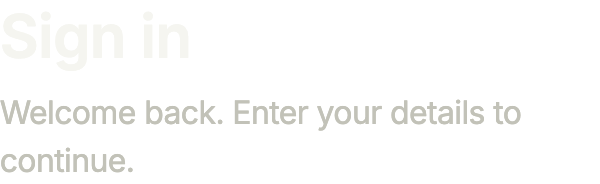
import 'package:your_app/ui/fliin/components/auth_header/fl_auth_header.dart';
import 'package:flutter/widgets.dart';

class AuthHeaderPlainExample extends StatelessWidget {
  const AuthHeaderPlainExample({super.key});

  @override
  Widget build(BuildContext context) {
    return const FlAuthHeader(
      title: 'Sign in',
      subtitle: 'Welcome back. Enter your details to continue.',
    );
  }
}Mark
With mark, your logo sits above the title: the screens that follow sign- in keep it.

import 'package:your_app/ui/fliin/components/auth_header/fl_auth_header.dart';
import 'package:your_app/ui/fliin/core/fliin.dart';
import 'package:flutter/widgets.dart';

class AuthHeaderMarkExample extends StatelessWidget {
  const AuthHeaderMarkExample({super.key});

  @override
  Widget build(BuildContext context) {
    return const FlAuthHeader(
      mark: _Mark(),
      title: 'Check your email',
      subtitle: 'Enter the code sent to c•••[email protected].',
    );
  }
}

/// Your brand above the title: here an accent square in place of a logo.
class _Mark extends StatelessWidget {
  const _Mark();

  @override
  Widget build(BuildContext context) {
    final theme = FlScope.of(context);
    return ExcludeSemantics(
      child: SizedBox.square(
        dimension: IconTheme.of(context).size,
        child: DecoratedBox(
          decoration: ShapeDecoration(
            color: theme.colors.accent,
            shape: FlContinuousBorder(radius: theme.shape.radiusLg),
          ),
        ),
      ),
    );
  }
}Centered
A welcome screen: your logo as is with FlAuthHeaderMarkStyle.plain, and everything centered with centered.
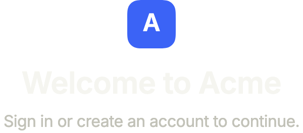
import 'package:your_app/ui/fliin/components/auth_header/fl_auth_header.dart';
import 'package:your_app/ui/fliin/core/fliin.dart';
import 'package:flutter/widgets.dart';

class AuthHeaderCenteredExample extends StatelessWidget {
  const AuthHeaderCenteredExample({super.key});

  @override
  Widget build(BuildContext context) {
    return const FlAuthHeader(
      mark: _Logo(),
      markStyle: FlAuthHeaderMarkStyle.plain,
      centered: true,
      title: 'Welcome to Acme',
      subtitle: 'Sign in or create an account to continue.',
    );
  }
}

/// Your logo, sized by the header's `IconTheme`: here an accent square with
/// its initial.
class _Logo extends StatelessWidget {
  const _Logo();

  @override
  Widget build(BuildContext context) {
    final theme = FlScope.of(context);
    final size = IconTheme.of(context).size!;
    return ExcludeSemantics(
      child: SizedBox.square(
        dimension: size,
        child: DecoratedBox(
          decoration: ShapeDecoration(
            color: theme.colors.accent,
            shape: FlContinuousBorder(radius: theme.shape.radiusXl),
          ),
          child: Center(
            child: Text(
              'A',
              textScaler: TextScaler.noScaling,
              style: TextStyle(
                color: theme.colors.onAccent,
                fontSize: size / 2,
                height: 1,
                fontWeight: theme.tokens.typography.weight.semibold,
              ),
            ),
          ),
        ),
      ),
    );
  }
}Usage
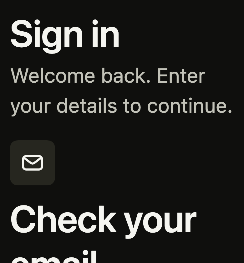
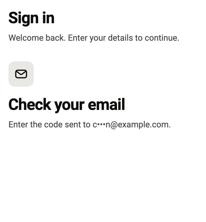
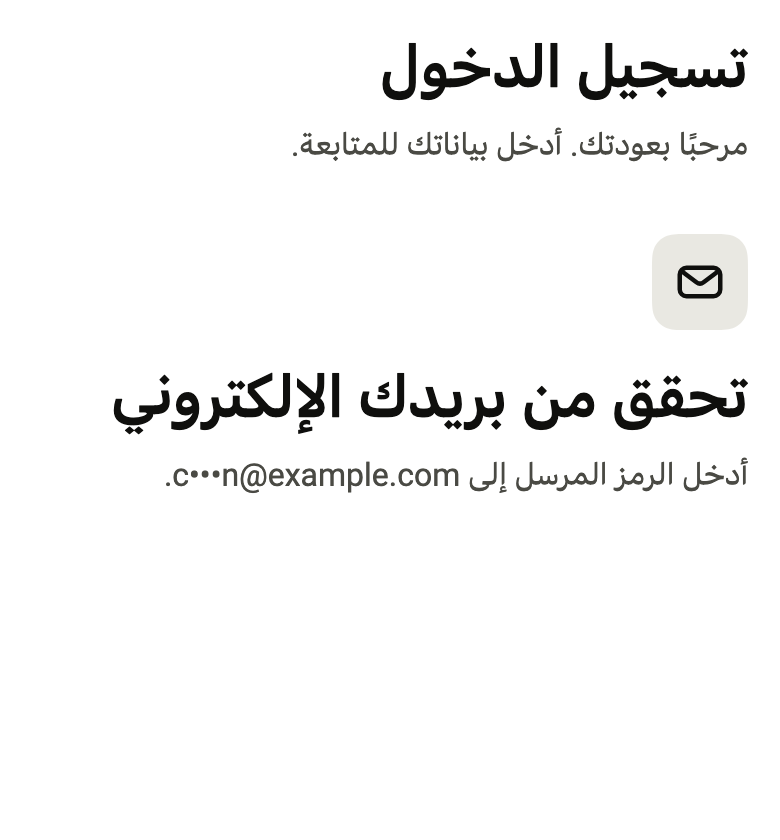
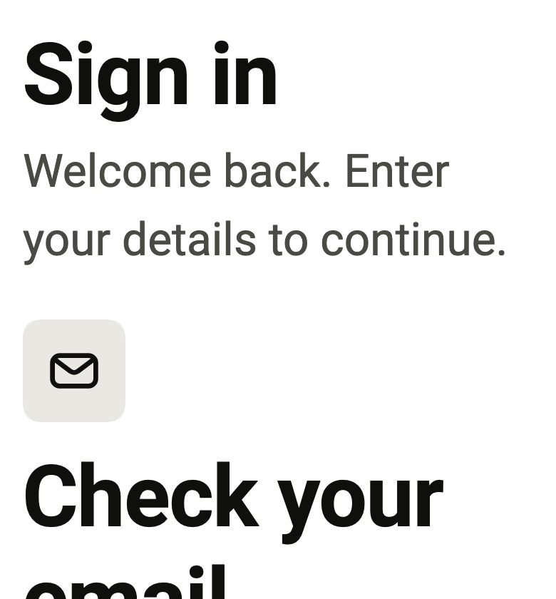
The code the reference images render:
final example = ColoredBox(
  color: FlScope.of(context).colors.surface,
  child: SingleChildScrollView(
    padding: EdgeInsetsDirectional.all(FlScope.of(context).space.lg),
    child: Column(
      crossAxisAlignment: CrossAxisAlignment.stretch,
      spacing: FlScope.of(context).space.xxl,
      children: [
        FlAuthHeader(
          title: 'Sign in',
          subtitle: 'Welcome back. Enter your details to continue.',
        ),
        FlAuthHeader(
          mark: ExcludeSemantics(child: FlIcon(FlIcons.envelope)),
          title: 'Check your email',
          subtitle: 'Enter the code sent to c•••[email protected].',
        ),
      ],
    ),
  ),
);API
FlAuthHeaderMarkStyle: enum {tile, plain}
FlAuthHeaderMarkStyle.tile: static final FlAuthHeaderMarkStyle
FlAuthHeaderMarkStyle.plain: static final FlAuthHeaderMarkStyle
FlAuthHeader: class extends StatelessWidget
FlAuthHeader.new: const new({super.key, Widget? mark, required String title, String? subtitle, FlAuthHeaderMarkStyle markStyle, bool centered, FlTextType titleType})
FlAuthHeader.mark: get Widget?
FlAuthHeader.title: get String
FlAuthHeader.subtitle: get String?
FlAuthHeader.markStyle: get FlAuthHeaderMarkStyle
FlAuthHeader.centered: get bool
FlAuthHeader.titleType: get FlTextType
FlAuthHeader.build: Widget(BuildContext context)Reference renders
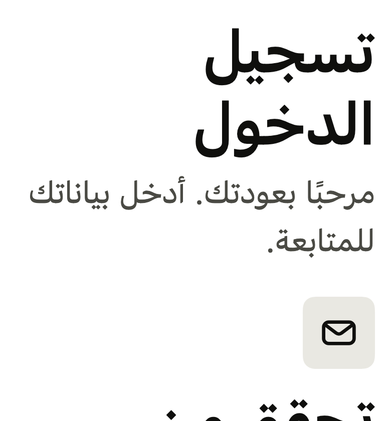
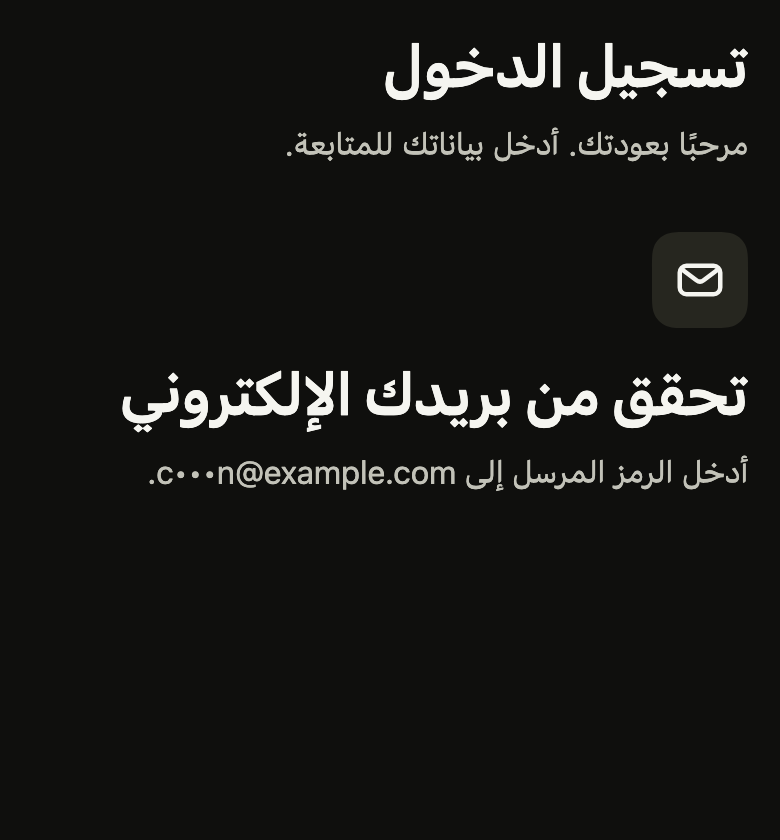
The 16 images published with version 0.2.2, rendered by the shared harness on macOS with Flutter 3.47.7. fliin verify auth-header compares your copy to them.
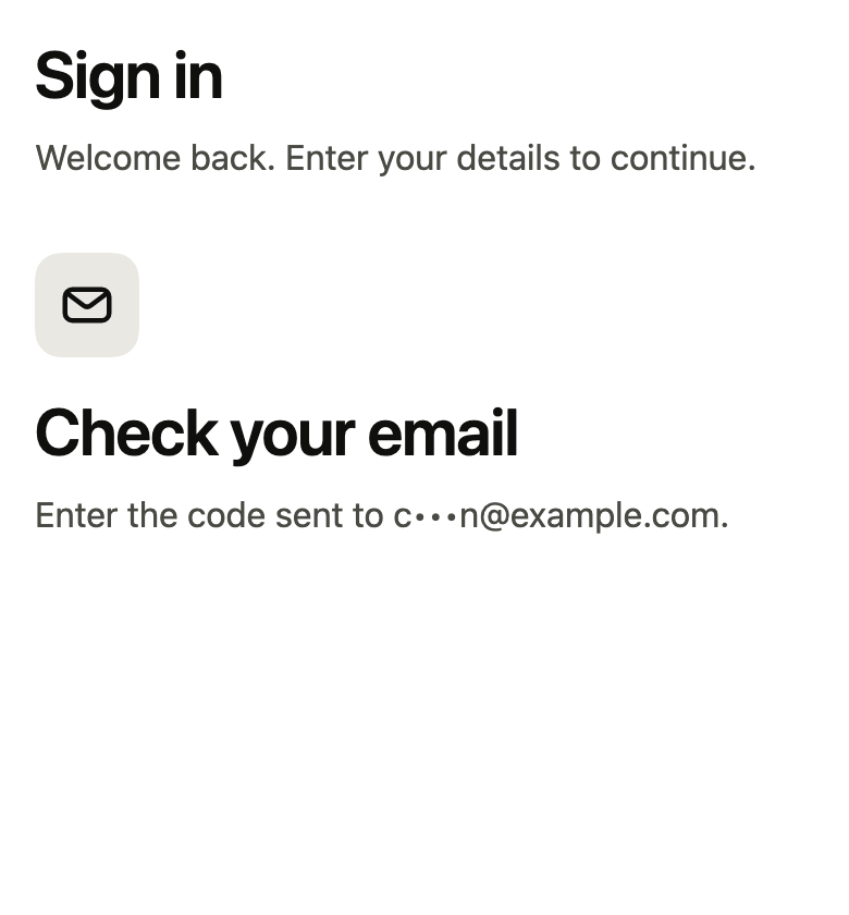
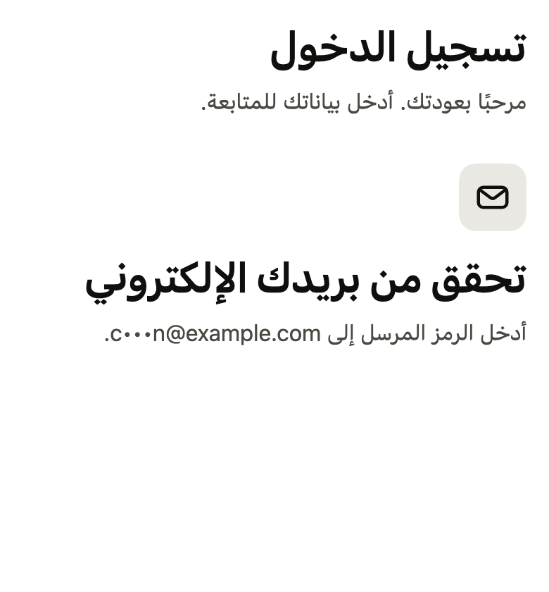

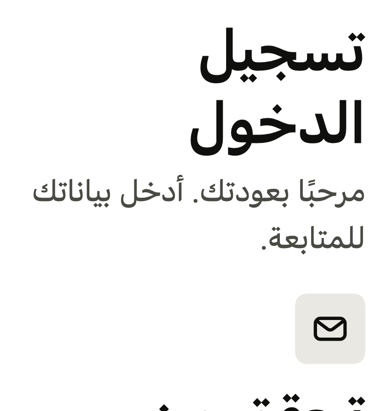
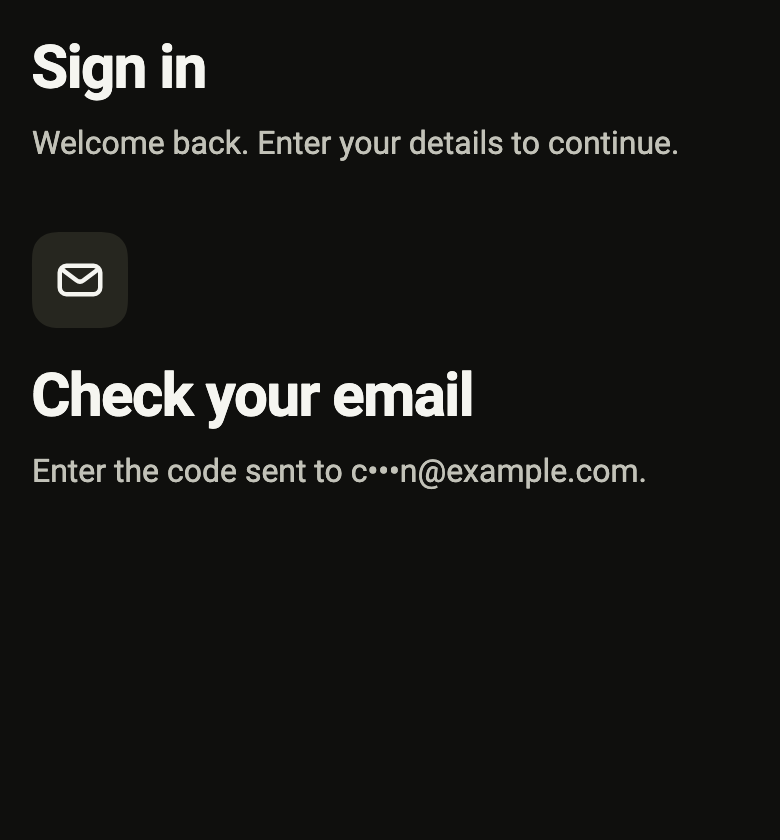
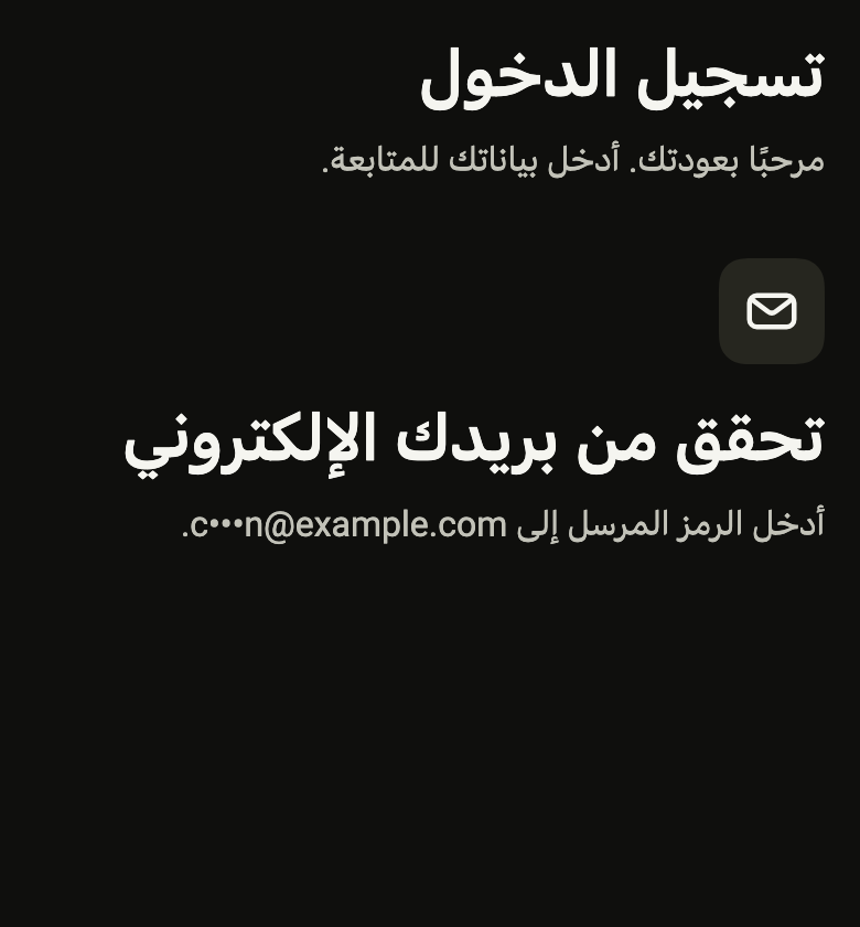
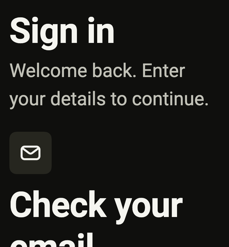

Use it to
- present a sign in screen with a title and a sentence
- show the brand mark at the top of a sign in screen
- explain where a verification code was sent
- make the screen reader read a single heading above the form
- give a sign up screen a centered title and a sentence
- Not for
- a large title at the top of an ordinary screen, with a back arrow: use an app bar (app-bar)
- the heading of a group of rows: use a section header (section-header)
- States